Webfont alternatives, fallbacks & Outlook
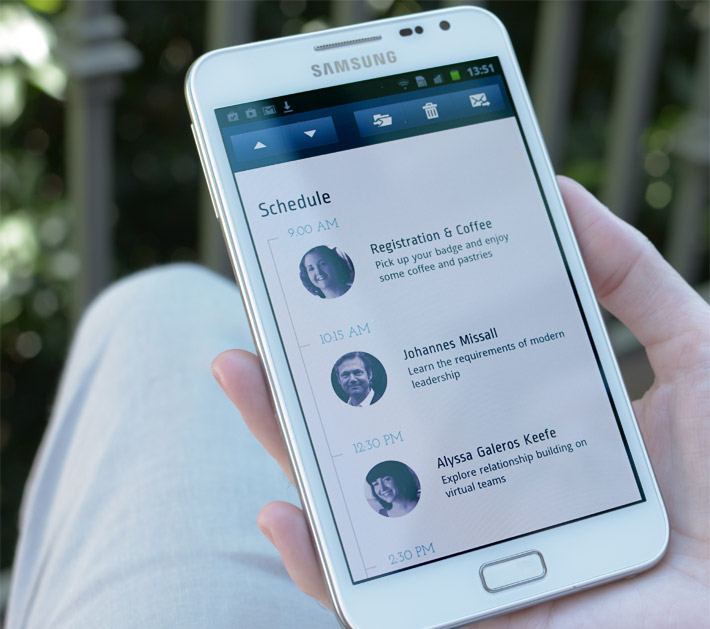
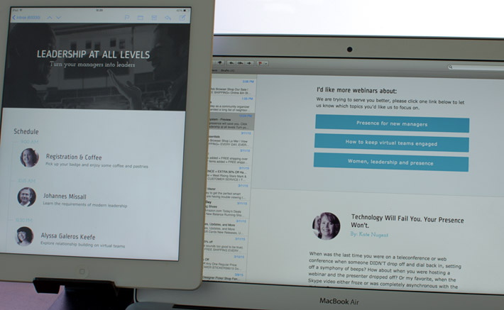
The Ariel Group schedule module on Android showing webfonts Ropa Sans and Josefin Slab
When you can't use brand fonts
For much of my work I don't get to choose which typefaces to use, I'll inherit them from a style guide or website. It's often hit or miss if those typefaces can be used in email. For instance Hoefler & Co. is a very popular foundry who do not currently offer email licenses. Webtype or MyFonts are the two main webfont services besides Google Fonts whose license covers email, so I'll start my search there. (Update as of November 4th you can use H&Co fonts in email, you can read the announcement here).
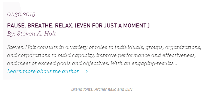
On their website The Ariel Group use the typefaces Verdana, DIN and Archer. If you're unsure which of your choices are websafe head over to CSS Font Stack. Verdana is a standard typeface with support across PC and Mac, DIN and Archer are both webfonts. A quick search reveals that Archer is a Hoefler & Co. typeface so we're out of luck. DIN can be licensed through MyFonts as a self-hosted option. If you strike out with the big aggregate services, it may be worth tracking the typeface back to the original foundry to see if you can deal with them directly.
As the Archer typeface would add so much personality I felt it was worth trying to find a substitute. I consulted Typewolf's, ‘The Definitive Guide to Free Fonts’ which lists alternatives to over 400 fonts, this lead me to the Google Font Josefin Slab. DIN was less of a priority, so rather than go the MyFonts route I found the Google Font alternative Ropa Sans. This isn't to suggest you should always opt for free fonts — there's more quality choices and often a wider selection of weights with paid — I just happened to in this instance.
Fallback isn't the right size
When exploring fallback options I use the side-by-side template in Typecast and toggle the baseline grid under the menu. I'll also play around in PS overlaying different type on top of each other to see how the x-height and width lines up. You can download Google Fonts to use in mockups and check a webfonts file size.
Typecast allows you to compare webfonts and fallbacks side-by-side in the browser then share the link.
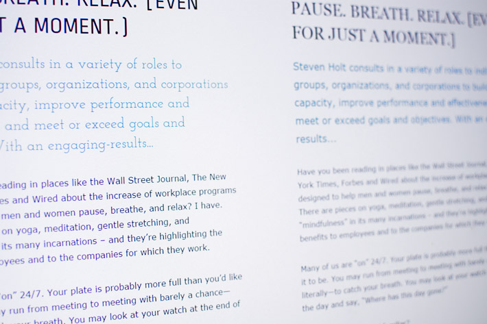
While Josefin Slab was a decent stand-in for Archer we had a problem; our two fallback options Georgia and Times New Roman didn't exactly match its proportions. There aren't that many serif fallback options that have wide support across PC and Mac, and none that look like Josefin Slab. We ended up picking Georgia as it's less formal, more in the spirit of Archer. Ropa Sans was also smaller than our preferred fallback Verdana.
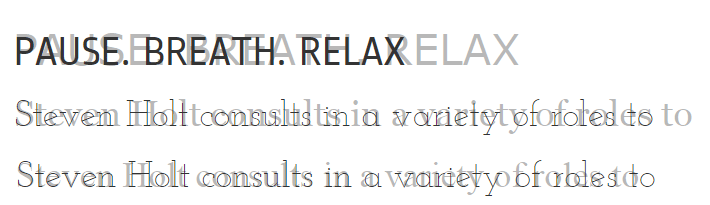
Standard fallbacks in lite grey (from top Verdana, Georgia & Times), proportions don't match
Separate webfonts and fallbacks
What we needed was a way to specify separate sizes for the fallbacks and webfonts e.g. 14px for Georgia and 18px for Josefin Slab, but we can't do this in email and font-size-adjust is only supported in FF. In the end what we went with is to separate the two using an @media switch with the webfont styles defined in the head and the fallbacks inline. In all tests the inline CSS was defined as follows with no webfonts in the stack:
/* inline style */
|
We then used a media query switch in the head to define the webfont specific styles:
/* css in the head */
|
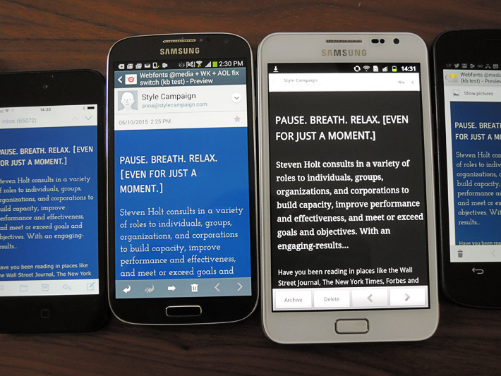
The caveat to this is Yahoo! Mail, AOL, Outlook.com and Thunderbird read the content within the media query, displaying the fallback typefaces in webfont sizes as they don't support @font-face.
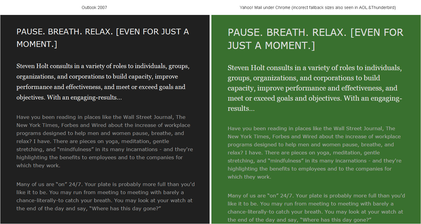
Outlook 2007 (left) showing correct fallback sizes and Yahoo! Mail under Chrome (right) too big. Litmus / Test
How you deal with this is very project specific. For The Ariel Group we decided to just dial down our webfont desktop header sizes — seen on Mac Mail and iPad — as we felt the contrasting typefaces and colors created enough of a hierarchy.
You can compromise by adjusting your desktop webfont sizes seen in Mac Mail and on the iPad
WebKit targeting
WebKit targeting would have partly solved our problem as it knocks out most of those clients that fall between the cracks. I think it was Brian Graves who first shared the line of code for WebKit targeting, but its been floating around for a couple of years now as a way to split old email clients from the more advanced. In our test we defined the webkit switch as follows:
@media screen and (-webkit-min-device-pixel-ratio:0) {
|
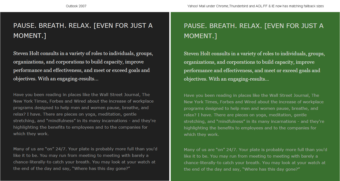
Outlook 2007 (left) correct fallback sizes and Yahoo! Mail Chrome (right) with WebKit targeting fix. Litmus / Test
AOL Chrome
Unfortunately AOL under Chrome identifies as a WebKit client, and as it doesn't support webfonts it still renders our fallbacks incorrectly. To knock out AOL Chrome you can use the old Yahoo! Mail selector hack (which you no longer need outside of this use case) as it also works in AOL. Yahoo! Mail and AOL do not support user defined attributes so they do not read CSS style declarations when prefixed with such attributes. This causes AOL to skip the media query and the webfont font sizes. So we're now able to style our webfonts independently from the fallbacks and have 26px Verdana vs. 32px Ropa Sans. In our test we used an attribute selector in the body named 'notwebmail':
/*css in head */
|
AOL Chrome: Fallbacks in webfont sizes (too big) and after the AOL fix. Litmus / Test
Support chart & test emails
I put together this support chart after running a QA in our device lab and Litmus on three test emails for each of the above scenarios. The results are color coded with black as the default background color, so in essence if it changes from black it can read some of the content defined in the media query.
QA in device lab and Litmus results are color coded e.g Gmail app black default. Support chart
- Black = default fallback fonts with all the styles defined within the media query skipped
- Green = reads content defined in media query, if you see webfonts they are supported
- Red = same as green just on mobile, if you see webfonts they are supported
- Purple = reads media query content + WebKit, if see webfonts they are supported
- Blue = same as purple just on mobile, reads content defined in media query + WebKit
One anomaly was that Outlook.com turned green in Litmus — showing fallbacks in webfont sizes like AOL and Yahoo! Mail — but when I ran the same code through my Outlook.com test account it came in black. Turns out I've been upgraded to the new 365 backend while Litmus is showing previews from an earlier version of Outlook.com. Litmus told me they will switch over once the majority of users are running the 365-based client. Either way any Outlook.com stragglers get knocked out by WebKit targeting.
Outlook displaying Times New Roman
If left alone Outlook 2007 and 2010 will ignore your fallback fonts and render Times New Roman. One side benefit to the above approach is it also fixes this quirk. We noticed in previous testing that using the @media switch with webfonts defined inline proved a bit flaky when testing in real desktop clients. Separating the two and never placing the webfont in the inline font stack has proven solid, as you're not giving Outlook anything to flip out over. Though this technique is primarily for when your webfonts and fallbacks don't match in size, if all you need is an Outlook fix there's a number of other workarounds such as using conditionals.
Extra webfont resources
- Collection of ~45 emails that use webfonts split into two sheets paid and free
- Webfont support for email
- File size comparison of the top 20 Google Fonts
- Webfont services and foundries that offer email licenses
- Typographic patterns in email