Typographic patterns in email
Methodology
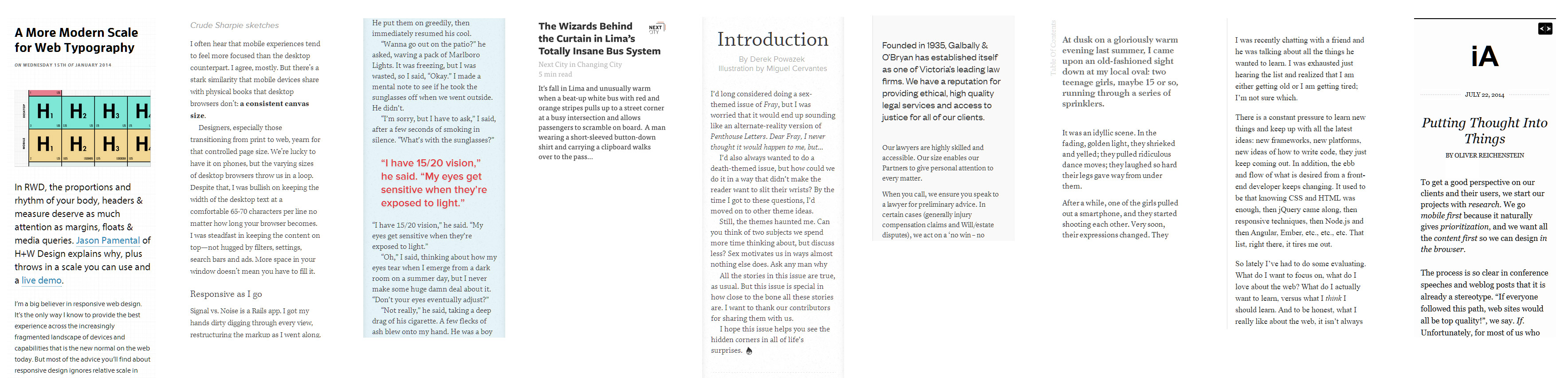
With ~50% of emails being opened on mobile all the emails in the study needed to be responsive, have a single column of live body text with a heading. I collected stats at three widths: full-width (desktop), mid-sized (450px) and small (320px). With a sample group of 50 I'm not expecting statistical significance, I just wanted to note some trends. By average I am referring to the mean, the most popular is the value that occurs most often, and in some cases I note the median or middle value. All the emails were deployed between Nov 2014 – Jan 2015. I used tools such as WhatFont, charcounter.com and webpagetest.org. I haven't had time to triple check it, feel free to email me anything wonky.
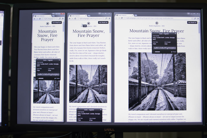
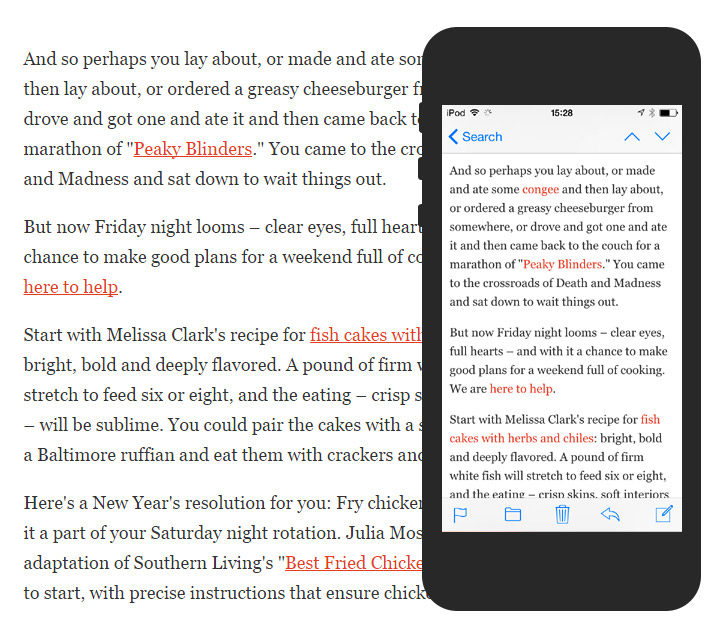
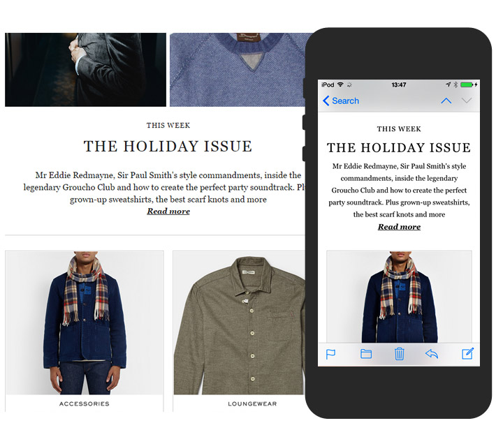
50 responsive emails at three widths using WhatFont (showing Craig Mod)
What I was interested in
I looked at many of the same data points as Constantin, though it's not identical. There are around 90 findings in all, so I'm just going to pick out some highlights:
- How popular are serif and sans-serif typefaces in headlines and body copy?
- Which typefaces are used most frequently?
- What is the most popular font size for body copy and does it change from desktop to mobile?
- What is the average number of characters per line at each width?
- What is the most popular desktop template width?
- What is the average ratio of line height to body copy?
- What is the average ratio of line height to line length in body copy?
- Are headings the same color as body copy?
- What background colors are popular?
- How are headings and body copy aligned across different viewports?
- What is the most popular font size for headings?
- Are headings linked?
- Size and color of pre-header text and if it's hidden on mobile
- How long does it take the average email to load?
- How much does an average email weigh?
- How much weight do web fonts add in comparison to images?
Serif or Sans-Serif?
- 74% used sans-serif for their primary heading and 26% serif
- 64% used sans-serif for their body copy and 36% serif
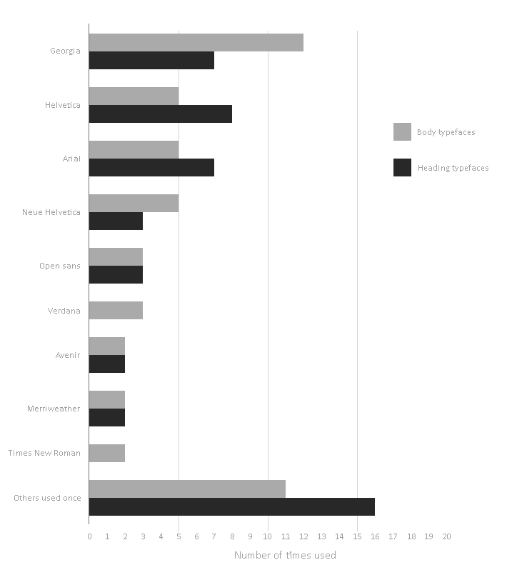
- Most popular sans-serif heading typefaces: Helvetica (16%), Arial (14%)
- Most popular serif heading typefaces: Georgia (14%) and Merriweather (4%)
- Most popular sans-serif body copy typefaces: Helvetica / Neue Helvetica (20%), Arial (10%)
- Most popular serif body typefaces: Georgia (24%), Merriweather & Times (4%)
- Serifs were used 10% more for body copy vs. headings
- Only five different serif typefaces used in body copy, vs. 15 different sans-serifs
- Times New Roman not very popular, wasn't used once as a heading typeface
- 24 different heading typefaces were used (16 only once)
- 20 different body copy typefaces were used (11 only once)
Helvetica was the most popular heading typeface overall used by 16%, as seen in Offscreen Magazine and TGD newsletters. Georgia was the favorite for body copy (24%), seen in Mr Porter and the New York Times newsletters. The two Google Fonts Merriweather and Open Sans are creeping in, and can be seen Dev Weekly and InVision.
Most popular heading and body copy typefaces
Constantin noted a surge in the use of serifs for body copy on the web (61.5%), whereas this study placed it at 36% for email. They possibly included more news sites which tend to skew serif. You also don't see as much long-form writing in email as the bulk of the content usually resides on a landing page. Though one lovely example is Craig Mod, which uses the serif Google Font Lora for both headings and body copy. Most often sans-serifs and serifs are mixed, like this classic Helvetica / Georgia combination from MailChimp.

36% used a serif for their body copy and 64% sans-serif
To help you pick a typeface there's the, Combining typefaces pocket guide, Great font combinations article and Paul Airy's newsletter looks at font pairing in email.
Body copy
In Butterick's Practical Typography guide it states,“Start every project by making the body text look good, then worry about the rest”. Building out from the body copy was repeated in all the typography articles I've read. What's key here is trying to maintain the proportions between the font size, measure (line length) and leading (line height) across various viewport widths.
Font size
- 16px was the most popular desktop body font size used by 44%
- 16px was the median desktop body font size
- 15.7px was the average desktop body copy size
- Body copy on desktop ranged from 13 – 20px
- 16px was the most popular mobile body font size used by 38%
- 16px was the median mobile body font size
- 15.58px was the average mobile body copy size
- Body copy on mobile ranged from 13 – 20px
- 72% kept the same body font size across desktop and mobile
- Of 28% who changed, 64% went smaller & 36% went bigger
Reading distance is a key consideration when choosing font sizes. On the desktop with an arms length between me and the monitor, the 20px Robocat body copy set in Helvetica (right), is a more comfortable read than the 14px Muli seen in the Patagonia email (left). iA explains how for their Writer app, they made the type sizes bigger on the iPad vs. iPhone as you hold the iPad a little bit further away.
20px body font (right) is easier to read at this distance than the 14px body copy (left)
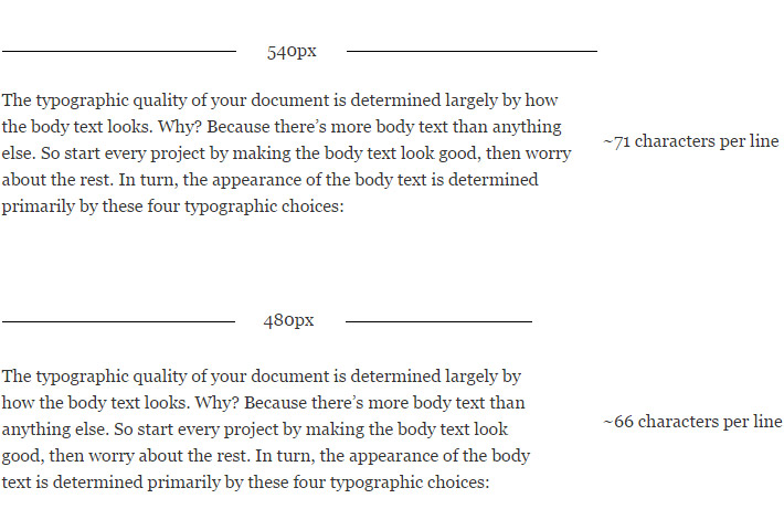
Measure (no. of characters per line)
The Measure is the width of a body of type, measured here in pixels or characters per line as email devs don't typically work in ems. Robert Bringhurst recommends 45 to 75 characters for a single-column desktop page, with 66 characters (counting letters and spaces) being ideal.
- 600px most popular desktop template width (623px avg., 480 – 760px range)
- 540px average desktop column width
- 78.5 average no. of characters per line on desktop
- 53.86 average no. of characters at 450px
- 39.02 average no. of characters at 320px
- Ranged from 22 – 57 characters on mobile
- 76% fell into 36 – 46 character range
I did a quick test using Georgia set at 16px at the average measure of 540px, and it gives us a character count in the 70s. Not bad as 75 is the top range. Ideally though we want to be closer to 66 characters, this gives us a measure of around 480px.
Robert Bringhurst recommends 45 to 75 characters per line, with 66 characters being ideal. Quote from practicaltypography.com
Constantin found websites average 83.9 characters per line, whereas this study found desktop emails average 78.5 characters. For mobile email we drop down to 39 characters on average per line. Typecast recommends sticking between 35 – 40 characters on a typical smartphone, 48% of the emails in this study fell into that range.
Desktop emails have become narrower in recent years due to the uptake of scalable layouts, which helps keep us within the 45 – 75 character range. 600px was the most popular desktop template width in this study used by 53%, overall widths ranged from 480 – 760px. If you want a wider column width, then just increase the font size until you hit the optimal number of characters, Trent Walton has a nice trick using two asterisks.
Leading (line height)
- With a 16px font size a 24px line height is most popular
- 1.51 average desktop ratio between line height and body copy (Constantin's result 1.46)
- Ratio between line height and body copy drops to 1.49 at 450px
- Ratio between line height and body copy drops to 1.45 at 320px
- 22% tightened their line height on mobile
- 52% set the line height in pixels
- 24% set the line height in percentages
- Average line length divided by line height = 23.1 (Constantin's result 24.9)
- 1.38 average paragraph spacing / line height (Constantin's result 1.39) 1 = equal to line height
A classic rule-of-thumb is to make your line height 1.5x the size of your body copy, so a 16px body font × 1.5 = 24px line height. This study was spot on, as the average line height to body size ratio was 1.51. The wider your measure the more generous you can be with the line height. Tim Brown refers to this as molten leading or having a fluid line height. Jason Santa Maria explains, “As your eye gets to the end of a long line of text it needs that cushion to get to the next one without getting lost...if your lines are shorter you can pack them in a little tighter”. We did see a reduction in the line height on mobile, it dropped from 1.51 down to 1.45.
NYT Cooking line height tightens from 30px on desktop to 25px on mobile (1.6 to 1.5 ratio to body copy)
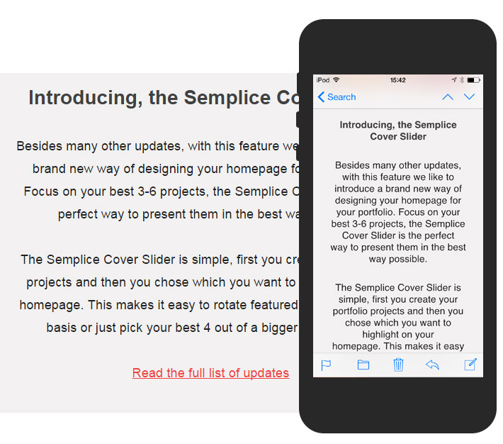
52% of email designers set the line height in pixels, some like Semplice changed their line height at different breakpoints. 24% used percentages, for instance Lagom set their body copy to 150% — iA give 140% as a “good benchmark” — a lot depends on the typeface. Paul Airy recommends percentages for line height in email as pixels are awkward to set proportionately. Though we've typically stuck with pixels as they render consistently across email clients.
Color
- #000000 was the most popular body font color (20%), followed by #333333 (16%)
- 28 different shades of body copy, majority off-black
- 56% used the same text color for headings and body copy
- 26% used lighter shade of gray in body copy vs. heading, 4% darker, 14% different color
- 72% used pure white #FFFFFF as the background color
- 48% no links in body, 20% colored, 18% underlined & colored, 10% underlined, 4% other
- #000000 was the most popular primary heading color (24%), followed by #333333 (16%)
- 40% of secondary headings used a different color than primary e.g. lighter shade of grey
Some of the heading (top) and body copy (bottom) type color combinations
iA state,“With high contrast screens it’s preferable to choose either a dark grey for text or a light grey for the background, instead of a hard black on white”. While subtle variations in greyscale can add contrast, if your body copy is demoted too far it can become hard to read.
#FFFFFF was the most popular body copy background color used by 72%
Jason Santa Maria recommends that typefaces with a heavier typographic color need more line height or a lighter hue, so they don't overwhelm the rest of the content. We've occasionally adjusted the text color across viewports due to the way fonts render at different sizes. It's impossible to accurately judge type in Photoshop, you need to eyeball it in the browser using either self made prototypes, Typecast or Typetester.
Alignment
- 54% center & 46% left align their primary desktop headline
- 54% left-aligned and 46% center their primary mobile heading
- 74% left-align and 26% centered their desktop body copy
- 76% left-align and 24% centered their mobile body copy
Center aligned body copy can be difficult to read as you have to find the start of each line
When user testing emails the feedback was always that center aligned body copy was harder to read, “Maybe some sections like that, where there’s quite a lot of text, it’s just a little difficult to read. I guess it’s because the text is center aligned” – usertesting.com participant. Shorter line lengths on mobile exaggerate the issue. Captions, the odd short sentence or headings were fine, but once you get into paragraphs it's best to stick with left aligned. As mentioned in ‘An Ode to Centered text’ whole paragraphs should never be centered.
Average size of headings
- 30px most popular primary desktop heading size used by 18%
- 30px was the median primary desktop heading size
- 31.6px was the average size of the primary desktop headline
- Two primary heading desktop groupings 24 – 26px and 28 – 36px
- 2.0 avg. ratio between body copy and primary heading (31.6 / 15.7)
- 1.2 average desktop primary heading to line height ratio (range 0.65 – 1.8)
- 62% of primary desktop headings were not linked, 38% linked
- 68% didn't change desktop heading size at 450px, those did 87.5% went smaller
- 64% used same size primary mobile heading as desktop (one scale)
- 28.48px was the average size of the primary mobile heading (320px)
- 30px and 32px were the most popular mobile heading sizes (both 12%)
- 26.5px was the median mobile heading size
- 1.17 average mobile primary heading to line height ratio
- Only 14% used CAPS for their primary heading (fashion retailers mostly)
- 72% had a secondary heading in use
- 27.9px was the average size of the secondary desktop heading
Many email devs don't employ h2, h3 etc. tags so I decided to go with whatever was in use, making note of the largest and second largest heading sizes using WhatFont. 30px was the most popular size for primary desktop email headings, smaller than Constantin's finding of 38px on the web. Possibly chosen for convenience as it does a fair job across desktop and mobile, including apps like Gmail that don't support responsive design. 64% used a single heading scale across all viewports, out of the remaining 36%, 87.5 went smaller on mobile. For instance Mr Porter dropped from 30px to 25px on mobile, a subtle tweak which results in a more elegant feel rather than sticking with clunky desktop headings.
Mr Porter's primary heading drops from 30px on desktop to 25px on mobile
There's less consensus around heading sizes, though 2x (~32px) was the average ratio between the body copy and largest heading in use on the desktop. For comparison Typecast mentions setting their h1s to 3x though you'd expect larger headings on the web. You can use a tool like Modular Scale to experiment or there's always the classic typographic scale:
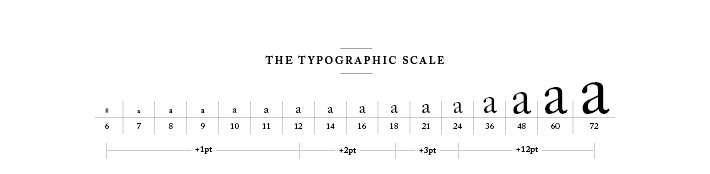
Scale from The Elements of Typographic Style by Robert Bringhust, image from retinart.net
Besides using letter size to establish a visual hierarchy, alternatively Marko Dugonjić suggests using a variety of style options such as italic, all caps and small caps to create tension. Here's a live demo, select 'Hierarchy with Style'. This approach is particularly useful on mobile where there's less space for large headlines, you could also switch to a condensed font. Headings are one area where designers tend to take more creative license. There was greater variation in font sizes, alignment and an increased use of web fonts versus body copy.
Pre-header text
- 66% used pre-header text on the desktop
- 36% instructions only, 33% instructions & snippet and 30% snippet only
- 11px most popular on desktop used by 33%, then 12px 18%, 10px 12%
- 12.3px average size of pre-header text on desktop
- Ranged from 9px – 18px on desktop
- Ratio of desktop pre-header text to body copy = 0.78
- Average desktop pre-header text line height ratio 1.11
- 76% used a sans-serif typeface
- Arial most popular sans-serif, Georgia most popular serif
- 22 different pre-header colors used, #000000 then #999999
- 82% kept their pre-header text on mobile, 18% hid it
- 11px most popular on mobile used by 40%, then 16px 22%, 14px 18%
- Average font size on mobile 12.9px (vs. 12.3px on desktop)
- Ranged from 8px – 16px on mobile
- 71% kept it same size on mobile, 22% bigger & 7% smaller
- Ratio of mobile pre-header text to body copy = 0.85
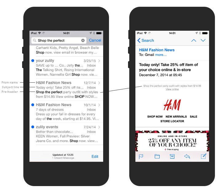
The Pre-header is displayed along with the From Name and Subject Line
The pre-header resides at the very top of an email, as the first piece of HTML text it's displayed along with the from name and subject line on most smartphones. In this study I've distinguished between instructional pre-header copy such as 'View online', and snippet text which is more descriptive and often compliments the subject line. Litmus have a detailed pre-header text write up along with a support chart.
Performance
- 1245 average speed index via webpagetest (aim for <1,000 which 43% were)
- Start render first view averaged 0.94 sec
- Fully loaded first view averaged 2.64sec
- 24 average number of total requests
- 13.7 average number of image requests (57% of total requests)
- 711 KB fully loaded bytes average
- 568 KB average weight of images
- Images account for 79.8% of average emails weight
- Image weight ranged from 9KB – 4.4MB, 50% 200K or under
- 69.7K average weight of web fonts (9.5% of total emails weight)
- 30% were using web fonts (Open Sans most popular, then Merriweather)
Originally I included performance as I'd heard a lot about how web fonts can slow things down. Looking at the top 20 Google Fonts the average weight is 28K (WOFF) for one weight, and most people used three in this study so they do add up (69.7K was the average web font download). While web fonts are certainly something to keep an eye on, they accounted for 9.8% of the total weight compared to images which accounted for 79.8%. As Guy Podjarny noted, images are where most of the bloat resides. One helpful tool you may have overlooked is Litmus's Image Check, which tells you the number of images, size and time to load when you run an email preview.
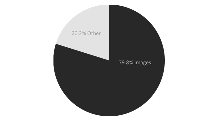
Images account for 79.8% of an average emails weight (568KB average image download)
Performance is as much a cultural problem as it is technical, it's an abstract concern, out of sight out of mind. I've been experimenting with incorporating performance budgets into our process to address this but its still a work in progress. Lara Hogan of Etsy, shared a tweet of their performance wall which helps them, "*Feel* the difference on mobile connections." Webpagetest.org which I used for the performance section of this study, generates videos and filmstrips which can help clients visualize how their emails load.

Filmstrip - H&M took 4.095 sec until start render (first point in time that something was displayed to the screen).
Sum up
Originally I wanted to explore what it was about sites like iA, Fray, Medium, and Pelican Books that made the typography so solid and attempt to incorporate those findings into email design. Was there a consensus around body copy size and margins on mobile for instance. What I found from this study and going back and looking at those websites, was that there isn't one set of numbers that's going to work in every situation. As Tim Brown points out in this video (worth the $1.99), good typesetting isn't transferable as it depends on the typeface being used.
While font sizes tend to stick within a similar range on the web, there's still room for creative license.
Though this study does provide a decent starting point when designing emails. Such as using 16px body copy with a 24px line height, which you can then adjust to suit the typeface and line length and on and on. The proportional relationships, building out a custom responsive type scale that adjusts across viewports and some basic guidelines such as fluid line heights have proven the most useful.
It's also worth looking at the resources tab in the Google spreadsheet, as the additional reading was really valuable and it lists many typography experts that you can follow. If you are a web developer a good place to start is Jason Rodriguez's free online chapter, 'Typography in Email’, as it will get you up to speed on the differences between the two disciplines.