Integrating mobile marketing with email: Getting started
We've seen similar integration with email and social media. Retailers like Neiman Marcus and Gap are using email to gather Facebook and Twitter followers.
The first of three mobile in email posts below, covers how to get started. Next up promoting text messaging in email, then finally iPhone apps.Run a "mobile test"
Below are three ways to test the mobile waters:

1. Subscription {view Rugby home}
Consider adding a mobile option to your email sign-up and preference center, you'll be able to measure the level of interest.
Rugby have a combined email and mobile sign up on their homepage.The Lane Bryant email-sign-up page offers combined email and mobile subscription.
Marks & Spenser has mobile sign up on their offers page along with social media.Many Brands have email sign-up on the homepage, but you have to dig for social media or mobile alerts. Should the three be grouped? I like the convenience of having them in one place, as long sign-up fields are kept to a minimum.
![]()
2. Poll {view Whole Foods email}
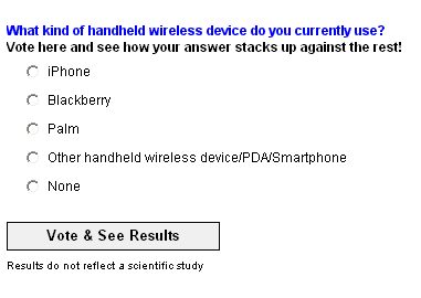
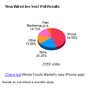
In this June email, Whole Foods asked email subscribers, "How wired are you?".


Although this poll will not tell you how many of your subscribers read email on their mobile - or PC later - it's useful to know the email-friendly iPhone is dominant.
![]()
3. Link to a mobile version {view Oasis email}

Many brands such Clinique and Bluefly link to a mobile version in the pre-header. If enough of your email subscribers use the link, give mobile rendering and marketing more consideration.

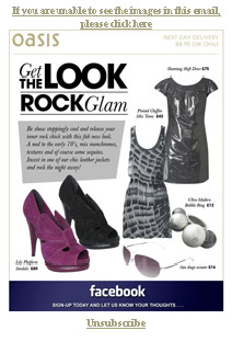
UK retailers Oasis and Karen Millen added the link,"Click here to view on your Blackberry or iPhone", linking to two different mobile versions.
The full-sized Blackberry version is below, it's always a good idea to repeat your offer in HTML text and not rely on a single image like Oasis.

The iPhone version was identical to the original email, again with no HTML text. Oasis and Karen Millen have since removed the mobile links. This implies limited use, maybe due to an over-reliance on images? Still hats-off to Oasis and Karen Millen for experimenting.
I like how REI added a mobile icon to further highlight the mobile/text link.
The pre-header is getting crowded. Some brands have dropped whitelisting or replaced Forward to a Friend (FTAF) with Share with your Network (SWYN). Prioritize which links work for you, though mobile links should fall above the fold as no one wants to scroll on a cell.
![]()
further mobile email reading
Mark Brownlow's Mobile email: the marketing challenges (Aaargghhhh! about sums it up)
I subscribed to the Mobile Marketer Daily newsletter a while back, its a great resource.
Screenshots of mobile email rendering by Gregg Oldring
Mobile Commerce Usability: Home pages and Navigation part of a series by Get Elastic