Responsive email navigation
Wanting to see if the patterns I use are popular industry-wide, I looked at the navigation of 50 responsive retail emails. Here is a breakdown of the patterns I discovered.
Reduce (15 of 50)
Reduce the number of tabs when switching from desktop to mobile. Good: Extra desktop tabs, takes up only one line on mobile. Bad: Too many desktop tabs can be at the expense of tablet friendly spacing, have to decide which tabs to keep.
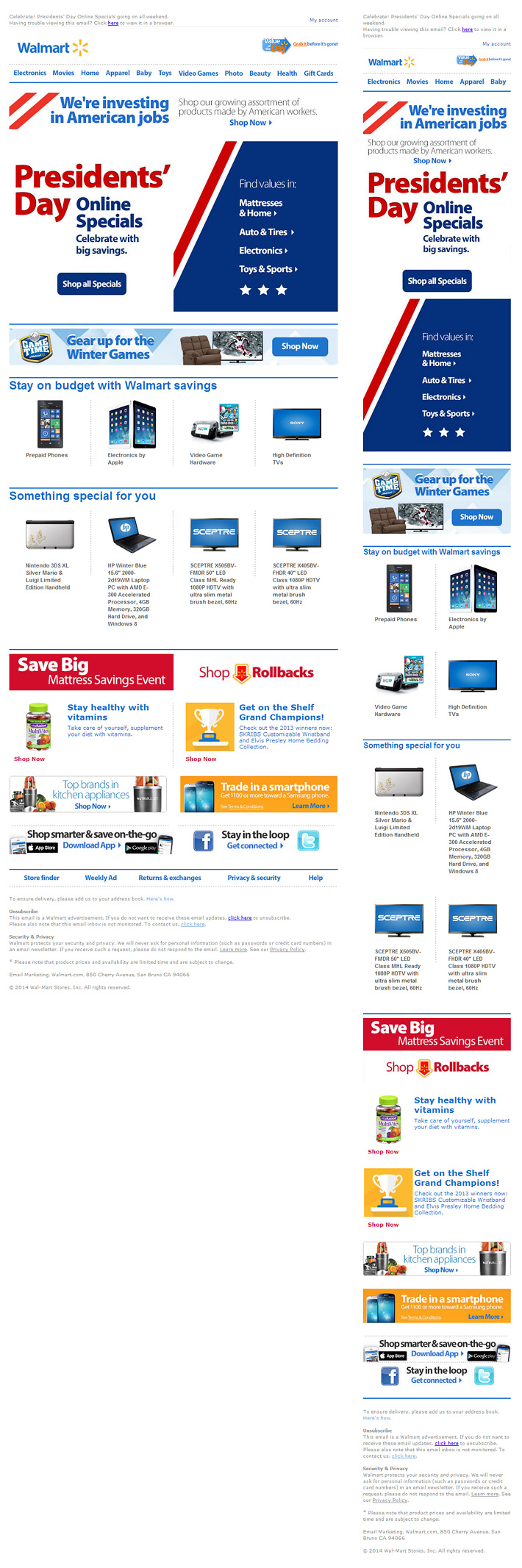
Retailers who reduce: Allen Edmonds, Bluefly, Columbia, Giggle, John Lewis, Nike, Nordstrom, Prep Sportswear, REI, Size?, Target, UGG, Uncommon Goods and Walmart.
Hide (13 out of 50)
Hide the desktop navi from mobile users. Good: Right to the main content on mobile, avoids having to implement a mobile navi solution. Bad: No mobile navigation, if it isn't important why have it in the desktop build?
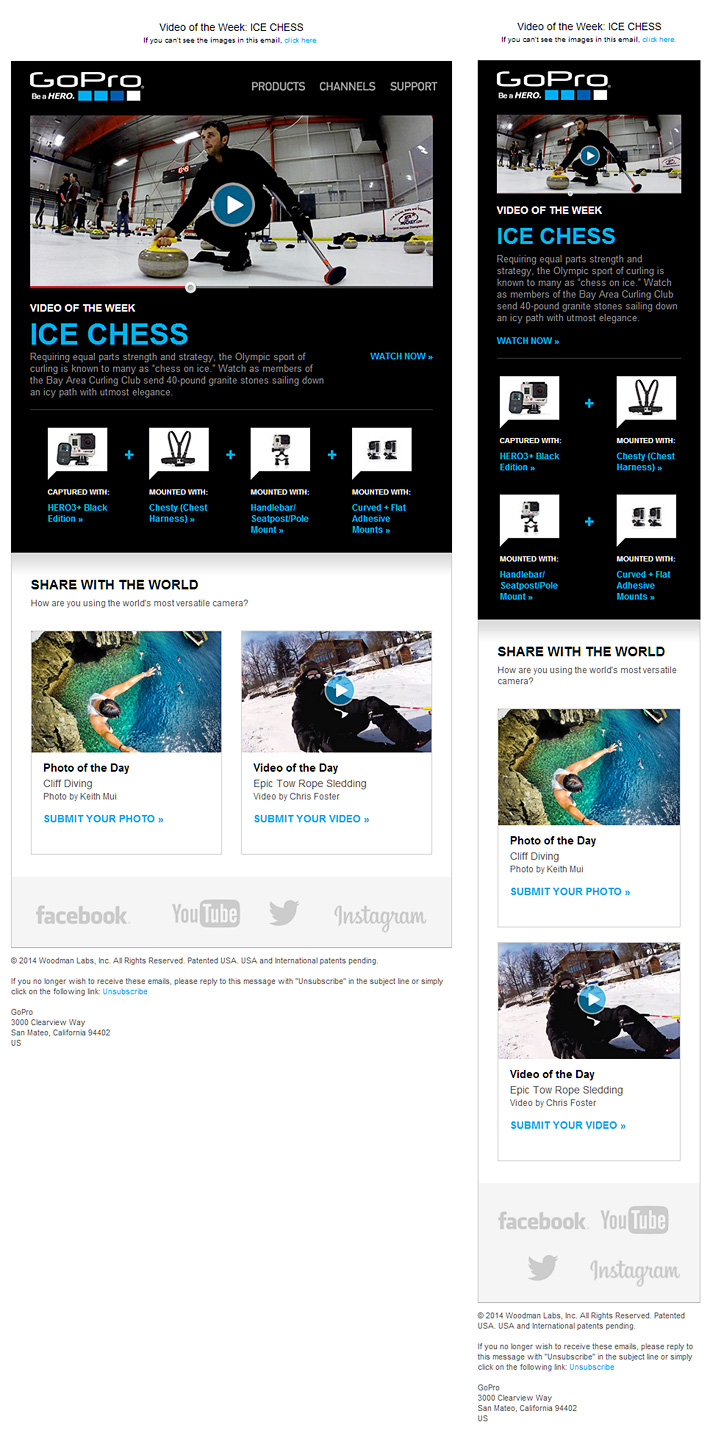
Retailers who hide: American Apparel, Apple, asos, Boots, GoPro, Kmart, O'Neill, Paul Smith, Refinery29, Shoebuy, The Home Depot, ThinkGeek, Toms
Top to Bottom (8 out of 50)
Reposition the navigation from the top on desktop, to a vertical list at the bottom on mobile. Good: Content first, often mimics the mobile site, positioned at bottom so you can give each tab plenty of height. Bad: Mobile navigation may be too buried for some users.
Retailers who use top to bottom: Gap, Horchow, Joy, Mr. Porter, Net-a-porter, Neiman Marcus, Saks, Timberland
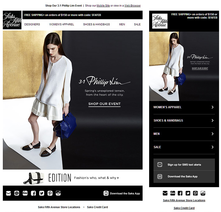
Saks keep things more compact than other retailers using this pattern, by reducing from 5 tabs to four on mobile and hiding their secondary banner.

Shift (8 out of 50)
Start with 3-5 tabs on desktop, then just shift them into place on mobile. Good: Nice and easy. Bad: Limits you to 3-5 tabs on desktop (though I usually don't exceed 4).
Retailers who shift: Amazon, Michaels, Moda Operandi, ModCloth, Mulberry, Nine West, River Island and Tsubo.

Stack top (3 out of 50)
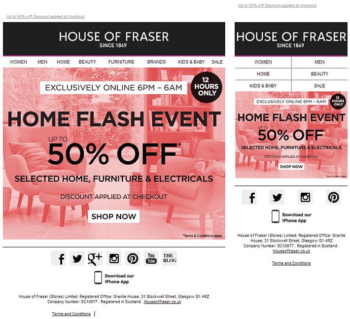
Split the desktop tabs into a two column stack on mobile. Good: Keeps navigation exposed and accessible, touch friendly format. Bad: Can take up too much first screen space, especially if stacked in a single column. I try not to exceed 6 tabs, 2 col. with this pattern.
Retailers who stack: House of Fraser, Wilsons Leather, Levenger.
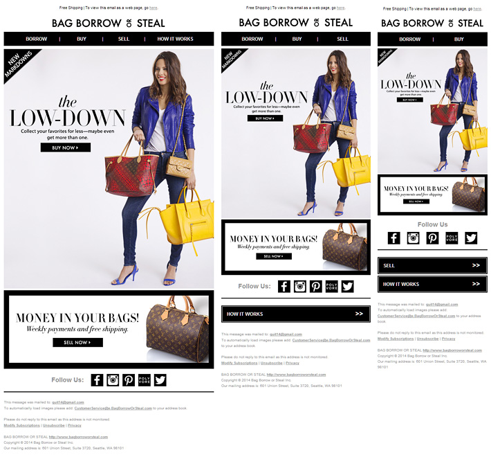
Split (2 out of 50)
Part of your navigation stays up top, while the other part is positioned below the main content. Good: Retains one row of key tabs up top, accommodates a larger no. of tabs. Bad: Might be easier for users to view the navi all in one place, bit trickier to implement.
Retailers who split: Bag Borrow or Steal and Crocs.
Wrap (2 out of 50)
Wrap the navigation on mobile. Good: Easy to implement. Bad: Can take up valuable space, look a bit scruffy. The temptation not to add enough line-height and padding.
Retailers who wrap: Havaianas and Dicks Sporting Goods

My notes
Adaptive layout vs. responsive - If you want to be picky 77% were adaptive layouts, not responsive. Retailers must feel mid-sized devices are too small fry to support right now.
HTML vs. images - 34% use an image-based navigation and 66% use HTML.
Tablet friendly - Some desktop navigation is not tablet friendly. Choice is between 10 desktop friendly tabs, or 5 tablet ones (need extra spacing e.g Saks vs. Walmart). Or add some tablet media queries...
Number of desktop tabs - 13 highest no. of desktop tabs (Boots, Net-a-Porter and Neiman Marcus). Lowest is 3 (GoPro and Michaels). 5, 6 then 8 are the most common no. of tabs.
Number of mobile tabs - Highest no. of mobile tabs is 13 (Neiman Marcus), lowest is none with the hide pattern. 0, 3 then 4 are the most common no. of tabs.
More tabs on mobile - Some retailers added an extra category or two on mobile (Gap went from 8 to 10). Or contextual tabs like search, phone or SMS.
Only mobile - Others displayed mobile-only navigation, like this email from Mr. Porter. They have more than one navi pattern (a few do), test withholding the desktop navi for certain campaigns.
No navi - Some responsive retail emails like Luggage Online and Threadless have no navigation. They were not included in this research, though 'no navi' is obviously an option.
Mimic mobile site - Should you mimic it like Saks or T.J. Max? Sometimes, but be careful of copying functionality you don't have (+ in Timberland didn't drill down, was also not linked).
Performance - Image based tabs add weight - and are often blurry blobs - so does hiding content. Though navi tends to be pretty lightweight.
No toggle or fly outs - Hamburger is all over the web, but not seen in my sample group. Here's what it looks like. As web navi patterns have advanced with JS assistance, we can't always follow.
Sub navi - See REI and Moda Operandi. Luckily no mega-menus for us.
What's it all about
Popular could just mean its easy to implement, everyone is copying everyone else or retailers prefer to play it safe. There's still more testing to be done around how all these different navi patterns affect performance. We'll see new responsive email navigation patterns emerge along with these old faithfuls. If I've missed any good one's let me know...