Media query trifecta
Want to reach Moms? Send them a mobile email at 7am
That was one of the finding's in this (pdf) Babycenter report, with 78% of moms saying they use email on their smartphone. So when WhatCounts approached us to design a welcome series for SavvyMom, it was no surprise their mobile usage was over 20% (higher factoring in image blocking as BB & Android were only 2%).
With 90% of mobile users on iOS, Brittany Schneider (Director of Strategic Services), Aaron Grey (awesome coder) and I set out to re-design their welcome email. Here's some of the challenges, with Aaron contributing.
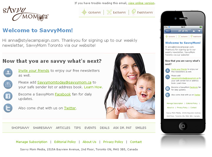
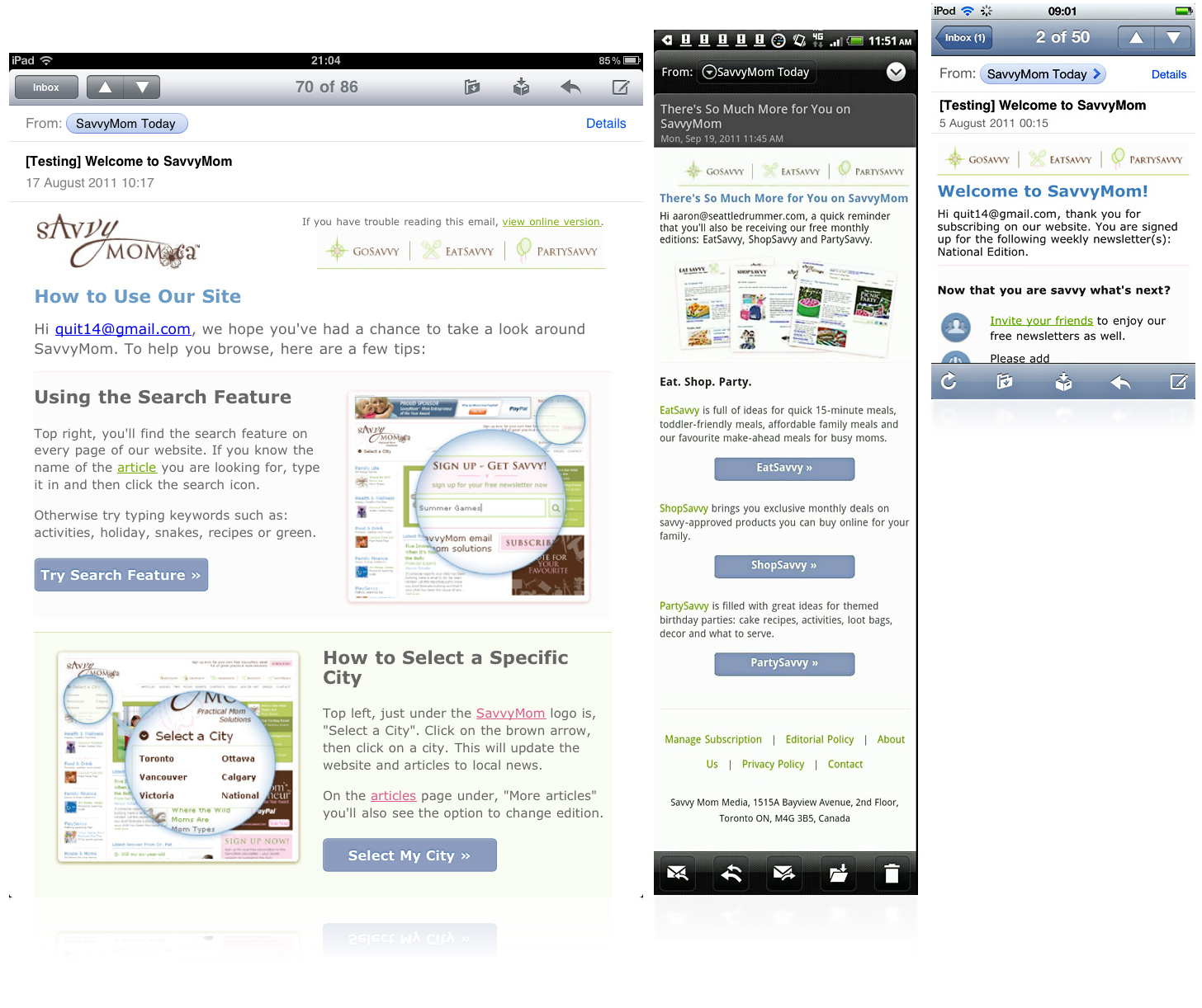
Email 1
View email1 (resize your browser / @media not supported in IE8 or below FF3.5)
Fixed to fluid
16mths ago I wrote how some app sites favor 320px blocks of content, I had the same idea for SavvyMom. 640px wide fixed layouts on the desktop, that would reformat into one fluid column on the iPhone. With content blocks like the navi 320px wide or less.
Hide desktop content
In all three emails we hid the online version link, logo and recovery footer from mobile users. In email 1 we also hid the desktop image. One downside of display:none, is all the desktop code and images are still downloaded. The fluid layout as baseline would have been preferable, but there's little support for @media on the desktop.
Branding vs. content
Putting, "SavvyMom" into the title text of each email allowed us to hide the logo. Freeing up first screen space, while retaining branding. Here's a couple of my drafts, with and without the logo.
Font size vs. optimizing 1st screen
We had the choice of keeping the large desktop fonts (left). Or using @media to reduce the font size, moving CTA's onto the first screen (285px). We went with the smaller title font (right).
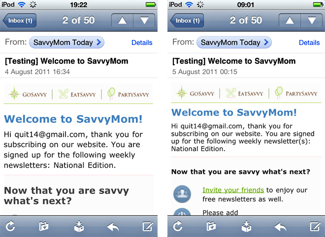
Contrast
As we'd reduced the font size, I changed the font color from gray on the desktop to black on mobile devices to aid legibility. I also drafted up a mobile version with more contrast in the background. Though the lighter pastel pink was chosen, to keep things consistent.
Email 2
View email2 (resize your browser / @media not supported in IE8 or below FF3.5)
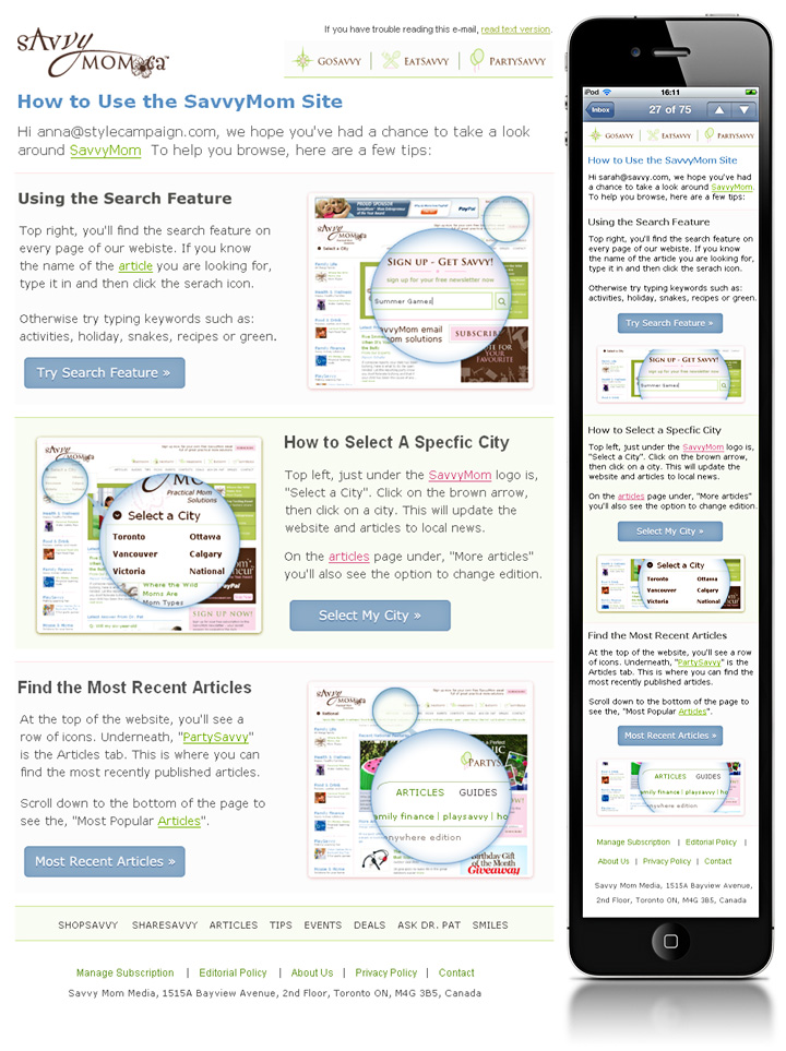
Swapping images to minimize scrolling
I drafted three options for email2: desktop images, mobile images and no images. We picked alternate mobile images, they were instructional so I didn't want to hide them. Support for jump tags is flaky, it takes two taps on the iPhone, but it's something to test. Though the best advice to minimize scrolling is use less copy.
S-curve?
In her audit, Britanny noted that SavvyMom's s-curve layouts consistently out-performed vertical aligned layouts. Only I wasn't sure you could go from an s-curve into a single column, and have all the content in the right order. So I prepared two options. Even Aaron had doubts, before finding a working solution:
"I was able to use @media CSS to remove the desktop image from each section and bring forward the mobile image. I accomplished this by defining the mobile images in the @media CSS as background images and then calling them into the HTML using a div tag. I also used @media CSS to center the call to action buttons for the mobile version.In email 2, I built a two column table for each content block. Then, I was able to use @media CSS to make the table size to the window, decrease the table cell width that held the image to 0, and then hide the image. So the 2nd column cell of the middle content block appears to bump over to the left in the mobile version and all three remaining content blocks line up vertically".
Here's the code (or just view source in email 1, email 2, and email 3):
@media
#main .wrap { width:100% !important; }
#main .photo { display:none !important; width:0 !important; }
HTML:
<td align="left" valign="top" width="320" height="100" id="main" class="photo">
Email 3
View email3 (resize your browser / @media not supported in IE8 or below FF3.5)
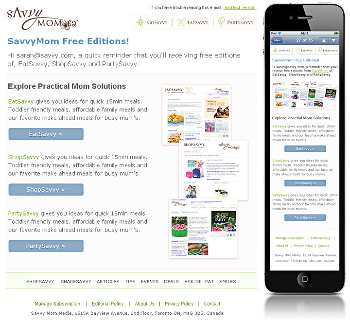
Designing for touch
All targets were proportioned for touch. The navi is 320x44px and CTA buttons are CSS3 and finger-sized. The copy has only one link per paragraph. You have to be careful when fluid text wraps, that you don't end up with one URL on top of another.
We also tested on real devices. Moving quickly from sketches, to Photoshop mock-ups, to testing and refining on iPod, iPad and Android. This enabled us to finesse the footer, which was initially prone to mistaps. As Aaron points out,
"To create the desired spacing in the footer and an easier link to tap, we added padding, increased the font size, and increased the line-height in the @media CSS".
Segment by context
Designing this series, reinforced what a powerful tool media queries are. But it also highlighted limitations around image use, desktop support, placeholder content and sharing HTML across desktop and mobile.
To be fair @media never claimed to be a cure all, it simply changes your layout and does a fantastic job. But by itself, screen size is a vague indicator of context. We need more real-time data, like time of day and location.
Now that we've got a handle on mobile layouts, I'm left thinking about what Paul Gelb of Razorfish said recently,
"In two years or so we are planning for a shift where we will segment not by device anymore but by behavioral context. Is it at home, is it on the go..."
Update: when compared to the control, email 1 in this series saw a 3x lift in click-to-open rate. Comparing mobile vs. desktop views, 12% of those who opened the redesigned email on a mobile clicked and 6% who opened on the desktop clicked.
11.04% of the subscribers who read either the second or third email in the series had not read the first one.