Android: grid of grim
Android only displays the top left-hand corner by default and those dimensions vary. While there's not one "fold", you still want to try for some level of optimization. I created this grid showing the default view of eight Android devices and thought I'd share. Just align your creative top-left.
Download grid of grim (Zip 450k)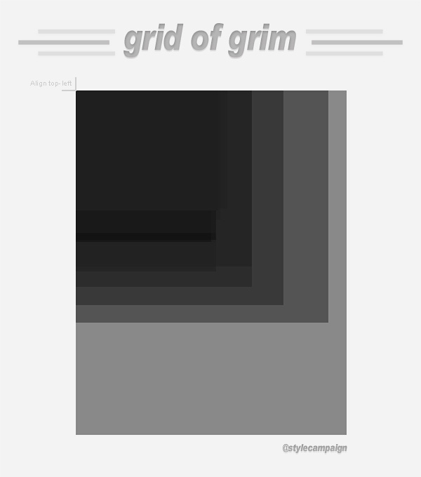
(above image not actual size)
The grid dimensions are based on the eight Android devices we currently test on:
1. LG GT540 - 2.1 Eclair, 320 x 480
2. Motorola Defy - 2.2.2 Froyo, 480 x 854
3. Samsung Galaxy Ace GT S5830M - 2.3.6 Gingerbread, 320 x 480
4. Samsung Galaxy S2 - 2.3.6 Gingerbread, 480 x 800
5. Samsung Galaxy Nexus - 4.0.4 Ice Cream Sandwich, 720 x 1280
6. Galaxy Note - 2.3.6 Gingerbread, 800 x 1280
7. Kindle Fire - Silk, 600 x 1024
8. Nexus 7 - 4.1 Jellybean, 800 x 1280
Each device is on a separate layer in the PSD, so you can look at them individually. Android groups screens into four sizes: small, normal, large, and extra large. We tried to cover that range, along with different platform versions when buying devices. Though Gingerbread currently dominates at ~60%, followed by ICS then Froyo as of August 1st.
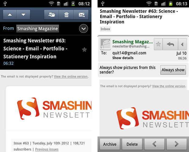
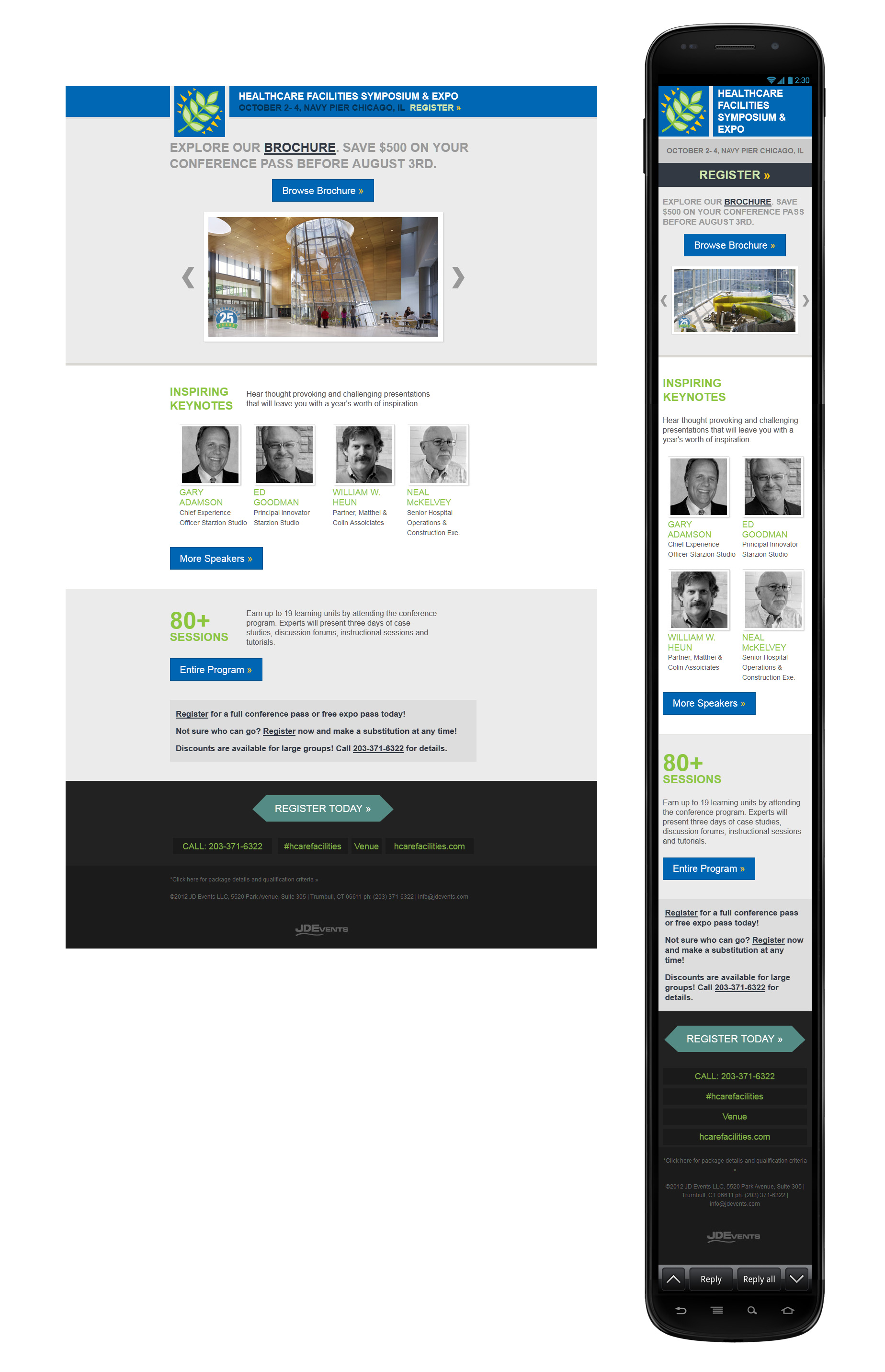
Native vs. Gmail
To complicate matters the native client and Gmail app display differently. I've recorded both in my grid. We don't have a ballpark of how many Android users uses prefer the Gmail app over the native client. Image blocking makes it difficult to collect stats and I've heard differentiating the UA string might be an issue.
{ Native client on S2 and Gmail app on S2 with UI obstructing the bottom }
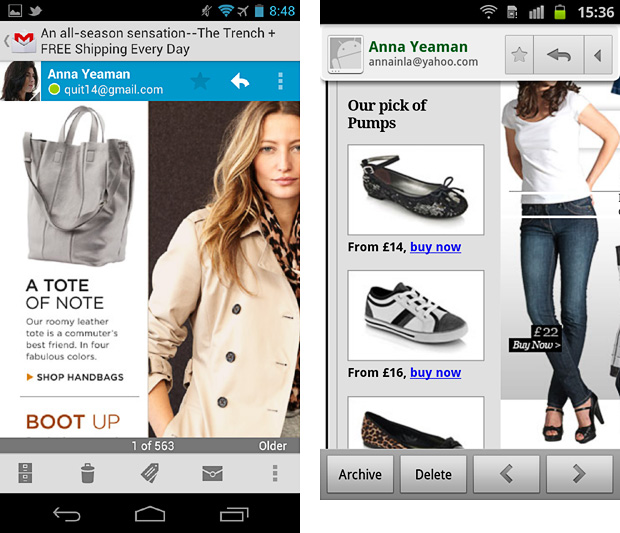
Optimize left-rail 2nd
I never scroll right on Android unless prompted. I'll look at the preview pane, maybe enable images and if I'm interested scroll vertically. The left-hand content then needs to fit the screen, or I'll delete it. I've seen similar behavior from other Android users click-thru data. Although not conclusive, I'm going with this theory for now.
These Next and Banana Republic emails are years old, but a left rail would work well for Gmail app users today.
CTA alley
Wherever you touch the screen, this Android tool draws a line like Etch-a-Sketch. It records the co-ordinates, speed and input size (e.g. tip of finger).
When holding the phone one-handed and using my thumb, my swipe path typically looks like the screen on the left. When holding the phone in my left hand and using my right-hand finger to scroll, it looks like screen right.
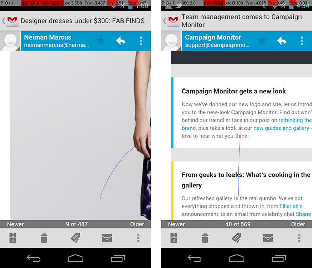
In most cases I prefer the lower middle, to bottom right-hand side of the screen (right-handed). I call these areas CTA alley on the grid. Users hand sizes will differ, though the areas we can comfortably reach remain the same. There's more designing for touch tips here.
@media on Android
Android's native email client supports media queries, the Gmail app doesn't. When designing responsive layouts, I still try to optimize Android's preview pane in the desktop layout as I know Android Gmail users will be viewing it.
{ View full template here }
I tried to get pertinent info onto the first screen. Gmail (left) and native client (right). Leaf logo the only image.
If using max-device-width: 480px, it doesn't trigger the mobile build on a high res Android like the Nexus...max-width: 480px will. It's screen width vs. viewport width. Also why you can't resize your browser to test mobile layouts if using max-device-width: 480px, as your desktop monitor likely exceeds that res.
{ 480px breakpoint triggers mobile CSS in native client on 800 x 1280px Galaxy Note / "Gigantiphone" }
Zoom
The zoom/pinch gesture isn't supported in the Gmail app, except the Kindle Fire which now has a "zoom mode". The native client on the S2, Ace, Defy, Note and LG let you zoom in and out to view the whole email.
The native client on the Galaxy Nexus (ICS) and Nexus 7 (Jelly bean) only let you zoom in on the default view, not out. Like image blocking, zooming is a mixed bag and we've no way of knowing either way.
Orientation
I only mapped portrait mode in the grid. The default screen in landscape is filled with chrome on most Android's, so here's hoping it's not popular. You sometimes have to reload images when switching orientation, so that's another deterrent. The Nexus 7 comes with orientation turned off by default, it's fixed in portrait. The native client on the Nexus 7, S2 and Note have a split screen in landscape.
{ Native client on the S2 }
Fonts
Users can alter the system font and size, but it doesn't affect your styled HTML. It's only applied to the surrounding UI. Worse case, your subject line might be shortened but your creative won't be affected.
No 1st screen on Android
There's so many different Android screen sizes, trying to map them all would be nuts. I just wanted to get a feel for how much that default view differs on popular devices. While having a fixed-width guide is somewhat delusional, I've found it useful when blocking out desktop and adaptive layouts. Especially considering the Gmail app. Obviously a fluid layout with media queries layered on top would be best, but most emails are still fixed-width, or at best px-% hybrids.