Finger Snafu
1. No user reconnaissance
Ignoring user context
65% of US adults sleep with their phones on or near their bed. So its no surprise that peak mobile email usage takes place at 7am, probably right after the alarm on their phone wakes them up.
We are designing for users with blurry vision, poor co-ordination until after their first cup of coffee and little time to spare. Goals? shower, what to wear, breakfast and maybe a hangover cure (yeah people also read mobile emails drunk).

2. Dismantle cluster bombs
Clusters of links stacked closely together, mistaps unavoidable.
Most pre-header links including the, "mobile version" are not designed for touch. Fonts are tiny and the lack of vertical spacing makes it impossible to avoid a mistap without zooming in.
Zooming or pinching is a multitouch gesture which requires two hands, further inconveniencing one-handed users.
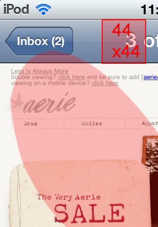
It's not just pre-headers that need to be re-evaluated. Check out the stack of impenetrable links in Esquire's email and the table of contents in Smashing Magazine's.
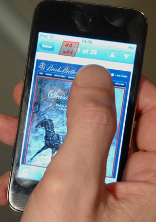
The Apple Human Interface Guidelines (HIG), recommend a minimum target area of 44 x 44 points.
3. Search & rescue the CTA
Tiny call to action buttons, impossible to see at a glance let alone tap.
When it comes to buttons app designers have realized you can never be too obvious. Mobile users are often distracted, for instance 62% of people use their mobile while watching TV.
Compare a typical in-app call to action with the email on the left.
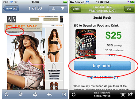
In-app buttons are at least 44px high, positioned were the thumb naturally rests and expand across the width of the page.
That way it doesn't matter if your holding the phone in your left or right hand. Even if a user is right-handed, they'll switch hands when multitasking - e.g. eating lunch - then switch back after they’re done.
4. Ergonomics MIA
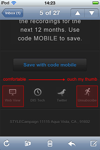
Some parts of the screen are easier to reach than others.
Touch screen input is via fingers and thumbs, often one-handed. Pay attention to how users grip a device, it can improve the usability of your email.
Place popular controls such as, "Web View" within easy reach of your thumb. Less popular or sensitive content such as, "Unsubscribe" place bottom right, as it's awkward to bend your thumb back.
5. Friendly fire mistaps
Touch targets in close proximity to the toolbar.
The Windows Phone 7 UI guidelines recommend that you increase the size of your touch targets, if they are close to the edge of the screen. Ideally leave some padding above the toolbar, as its an area susceptible to mistaps.

6. Camouflaged creative
Creative that blends into the background making it illegible.
Poor contrast is heightened on tiny screens, making small elements hard to read. Add in partial attention, who knows what lighting conditions and white text on a gray background is not advisable.
It’s always worth doing a grayscale check for mobile emails.
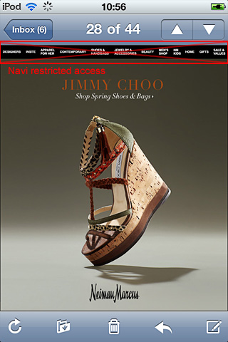
7. Navi Fubar
Messed up navigation or pre-header due to auto-scaling text.
If your HTML text is under 12px, the iPhone will automatically scale it up potentially breaking your layout.

To turn off auto-scaling add the following code (or make your fonts bigger):
style="-webkit-text-size-adjust:none"
8. No design element left behind
Half measures and inconsistent design.
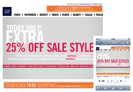
This email is great if I'm shopping for shoes, not so great if I want to shop, "NM Kids" via the navigation.
While small steps help, it's frustrating for mobile users to be barred from parts of your creative. One study found poor mobile usability on par with visiting the DMV or being stuck in traffic.
9. Lack of in-field testing
Preview tools rock but for nuanced design supplement with real devices.
Get to know the platform you are designing for, or risk annoying users.
It's only because I own an iPod that I know how easy it is to scroll, how long it takes to load, that my thumb dislikes the bottom right corner, how cartoonishly responsive the interface is and that it has an annoying habit of flipping orientation when I'm lying in bed.
Designing for touch is a lot easier when you have a real device to interact with.
10. Tadpole training
Many users are new to touch gestures and carry desktop baggage.
When I first started using touch screens I'd avoid swiping over linked areas. I was worried I'd accidentally trigger a URL, so I'd look for, "safe" paths to navigate around the page.
Keep in mind that some users have only spent months using touch screens, compared to decades with a mouse.

Mobile designers are also tadpoles, conventions are murky e.g. with no hover state how do you indicate an element is linked without resorting to buttons everywhere?
Users don’t know where they can click. With iPad UIs, we’re back to square one. We haven’t seen this since mid-1990’s - Nielsen 2010
This ambiguity, means there's an increased risk not all users will interpret your design as intended.
I've committed every misfire on this list and many I'm not yet aware off. The only way to refine your skills is to give it a try.