Designing for Windows Phone
Hostile environment
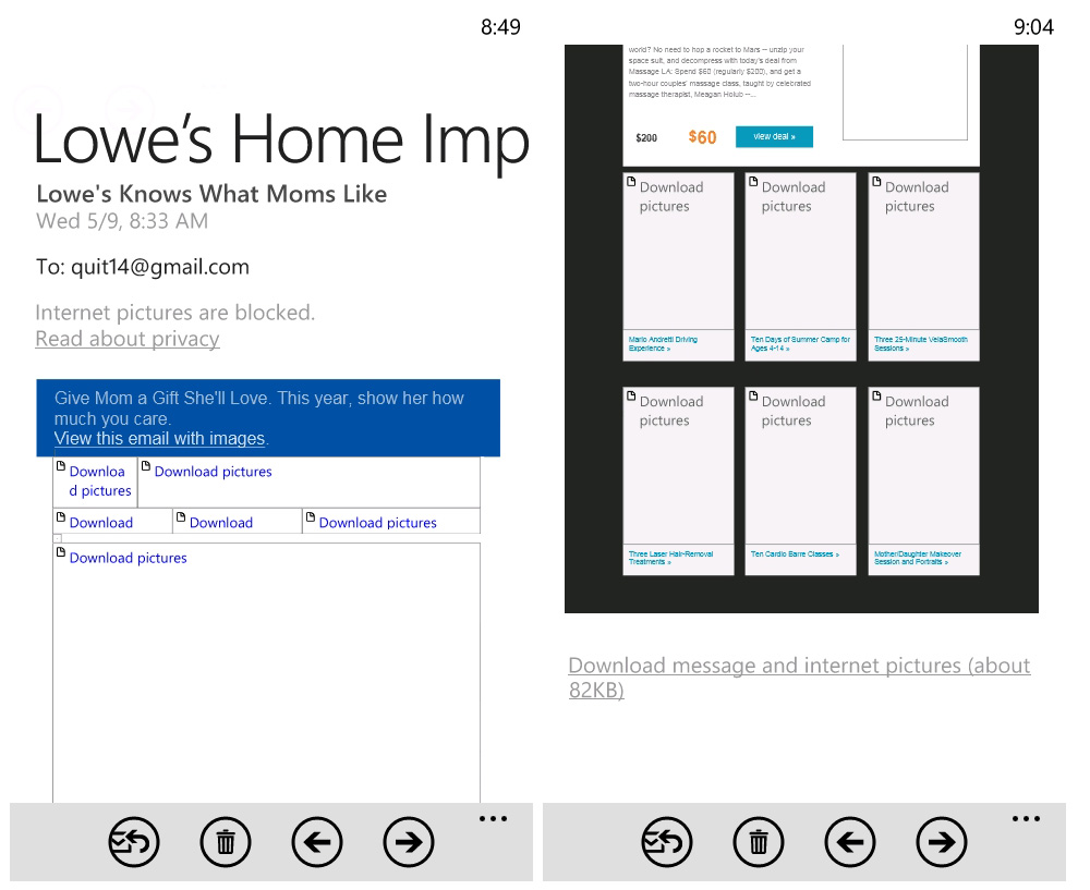
Images are blocked by default, in place of alt text you see "Download pictures". The file weight is displayed below the creative as a further deterrent. Knowing many users pay for data, WP, BB and Android allow the user to manage downloads. Though widespread image blocking makes it hard to get accurate mobile usage stats.
{ Screenshots from Nokia Lumia 800 running WP7.5 "Mango" / screen is 480 x 800px }
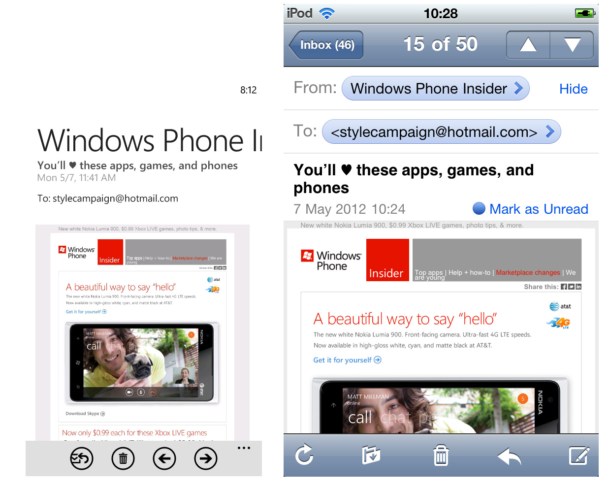
From name dominates
The from name - sliced off after ~15 characters - dominates the creative below, which by default is more zoomed out than iOS. You can pinch to zoom in, or use the lesser known double tap gesture but it's extra work.
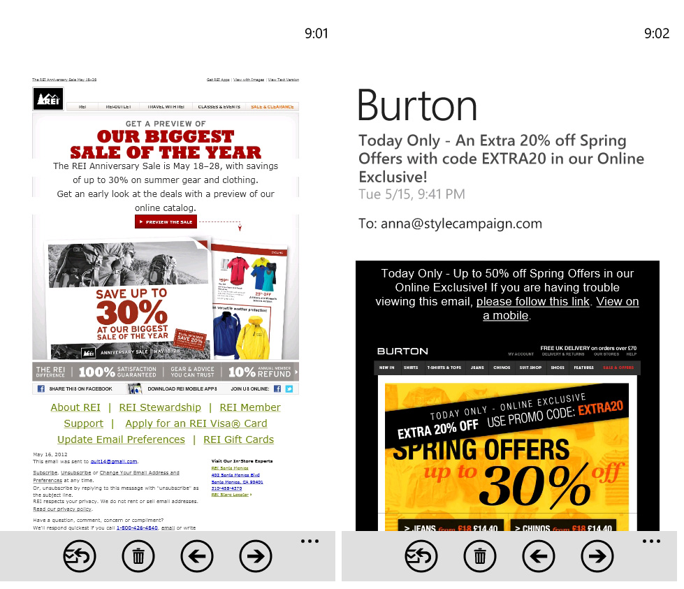
Auto scaled HTML text
WP scales some HTML text up depending on its container. This results in odd sections of copy being emphasized and occasional formatting issues. Though on the plus side, some pre-header and footer text becomes legible. BTW I'm sure it's a coincidence that Google's emails are broken.
Gmail quirks
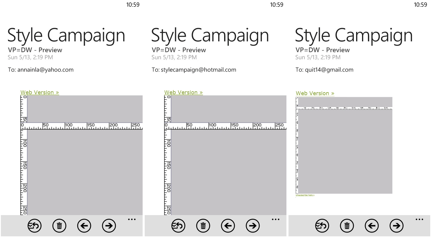
Media queries are supported in the browser (IE9), native email client, Hotmail and Yahoo! Mail but not Gmail. Defining the viewport also works in the native email client, Hotmail and Yahoo! Mail, but again no Gmail support as it strips out the header. Below, the viewport is set to equal the device width. Gmail ignores it and the 600px wide image is zoomed right out. This might be because it's left aligned, see also Neiman Marcus.
Flat UI vs. 3D
Do users have a harder time distinguishing flat buttons, or is color and size enough of a visual cue? A flat UI like Metro is more email friendly as gradients, drop shadows, glow ect have little support on the desktop. You also have to write more code for iOS-y buttons and it takes longer to draw.
Different UI elements from Android, iOS and Windows Phone 7 - from Android guidelines.
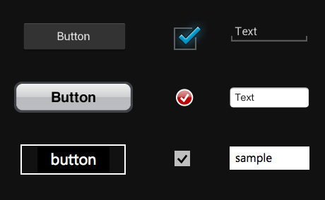
While I prefer a minimal look, I'm nervous about ditching depth cues altogether. With no hover state a drop shadow can serve a useful function. I also wonder if we'll outgrow skeuomorphism as touch interfaces become more familiar?
Mobile testing
I'd been using DeviceAnywhere for a while before I got a real iOS device. Within seconds of playing with my email on an iPod, I wanted to tweak the design. You can't beat seeing where your grip rests, the speed with which you scroll, positions you read in, download times, accidentally triggering links and other newbie errors.
Besides the Lumia, I just added a Samsung Galaxy Nexus to our testing suite and a Galaxy Note is on the way. I felt it was important to expand the range of Android devices we test on. Though it's impossible to have every device, so I still supplement with tools like DeviceAnywhere (more preview tools).
Though if you're a designer it's worth getting a Windows Phone just to study the design patterns. Also the Lumia has the most beautiful matte screen, it's like the monolith from Space Odyssey...makes me want to design dark emails all day long.