Fluid mobile email design (part 4)
1. What's a fluid email? {View}
Fluid emails adapt their layout to different device widths.
From a 176px wide N70 or Sony K75...
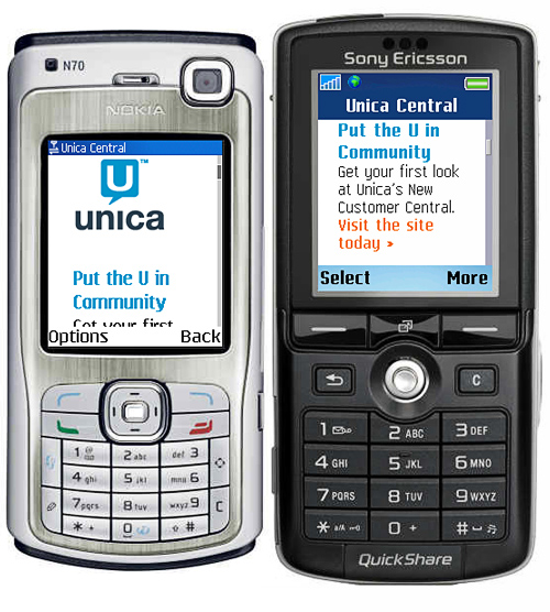
To a 320px wide iPhone ...

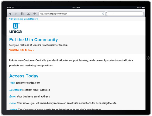
1024 x 768 tablet like the iPad...
to your Gmail account on a PC.

Fluid templates set the container width in percentages, and lend themselves to rich-text layouts.
2. Fluid images?
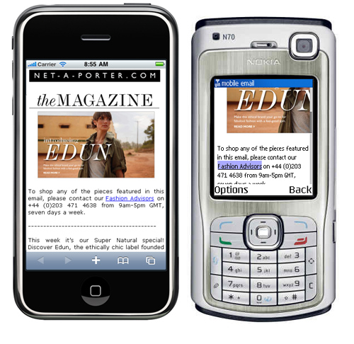
Adding a fixed-width image into a fluid layout can cause issues.
The 300px wide fixed-width image in this net-a-porter mobile email, is perfect for the 320px wide iPhone (below left). But doesn't do as well on the 176px wide Nokia (right).
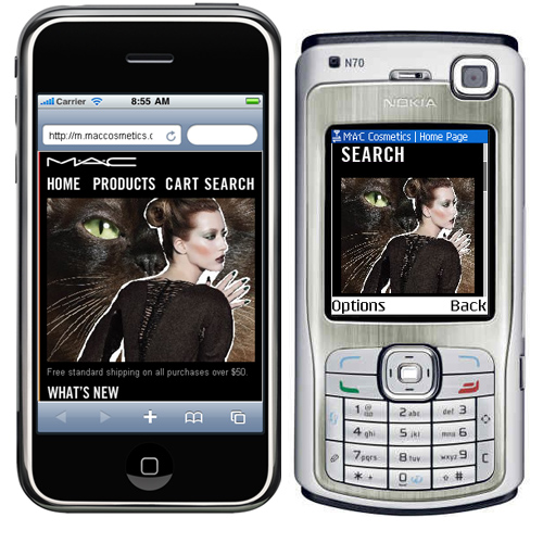
In contrast the elastic image on the MAC Cosmetics mobile site, scales to fit either device width.
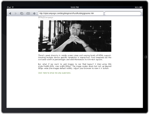
3. 550px wide fluid image test {View}
I tested this template - adjust your browser to view it scale - which contains a 550px wide image with the code:
IMG style="width:90%; max-width:550px"
The image scales down, but not up beyond 550px wide (the images default width). It's set at 90% to leave a margin around the edges.
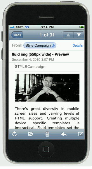
In portrait mode on the iPhone 3G / 320x460 ...
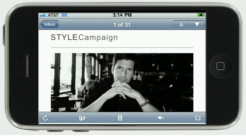
In landscape mode on the iPhone 3G / 460x320 ...
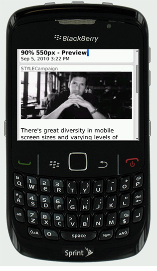
BlackBerry 8530 (Curve) / 320x240 ...
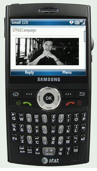
Samsung SGH-i607 (Blackjack) / 320x240 ...
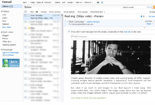
In Hotmail (after I scaled my browser down) ...
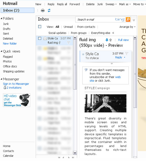
In Hotmail (default browser size)...
And on the iPad (See Net-a-porter with and without a max-width)
4. Support for fluid images
| Looking pretty good | |
|---|---|
| Email clients | |
| Outlook 2000 | Yes |
| Gmail | Yes |
| Hotmail | Yes |
| AOL | Yes |
| Outlook 2007 | Yes |
| Thunderbird | Yes |
| YahooMail | Yes |
| Entourage | ? |
| Apple mail | ? |
| Lotus 7 & 8 | ? |
| Mobile | |
| iPhone 3G + 4 | Yes |
| iPad | Yes |
| N70 Nokia | Yes |
| Sony K750 | Yes |
| Android | Yes |
| Samsung SGH-i607 (Blackjack) | Yes |
| BlackBerry 8530 (Curve) | Yes |
| Web browsers | |
| Firefox 3.6 | Yes |
| Chrome 5.0 | Yes |
| Internet explorer 8 | Yes |
| Safari 4.0 (Max around 280px) | Yes |
| Opera 10.6 | Yes |
The test template scaled below 550px in all browsers. Though there are some caveats: Minimum browser widths vary, e.g. Safari 4.0 went no smaller than around 280px wide. IE6 ignores max-width (does not cap how large the image scales up to), but IE8 supports it.
If your on a mobile/email client I've not yet tested, let me know how it performs...
5. Alternatives
Fixed-width images:
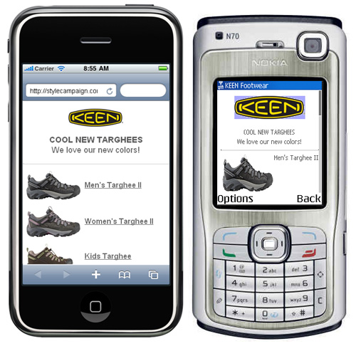
If your using fixed images in a fluid layout, then make them small like in this KEEN mobile email:
@media query:
For devices with CSS3 support @media is an alternative. It's supported on the iPhone, Palm and Android, though not currently under IE.
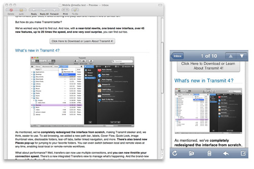
Check out Campaign Monitor's great write up on this Panic email that uses @media. The images below are from that post:
No images:
You can always stick with a rich-text layout for your primary email, like the Good Experience newsletter. One key benefit is smaller file sizes, though I can't see many B2C emails abandoning images altogether.
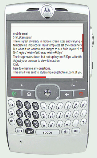
No matter what you do, some mobile devices don't support images. Only the text is displayed like the Motorola MOTO Q below:
There's great diversity in mobile screen sizes and varying levels of HTML support. Creating multiple, device specific email templates is impractical. We need future-proof designs that adjust to their context.
Fluid emails meet that challenge, rendering well on a PC or mobile device (not just the iPhone). But for wide adoption beyond the, "mobile version", businesses will want the option of adding images.
Luckily, support for fluid images is stronger than I expected. I'll certainly be doing some further testing ...
---
Update: Read a follow up post here