Using @media to bypass max-width
Fluid emails adapt their layout to different device widths. As the browser widens and narrows, the layout adjusts to fill the available horizontal space. That’s because container widths are set in percentages rather than pixels.
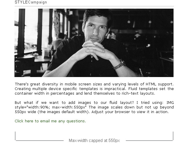
Max-width
On a wide screen monitor, long lines of text can become hard to read. Also fluid images can expand well beyond their actual size. To fix this we set a max-width, in this case 550px (default width of the image).
"IMG style="width:90%; max-width:550px”
Unfortunately max-width is not supported in Outlook07 or IE 6.
Here's the original test template (here's how it looks in IE6).Fixed to Fluid
Using @media we can switch from a fixed layout to a fluid layout, below a certain screen width.
So we'd say: make the width=550px, BUT if the screen width is below 660px make the container width=100%.
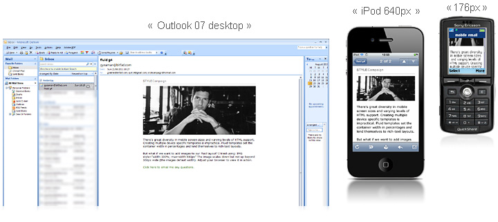
Instead of looking stretched in Outlook07 and IE6, the width is now capped at 550px on the desktop. Though when viewed on a small screen, the layout is fluid all the way down to a 176px wide Sony K750.
Here's the test template with @media (here's how it looks in IE6, Outlook 07 and iPod).Flip it?
In the above example, mobile browsers that don't support media queries would default to the desktop template. Alternatively we could set the fluid layout as our baseline, then switch to fixed on larger screens. Though lack of @media support would mean many users (Outlook07/ IE8 & below) would see the mobile layout.
Keep in mind...
When you send out high resolution fluid images, the mobile browser has to resize them e.g. 1024px down to 320px. Not only does this slow things down, but many users pay for bandwidth. Ideally you want to serve the right sized images to the right device.
Many brands can still benefit from this max-width workaround, Obama for one. His 2012 campaign consistently uses a fluid email template, placing accessibility above all else.