37 horizontal scrolling emails
Horizontal emails tend to be image based and favored by B2C rather than B2B. The side scrolling layout breaks convention, so subtle cues such as teaser content and intuitive design will determine if your email frustrates or delights. Here are 37 rare, experimental horizontal emails.
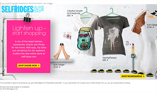
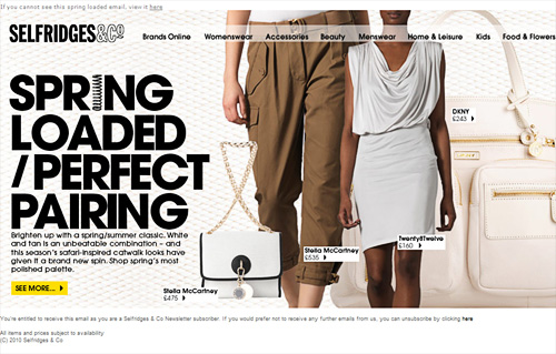
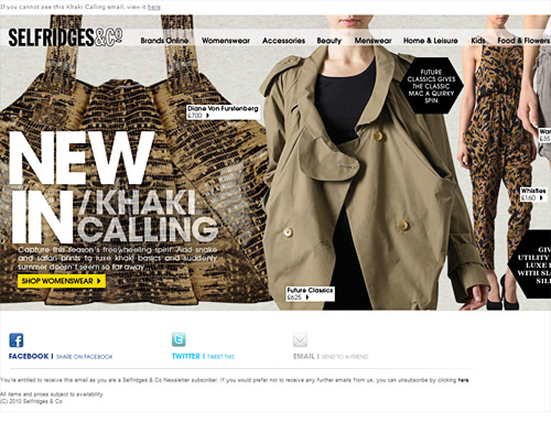
1. Selfridges
{03/30/10 / New arrivals - Buy online at Selfridges.com}
{04/15/10 /Spring loaded - Go neutral this Spring at Selfridges.com}
{04/22/10 / New in - This season's latest looks at Selfridges.com}
{04/29/10 / See our picks for the perfect bank holiday weekend wardrobe}
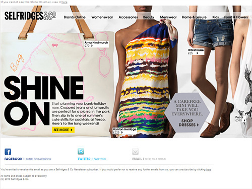
UK retailer Selfridges, sent me four horizontal emails within 30 days. All 2000 pixels wide, they increased the height from 536px to 716px to accommodate social media links in the footer.
2. Hugo Boss
{05/07/09 / Summer hits - find out more!}
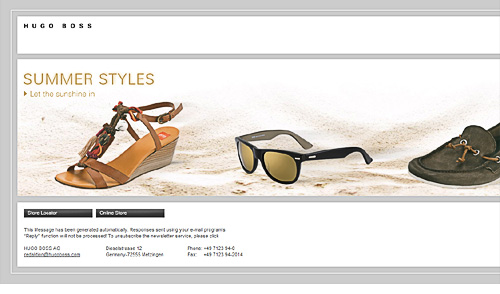
The maximum horizontal scroll in Outlook 2007 is 2110 pixels, this Hugo Boss email is 5227px wide resulting in rendering issues.
3. EEC
{12/17/09 /Happy Holidays From the EEC & Smith-Harmon - 2 Gifts Inside}
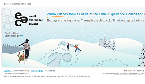
This EEC newsletter was the first side scroller I'd seen with animation. At only 1577px wide, the designers had clearly tested maximum scroll widths under different email clients. The text is HTML including a prompt to, "Scroll right for your holiday gift --->". Creative and well executed by Smith-Harmon.
4. Urban Outfitters
{10/06/08 /Right on.}
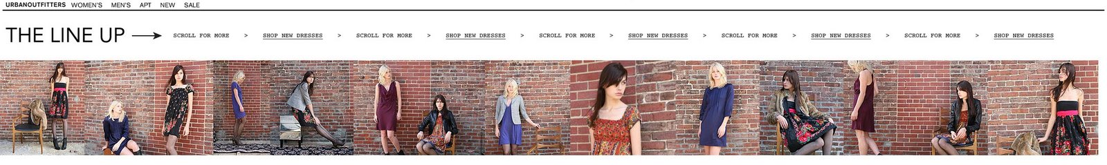
Urban Outfitters brand is bold and edgy, likewise their subscribers expect bold email creative. This example highlights how the horizontal format works well with photo galleries. Thanks to Chad White, for sending me this example.
5. StyleCampaign
{03/30/10 }
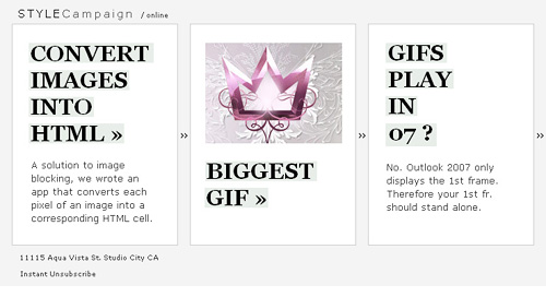
I designed this iPhone friendly side scroller in March 2010. I don't think I even had an iPhone to test it on, but was using an online emulator. It is 980px x 356px, ~ 20K in size, 90% HTML and on a PC all the content sits above the fold.
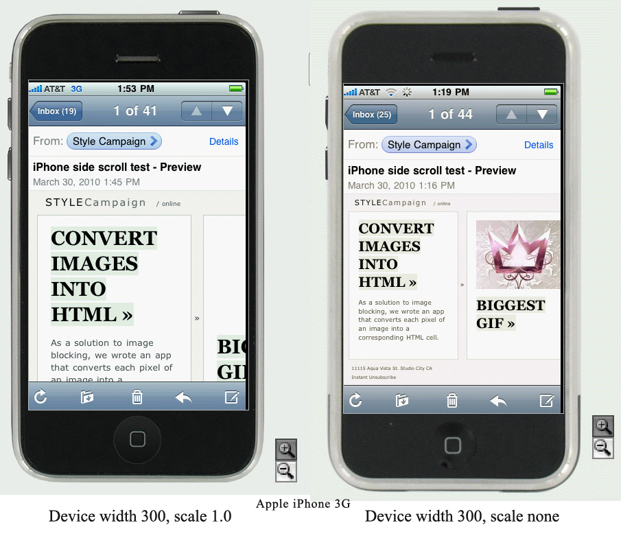
After 10% of our subscribers opened our Dec. 09 email on mobile, I decided to experiment with mobile layouts. You can read about it here, and I later refined the format a bit. Not having a real phone and testing online, I was deluded into thinking I could set the device width.
6. Icebreaker
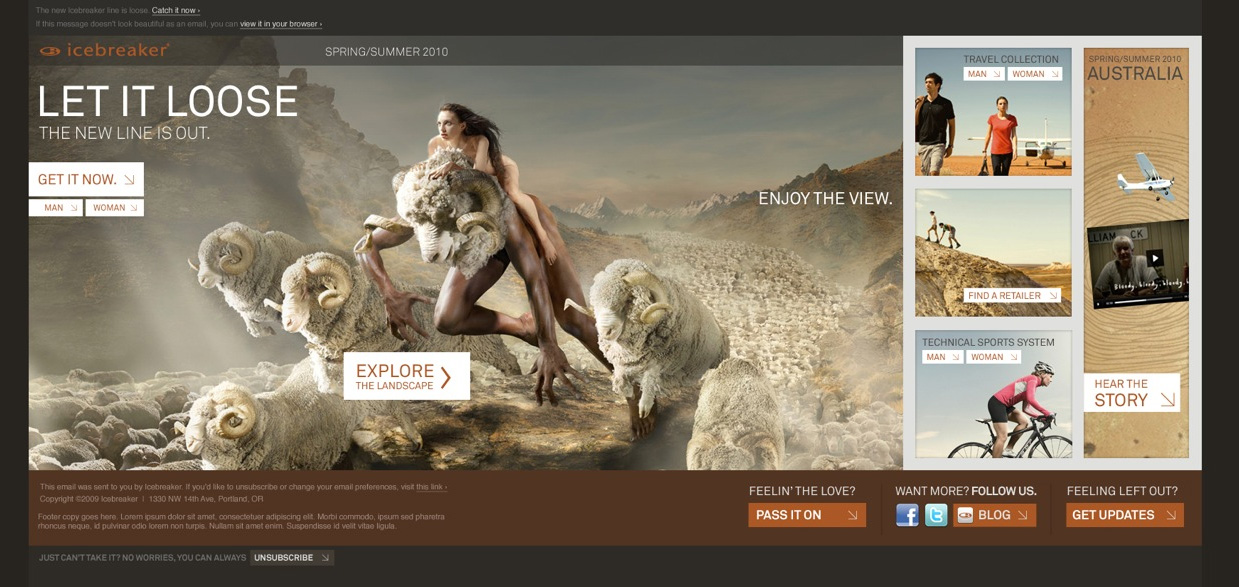
In this vertical vs. horizontal A/B test by eROI the horizontal design won. The use of anchor tags, viewable in the preview pane is a nice touch. Though note that anchor tags are not supported by all email clients.

7. Canadian Tourism Commission
{11/05/09 }
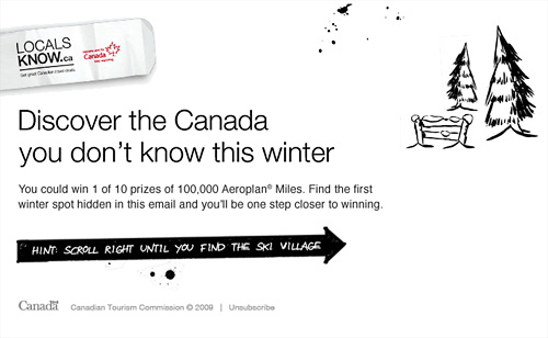
Not just a horizontal scroller but a maze. Chad White named it, "One of the most interesting emails I’ve seen all year" and eROI called it, "Wild". You can check out more on how it was made here. BJ Vicks, Community Manager at Radar DDB told me,
I think it’s safe to say that we’re thrilled with the response to the whole Locals Know program...I hope this helps illuminate the campaign a bit. The numbers outside of the newsletter speak for themselves.
8. Zinio

As you scroll right the previous, "GET IT NOW>>" button is obscured, so eROI added extra call to action buttons throughout. Compare this to the Hugo Boss example, which has only one CTA far left. In their last three horizontal emails, Selfridges added two deals far right. No doubt realizing as eROI did, the need for additional CTAs off the first screen.

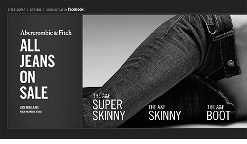
9. A&F
{10/01/09 /Young and Sexy, Vintage Hoodies}
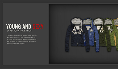
These two, "Young and Sexy" emails show some of A&F's horizontal experiments. Placing the copy flush left, (ideally in HTML) is the preferred layout.
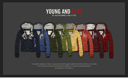
Between July 09 and Jan10, A&F sent me 20+ horizontal scrollers. The widths vary from 1161 up to 2609, heights are between 524 and 889px.
The email above is 889px tall. I'd keep heights under 550px, otherwise people have to scroll in both directions which defeats the purpose.
The email above is 2609px wide. We tested the maximum horizontal scroll, and you want to keep widths under 2110px for Outlook 2007. Feel free to use our horizontal test email yourself.
After taking a break from side-scrollers for over 6mths, A&F sent out the above 2342px wide email in Sep 2010. The Facebook link (top-left) is a key difference. It's never a good idea to overuse certain design elements, so taking a break is a good call.
{02/18/11 / Ready to get all your favorite jeans on sale?}
{04/20/2013 / #ABERCROMBIEHOT List: Festival Favorites ♫}
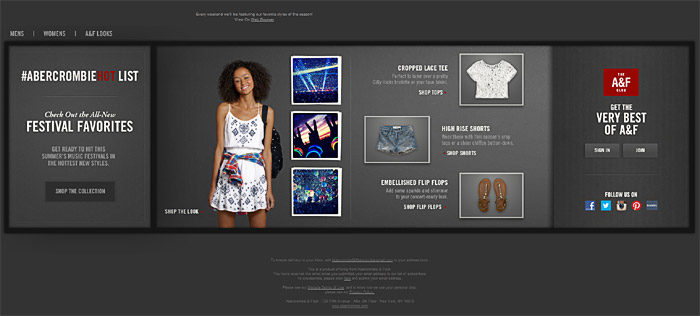
The last horizontal email I received from A&F was January 2014, so maybe the spree is over.
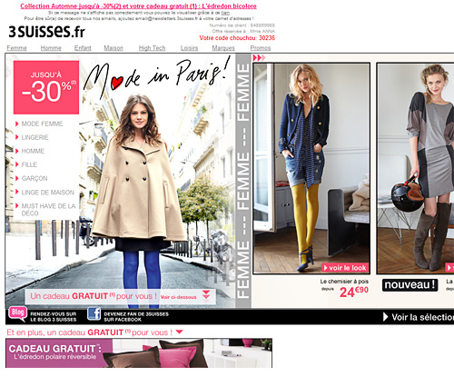
10. 3 Suisses
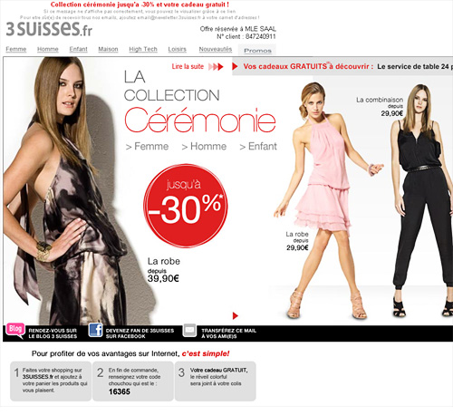
Thanks to @EmmanuelleSaal for sending me this example from French retailer 3 Suisses. It's one of the widest at 2730px, it differs from many of the other examples in that its made up of 5 tables rather than one. It uses arrows as visual cues and pre-header text, though some HTML copy would have been nice.
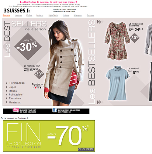
3 Suisses sent a second horizontal email, this time with a touch of animation. At 1741px wide, it's narrower than the previous one and works for Outlook 07 users. Like Eddie Bauer, they hedged their bets with a second vertical section for users who miss the visual cues to scroll right.
11. AAA
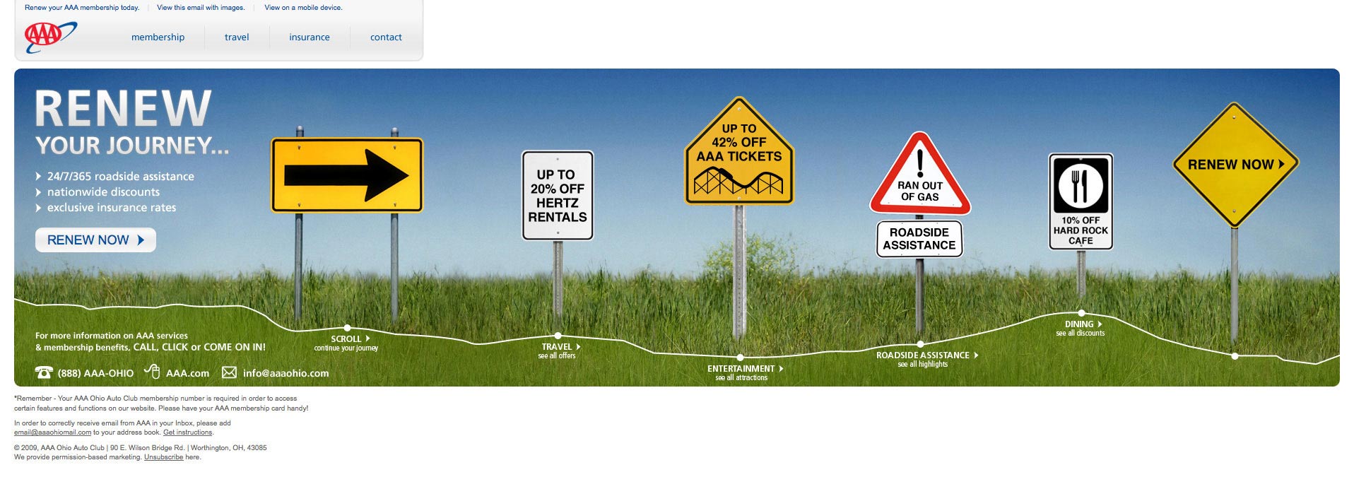
This email was designed by ExactTarget, as part of the Connections Extreme Makeover: The Email Design Competition.
"Out of the three redesigns tested in the competition, our design outperformed the control CTR by 26% and outperformed the projected revenue of the 2nd place finisher by 4%."
Here's what AAA's email looked like, before the redesign.
12. Eddie Bauer
{08/09/10 /All-New Denim! Introductory Offer - Save Up To $20 On All Jeans}
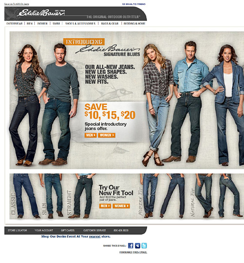
I nearly missed this horizontal email, as there are no visual cues to prompt users to scroll right. It's 1890 wide and 1425 in height. This is a two-for-one side scroller, though the additional height forces you to scroll vertically as well as horizontally.
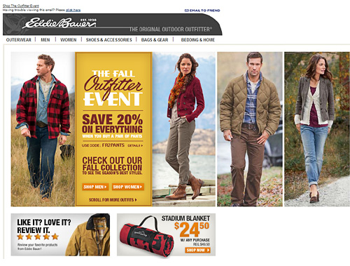
This is Eddie Bauer's second side-scroller (around 1mth apart). Its 1450px wide, slightly narrower than the previous one. They stuck with a secondary vertical section (like 3 Suisses above).
13. Chick-fil-A
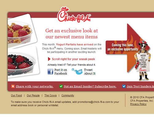
This horizontal email was designed by BrightWave Marketing. It's 1,100 wide, with plenty of HTML text and visual cues to scroll right. I like how they repeat the CTA to share with your network at the start and end.
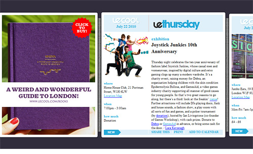
14. LeCool
15. Bra Smyth
{09/12/10 / Chantelle Ships Free!}
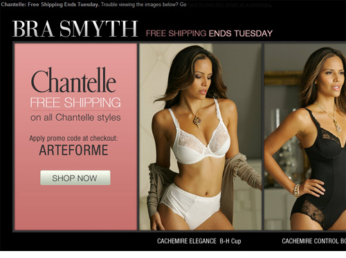
This email was designed by Bryan Boyd. Its 2027px wide, which works well for 07 users.
{09/15/10 / Shop By Price Everything Under $45}
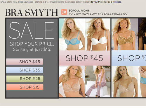
Bra Smyth's second side-scroller- sent 3 days later - has visual cues to scroll right up in the pre-header area. It's 1666px wide. When I asked Bryan how the emails performed he told me:
@stylecampaign so far so good. Changed some things on second one. Like visual to scroll. These were firsts, so will evolve with testing - @brymw
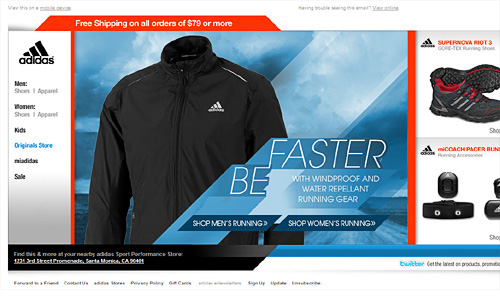
16. Adidas
{10/31/10 / Gorefest!}
17. Oasis
{11/28/11 / 4 Weeks To Go - Christmas Party Dressing}
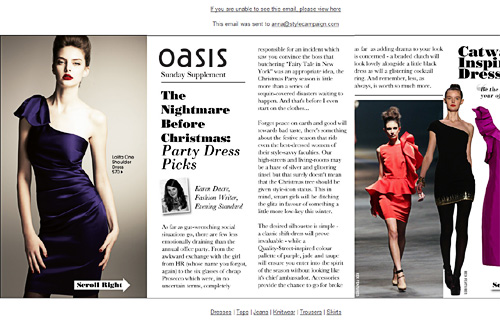
Looking to mix things up during the 2010 holiday season, UK retailer Oasis started sending a horizontal "Sunday Supplement". The few I received contained a lot more editorial content than their usual fare. The one above is 2897px wide, exceeding the maximum horizontal scroll in Outlook.
18. Next
{01/27/11 / You'll love the new cotton and chambray collections from Next}
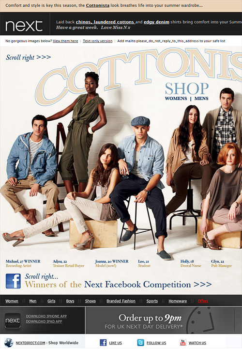
This horizontal email from UK retailer Next, is chunky at 1326 x 873 pixels so users might have to scroll in both directions. Placing the navi at the bottom is unique, as is centering the hero copy. The three stacked tables in peach, gray and white ensures the pre-header text (in HTML) pops.
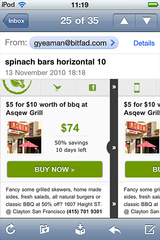
19. Mobile Spinach
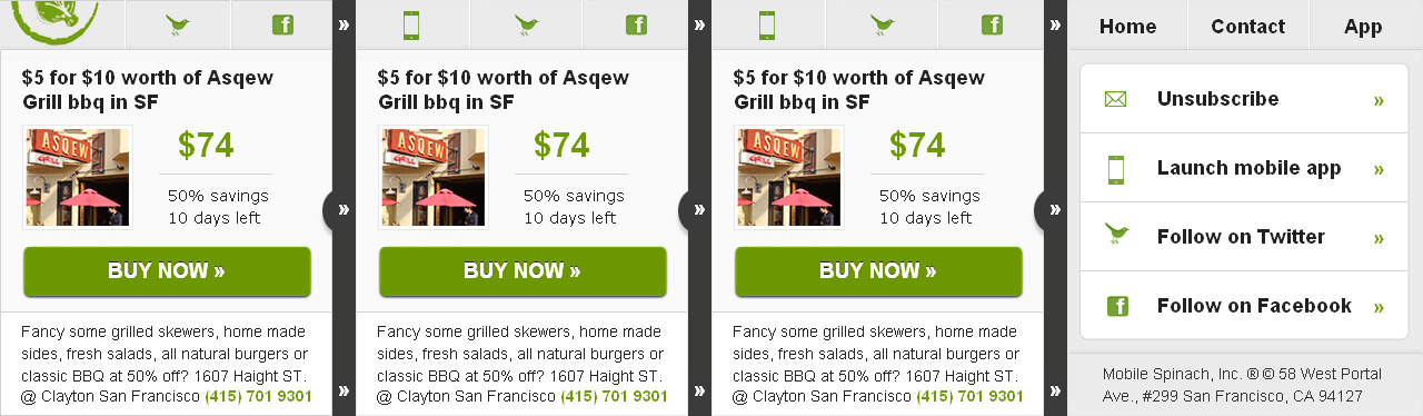
I designed this horizontal mobile template for Mobile Spinach in 2010, when viewed on the iPhone you can see teaser content to the right:
20. Saks
{04/10/11 / Celebrate Marc by Marc Jacobs 10-Year Anniversary}
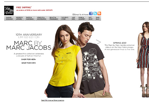
Like Eddie Bauer above, Saks did not alter their navi bar when they went horizontal. The light gray arrow on the guys shoulder is a subtle visual cue. I've only received two horizontal layouts from Saks, the one above at 1677px wide and another on Mon, May 2nd at 2911px.
21. Hollister
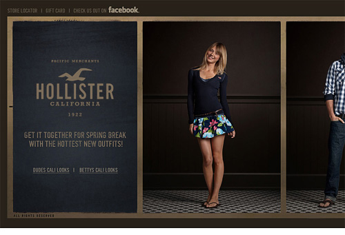
As you'd expect this horizontal layout is the same as A&F's above, just a different color palette. It's 2621px wide...
22. Crocs
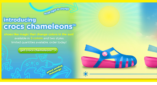
@trendlinei shared this 1779px wide Crocs email on Twitter, it's similar to the Hugo Boss one top of the page. The animated arrows are strong visual cues, along with the line along the bottom, demonstrating how the shoes change color depending on the available sunlight.
23. Daily Candy
{ 11/19/2012 / Looks That Stop Traffic }
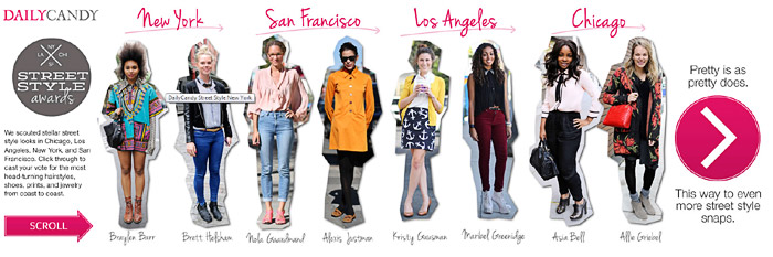
The iPhone' native client scales horizontal emails to the height. So for it to still be legible, you want to keep scalable horizontal emails 300-500px tall. Alternatively you could make it responsive and flip it vertical on mobile like we've done for a few clients. This one is ~530px high, though the images hold up well on the iPhone.
24. StyleCampaign
{ 03/29/2013 / Responsive email design }
I wanted to use a large background image with a slightly editorial vibe. I designed this at ~1475 x 860px so it's quite chunky. This wide responsive layout allowed me to play with a desktop, tablet and mobile view. Left hand column is for Android Gmail users. More experimental than anything. I did notice how the odd iOS app scales to the width causing usability issues, though those apps are generally edge cases.
25. JC Penny
{ 02/19/2012 / Hello, Sunshine! }
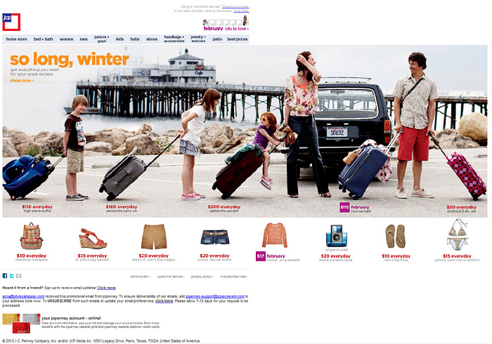
JC Penny sent me 15 horizontal emails between Feb-Aug 2012, this was one of my favorites. It works well on tablets and the creative fits the format. Many of JC Penny' horizontal emails were more chunky coming in around ~1450px wide.
26. Crate&Barrel
{ October 31, 2012 / 20% off beer glasses. One week only }
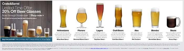
While the JC Penny one above is arguably aimed at desktop and tablet users, the shorter Crate&Barrel layout will work better on the iPhone.
27. Horchow
{ March 17, 2012 / Get the beach-house look + great deals on lighting (20% off + free
shipping }
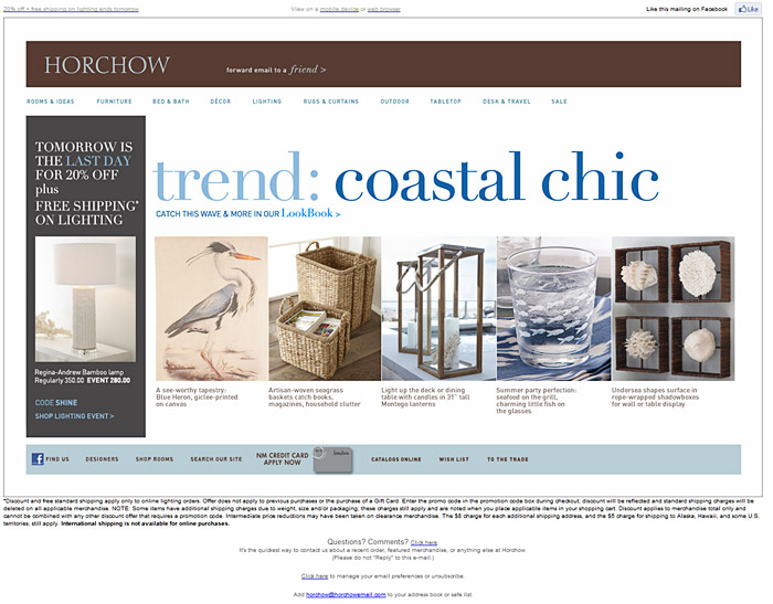
Another chunky one, though the footer text will make the content zoomed out on the iPhone. This was sent on a Saturday, I've received a number of horizontal emails on weekends. Maybe as users are more likely to be on tablets, or it is a slower day to test an experimental design. I received 10 horizontal emails from Horchow between 11/28/2011 and 3/17/2012. 2012 was the year we saw many brands testing horizontal layouts, my impression is it's been slower in 2013.
28. aerie
{ March 21, 2012 / Take 30% Off: Say Hello To Spring! }
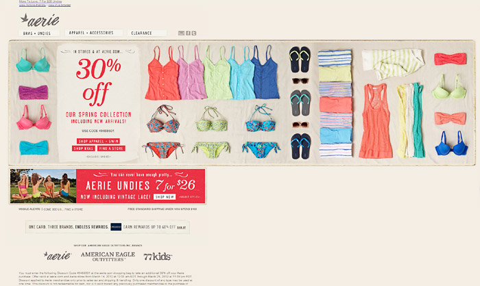
Again the extra height will work against iPhone users, though I do like the touch friendly product images that need no supporting copy.
29. American Eagle Outfitters
{ 8/31/2012 / Take 30% Off & get Free Shipping All Weekend Long. }
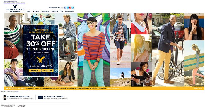
This was one of my favorite horizontal emails from 2012, I liked the animation and disordered grid layout. I'm not sure if the images are of customers or models, though the attempt to make it more personal via the #liveyourlife hashtag is a nice touch.
30. Olympus
{ 3-2 yrs old I think, found on twitter }
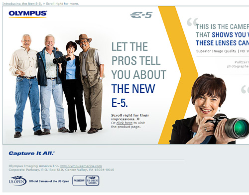
Mobile has changed the way we design emails, so this feels a bit busy by today's standards. Though I do like the testimonials from pros, followed up by the camera shot far right. Again we see the horizontal format used for an important event such as a product launch.
31. Fossil
{ Feb. 2013 }
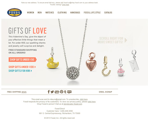
You often see the horizontal format used over Christmas in order to stand out, this is the first Valentine's example I've seen.
32. Sorel
{ Dec. 2010 }
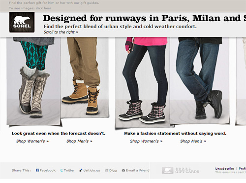
This holiday email is around 560px tall, so somewhat compact for iPhone users. I like how the large title runs horizontally along the top, and that they used HTML text under the images.
33. Monster.com
{ 3/27/2013 }
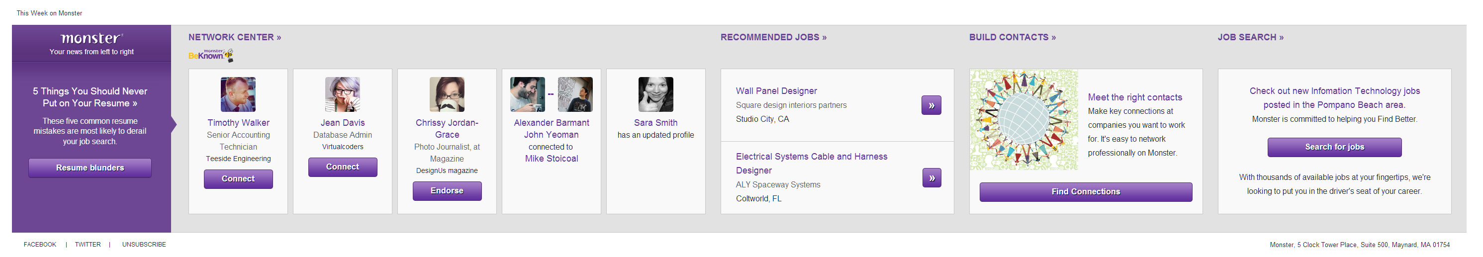
I designed this in March 2013 for Monster.com, they wanted to test a horizontal vs. vertical format. We looked at making this responsive so it flipped vertical on mobile, but in the end we stuck with a scalable format around 450px high. What was tough about this was the 2110px Outlook limit, as all of the content is dynamic (some of these are fallback modules). Though it worked out well on the desktop and iPhone, Android is more of a wild-card height wise.
34. REI
{ 6/14/2013 / Swim, Bike, Run }
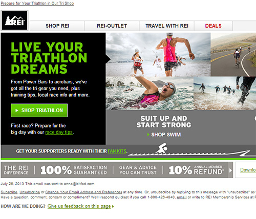
A scalable horizontal layout, around 580px tall. On the iPhone it will scale to the height rather than the width. I like that they placed the small black arrow higher up, it ensures Android users will get that cue irrelevant of screen height.
35. AlchemyWorx
{ 2/20/2015 / Pros and Cons of sideways scrolling emails }
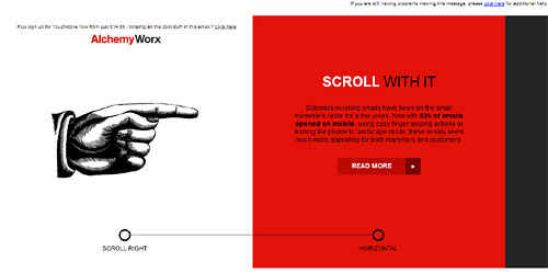
This is the first horizontal email I've received in almost a year. I like the pixel art hand when images are blocked. Although it is an excessive visual cue the email is about side-scrolling, so its more in the way of a hero image than something you'd normally deploy. It would have been great also just with the thin line running along the bottom. I've seen similar vertical lines employed to get users to scroll up and down on mobile.
36. Netflix
{ 04/03/2015 / Coming Friday, April 10th… Marvel’s Daredevil }
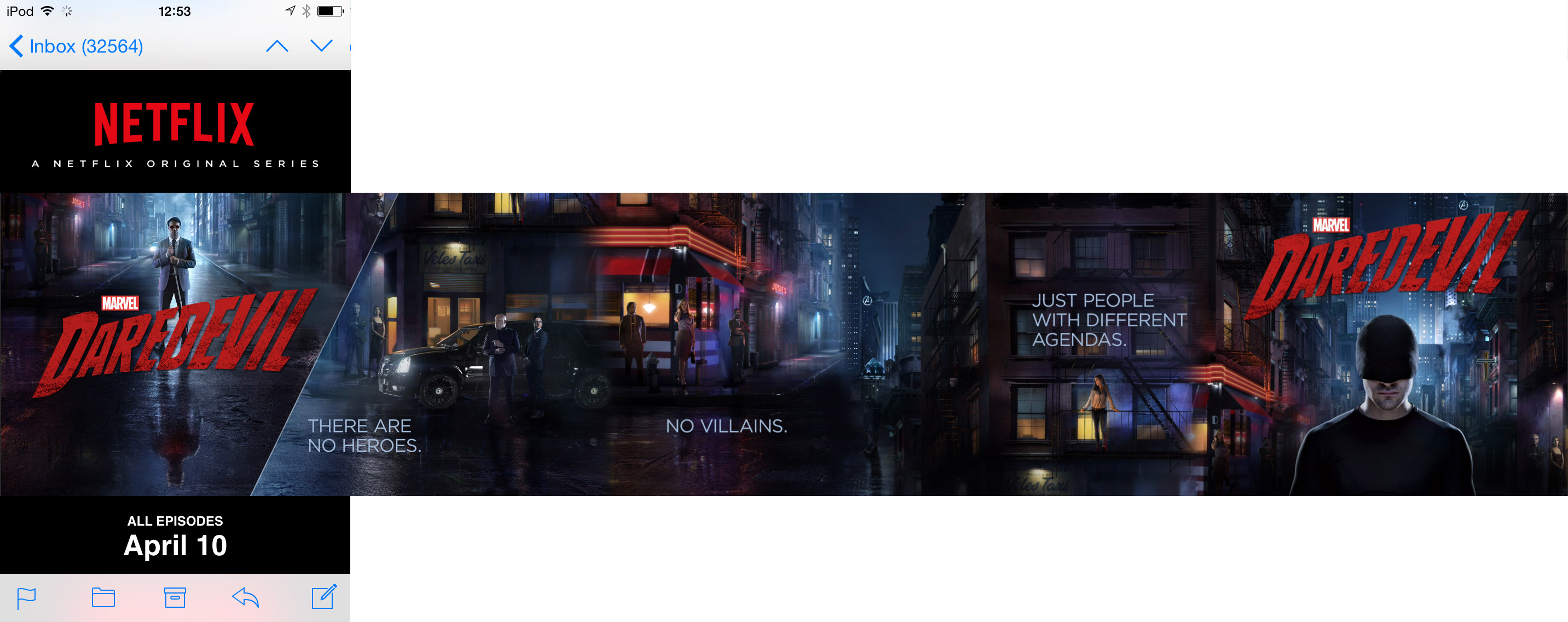
This Netflix email promoting the DareDevil series has some really nice touches. It's vertical on the desktop, but switches to a horizontal scroll on mobile, including the iPad. Instead of the whole email scrolling, only the center hero section moves left and right when you swipe over it. It's an elegant solution which keeps the branding and CTA in place.
The diagonal treatment of the image acts as a subtle cue to scroll without resorting to arrows, the teaser content just peaks through so you know there's more to the right. There's also an animated semi transparent circle. To get a better feel for how it works on mobile view the video screencast below.
37. ActionRocket
{ 09/13/2019 / Emailweekly #242: Horizontal Scroll? }
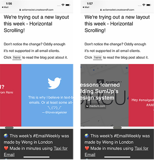
This horizontal email uses an overflow technique which works in iOS, Gmail webmail and Outlook for Mac. Just like the Daredevil email above, only the center section scrolls and it's quite effective on iOS, as you can just swipe through the selection of posts. Although horizontal emails have had their heyday, it's still fun to see what's possible with today's email clients.