Mobile email design (part 1)
Rather than link to a separate mobile version (more on that later), I wanted these emails to display attractively on an iPhone and a PC.
This is the first of four designs, in which I share my tips and mistakes (copy below covers same content as video) can also jump forward to mobile email webinar recording
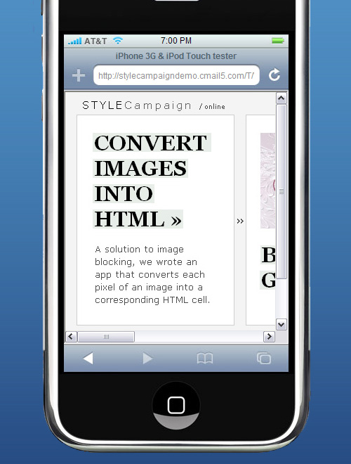
Horizontal scroll
Clearer shot of how the email looks on an iPhone:
1. Viewport width - 980 pixels
When the iPhone loads a page, it sets the viewport width to 980px. To account for this, you can set the device width to 650px :
<meta name = "viewport" content = "width = 650">
For the purposes of this side scroller, the width just needed to be under 980px.
2. Visible area - 320 x 356 pixels
One mistake I made, was assuming I had 320 x 480 pixels to play with. As the iPhone displays a status bar, URL text field and a button bar by default, you only have 320 x 356 pixels.
I've found using an iPhone stencil in Photoshop helpful, and plan to buy an iPhone notebook.
3. Fingers are bigger than a cursor
You use your fingers rather than a mouse to operate the iPhone. If your links are close together, a user could accidentally trigger the wrong link.
In his design for the iPhone post, Michael Dick reminds us how tough it is to click a small link on a small screen, he writes, "Because our finger is obviously a lot larger than our cursor, targets need to be big with a lot of padding...be brave, add as much padding as your design allows."
4. Pre-header text?
I kept the STYLECampaign logo and web version in the pre-header, even though it pushes the design down the screen. I'll add links alongside, such as unsubscribe and a CTA.
Len Shneyder of Pivotal Veracity asks us to, "Consider getting rid of your pre-headers as they can push your calls-to-action and branding further down the page and effectively OFF the first screen that the customer sees.
5. Mobile email preview tools
I listed 10 mobile email preview tools on The eMail Guide. For blocking I use a stencil in Photoshop and iPhoneTester. For in-depth testing DeviceAnywhere, which allows you to interact in real-time with 2,000+ devices.
Alternatives include Pivotal Veracity's eDesign Optimizer, and shortly Campaign Monitor - which I've used for years - and Litmus. Paul Farnell of Litmus told me,
“We are still working on iPhone email testing, but this is something we hope to release within the next 4 weeks. At the same time we’ll be launching support for Symbian, Windows Mobile and BlackBerry testing as well”.
Part 2 of my mobile email design series is skinny, then fluid, ending up with pixel art.
Update: iPad
I sent the horizontal email to Paul Farnell at Litmus, as they are launching an iPhone preview tool shortly. I was surprised when he sent me this screenshot on the iPad:
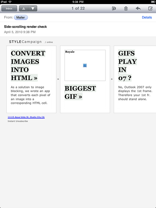
Paul confirmed that an iPad email preview tool will be available shortly,
"Yep - iPad is coming to Litmus, and Campaign Monitor too!".
BTW Images do display they just had the wrong urls...