Horizontal mobile emails
Worried users won't scroll horizontally? Here's the link activity per screen: 44% 30% 14% 12% nicely spaced out. Around 20% opened on a mobile, 28% in the evening.

At 978px wide, it was a redesign of my first horizontal mobile email from 14mths ago. Here's before and after screenshots.
Unpacked deck
The idea was simple. Build it like an unpacked mobile app, laying each screen side by side. Each page would be roughly 320px wide with elements in the right position and size for touch.
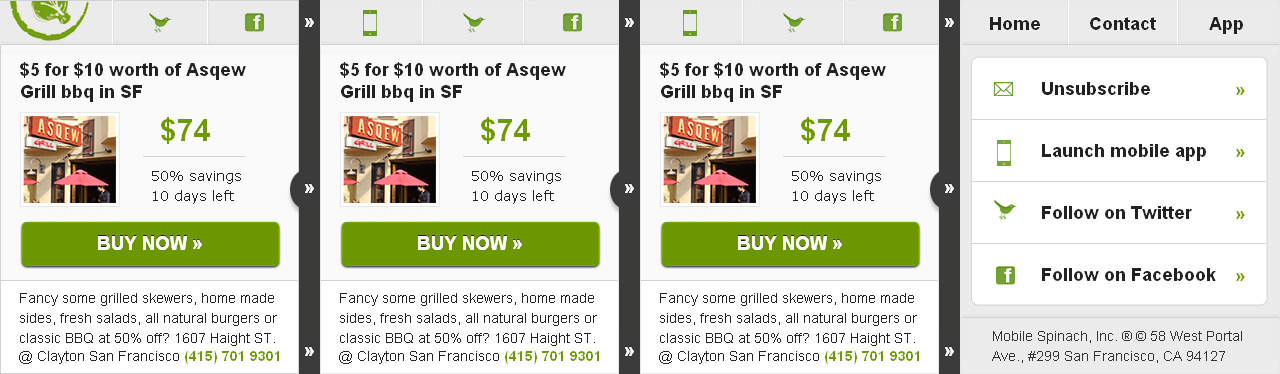
This one I built for Mobile Spinach last Sep, it's 1280px wide. One benefit for desktop users is all the content sits above the fold.
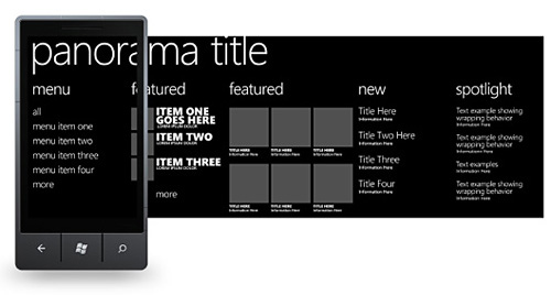
Panorama
So I was excited to learn WP7 - released in the US last November - supports horizontal scrolling.
"Panorama applications are a part of the core Windows Phone OS 7.0 visual experience...these applications offer a unique way to view controls, data, and services by using a long horizontal canvas that extends beyond the confines of the screen." - UI Design and Interaction Guide for Windows Phone 7
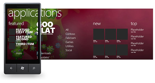
A background image is optional, "meant to give the panorama its rich magazine-like feel". The guidelines advise using either a single color background or an image that spans the entire panorama.
For email I'd mix the two (or stick with solid), bleed from an image into a solid color after the first screen. Background images have poor support in email and add to file size.
The resolution on Windows Phone 7 is 480x800px and the Panorama approx 2100px. The maximum horizontal scroll in Outlook 2007 is also 2110 pixels.
Windows 7 also supports two way scrolling, "Vertical scrolling through a list or grid in panorama sections is acceptable as long as it is within the confines of the section and is not in parallel with a horizontal scroll".
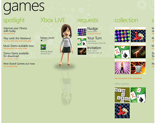
I've seen a couple of desktop horizontal layouts that support two way scrolling.
The layout above appears to be looped, once you reach the end of the panorama you don't hit a wall. Not something we can mimic in email, spotty anchor tag support is the best we have. As Ros mentioned over on Campaign Monitor for the iPhone "Two taps on the anchor link are required to jump to the linked element".
In April, Gartner predicted that in 2015 Microsoft’s Windows platform will secure second place in marketshare behind Android, at 19.5 percent, due to its alliance with Nokia.
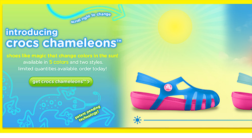
Teaser content
You'll notice the panorama and my template up top, use teaser content to indicate there's more to the right. The iPhone 3G is 320px wide, rather than make each screen 320px, reduce to 300px so the next screen peeks out.
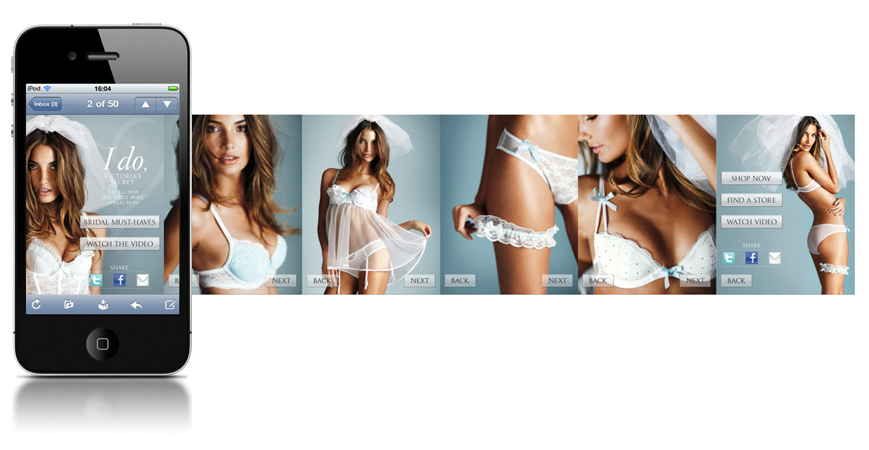
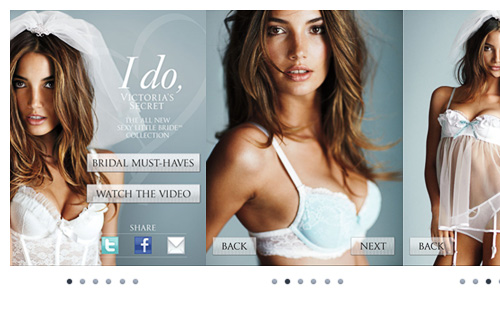
I took screengrabs from the Victoria's Secret mobile bridal site and laid them side by side. If the max scroll in Outlook 07 is 2100px wide, we can fit 6-7 screens.
A horizontal look book works well for fashion retailers, though layouts can contain different text to image ratios. I also liked how VS linked to a short video which played on iOS.
Page indicators
As well as teaser content, try adding page indicators to the bottom of your layout. A familiar visual cue, which tells users how many screens there are and which they're on. You could even add anchor tags for the clients they work under.
Scroll indicator
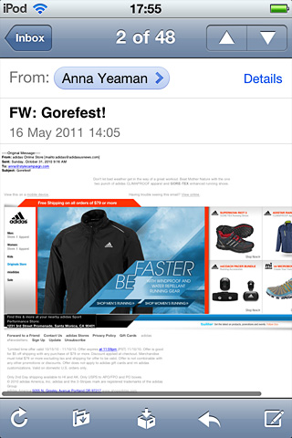
When you load an email on the iPhone, a semi-transparent gray bar pops up for a few seconds, it's a scroll indicator. Not only does it tell you which way to scroll, it provides a guide as to how much more content there is.
If the Adidas email below was wider, the scroll indicator would be narrower. As it is, we know there's only a bit of content to the right.
Try to reduce the lines of footer text in horizontal layouts (and the pre-header). The more height you add the more zoomed out your creative will be, making it hard to read on the iPhone.
No footer text 580px viewable vs. 770px zoomed out.
View full-sized screenshots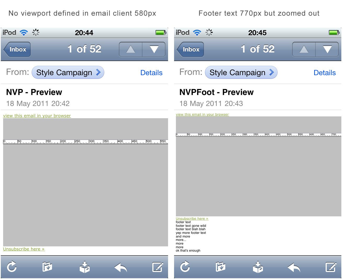
Arrows
Many of the examples in the horizontal email gallery (just updated) use arrows, some animated. Whether teaser content is enough, or a heavier hand is needed is something to test.
If Windows Phone 7 lives up to its predictions, mobile users will become much more familiar with horizontal scrolling. Though it's one choice amongst many.
In the last 18mths I've tried 320px and 400px skinny layouts, two column skinny, fluid, responsive, dynamic, horizontal and even some imageless pixel art. There's not one mobile email layout that fits all, your content will determine which you pick.