10 tactics from ProFlowers - leading e-retailer with a 27% conversion rate
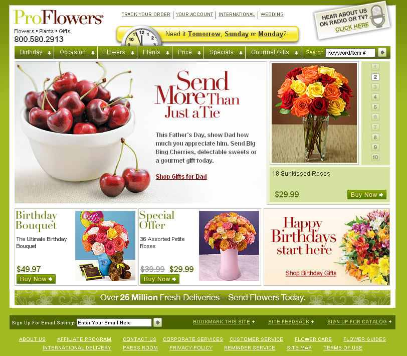
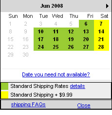
1. In the header it reads , "Need it tomorrow, Sunday or Monday?" Once you've choosen a day, you view a selection of product options. Choosing a gift based on a desired delivery date saves time and disappointment.

2. The header has another great graphic "Hear about us on Radio or TV? Click Here". On entering a promotion code you enter a Radio Listener Specials page. I guessed, "proflowers" and it worked! It's too obvious to be anything but a marketing ploy, still I felt like I had cracked the Da Vinci code. The main offer was "Receive a FREE glass vase or a discounted premium vase with today's flower order". View the Radio Listener, landing page here.

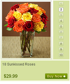
3. In a rush? you're only one click away from a purchase. The homepage rotates through ten popular bouquets in the top-right corner. (Powered by Javascript rather than Flash)
4. The first time I visited the homepage the main graphic promoted Father's Day, when I re-visited 5 mins later it was promoting Birthday bouquets. a/b testing will tell you which performs better, ProFlowers uses Omniture to measure consumer response to online promotions.
5. A micro site for Wedding flowers, including real customer wedding photo's and a separate wedding newsletter.
6. Paypal and Comscore carried out a recent survey and found that two-thirds of consumers who put items into a shopping cart did not complete the purchase. High shipping fees were the main reason the shopping cart was abandoned. ProFlowers gives you clear shipping fee information before you click the order button. I liked the "secure checkout" diagram which guides you through the steps.
{You pick your delivery date and shipping fee before ordering - see below}
7. You can shop by price, flower or occasion. I found this really intuitive, I like daisies and need a Father's Day gift it was easy to find both. I was not overwhelmed with choice, 16 options max.
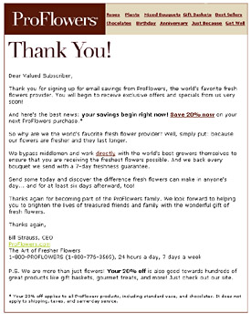
8. Email sign up on every page of the website. Search engines don't always drop people off on the homepage, you need to ask for email addresses more often and in different ways.
9. I received a welcome email within 10mins, offering me 20% off. To see more welcome email examples click here.
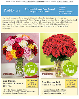
10. The ProFlowers email newsletter is packed with good practices:
- At the very top is the HTML link, "Take a look and choose Assorted or Red Roses for just $29.99". Read a post covering this emerging tactic, increasing used by top retailers.
- Besides the logo, the header is entirely html, and wastes no space. "Everybody loves free roses! Buy 12 get 12 free", is the main title with four additional links to landing pages. This information packed preview pane has the benefit of being accessible on mobile devices.
- Paragraph of engaging HTML text at the top in a conversational tone, "Our most popular offer is back in bloom".
- The offer, pricing and links are in HTML text, making this email readable with images turned off.
- The upgrade specials underneath the two main bouquets is a tactic I will be trying out myself.
- A reminder service allows you to set a date to be contacted via email, such as a week before your Mum's Birthday.
- A Father's day promotion in the footer, Father's day is a week away so it's highly relevant.
- An eye catching, "Share with a Friend" graphic.
- A link to a well branded, simple preference center, see screenshot. They make the best of a bad situation, asking why you want to unsubscribe.
{Click to view ProFlowers email}
I'm sure there are many more reasons why ProFlowers has a 27% conversion rate. The tactics above grabbed my attention and appeared simple enough for other businesses to adopt. My favorite was the Radio specials link. A few of my clients spend heavily on radio advertising and I plan to pass this along. It could be adapted to Newsletter promotion codes, "Have a newsletter code? Click Here for VIP specials". Their newsletter header, with it's lack of wasted space and HTML text is something to keep in mind also.