The welcome email - don't blow the first date
Here is a tip.
Don't play it cool and keep them waiting a week, then send out a "thank you for subscribing" form letter.
Unless you want to get dumped.
According to a study by MarketingSherpa, your welcome email is likely to be the most opened email you send. Below are 7 examples to give you some ideas, including what not to do.
Click on the images to view full-size
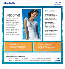
{Subject line: Welcome to Marshall's Email!}
Rather than load up the subscription page with too many questions, which is a big turnoff, Marshall's uses their welcome email to find out more about you. They did ask for my postcode on sign up, which was used to give me useful info about my local store.
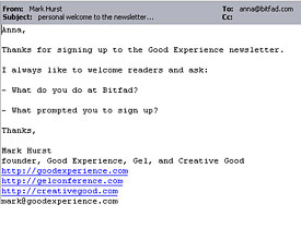
{Subject line: personal welcome to the newsletter...}
One of the best welcome emails I received was from the Good Experience Newsletter. It cut through the hype and made a real connection. After I replied back I got another personal email with a link to some Gel conference web video's. I know that everyone who signs up gets the same treatment. Still it left me feeling warm and fuzzy, so next time one of their emails arrived in my inbox I took the time to read it.
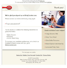
{Subject line: Thank you for registering at Betty Crocker.com}
Betty Crocker's dinner made easy campaign, was one of the 5 email marketing nominees for this years webby awards. The subscription form was too long, still I liked how their welcome email instantly rewarded me with some recipe ideas.
Three days after I received the email below and I received a "Get to know Betty Crocker.com" email which I found more interesting. It contains links to three recent newsletters.
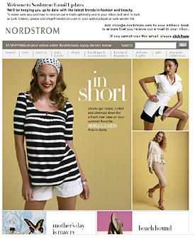
{Subject line: Welcome to Nordstrom.com E-mail | New Women's Shorts Styles for Summer | UGG(R) Australia Sandals}
Nordstrom takes a different tact, just adding a welcome image at the top of their next newsletter "new welcome banner.gif". I don't know why they didn't use HTML text rather than an image.
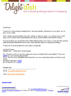
{Subject line: Welcome to the Delight dish :: we are so glad you've subscribed!}
Often welcome emails are automatically sent out in response to a web form. Some email providers limit you to a text only version, which is not a bad thing. What is bad is the stilted bare facts tone often set in these emails. Try using conversational language. I like this example from Delight as it shows some personality and deepens my interest in the brand.
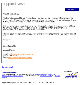
I have around 15 identical welcome emails like the one below, from Constant Contact users. The template and copy are the same, company name is all that's changed. As the Delight email above shows, it is possible to send a custom welcome email via Constant Contact.
Rather than laziness, its often the result of some overworked staffer who got email marketing lumped into their "real" duties and are doing the best they can. I know this as years ago this person was me.
Most Constant Contact users manage their email campaigns in-house. They are small business owners already overstreched and under pressure. I know just getting an email out is an accomplishment when you have a to-do list a mile long... still if you can find 5mins to re-write the welcome letter you might improve your results.
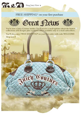
{Subject line: Thank you for registering for Juicy Couture e-mails}
Free shipping seems to be the favored sign up reward these days. It's become so standard on the web, I am no longer moved by it. I am happier with a big discount like Border's gave me, "40% off any one book" which I promptly used. Who can buy just one book? I purchased over $25 worth to be eligible for free shipping.
Here are some of the basics you might want to include, some of this will be on your subscription page also:
• Send them an instant reward as a thank you.
• Get whitelisted - ask them to add your email address to their address book.
• Show some personality, never stick with default copy if possible.
• Link to a privacy policy - it further underscores your companies integrity.
• Lead them back to your website - pages that might interest a new customer.
• Remind them of the value of being a member, what advantages do they get.
• State your publishing frequency - you need to set expectations.
It seems only fair to show you my welcome email. I chose HTML rather than plain text, but that's just me. When you sign up to my newsletter you instantly get sent a welcome email. It inserts your first name in the subject line and copy (Anna in this case). I'm getting writer's remorse just reading it again. You can see it here (I disabled some of the links)