Basics of animated Gifs and WebP in email
|
|
An introduction to animation in email, using Gifs and WebP. It’s in three parts, this is part one ‘Cuts’, I'll follow up with video and keyframe animation. I'll take a look at trends, file-size, motion toolkits, guidelines, accessibility, and making a WebP animation. Much of my earliest writing was about animated Gifs, so it's a nice subject to dig into and relax with.
Speaker – Anna Yeaman, 30 mins long, WebP starts at 16:52
All the slides →
Hi this is Anna from stylecampaign, I’ll be talking about the basics of animation in email using Gifs and WebP. This talk will focus on ‘Cuts’, I’ll follow up separately with video and keyframe animation. I’ll put a transcript up on the blog for anyone who prefers that.
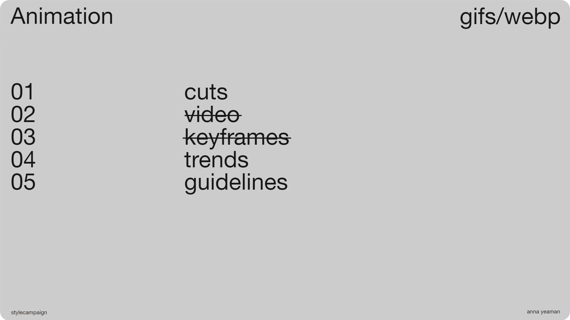
Slide 03, This talk will focus on ‘cuts’, I’ll follow up separately with video and keyframe animation..
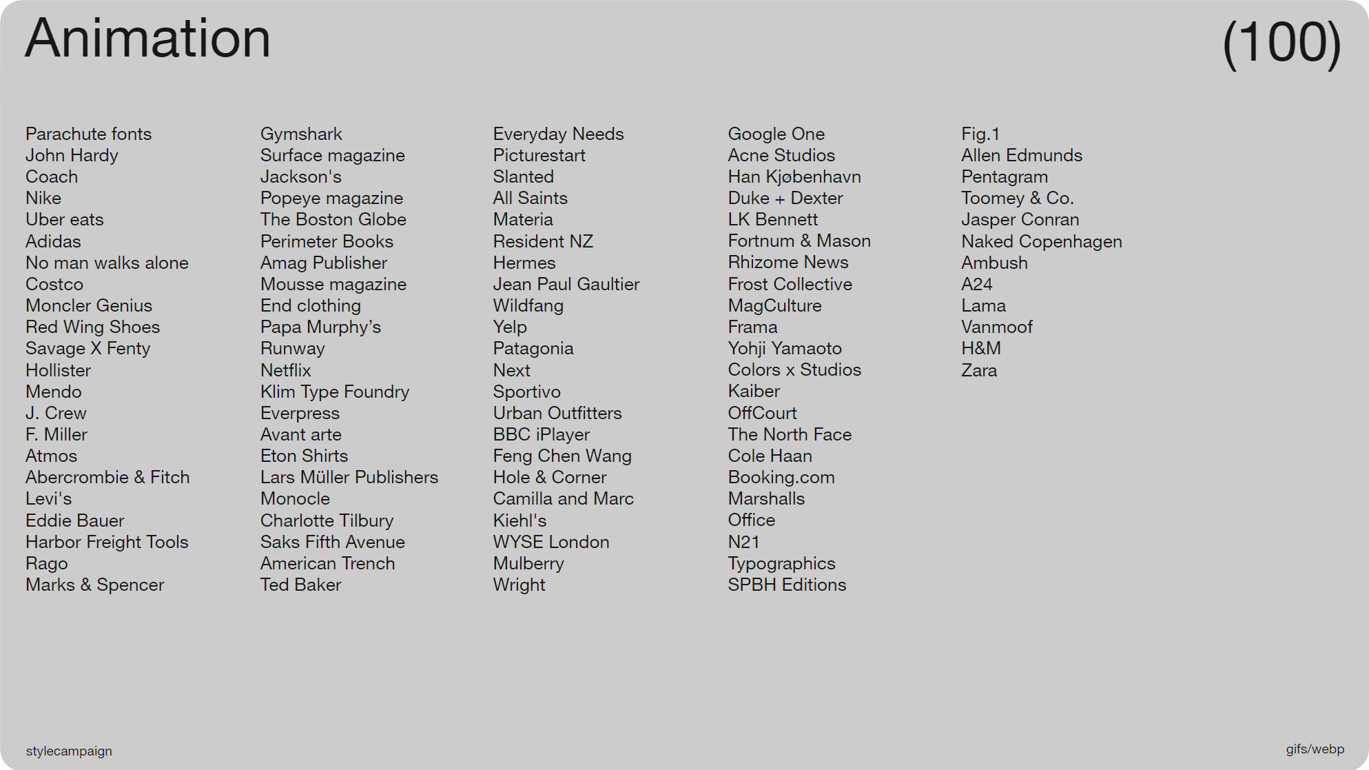
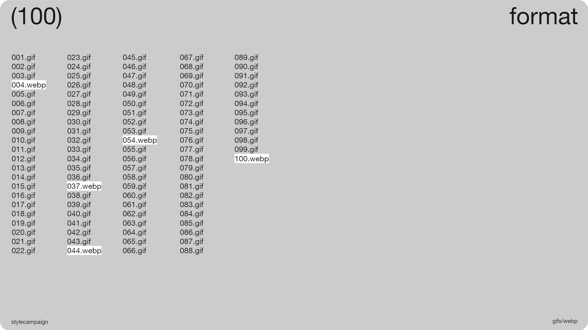
Slide 04, I saved 100 animations from my inbox (~April, 2023), just whatever came in each day.
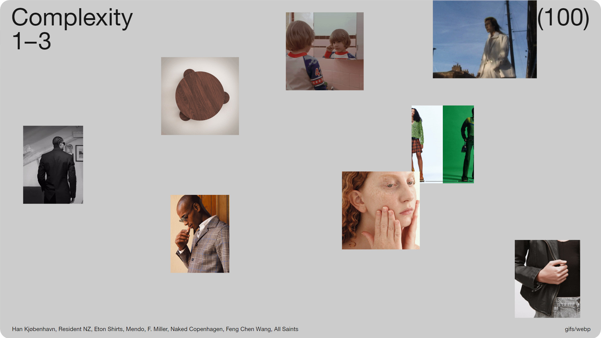
Slide 05, I sorted the 100 animations into groups based on their complexity.
So to get an idea of what’s typical right now, I saved 100 animations from my inbox (~April, 2023), just whatever came in each day. It roughly breaks down as 60% retail, and it’s largely promotional. I sorted the animations into groups based on their complexity; as I was mainly looking at the skills you’d need to create them.
The groups were cuts, video and keyframe animation, and with each there’s this sliding scale of difficulty. We’re going to start with ‘cuts’, which are the most straightforward to create. Brands of all sizes make use of them, and for some it’s the only type of animation that they do. We almost take them for granted, so it's nice to focus on them in a bit more detail.
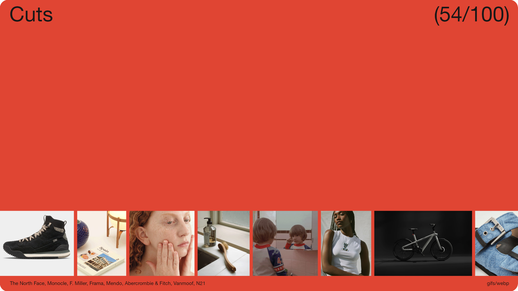
Slide 07, 'Cuts' made up 54 out of the 100 animations.
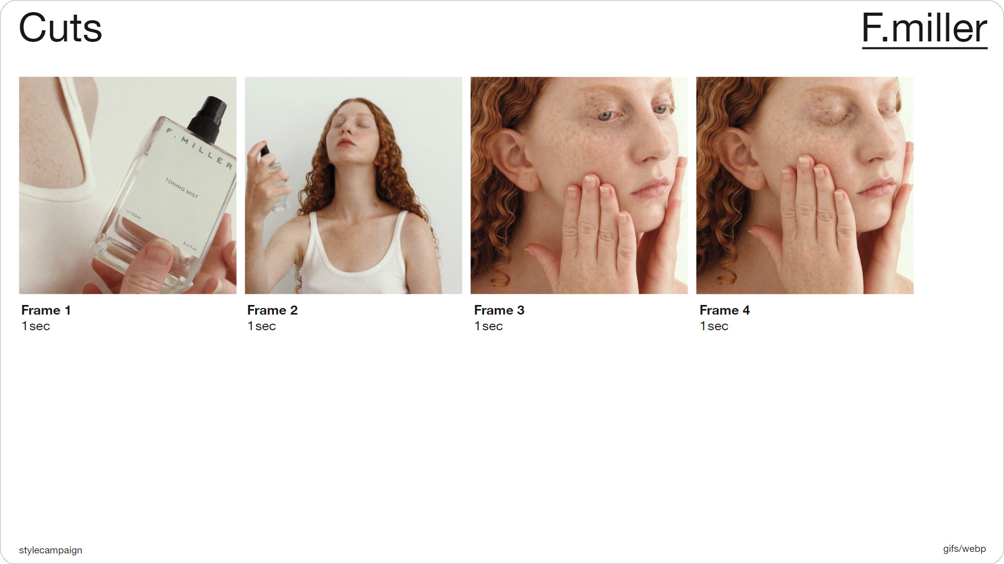
Slide 09, As you can see from this F. Miller example it just cuts between four images.
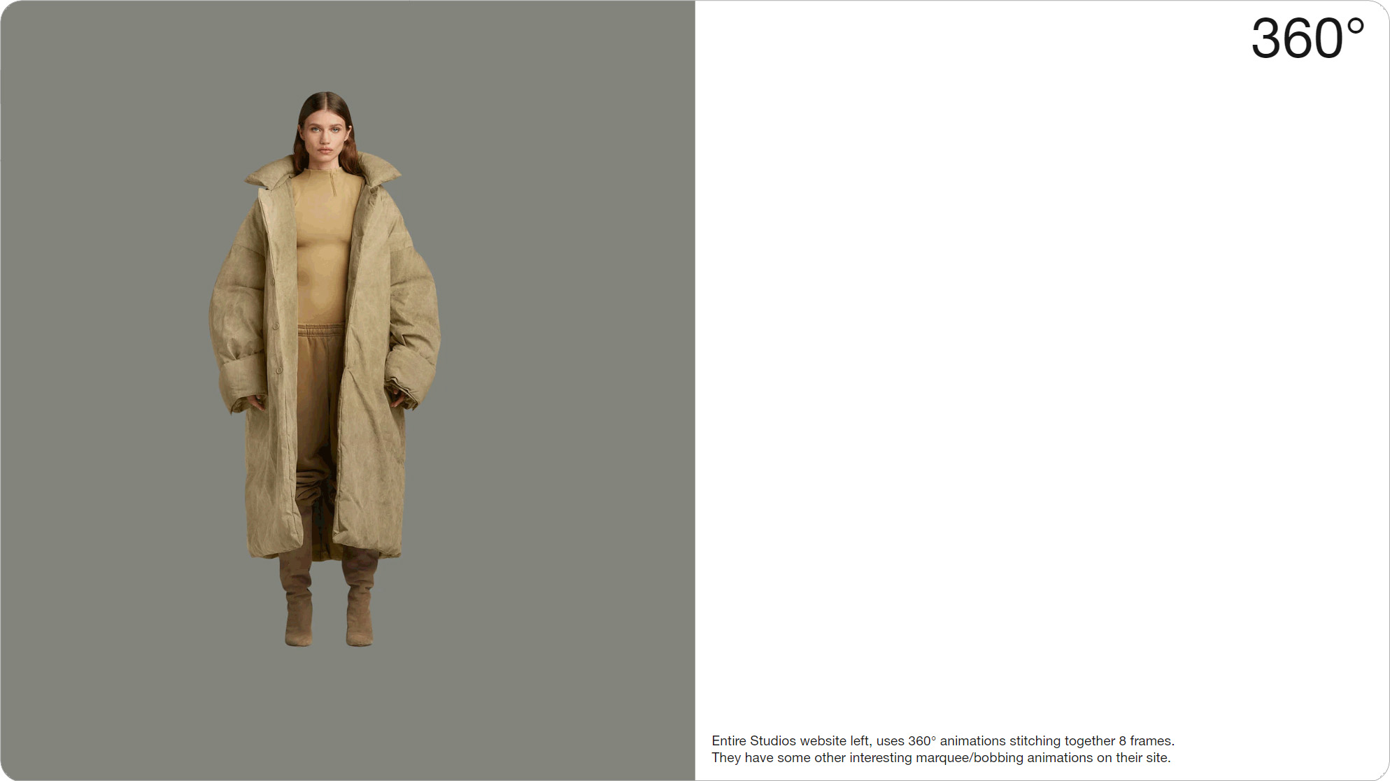
Slide 011, Entire Studios website, uses 360° animations stitching together 8 frames.
‘Cuts’ made up 54 out of the 100 animations. As you can see from this F. Miller example it just cuts between four images. You set the frame order and the timing (in this case 1 sec per frame). The ‘cuts’ are highlighted in white, and most were between only 2 – 4 frames long. Something like this 360 from Entire Studios might take you up to 8 frames.
All 54 animations in this group use the same basic technique, whereby they’re just slicing between a small number of frames. As they’re mostly promotional, they might only get used for one or two sends, so designers likely won’t have much time to spend on them. Possibly something like a welcome series, might get more time and budget spent on it. Though you can still get creative with these short loops.
Slide 014, Stack Overflow Email Guidelines.
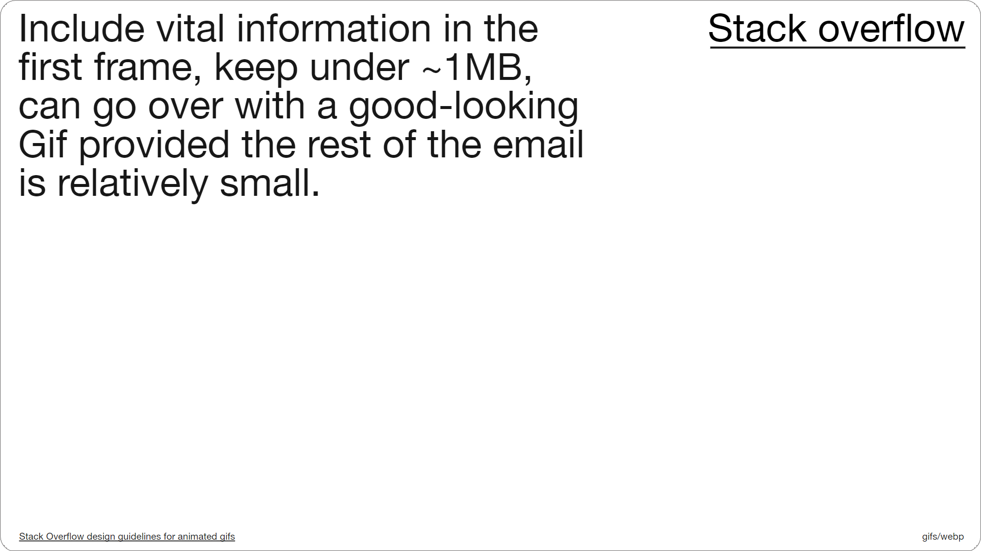
There isn’t really a definitive file-size recommendation for animated Gifs in email, I think the closest we have is probably 1MB, in that I’ve seen it mentioned by Mailchimp, Litmus and Campaign Monitor. This is from Stack Overflow’s email guidelines. So here they say to keep it roughly under 1MB, though you can make an exception for something special, assuming the rest of the email is relatively small. There’s also a mention of the first frame, and making sure any vital information is placed there.
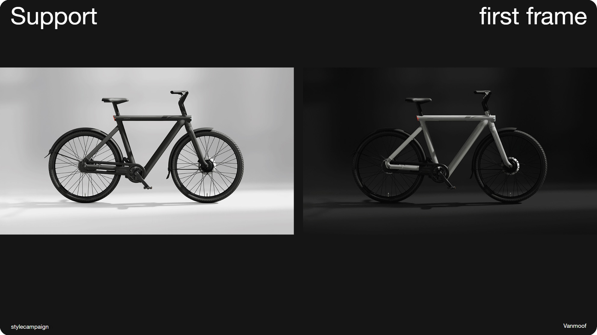
Slide 015, Above Vanmoof, some old desktop Outlook clients will only show the first frame.
This is because although animated Gifs are supported pretty much everywhere, some older desktop Outlook clients will only show the first frame, and as we’ll get into a bit later, it's also a consideration for WebP. So here Vanmoof still have a nice bike image on the right, even if we’re only viewing the first frame.
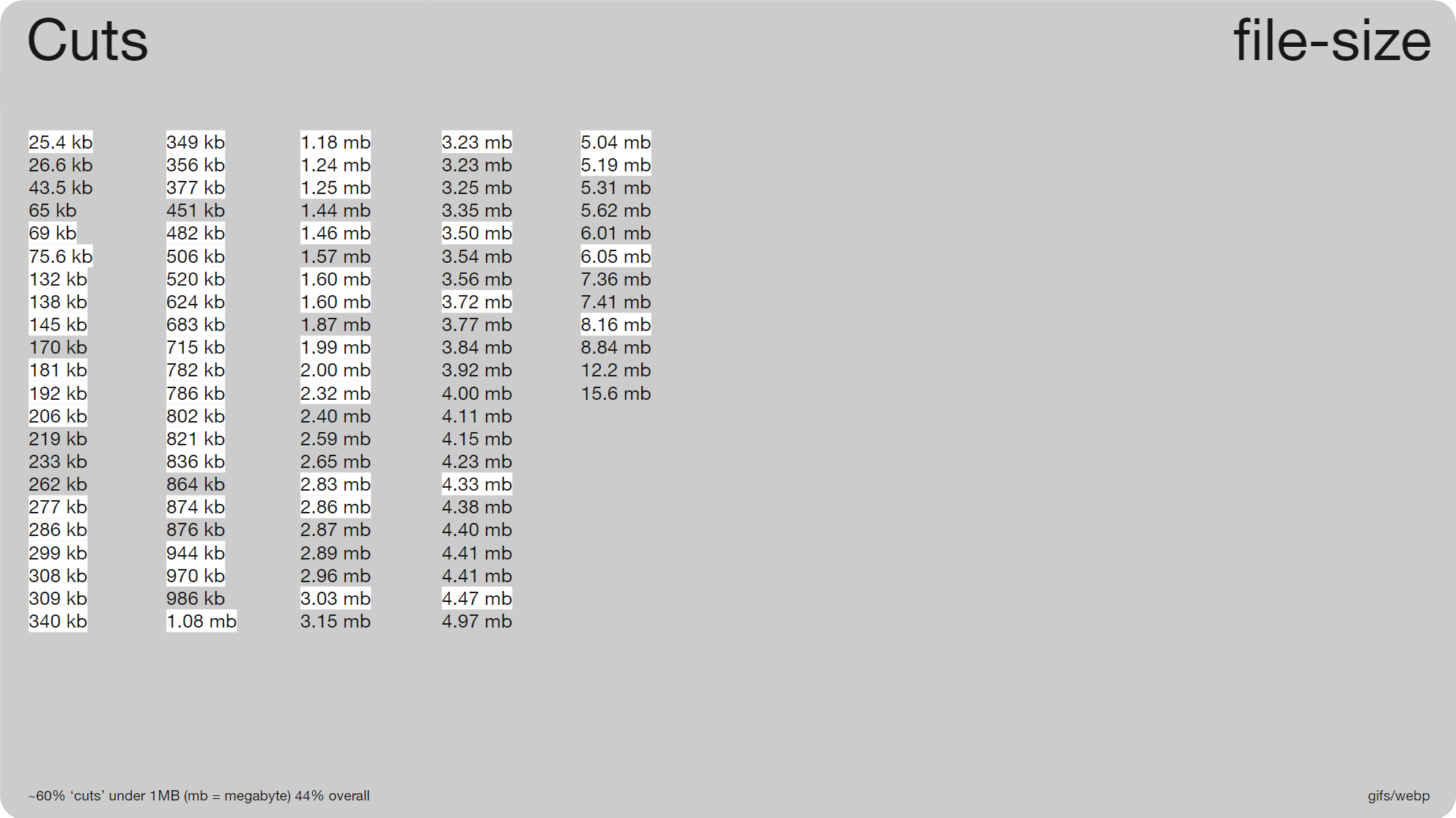
Slide 016, ~60% 'cuts' under 1 MB, and only 44% overall.
So getting back to that 1MB value. These were the file sizes for all 100 animations, again the cuts are highlighted in white. 60% were under 1 MB, but only 44% overall. So down here, on the bottom of the second column is where we hit 1MB. Assuming that's a difficult benchmark, and this implies that it might be , you may find it easier to audit your own creative so you have some real numbers to work from. Then you can gradually work in some improvements.
1 sec load times
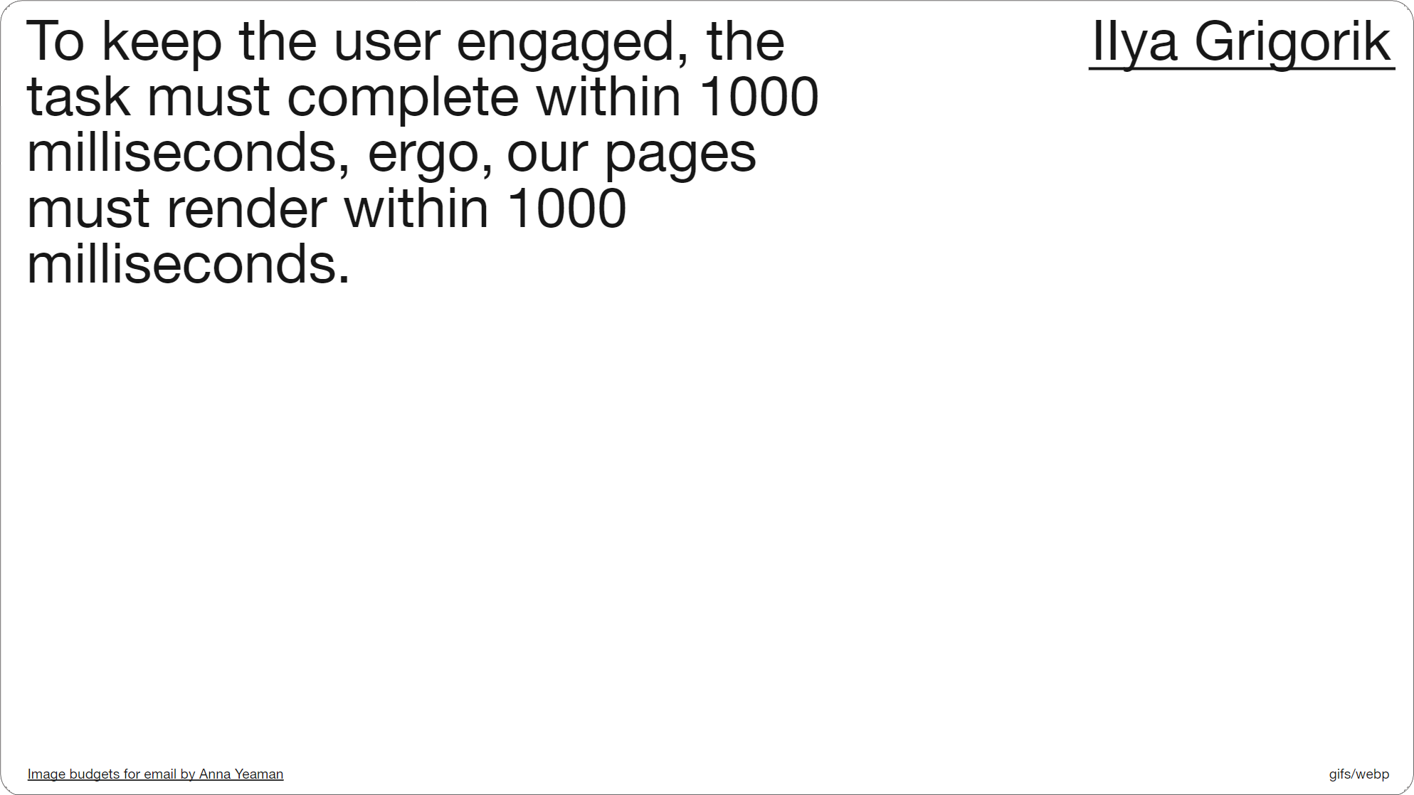
Slide 017, IIya Grigorik, Our pages must render within 1000 milliseconds.
You might want to factor in the 1 second rule, I grabbed this quote from one of my old blog posts titled ‘Image budgets for email’, and I was trying to figure out what 1 sec of image-weight looks like. I had it ~300KB in 2016, but that data’s likely old; I believe the 1MB threshold is loosely based on more current load time figures.
Minimum Viable Budgets
Slide 018, Tammy Everts, Performance Budgets talk.
If you want to do your own load time testing, this talk by Tammy Everts gives an introduction. Here she talks about fighting regression, and suggests that you look at your own data from the last 2 – 4 weeks (for email that might be longer), and then set the worst number — and not the best — as your performance budget. So in our case that would be the largest image size. Then just try not to go above that threshold again; after which you can work to bring it down. So it's a bit more of a pragmatic approach.
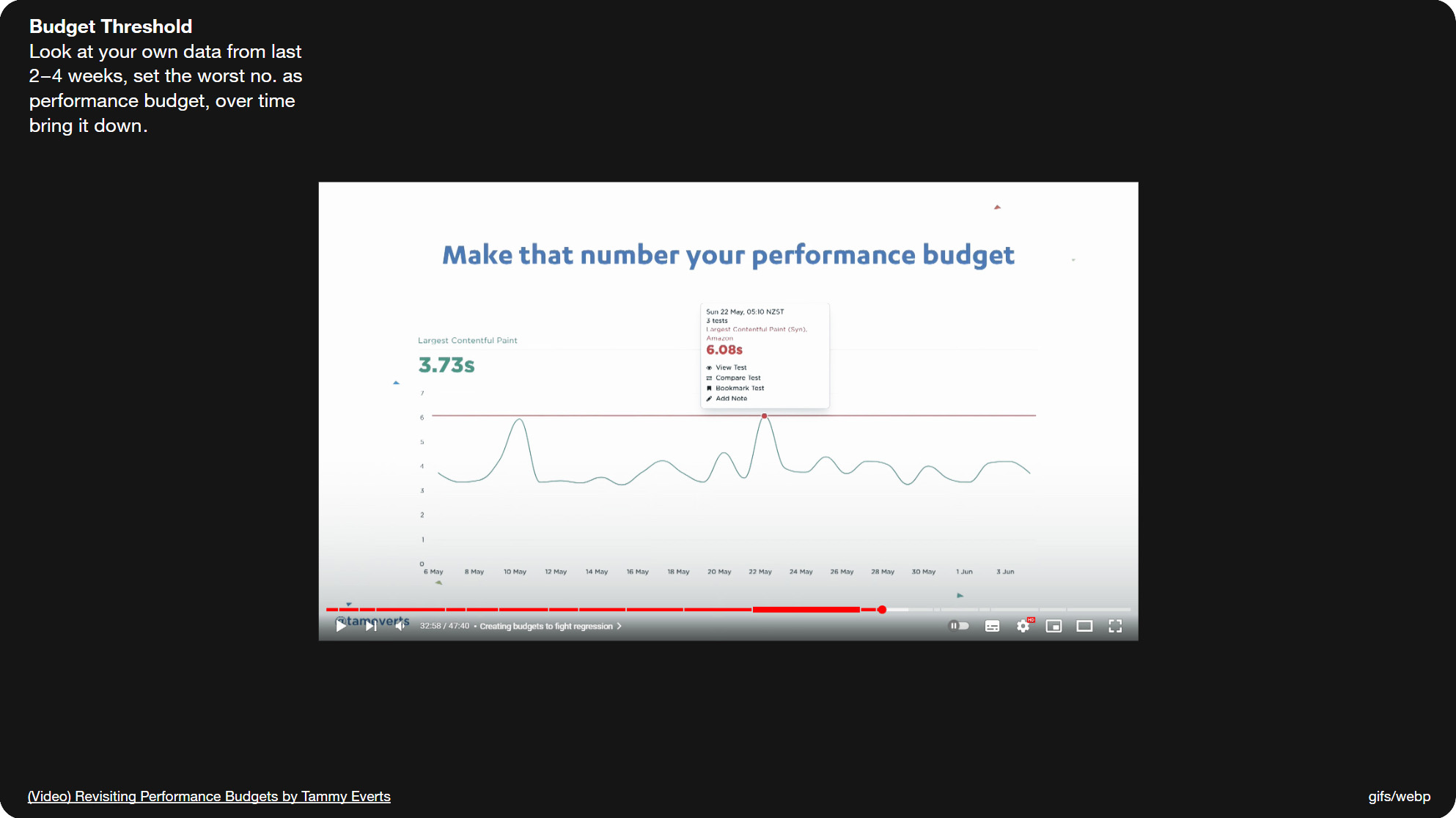
Slide 019, Metric in this image is the Largest Contentful Paint, or (LCP).
BTW the metric in this image is the Largest Contentful Paint, or (LCP), and you can see it over there on the left in green. This measures the amount of time it takes for the largest visual element, which is usually an image or a video, to render. And this is a useful metric because 50% of users won’t touch a page until most or all of the images have rendered, and not when the text first appears. So it’s a cue, once that animation or video has loaded, that it's safe to interact with the page.
Carbon Footprint
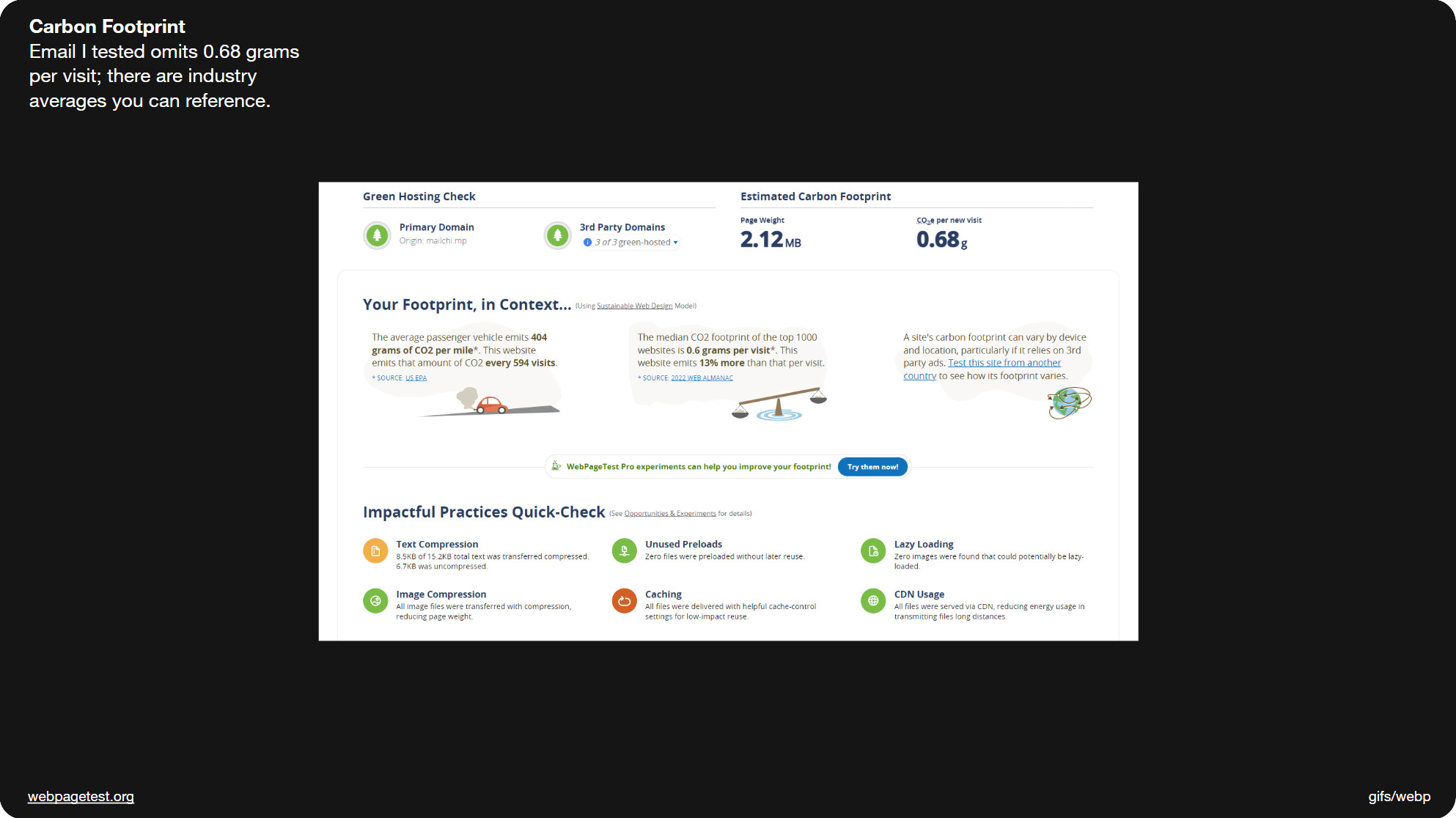
Slide 022, Webpagetest recently added a feature which measures your carbon footprint.
Webpagetest have also recently added a feature which measures your carbon footprint. For instance the email I tested omits 0.68 grams, and they give you some comparisons to websites and car emissions. Websitecarbon.com is another online carbon calculator. It’s a metric some of you might want to track.
Alice Li is giving a talk about eco-friendly emails later this year at Litmus Live (as is Ted Goas at Email Camp), so hopefully some of you will be able to catch those. There's additional links in the slide notes, such as this article where MEK explain how they designed their website to reduce its CO2 emissions and energy consumption.
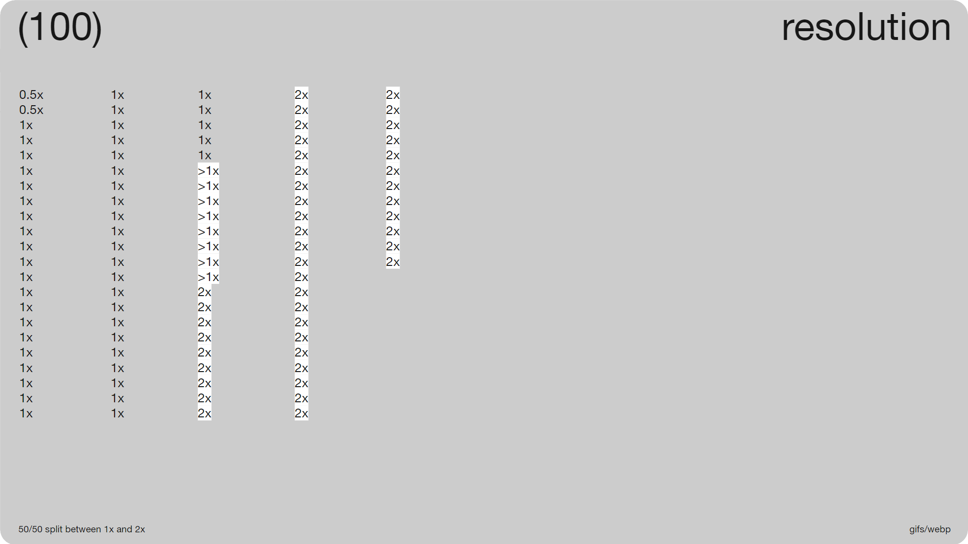
Slide 023, 50/50 split between 1x and 2x resolution.
One reason file-sizes seem to be increasing is we’re doubling up the resolution. There was a ~50/50 split between 1x and 2x res (49 vs. 51) for the 100 animations. This is where say a 600 × 600px image is replaced by 1200 × 1200 px, it’s so that it maintains its quality on high res monitors. The code stays at the original size so 600 × 600px, it’s not something that needs to be adjusted. As you can see in the third column, it doesn’t have to be strictly twice the size, you can go with 1.5x, as long as you maintain the image ratio while increasing the size. If we look at just the cuts ~65% (35/54) were greater than 1x res.
Industry and Audience Stats
It’s hard to know whether to 2x animations or even videos, it will likely depend on your industry and priorities. This Cloudfour article talks about how 2x res can be especially important for eCommerce in order to reduce the risk of returns; I think in regards to color fidelity. It mentions a survey by Cloudinary, obviously it's a bit to their benefit, but if you’re a fashion retailer you’ll want to use the highest quality images you can get away with, and that may be slightly more of a priority than the time it takes to download. It’s also fashion retailers who’ve been the first to adopt WebP and AVIF formats in email, at least from what I’ve seen.
The article also references a post by Jake Archibald, who argues that the majority of users are on high density displays. He shares some stats from the UK government site, Gov.uk which show that 80% of their users are on higher res screens, and though that’s UK specific, it does give you an idea.
Slide 029, none of the 'cuts' used a cross fade.
Though one way we’re saving on file-size, is no one uses fades anymore (0/54 ‘cuts’). Years ago, you’d sometimes add a crossfade in between the frames. Though it can feel a little dated nowadays, and it adds to the file-size.
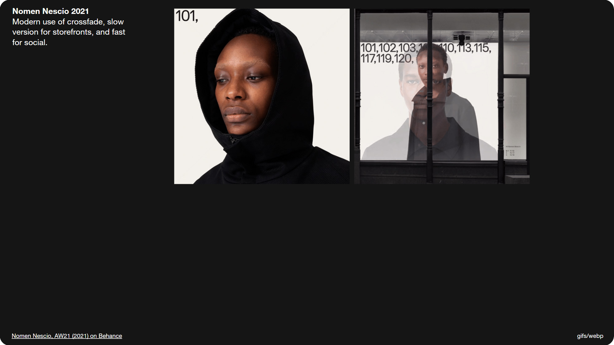
This Nomen Nescio animation from 2021, manages to make crossfades feel quite modern. There’s a slow version that you can see here which is for storefronts, and a fast version for social media. I’ll briefly show you the fast version, though heads up it does have some flickering. It does make good use of all those images though. Speed affects both accessibility — we have the three flashes per second rule — and the overall tone. And as this shows, it can vary depending on the context.
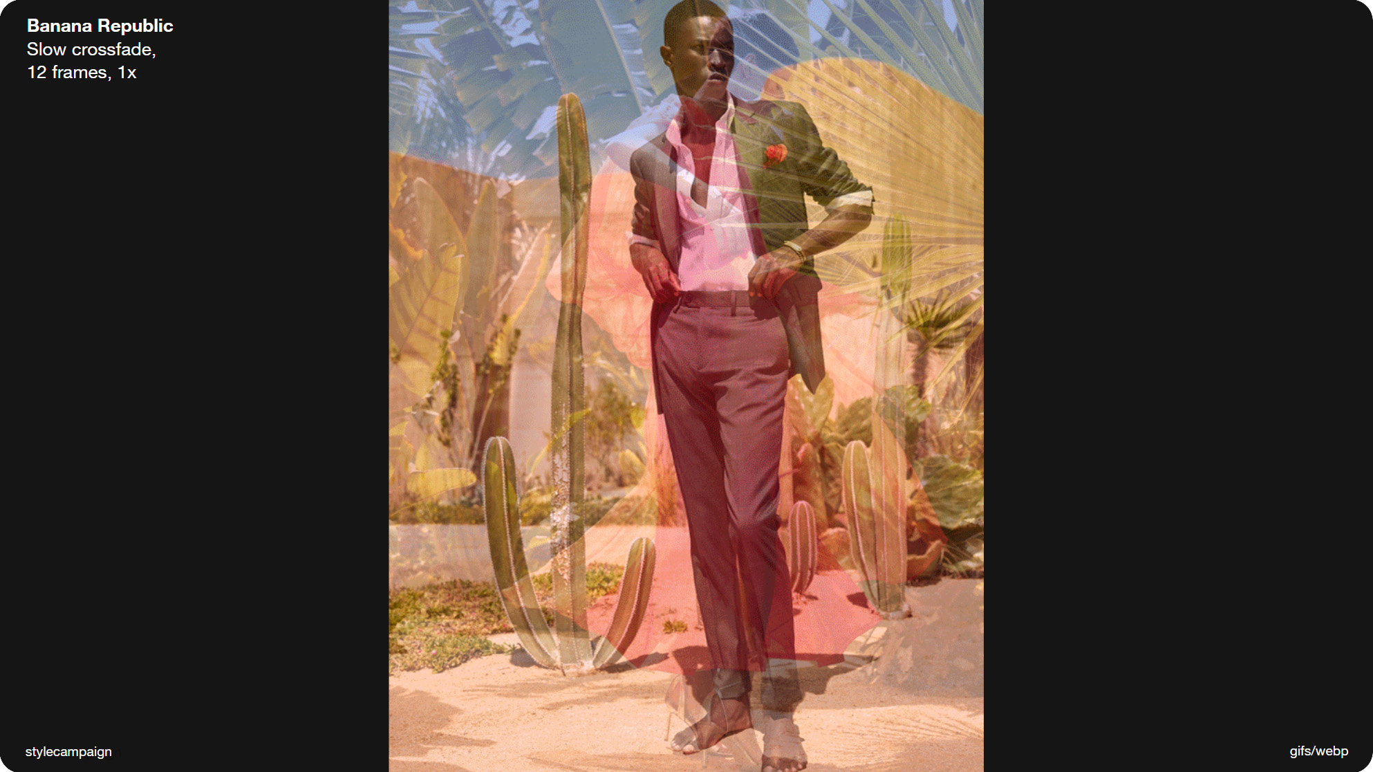
Slide 030, Hero animation slow crossfade from Banana Republic.
Just as I was saying no one uses fades anymore, I received this hero animation in an email from Banana Republic. Like the Nomen Nescio example, it’s quite a slow fade. Banana Republic don’t use animation that often, but the little they do seems well considered. Rather than sending out a large number of ad-hoc animations, they appear to be reusing the same handful just with different creative. Maybe a younger audience would demand more frequent and varied animations.
Slide 031, toolkit of reusable animations.
Having a toolkit of reusable animations makes a lot of sense, just like having a collection of pre-built email modules; It saves time and keeps the branding consistent. So maybe think about how you can consolidate your animations, and package them up, and that way you’ll always have something on-hand. Just like with email templates, creating endless one-offs isn’t very efficient. You can include these types of resources alongside your animation guidelines, for instance Material design have a ‘motion design kit’ with After Effects files, and Audi have some example animations.
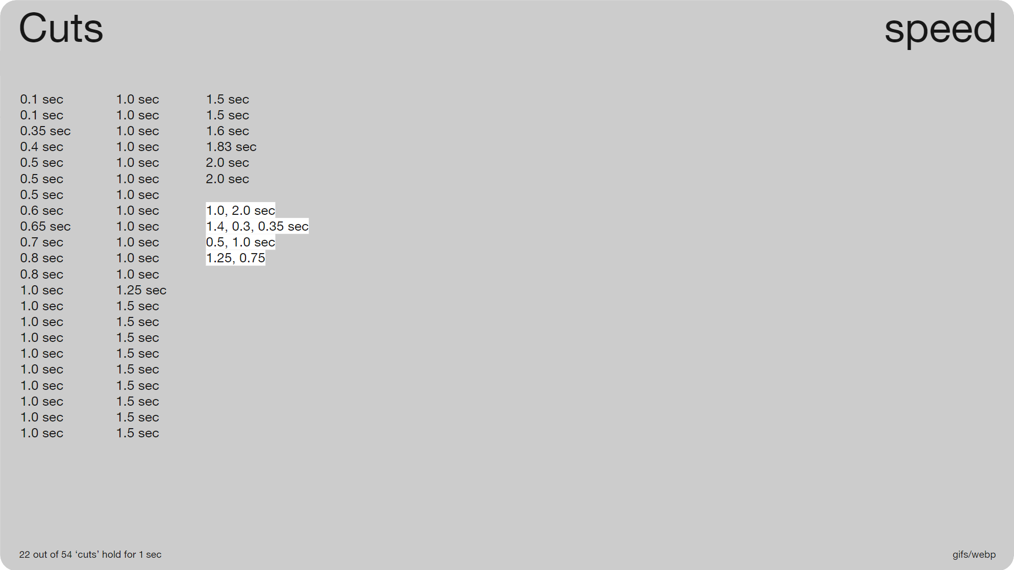
Slide 033, 22 out of 54 'cuts' hold for 1 sec
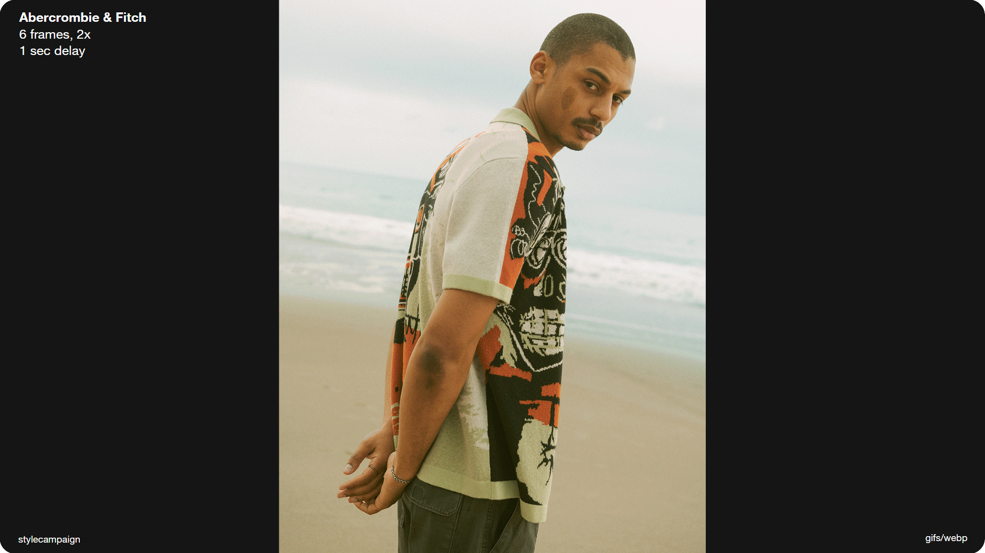
Slide 034, Abercrombie & Fitch animation goes, 1sec, 1sec, 1sec etc. delay same the whole way through.
Unsurprisingly 1 second and then 1.5, were the most popular speeds used with ‘cuts’. Most of these animations don’t speed up or down (50/54), their timing is constant. So as you can see here (Abercrombie & Fitch animation) it goes, 1sec, 1sec, 1sec so the delay is the same the whole way through.
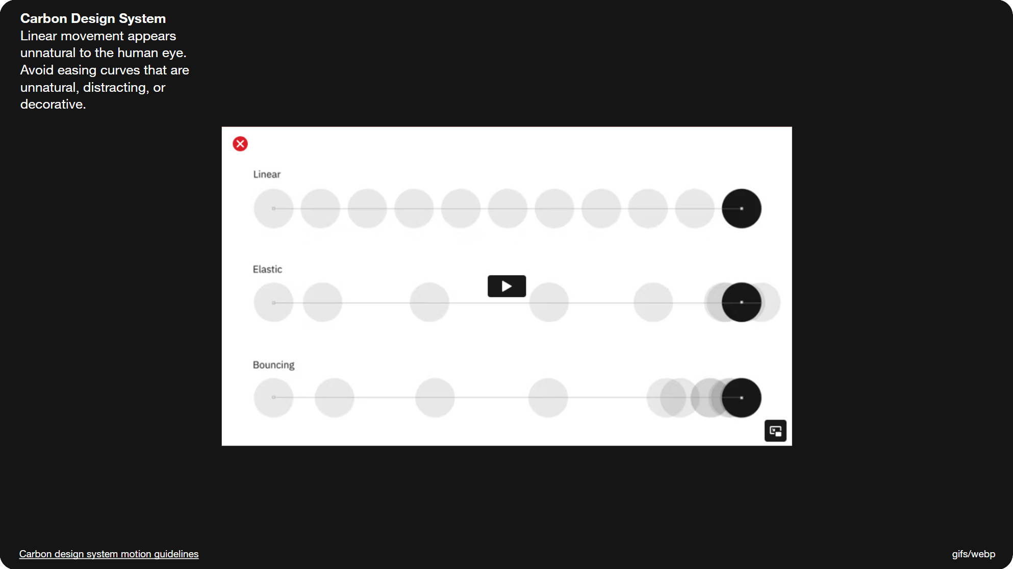
Slide 035, Carbon Motion Guidelines they rule out using linear movement.
A few of the design systems I looked at mentioned using natural looking animation, and went into detail about easing. In the Carbon Motion Guidelines they rule out using linear movement, saying that it appears unnatural to the human eye.
Varied Timing
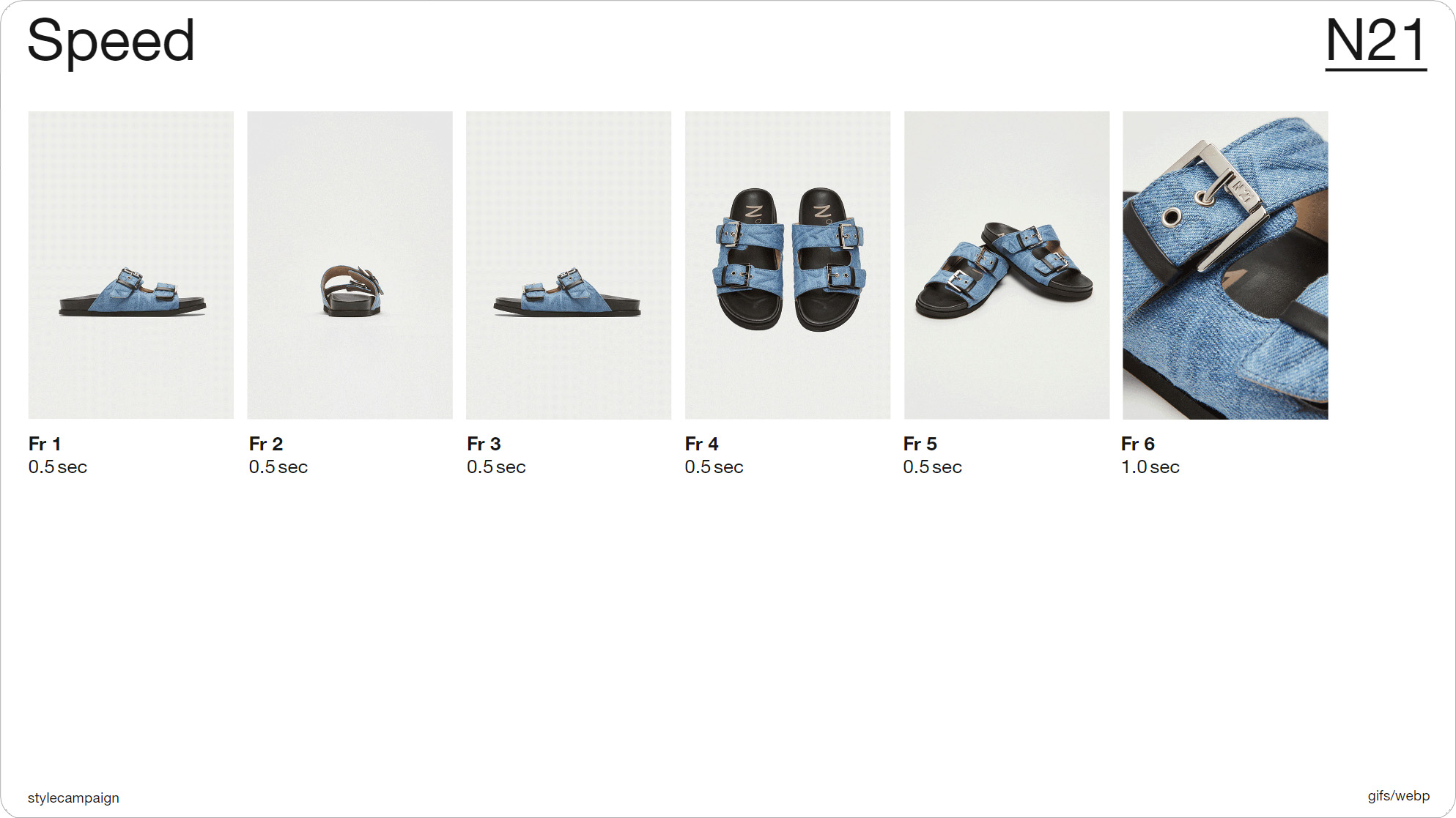
Slide 036, N21 held longer on the last frame, 1,2,3,4,5, hold.
Four out of the 54 ‘cuts’ did vary their timing, possibly in an effort to mimic easing in some small way. N21 held longer on the last frame and this interrupts the loop slightly, so now it feels like there’s a beginning and an end. So it goes, lets see if I can catch it 1,2,3,4,5, hold; 1,2,3,4,5, hold.
Patagonia also added an extra second to the last frame. So this is a two frame animation, and it goes one second, then two seconds. So let's see, one second, two seconds. One second, two seconds. That extra pause at the end gives you time to absorb the message, and take a breather before it starts up again.
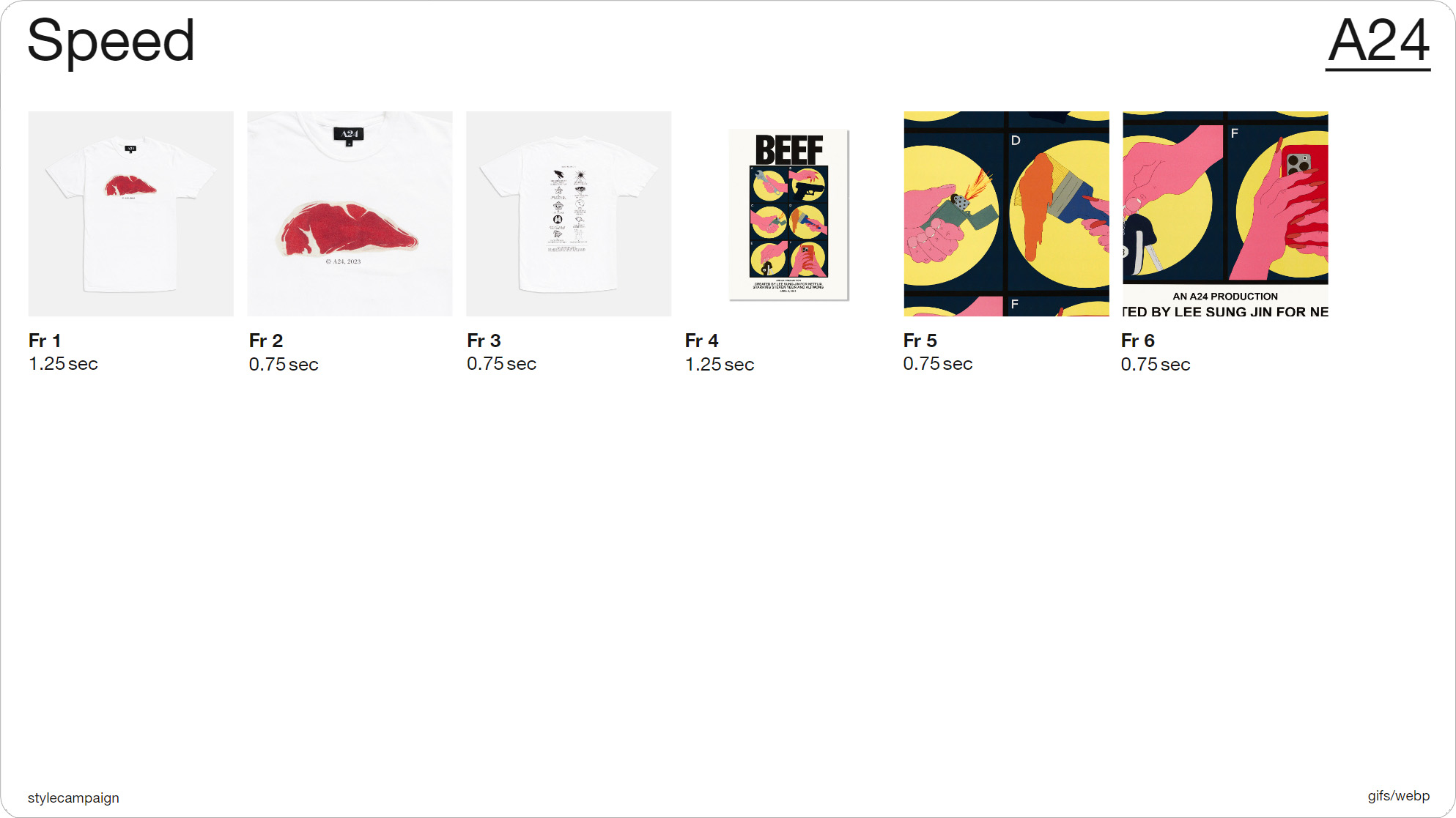
Slide 039, A24 are going slow, fast, fast, slow, fast, fast.
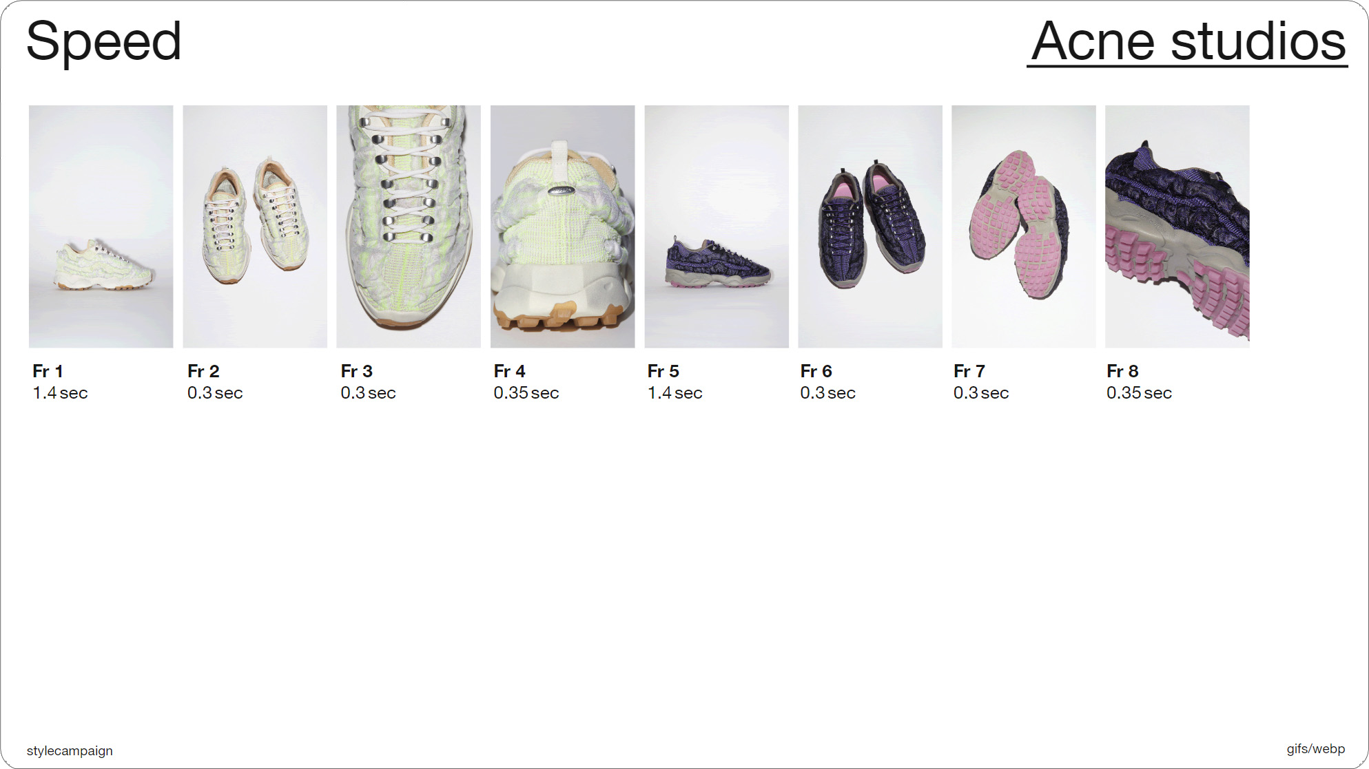
Slide 041, Acne studios hold longer on frames 1 and 5, and then speed up.
A24 are going slow, fast, fast, slow, fast, fast. They reset the timing when they introduce the second product on frame 4. So let's have a look, we’ve got slow, fast, fast, slow, fast, fast. Acne studios do the same thing, they hold longer on frames 1 and 5, and then speed up. So it’s hold, speed up, speed up, slow down a tad, then hold, speed up, speed up, slow down a tad. So I'll show you that.
This pattern can help to distinguish between multiple items, and it's quite dynamic compared to constant timing. Though there is that 3 flashes per second rule to bear in mind, if you are going to experiment with timing, and especially if you’re speeding frames up.
for people with reading or attention disabilities, never-ending
Gifs make it difficult to read surrounding text.”
BBC 'Gel' system guidelines
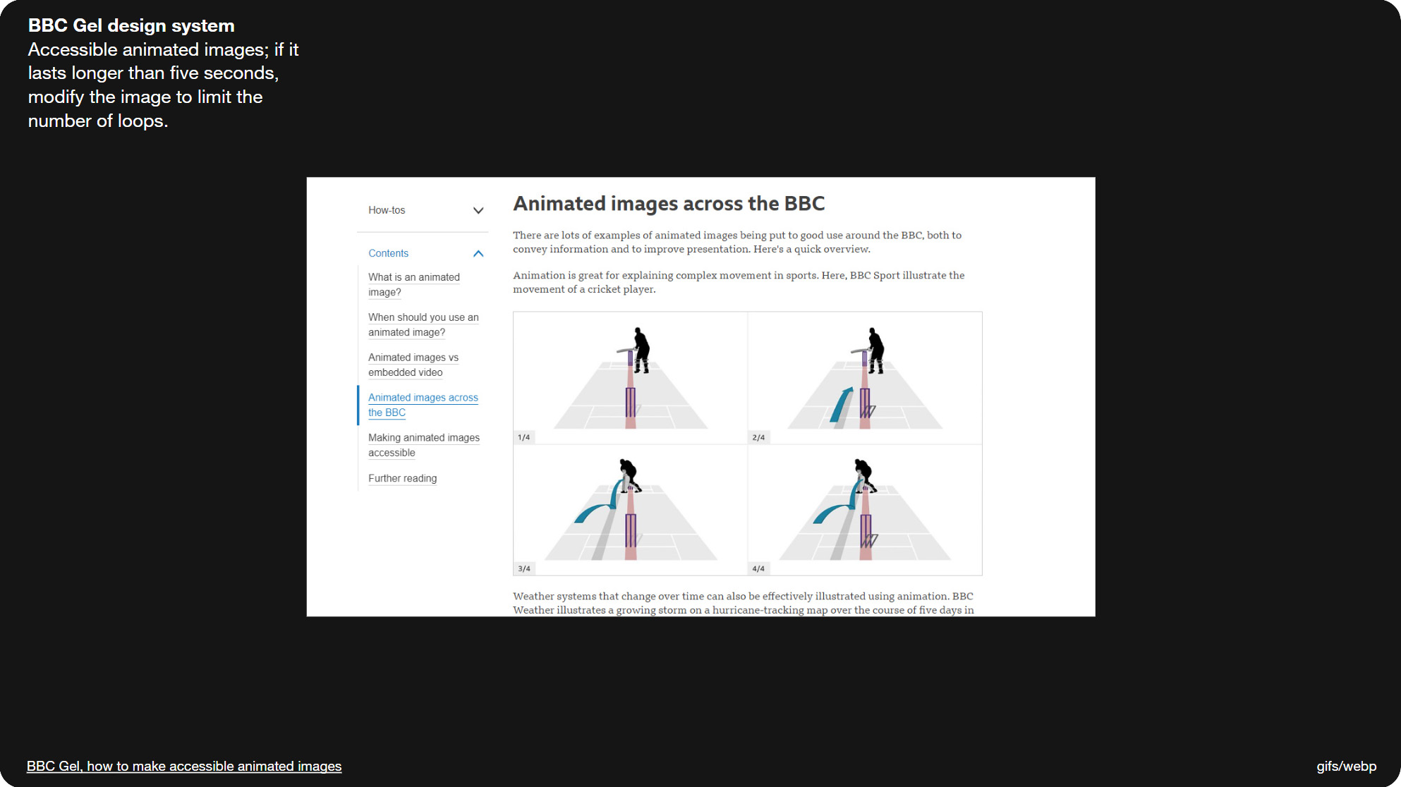
Slide 044, BBC Gel design system have a section on animated Gifs.
These are the motion guidelines from the BBC, their design system is called ‘Gel’ and they have sections on animated Gifs and also accessible emails. They suggest that you only play Gifs through once, as looping can affect people’s ability to read the surrounding content. There’s also a whole section on measuring your loops, so as to not go over 5 sec total, which is a, is it We-cag?, WCAG success criteria for animated Gif's. So you could set it to loop twice, just so long as those 2 loops don’t exceed 5 secs total. And this is the link the BBC gives for that 5 sec rule.
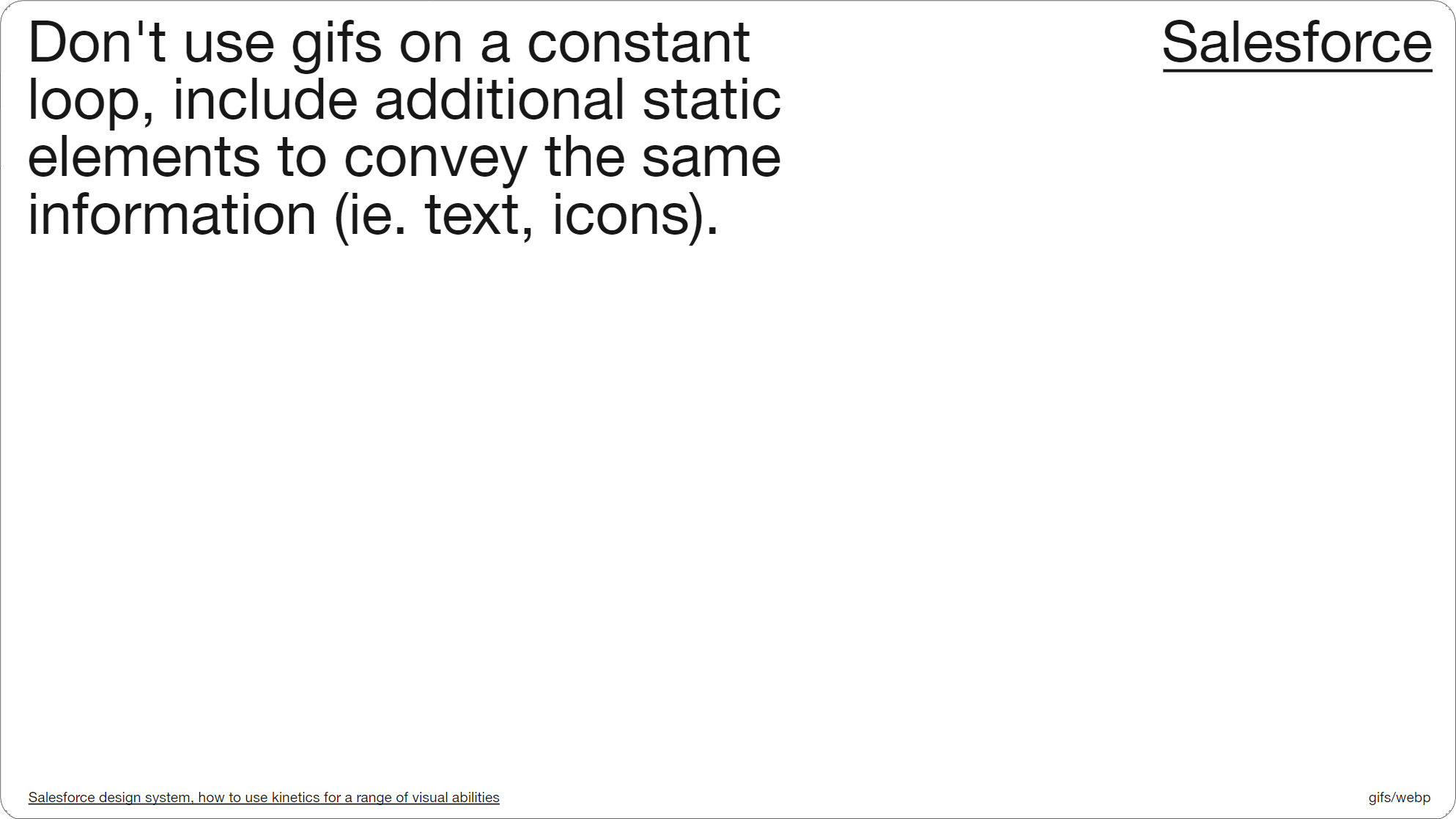
Slide 046, Salesforce motion guidelines state not to use Gifs on a constant loop.
Salesforce motion guidelines also state not to use Gifs on a constant loop, and to make sure you repeat any information in a static format such as text. All the ‘cuts’ that I saved out of my inbox looped forever; when you save an animated Gif you do have the option to have it play through once, or to set a custom number like four times.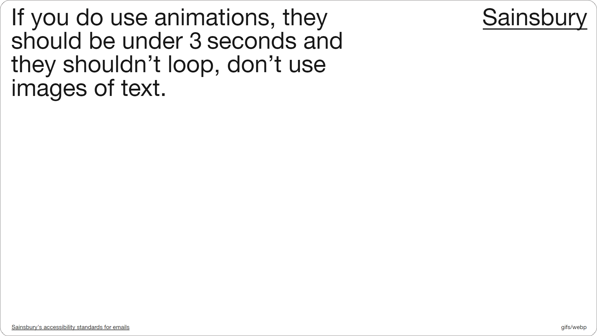
Slide 048, Sainsbury’s email guidelines say don’t use images of text.
Sainsbury’s also have some email guidelines, and they start by saying to avoid using animation where possible, but if you do to keep it under 3 sec, avoid loops, and don’t use images of text. And they stress not to put text in an animation. I think around a third of the 100 animations I saved had some kind of text as part of the image (32/100). Unless you rule it out completely like Sainsbury’s, there’s a bit to consider, beyond the obvious stuff like always using alt text.
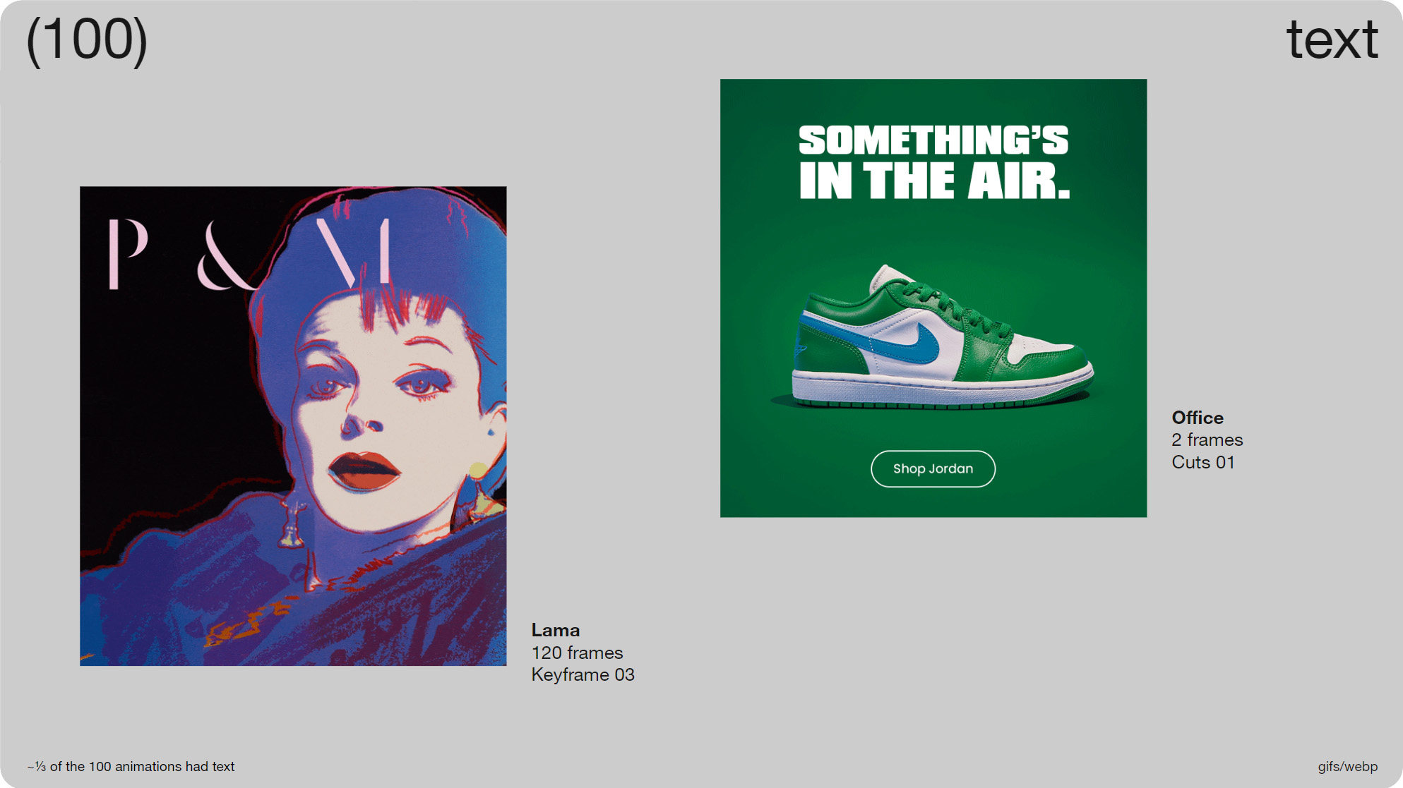
Slide 049, 1/3 of the 100 animations had some kind of text as part of the image.
For instance, do you differentiate between the text itself animating, like on the left, or just the background like on the right. Is the text obscured at any time. Sometimes with cuts you have text on one frame, it pops up, then disappears again and you find yourself chasing it a little bit. Also is the information repeated elsewhere, like Salesforce just mentioned in their guidelines.
With this Lama email on the left, they had a live text title right above the animation saying ‘Prints & Multiples’ which is what the P&M that’s being drawn stands for. I’ll see if I can find it, there we go. So you can see the live text title above the animation, so in this case the animation is almost supporting content, just decorative.
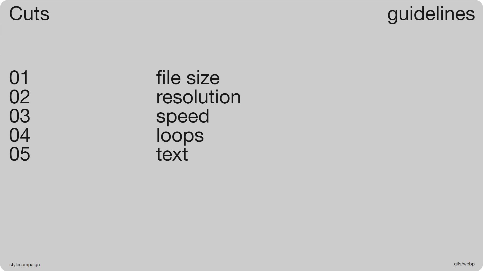
Slide 050, Recap, file-size, resolution, speed, loops, text.
So just to recap, we’ve covered file size and how you might set a limit using either 1MB or your own numbers, resolution and whether to use 1x or 2x res and how its more of a priority for some brands, speed and whether to use constant or varied timing, looping and some of the recommendations around that, and lastly whether or not you’ll want to include text. Your own animation guidelines will likely include one or more of these elements.
Though it doesn’t have to be a book, just something clear and concise, which is why I like some of the shorter guidelines that I've shared. Like Sainsbury's who I mentioned before and have just 7 items, you’re able to quickly read through them, and as a designer it’s definitely helpful to have something to go off. If you don’t have a designated place for your guidelines, you can just put them in a deck, as long as everyone has access to them.
Slide 053, Material Design and Apple HIG both have sections on motion.
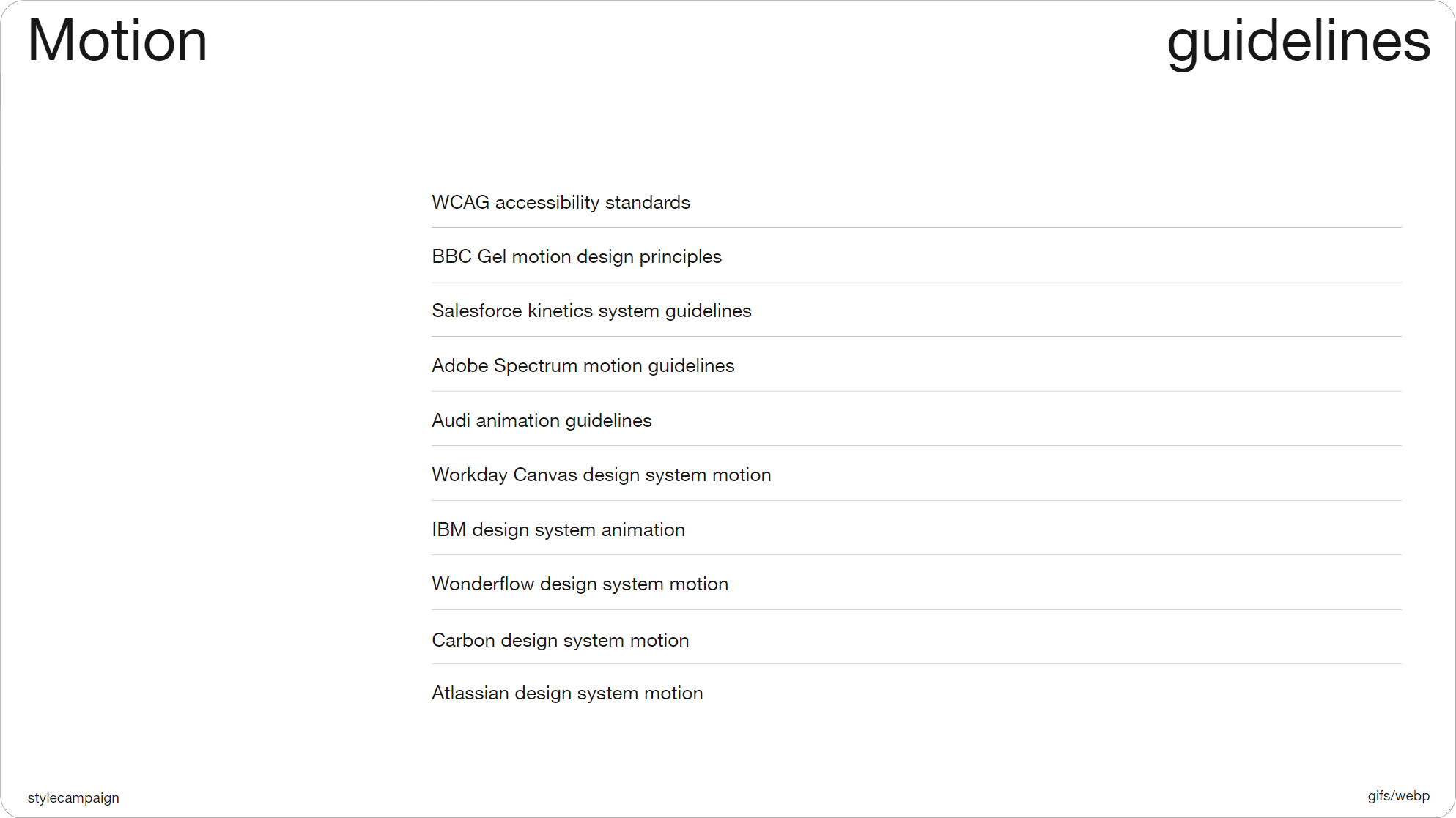
Slide 054, Motion guidelines, not email specific, but worth going over.
- WCAG accessibility standards
- BBC Gel motion design principles
- Salesforce Kinetics system guidelines
- Adobe Spectrum motion guidelines
- Audi animation guidelines
- Workday Canvas design system motion
- IBM design system animation
- Wonderflow design system motion
- Carbon design system motion
- Atlassian design system motion
It helps to look at other people’s guidelines; Material Design and Apple HIG both have sections on motion. As do all of these (above). While not email specific, they’re worth going over. As well as having lists of do’s and don’ts, they talk about when and why to use animation, they maybe share some examples, or discuss tooling. Whatever is helpful to getting the job done. For email you’d probably have animated Gifs, and possibly CSS animation.

Slide 055, Val Head recommends carrying out a motion audit.
Val Head has been writing about motion and design systems for a while, and recommends starting with a motion audit. Many of us already do a module patterns audit when working on email systems, so it's not an unfamiliar process. Obviously we’d have our own take on it as email designers. ‘Animation in Design Systems’, was a free ebook by Val Head.
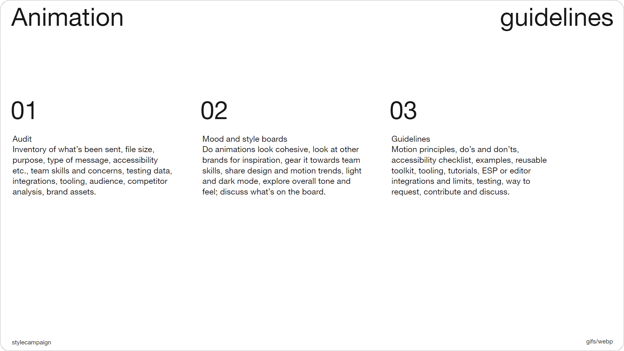
Slide 057, Rough breakdown of animation guidelines process.
So this is rough breakdown of some of the things I’ve looked at when doing animation audits. One thing you might note is the purpose of the animation. Was it to highlight a product feature, or express a mood such as excitement. Culture Amp assign moods to some of their components, this is an ’informative intro’, and each of their illustrations are nicely animated. Once you’ve taken inventory of your past animations, things like motion principles will become clearer, as you’ll be able to see when and how you use animation most often.
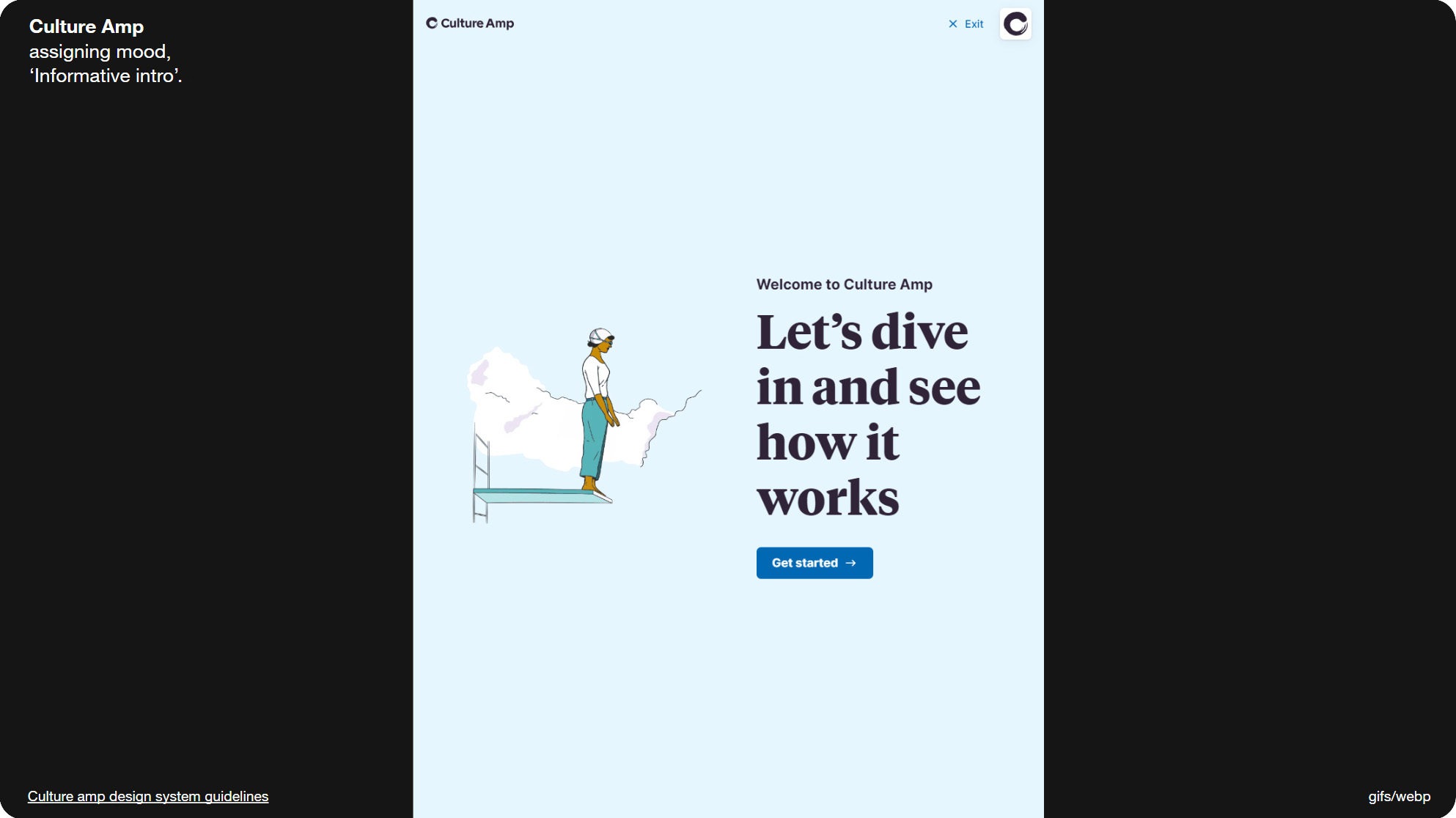
Slide 058, Culture Amp assigns moods to some of their components.
Mood and style boards can be helpful; for instance if you were to put a bunch of your animations together, do they look cohesive. From this you can come up with a first draft of your animation guidelines. And as we’ve seen, it's not unusual for that to be just a short list.
Slide 060, 5 out of the 100 brands were using animated WebP files.
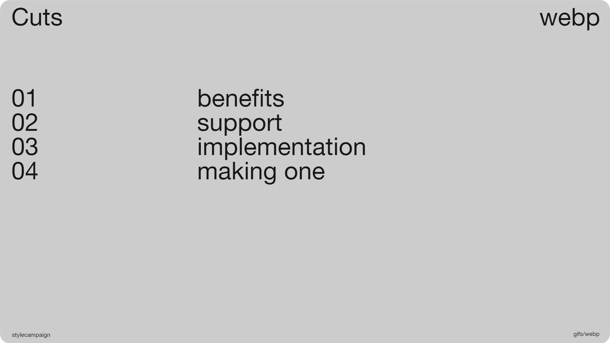
Slide 061, WebP, benefits, support, implementation, making one.
In the past we’d have stopped with animated Gifs, but now there’s a whole extra section. As 5 out of the 100 brands were using animated WebP files. So let's look at why we’d want to use WebP, support, how to implement it in email, and then I’ll make a WebP animation.
The WebP file format was created by Google in 2010; and they state that animated Gifs converted to lossy WebP are 64% smaller. They’re also ~30% smaller than a Jpeg, without loss of image quality. So WebP is not only useful for animations, but also for static images.
File size
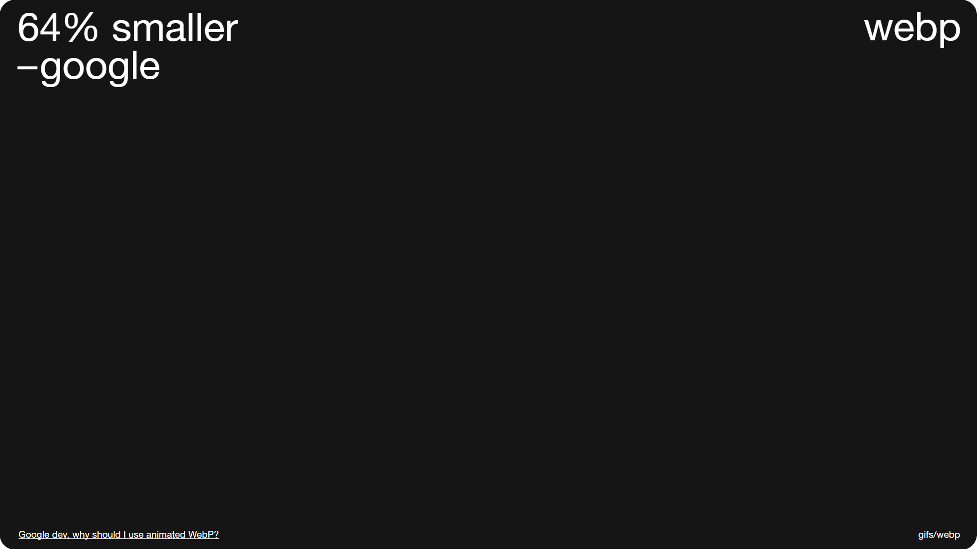
Slide 062, animated GIFs converted to WebP are 64% smaller.
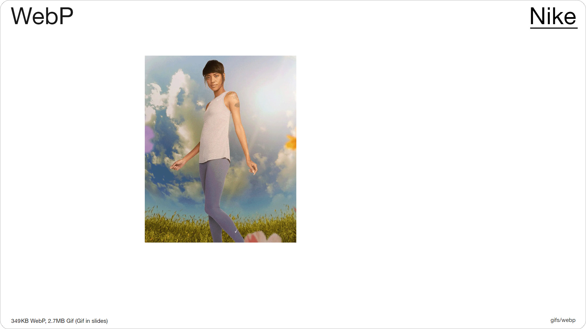
Slide 064, Nike 349KB WebP file, converted to a Gif increased to 2.76MB.
Nike were one of the brands using WebP in email, and this animation they sent me is a 349KB WebP file, and when converted to a Gif it increases to 2.76MB. So the file savings are really significant. My own file size limit for animations like this used to be ~300KB, and WebP takes us back to those kinds of numbers, even if we’re using 2x res like Nike is here. This animation is 4 frames, and the image res is 1125x1380px, so they’re quite large files. And although you can’t see it in the slides, the image quality is noticeably better than that of a Gif; it looks on par with a Jpeg.
Image quality
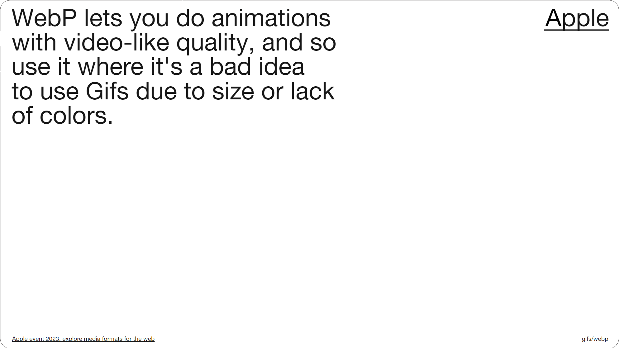
Slide 067, Apple describes WebP as having video-like quality for animations.
That’s because WebP supports 24-bit color, compared to 8-bit Gifs; you’ve only got 256 colors with a Gif so the quality can look a bit off, and you can’t always match up colors accurately. Apple describes WebP as having video-like quality for animations. So it’s a far preferable format to animated Gifs, it’s just a question of whether or not we can use them in email, and if we have the support.
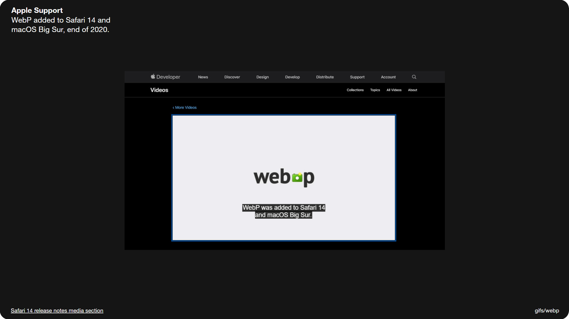
Slide 070, WebP support was to added Safari 14 at the end of 2020.
Slide 071, Caniemail support for WebP at 88–97% if you add in partial support.
So Web browser support is currently at 96.63% (as of June 2023), the only exception is IE11. Support was to added Safari 14 at the end of 2020, and it was maybe just over a year ago that I really started to notice WebP images in my inbox.
Caniemail place email support for WebP at 88%, and that increases to 97% if you factor in partial support. I also ran my own tests (around June 2023), and came up with the same results, so nothing appears to have changed since they last tested it. Ironically Gmail is the main holdout with partial support, as it only displays the first frame of an animated WebP, just like desktop Outlook and Gifs. It also converts the WebP file into a jpeg. But at least Gmail fails cleanly and shows us something; the real issue is older Apple and desktop Outlook clients come in blank.
Broken images
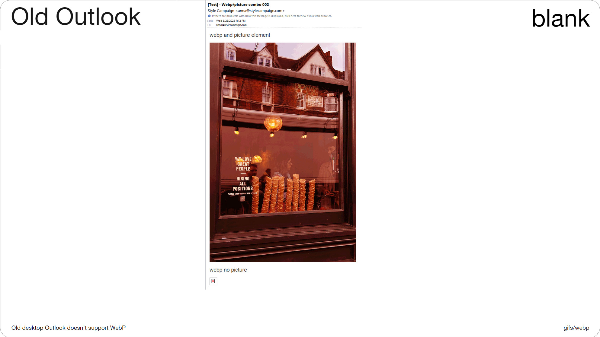
Slide 073, WebP (bottom) failed in old desktop Outlook, broken image icon.
This is one of my tests. You can see that the bottom image failed in older desktop Outlook, there’s just a broken image icon. This is a WebP file that I sent out as normal, just to see where its supported. If this was just an Outlook problem we could use conditionals, but it also fails in older Apple clients. The image above uses the picture element, which fixes our issue, here we get an animated Gif fallback that I colored pink.
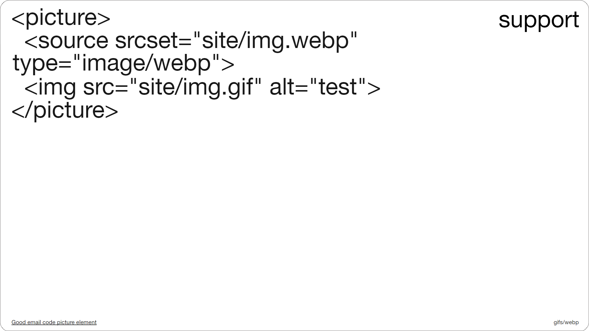
Slide 074, picture element code, WebP with a Gif fallback.
This is the picture element code. And what this is saying is here’s an animated WebP image, and if you don’t support either picture or WebP, then here’s an animated Gif instead (so the pink image we just saw). You could stack other image formats underneath WebP, so you could go WebP, animated Gif, then finally fallback to a jpeg. But after testing different combinations, I ended up going with just these two.
I put 'site’' in the image URL as our ESP doesn’t support WebP, and so we ended up hosting the file ourselves, and I thought some of you might have similar issues. Also where it says type=image/webp, this bit isn’t optional, I say this as I originally left it out of my testing, and it caused some issues for me in older apple clients. So with this small bit of code, newer Apple devices get the animated WebP, Gmail and older Apple clients an animated Gif, and desktop Outlook the first frame of that Gif. So we're covered basically.
Picture support
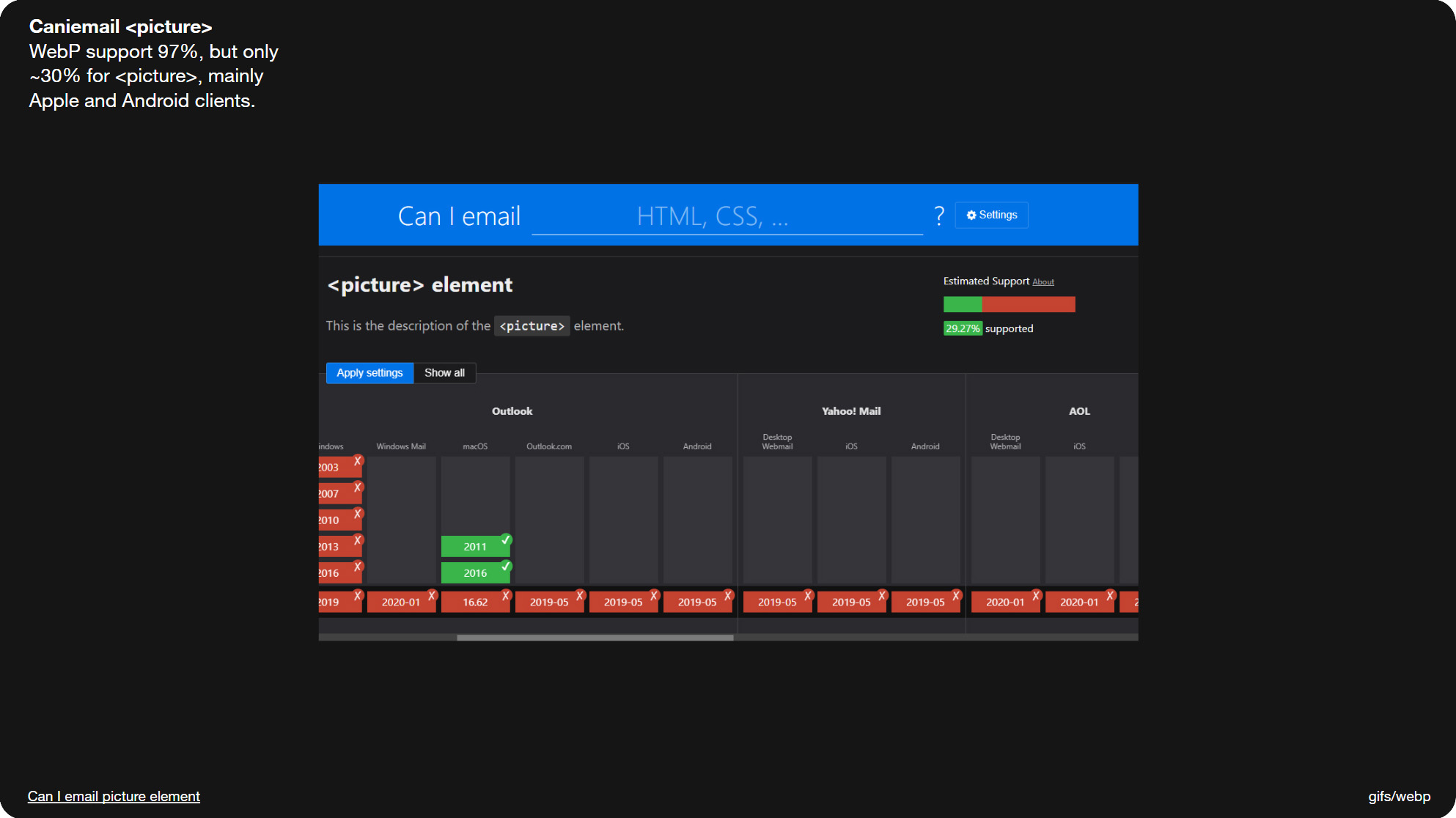
Slide 076, WebP support is at 97%, but there’s only ~30% support for picture.
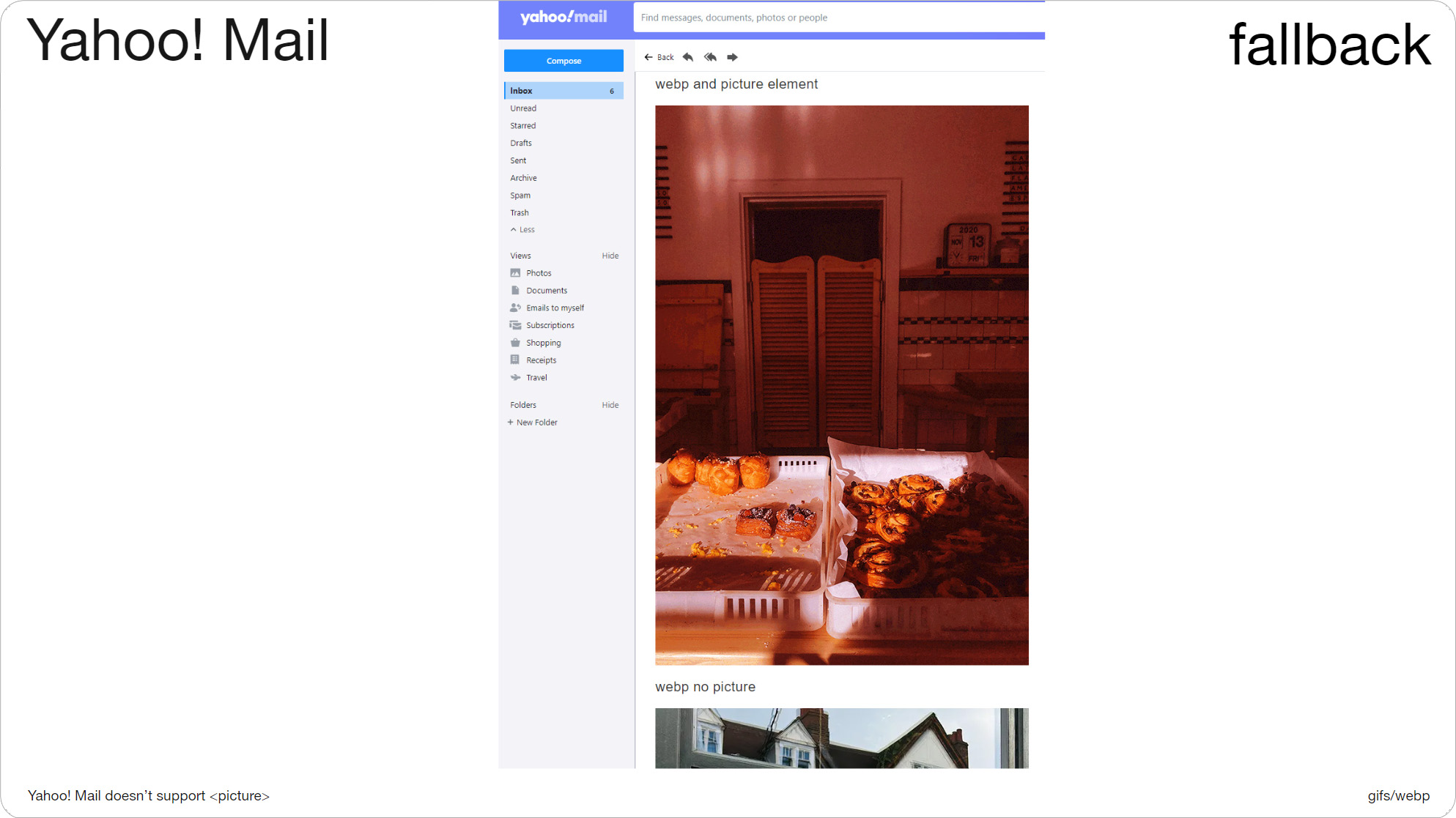
Slide 077, You lose WebP support in Yahoo! Mail using picture.
Though the one drawback is WebP support is 97%, whereas picture support is only ~30%. Which for now is mainly Apple and Android clients. If an email client doesn’t support picture, it just grabs whatever that final fallback image is, which in my case is an animated Gif.
So in places like Yahoo Mail! and Outlook.com which don’t support the picture element, you lose WebP support, and instead get the fallback. Which here is my pink animated Gif. This is the same test in Outlook.com. The image underneath is the WebP animation on its own without the picture element, it's not pink and it plays just fine. So it’s a bit of a compromise. You can use picture and you’ll get solid fallbacks, but you’ll lose web client support.
Email client marketshare
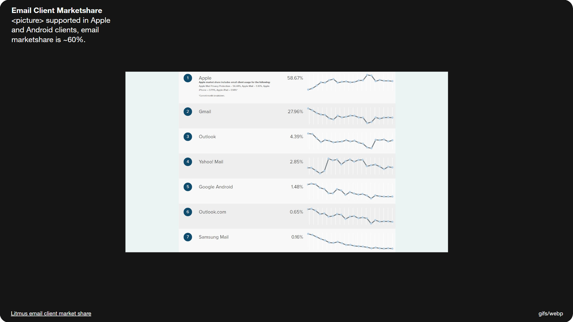
Slide 079, Apple and Android they make up ~60% of the email client market share.
Although picture support is low at ~30%, because it’s Apple and Android they make up ~60% of the email client market share, so it’s still feasible for many brands. Obviously your own audience stats might look a bit different than this. Also anyone viewing the online version will get the WebP animation, so there’s benefits there also.
Internal test
So that’s one way you can implement webp animations in email, and the picture element is really only a few extra lines of code. You can take, for instance, a couple of email modules and make webp variations, just to test internally with your own creative, and you’ll be able to see how straightforward it is.
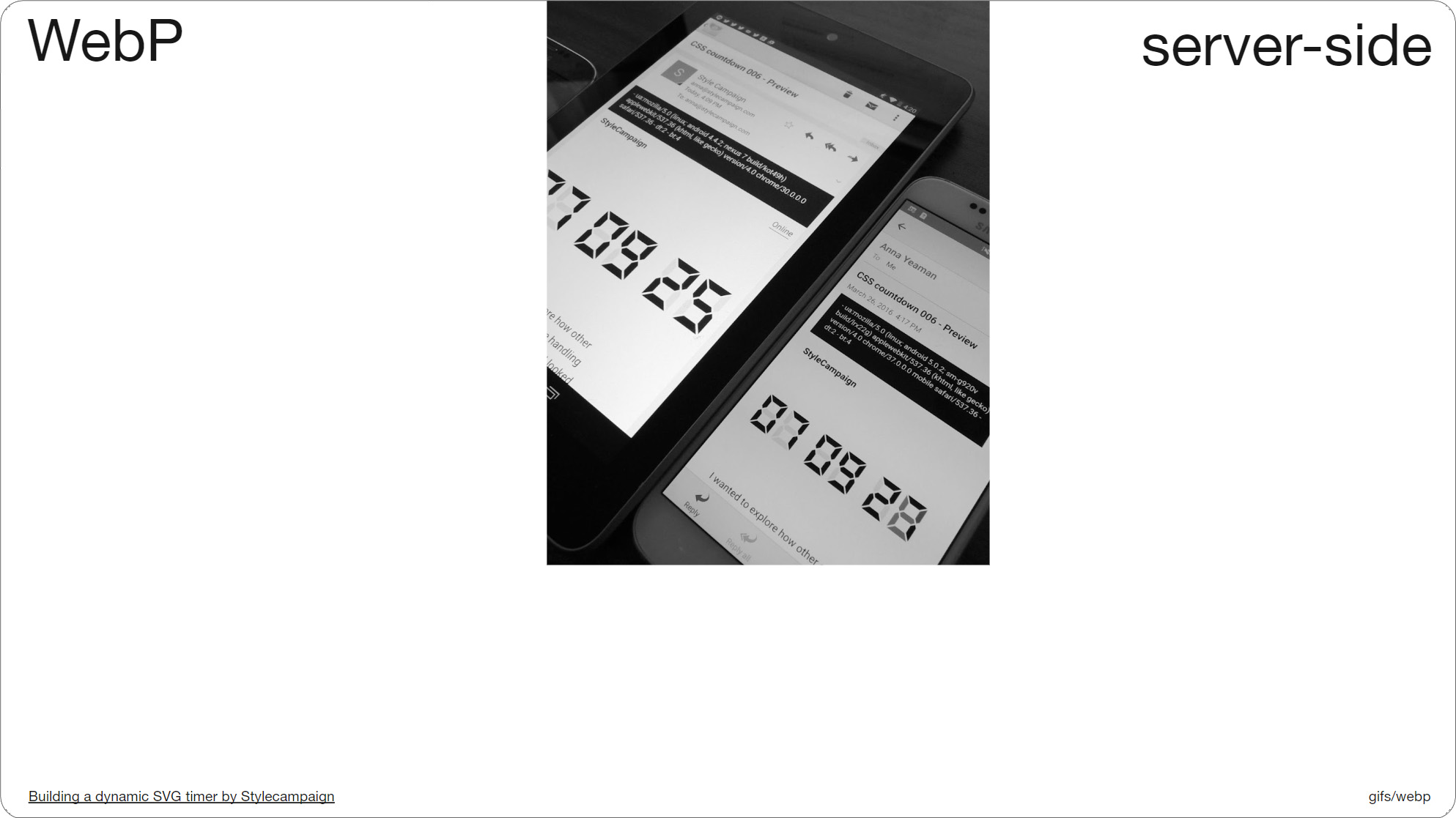
Slide 080, You can also use WebP animations in email via server-side UA detection.
Another way you can use WebP animations in email is via server-side UA (user agent) detection. The main benefit here is you get full WebP support, as we’re not relying on the picture element you get those web mail clients back. Again you can roll your own UA detection, like we did with this timer project that uses dynamic CSS animation; you can see the UA string readouts at the top in the black boxes. Or you can work with a vendor, and your ESP might already have an integration available.

Slide 081, Photoshop install WebPShop, which is a Google WebP plugin for animation.
Slide 082, let's make this 'cut' animation as both a Gif and WebP in PS.
But for those of you who want to put together a quick picture test, let's make a WebP animation. I’ll use Photoshop, as I think more people will have access to it. Photoshop added native WebP support just last year, in Feb 2022, so you can now open and save a single WebP image, but it doesn’t yet have native animation support (check it may have changed). So for now, you’ll need to install WebPShop, which is a Google plugin that lets you view and create WebP animations in Photoshop. Making a WebP animation is a little different than making a Gif, so I’ll go through both.
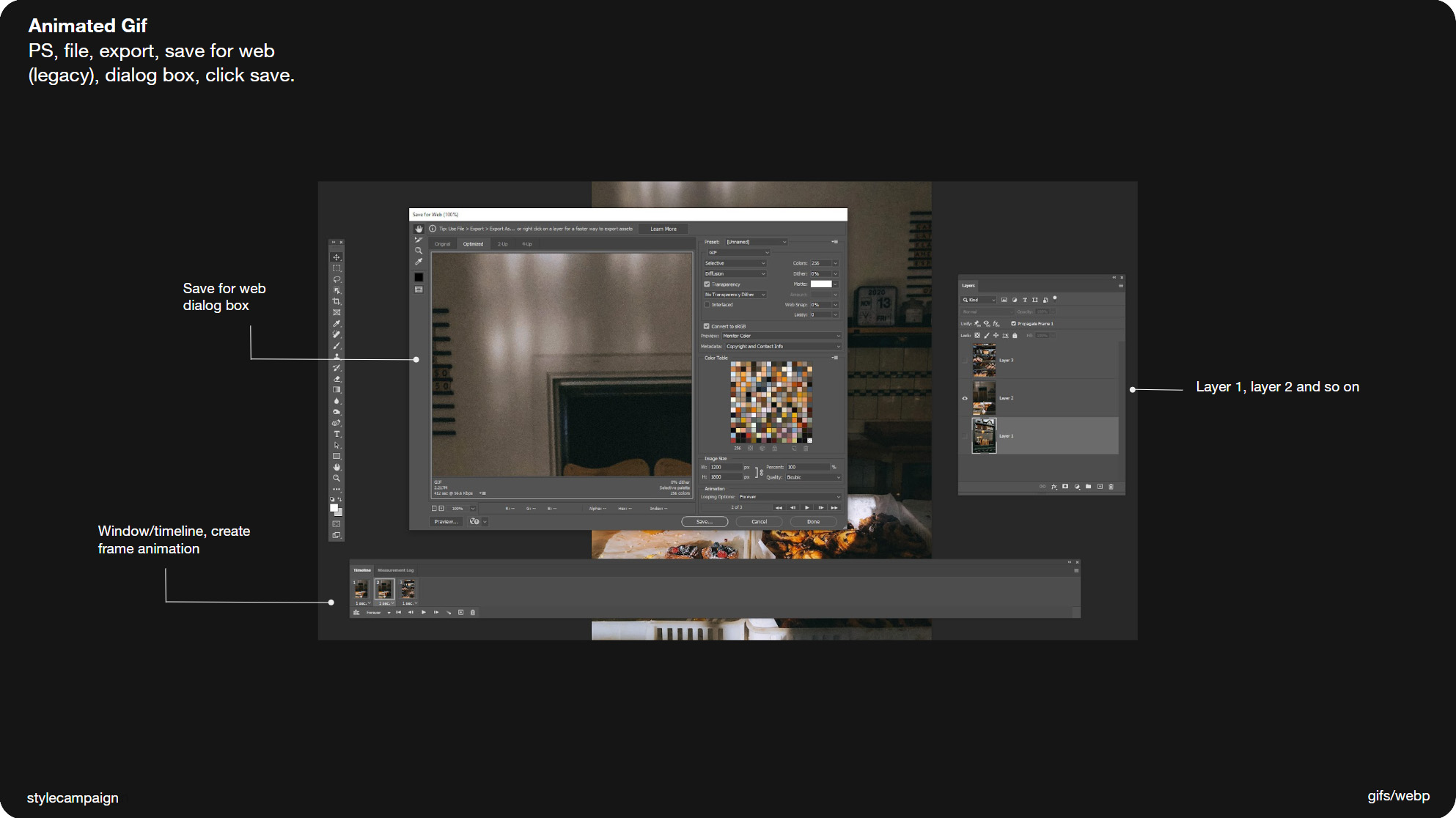
Slide 083, In Photoshop make an animated Gif via window/timeline.
- Open PS/file/scripts/load files into stack (many layers) otherwise just do it manually
- Window/timeline/create frame animation/timeline menu/make frames as layers
- Set timings below left e.g. 1 sec/loop forever or 'other' number e.g. 2
- Export/save for web (legacy)/settings/save
- Use it in your email template like any other image
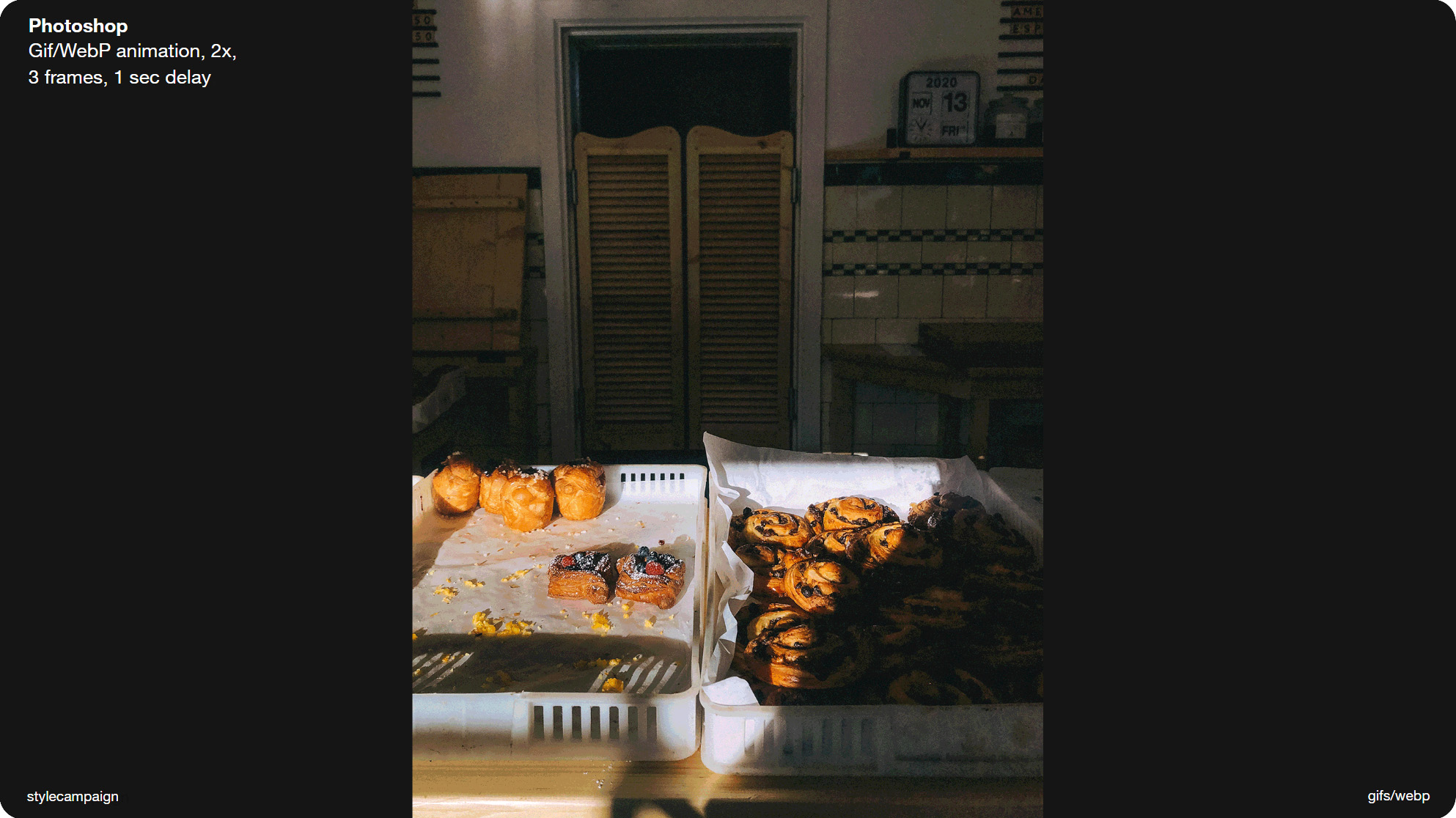
Slide 084, In Photoshop put timings in layer name for WebP.
Making a WebP animation via the WebPShop plugin is a bit different than a Gif, as you don't use the timeline at all. Instead you put the frame timings in the layer names e.g. Frame 1 (1000 ms), Frame 2 (1000 ms) and so on. Then do a save copy as WebPShop.
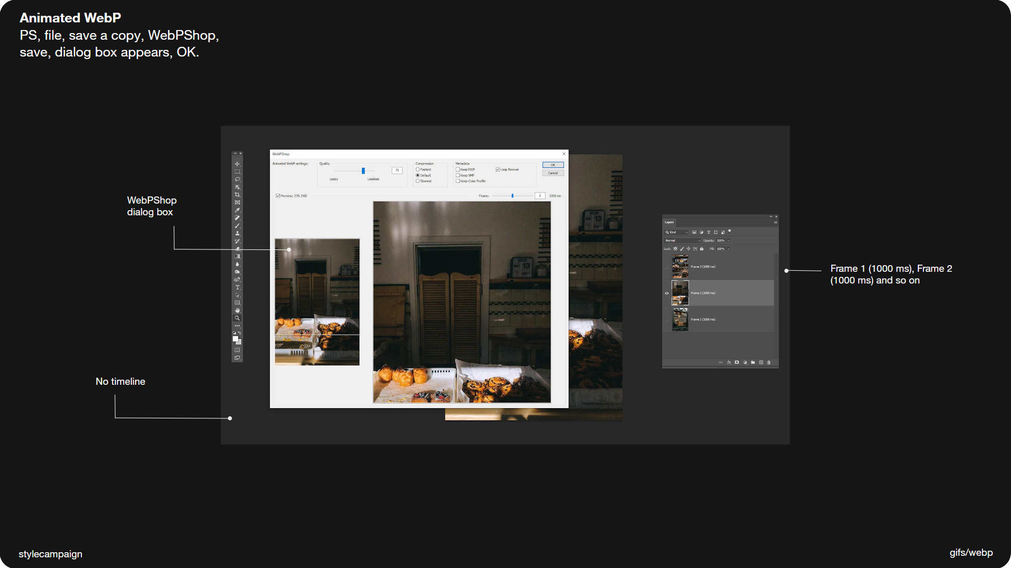
- Open PS/file/scripts/load files into stack (many layers) otherwise just do it manually
- Put the frame timings in the layer names e.g. Frame 1 (1000 ms), Frame 2 (1000 ms)
- Save copy as WebPShop
- Should see a dialog box, hit the preview checkbox
- Choose settings e.g. lossy and OK
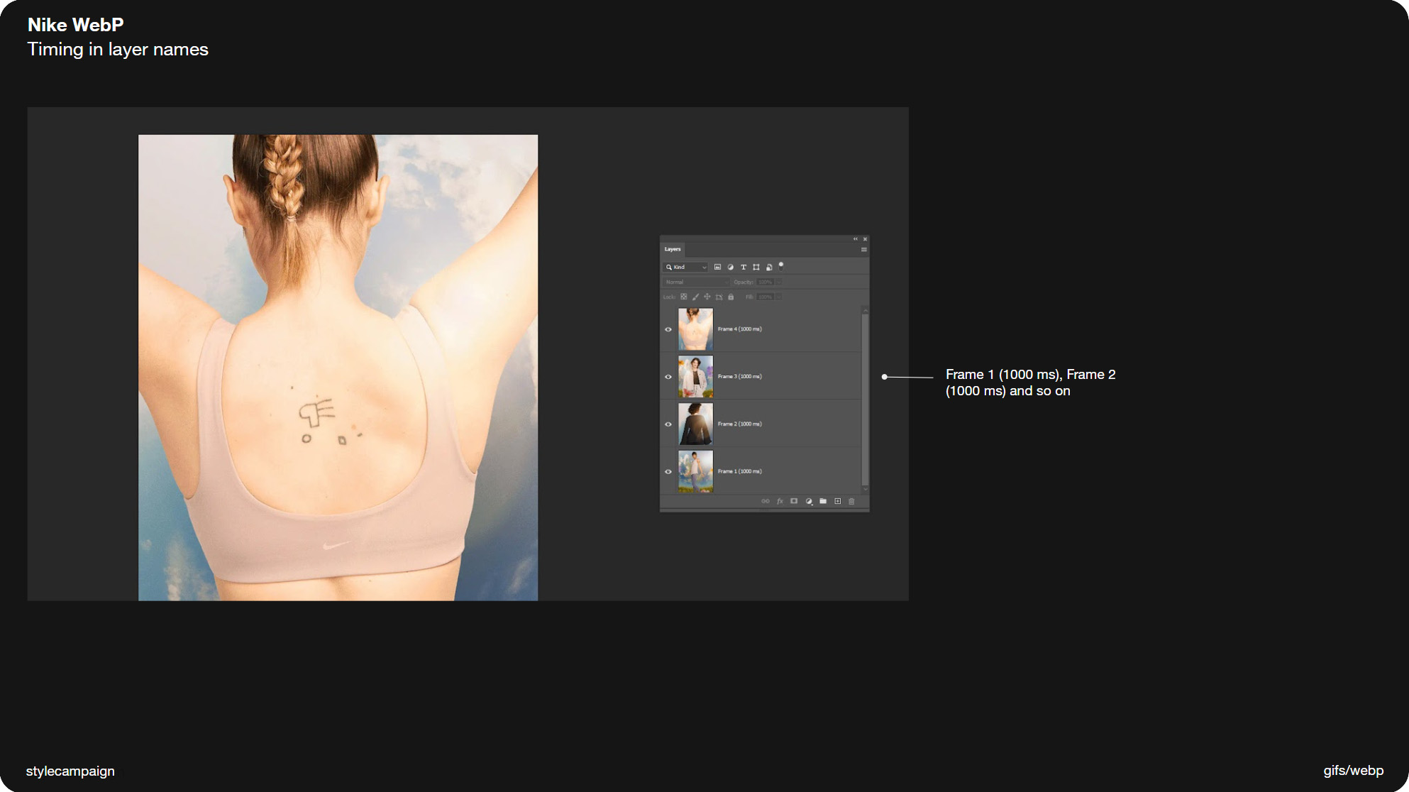
Slide 085, Nike WebP example from earlier can see timings in layer names.
This is the example I was talking about earlier from Nike (above), and you can see it’s just the same. Frame 1 (1000 ms), Frame 2 (1000 ms), Frame 3 (1000 ms), and Frame 4 (1000 ms). You can keep 'both' animations in the one .PSD file, then you can either just save for web (Gif), or save copy as WebPShop (WebP).
I'll be looking at a couple of other ways to make WebP animations in part two which is video. As when you've say 60 frames, naming layers manually isn't going to be very practical. But for now this is a simple way to make WebP ‘cut’ animations in Photoshop.
Slide 086, Next I’ll be looking at group 2 which is ‘video’.
Slide 087, Thanks for joining me.
That was group 1 ‘cuts’ which made up the majority of the animations from my inbox haul (54%). Next I’ll be looking at group 2 which is ‘video’. But that’s all for today.
Thanks for joining me – Anna.