Building a dynamic SVG timer
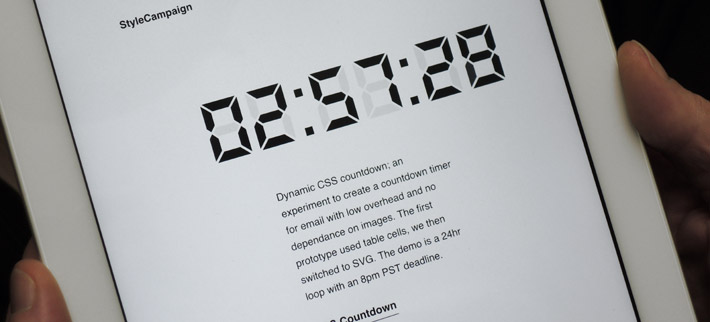
Final SVG timer for email experiment, there's also a dark build and a couple with bg images just for fun.
Early table prototype
The first build used table cells to represent the elements of the digital display, I set the background color of each cell to give the illusion of being turned on or off. We've played with pixel art in email before and it was a quick way to get a prototype up and running. I did experiment with the layout but I was mostly working on the animation at this stage.
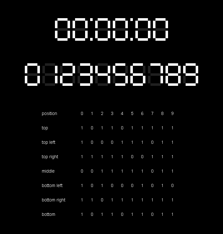
1st prototype used table cells, a list of on / off states used in the 42 synchronized animation sequences
The first task was to figure out the sequence, a simple list of on / off states represented by noughts and ones. This would give us a pattern that could be applied to the table cells to represent the numbers 0 to 9. A separate CSS animation sequence was then created for each of the 7 elements ( table cells ) that made up one digit. So for a 6 digit display we have 42 animations defined in the CSS.

7 table cells make up one digit each with its own animation = 42 total for a 6 digit display ( 00:00:00 )
It's straightforward enough to make a countdown sequence, but that won't tell you anything about the time. What's needed is to start the sequence at a specific value based on the current time, this means the CSS must be dynamically generated. The obvious solution was an external CSS file generated by a PHP script on a remote server.
CSS animation
The biggest problem with any of this is CSS animation. For some bizarre reason CSS animations are based on sequences defined in seconds and keyframes defined in percentages. This means, for example, that if you wanted to set a keyframe at three minutes and twenty two seconds for the ten minute digit you would have to calculate that time as a percentage of sixty minutes. As each digit is dependent on the state of the others there is constant conversion from one time frame to another. The math can get a bit complicated.
@keyframes h10t-anim {
0% {fill-opacity:0.085;}
28.382499962% {fill-opacity:0.085;}
28.383333292% {fill-opacity:1.0;}
86.715833202% {fill-opacity:1.0;}
86.716666532% {fill-opacity:0.085;} /* Transition lasting 0.00083333% of 86400 seconds */
100% {fill-opacity:0.085;}
}
#h10t{
animation-name: h10t-anim;
animation-duration: 86400s; /* 86400 seconds = 24 hours */
animation-timing-function:linear;
animation-delay:0.5s;
animation-iteration-count:infinite;
animation-direction:normal;
animation-play-state:running;
}
/* Example keyframes for top section of the ten hour digit */
CSS animations are based on sequences defined in seconds and keyframes defined in percentages, its nuts
With the keyframes for the hour digit sequences you are dealing with thousandths of a percent, and rounding errors can become a problem for synchronization. When the hour digit changes the ‘tens of minutes’, ‘minutes’, ‘tens of seconds’ and ‘seconds’ digits all have to transition at the same time, even though they are being driven by separate CSS animation sequences.
Unlike with dynamic images which grab the time from the server with each new request, here time is a construct of the CSS, so a few seconds of drift can occur when compared to the system clock over a period of hours.
SVG build
I had the basic animation sequence up and running when I switched over to SVG. The table layout worked well but it didn't look too convincing. Another problem was empty table cells don't scale well when set to percentage values, so it wasn't going to work well in a responsive layout. To create the SVGs I modeled them in the 3D editor Lightwave, then output them as Wavefront.obj files.
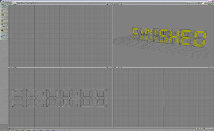
SVGs were modeled in 3D editor Lightwave, here you have the timer and ‘Finished’ on two layers
I then ran them through a 3D to SVG conversion tool I wrote a couple of years back called scVector, it culls any back-facing polygons so I didn't end up with 3D models. scVector crops to the 3D viewport, which then becomes the SVG viewBox dimensions. You want to crop the viewBox as closely as possible, otherwise the SVG becomes harder to position and scale.
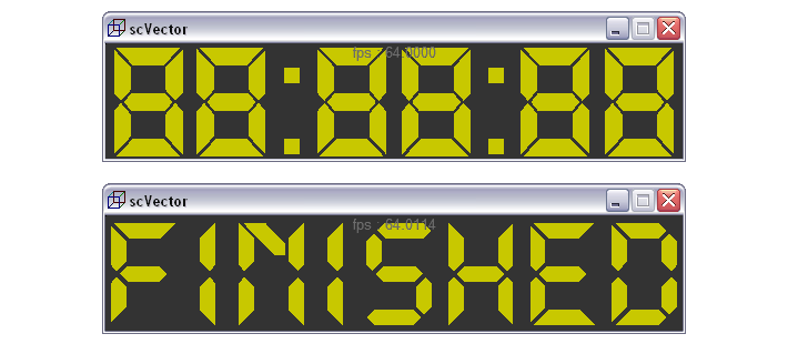
Exported SVGs as .obj files and then converted them to SVG using an in-house tool
Time up
This demo is on a 24 hr loop, when you reach the deadline at 8pm PST it switches to a different SVG group spelling out ‘Finished' for 30 min before resuming again. You can set the sequence to run once and then display ‘Finished' indefinitely but for the demo it repeats. Getting this to work at the appropriate time was a bit mind bending.
Though the action itself consists of placing a white rectangular SVG polygon in front of the timer and revealing the ‘Finished’ group in-front of that. This slight of hand had less overhead then animating the transparency of each SVG element, the file size of all three SVG groups combined is 10.2 KB.
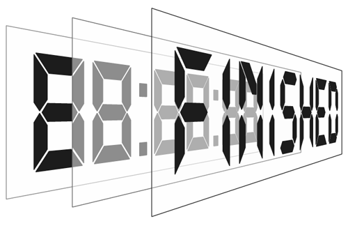
1 SVG containing 3 groups of polygons totaling 10.2 KB, each group displayed at a different time like a stage set
Email integration
We designed a baseline experience for those email clients that don't support external CSS or SVG. In place of the SVG there's a title spelling out, ‘Timer’ made up of table cells. We could have fallen back to dynamic images as Litmus did with their live Twitter feed which also features dynamic CSS, but preferred to give a nod to the table-based timer demo. The SVG is embedded in the HTML, and the animation that drives the SVG is delivered via a dynamically generated external CSS file. The external CSS also includes further checks such as querying if its a WebKit client.

By default you see this pixel art title, we then progressively serve up the SVG where supported
Android
Originally we were seeing some blank screens in the native Android client as either the external CSS was supported but not SVG ( 2.3 ), or the SVG was there it just wasn't animating ( 4.0 – 4.3 ). We finally realized that Android 4.0 – 4.3 doesn't support fill color and so it appeared blank as the animation wasn't firing. The solution was to animate the fill-opacity property instead which has broader support. So we now had the full experience running in native Android 4.0 – 6.0 which only left 2.3.
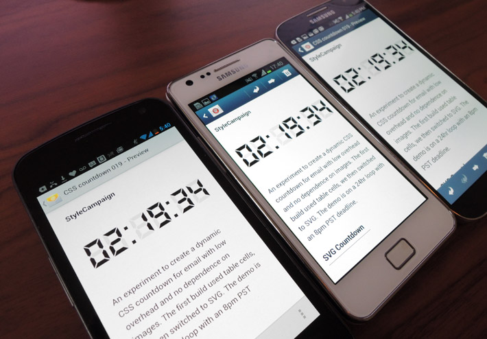
Android native clients 4.0, 4.1 and 4.3 now render the timer after switching from fill color to fill opacity
Device detection
We still had the odd client loading the external CSS, but then not meeting all the criteria thereafter. We'd done a lot of work with dynamic images in the past using server-side device detection, so in the end we layered that on for those clients with partial support.
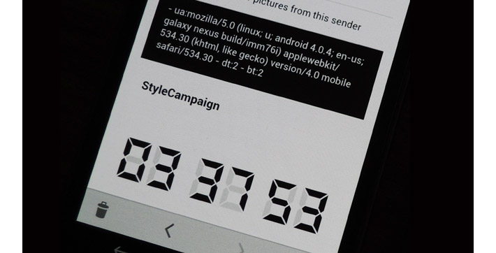
We layered on server-side device detection for clients with partial support
The PHP script now delivered the dynamic CSS based on the User Agent String of the requesting device. So we can say if you're Android 2.3 or less render the fallback. Device detection has its shortcomings — one is that some mobile apps don't have a unique UA string so they can't be isolated — but in this instance it fixed our most pressing issue which was 2.3.
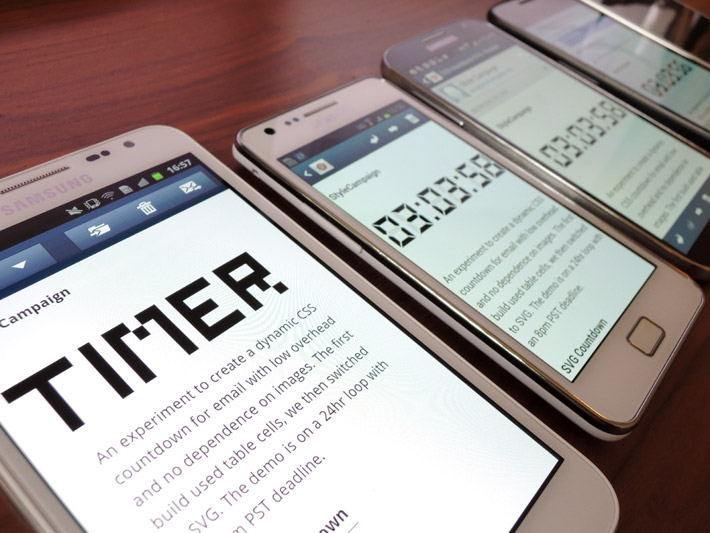
Used device detection to render fallback in Android native 2.3 otherwise it came in blank
IE browser
Once we introduced the idea of device-specific CSS to deal with Android 2.3, we decided to also use it to improve the IE browser experience. IE supports SVG but not animation, as the first frame was a white SVG on a white background it appeared blank. At first we came up with a hack so a separate SVG group appeared on the first frame in IE spelling out ‘Timer’.

Originally we tried a first frame fallback SVG for IE spelling out ‘Timer’
This is similar to how we handle animated Gifs in desktop Outlook which only displays the first frame. The downside was it interfered with the animation elsewhere and we felt we could do better. With device detection we set up an IE build which displays the correct time on open, its just a static SVG rather than animated. It also means the CSS is significantly smaller in IE as there are no animation keyframes sent from the server.
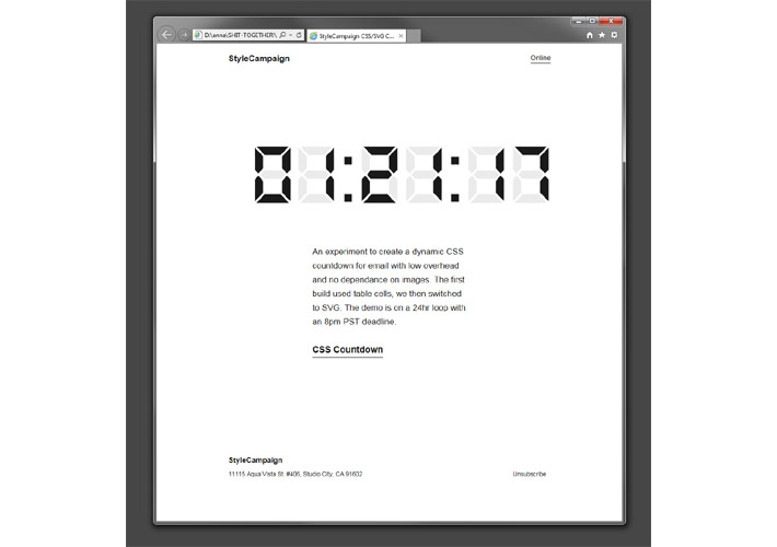
Device detection allowed us to display the time in the IE browser via a static SVG
Support
For this project we had to juggle support for external CSS, SVG and animation. When we'd previously looked into SVG support in email we went with a base64 encoded foreground image. However for this demo base64 encoding didn't work with the animation, so the SVG is just inlined in the HTML.
Full support for this technique breaks down as:
- Android 4.0 native client
- Android 4.1 native client
- Android 4.3 native client
- Android 4.4 native client
- Android 5.0 native client
- Android 6.0 native client
- iOS native client
- Odd iOS app like Sparrow and Malto
- Apple Mail
- Outlook 2011 (Mac)
- Outlook 2016 (Mac)
Webmail clients Outlook.com and Office 365 also support SVG but they didn't like the external CSS. We carried out the QA in our device lab and Litmus, here's the final QA. You'll notice we started out by going a few rounds in native Android. Android support roughly falls into three camps: 2.3 none, 4.0 – 4.3 supports basic SVG but not all properties and 4.4 onward has strong support. Android marketshare is still fragmented, but only 2.6% are currently using 2.3.
Optimizations
The external CSS file size started out ~400 KB and after some optimizations it's now ~60 KB, which isn't bad for something that runs indefinitely. In comparison a bitmap countdown is typically set to run for a minute on open, with the overall bandwidth usage potentially in the Megabytes.
As its email the HTML containing the SVG will already be downloaded. Playing it safe I then put a slight delay on the external CSS, otherwise you run the risk of progressive load of the animation sequences ( the client starts some of the animation sequences before others are fully loaded ). This can lead to poor synchronization of the transitions and failure of the fade transition at the start of the animation sequence.

Webpagetest for the Timer email
Omit obsolete animations
The numbers are made up of sections rather than whole shapes. To keep the animation keyframes down, I don't animate the SVG polygons that are already in the right position. So rather than switching all seven polygons from 2 to 3 we only need to change two of them.
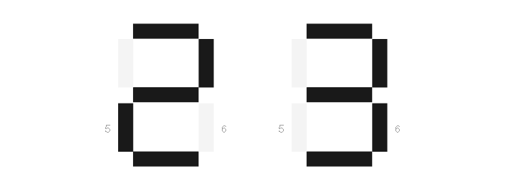
Only two elements change when switching from 2 to 3
Output clean code
We used our own 3D to SVG tool which outputs clean code with no redundant data. There are other SVG optimization tools available, such this one by Peter Collingridge.
Take out Webkit prefixes
Without WebKit prefixes it almost halved the CSS file to ~30 KB, it still ran in iOS but didn't in Android. It didn't make it into this build, but a future optimization would be to send iOS an unprefixed version via device detection ( we'd want to do more testing around this first ).
Future
There are a number of enhancements and optimizations that I didn't get around to testing. Now that I have the basic animation and email integration up and running I can experiment with the creative execution. I've been meaning to make a nixie clock for a while, and I like the idea of recreating one in CSS.