iOS email apps: highlights and data
While I like to keep track of iOS email apps, I've always considered them edge cases and don't sweat them during QA. Though lately I've been getting more questions about them from clients, so I thought I'd share some highlights from the more popular apps and put them in perspective regarding render testing.
Birdseye mail
Designed for the iPad to be touch friendly, in a side scrolling layout. My favorite Birdseye feature is you can scroll emails in the preview without having to open them, taking scalable layouts to a whole new level. It supports @media, with the preview showing the smartphone layout and on open it renders desktop...slick
While you're waiting for creative to load, it shows your avatar as a placeholder. Many iOS Mail apps make creative use of avatars, so its worth heading over to Gravatar and getting set up.
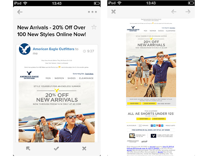
Incredimail
Forget the butler clip art, the iPad app has just had a Masonry-style makeover. You can preview text before opening, and it supports @media. Although it displays the occasional image thumbnail, Incredimail' inbox is far more text filled than Birdseye. Though the Facebook photo stream aligns with the image-driven UI trend.
I imagine we'll see more of these lean back inboxes, geared towards weekend and evening browsing. As the CEO of Birdseye states, "Our interaction with tablets is different and our needs in terms of email is different.”
Evomail
Besides the nice use of avatars, my favorite Evomail feature is when you tap and hold the subject line it switches to a full-screen view of the creative (below right). It supports @media, showing the smartphone layout by default then reverting to desktop in full-screen mode.
There's been some debate in the mobile web community around density - focused concentration vs. scanning and wayfinding is how Cameron Moll describes it - this app recognizes both use cases.
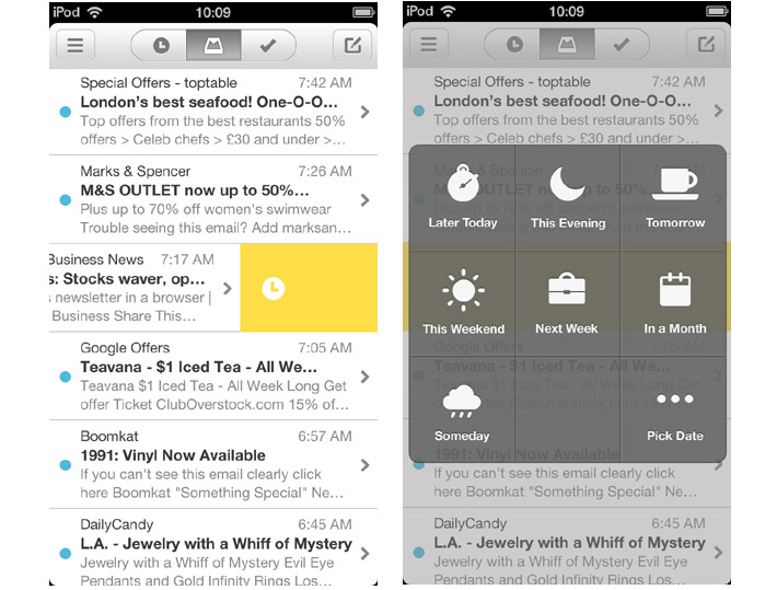
Mailbox
Mailbox has proven to be a bit of a pain during render testing, it has quirks. Though I love how you can swipe messages to delete or snooze with just your thumb. Side swiping is big on all these apps and something we also saw new in iOS7.
Mailbox has just been acquired by Dropbox. Sometimes acquisitions can turn early adopters off, with fears that the product will be "cannnibalized". This is one of the down sides to using apps, development can stop or change course at any time. Mail may be dull in comparison but it isn't going anywhere.
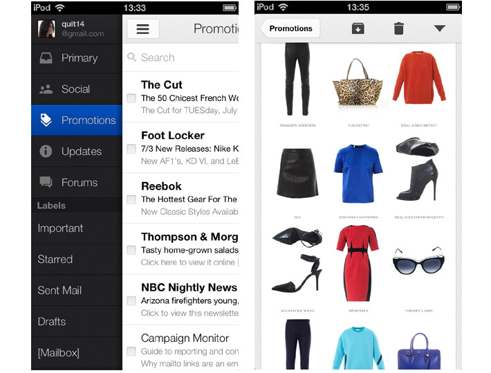
Gmail
My main question regarding the Gmail update, was does it show up in big enough numbers on iOS that I need to add it to my QA. I asked Justine Jordan over at Litmus, and she kindly pulled all their stats for June 2013:
23% of all opens are categorized by us as "Apple iPhone"
0.11% are categorized as "Gmail using iPhone"
0.09% are categorized as "Gmail using iPad"
(Grand total of 0.2% viewing "Gmail on iOS")
Looking at only mobile opens,
53% categorized as "Apple iPhone"
0.25% categorized as "Gmail using iPhone"
0.2% categorized as "Gmail using iPad"
(Grand total 0.45% viewing "Gmail on iOS")
"Keep in mind that due to the way that some of the third party iOS apps report their user agents, they may be categorized as the native client ("Apple iPhone"). So while the Gmail app will report as "Gmail using iPhone," the Mailbox app is going to report as "Apple iPhone."I would definitely say that based on the data we have (limited as it might be by technology itself), and anecdotal evidence...that these apps are not worth fighting over. They're used by early adopters, techno-geeks and the curious, and usually abandoned after playing around for a few minutes to see what the fuss is about. Fun? Yes. Worth worrying about? Maybe, after you get all your stuff looking and performing well on the built-in apps!" - Justine
So while it doesn't hurt to take a quick peek at how your creative renders in these apps, don't prioritize them or waste time debugging every little thing.
Sparrow
The original Mail alternative, Sparrow had a good run before it was acquired by Goggle in 2012. Lack of continued development makes it less appealing. Though Justine over at Litmus, tells me that Sparrow desktop shows up in their aggregate monthly reports so its still in play.
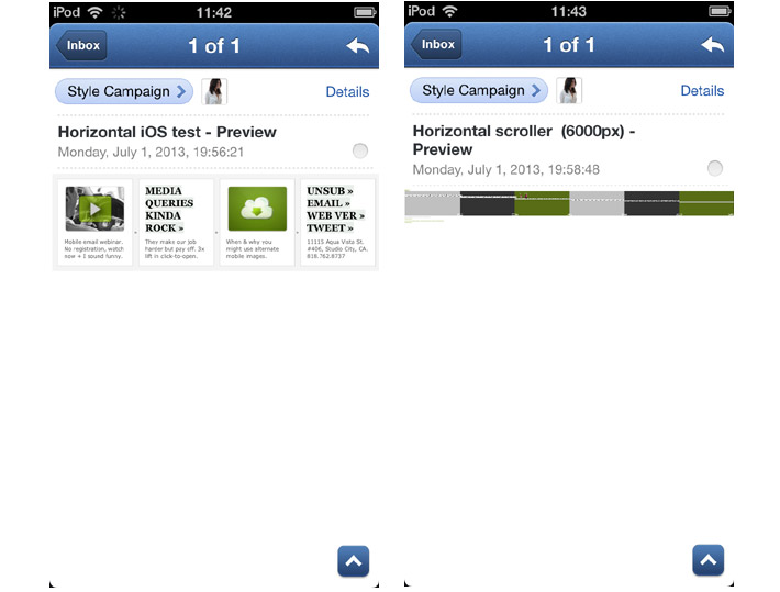
While Sparrow supports responsive design it doesn't play nice with horizontal layouts, scaling to the width (you can zoom in). Horizontal layouts in iOS apps are a mixed bag, unlike the default Mail client which scales to the height, apps like Sparrow, Evomail and Gmail scale to the width and in some cases don't support zoom.
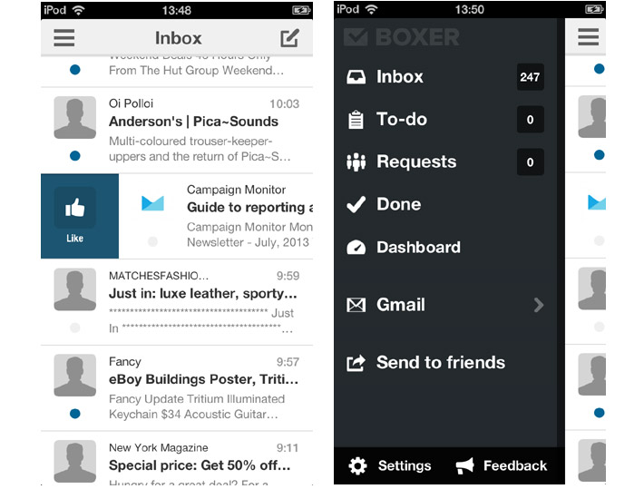
Boxer
Boxer is the only iOS app that hooks up to both Exchange and Gmail making it more appealing to B2B. It also handles Yahoo! Mail, AOL Mail, iCloud, Google Apps, Outlook.com. Boxer has a "Like" button which sends a message to the sender acknowledging that you received their email.
It also supports responsive design, animated Gifs, pull to refresh, avatars and renders horizontal layouts like the Mail client so its OK by me.
iOS still a native stronghold
It's a relief to know that iOS isn't as fragmented as Android, and that it's still overwhelmingly a responsive design friendly platform. While I might peek at app rendering, its not something to fuss over. Still I really like some of the innovations and UI in these apps, and consider them worth keeping up-to-date with. Birdseye might even have made a convert out of me...