Creative use of inbox space (horizontal scroll game)
{view horizontal email}
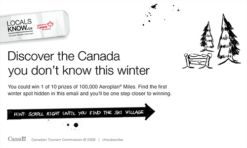
This is what you see when the email - from the Canadian Tourism Commission - lands in your inbox:

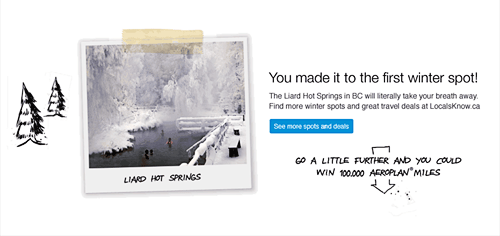
Subscribers can upload photos of hidden tourist spots to LocalsKnow.ca, as part of a sweepstakes.
![]()
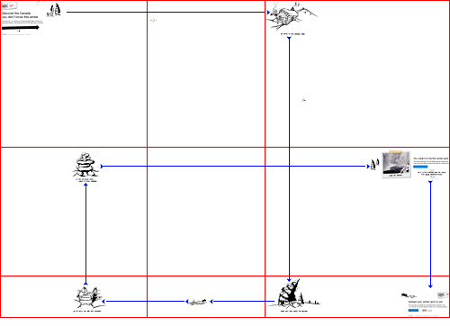
How's it made? {view 5000 x 3519 image}
The email is made up of 9 Gifs - see red sections below - held in a 5000 x 3519 table.

I've drawn blue lines, showing directions to the hidden winter spot. You're given tips such as, "Go South to the crooked tree". On completion, your prompted to upload your own photos.
![]()
Is it a winner?
My main concern is the width. As Dylan Boyd points out, Outlook 2007 has issues with creative over 2200 pixels wide. At 5000px, this far exceeds that recommendation.
When viewed in Outlook 2007, the design falters at, "Move left and cross the bridge". When I scroll left I cannot find the bridge. If you plan something similar, keep the width below 2200px.
The emails reliance on images and subscribers taking the time to play are also risks.

Overall its creative use of the email space wins me over. It's fun, unexpected and the act of hunting out the hidden location reinforces the campaign message.
(Thanks to @theeMailguide and @toddlucier for bringing it to my attention)
Update: Follow up chat with email designers here »
Max width on 07: We did some testing of our own - view and forward our test email - max width in Outlook 2007 was 2110px. Chad white of Smith-Harmon also got the same figure as did Dyaln Boyd of eROI after running some new tests.
We also tested different heights (200, 450 and 1350px) and widths (3,000 and 6,000) and still got 2110 in 07.