Apparel photography in email marketing (Models need not apply)
For those of you who use neither models or mannequins but photograph your apparel flat like Net-A-Porter, below is a collection of ten newsletters to inspire new ideas.
![]()
Spiegel: {view email here}
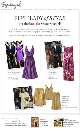
Retailers like to associate items with celebrities. As is the case with this Spiegel email, your outfit just has to have overtones of the original. This allows you to take straight product shots and pair them with lifestyle photos.
Check out wireimage.com, the largest celebrity photo archive on the web. It's affordable with prices ranging from $10-$75 a month. Select public figures your customers identify with and whose style corresponds with yours.
![]()
Anthropologie: {view email here}
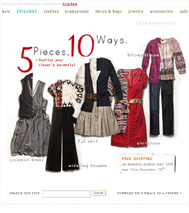
Edit together your product shots into outfits. In a recession promoting a capsule or mix and match wardrobe is on message.
![]()
Lands' End: {view email here}
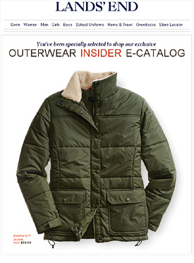
I like the simplicity of this Lands' End newsletter. They use animation to highlight the three colors the jacket comes in.
![]()
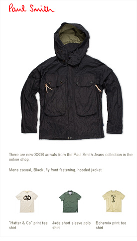
Paul Smith: {view email here}
Although this minimalist look is low maintenance, it's not for everyone. Brands like Paul Smith and Barney's can pull off a sparse design but it might be too edgy for some.
![]()
Abercrombie & Fitch: {view email here}
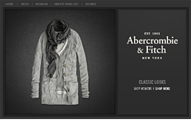
In contrast if we replace the white space with a textured background we end up with a more mainstream vibe. This can be done in editing, starting with your product shot against white. Abercrombie added a stripe background, gradient and a drop shadow.
Notice how the clothes have been loosely styled, giving the shot some rumpled personality. Like the Kate Moss just-got-out-of-bed look this is hard to do well.
![]()
Hermes: {view email here}
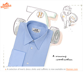
Hermes are original in that they use quirky illustration to jazz up their product shots. It's always fun and creative, like their subject lines.
![]()
Eddie Bauer: {view email here}

I've seen this checkered layout used by Neiman Marcus, Lands' End and Bloomingdales. Editing in a solid color is a simple way to ditch some of that white space.
![]()
Old Navy: {view email here}
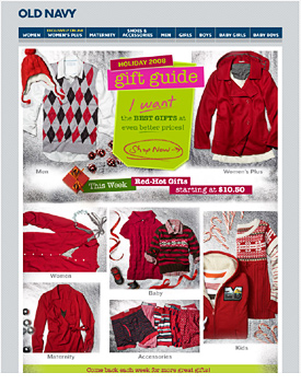
Old Navy drops in a silver background, holiday accessories and a vibrant font. Like Abercrombie notice the discheveled look of the clothing.
![]()
Forzieri: {view email here}
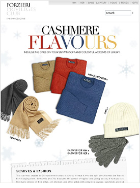
I often add graphics to my email creative. To save time I buy vector artwork from iStockphoto. Do a search for flourishes or retro background. You'll also find paper elements like the one above. I like how the colors are reflected in the font.
These items were not photographed in groups, but edited together for an organic feel.
![]()
Miss Selfrigdes: {view email here}
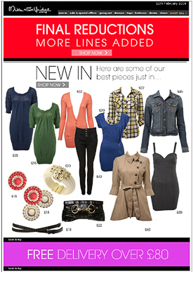
Apparel retailers like ShopIntuition, Kitson and TopShop often use a collage layout in their emails. If this is for you check out the blog WhoWhatWear. They do a good job with magazine layouts and I like their copy.
These clothes were photographed on a mannequin which was later edited out. The downside is the edges can look rough and once the mannequin is removed you are sometimes left with awkward results (see salmon cardigan). I would only use this style of apparel photography and editing with trendy contemporary brands.
![]()
In this economy were all trying to get the most out of what we have. Recycling product photos into email creative makes financial sense. Cut corners using wireimage.com and iStockphoto to add some visual interest. Get your editors hat on and you won't be lacking for style.
