Poor man's email survey
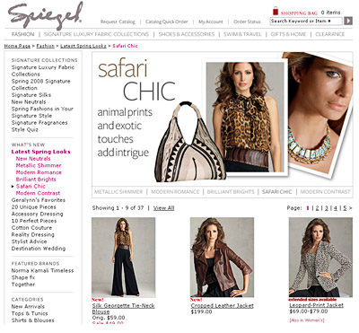
You can use the data to send more targeted emails, in this case I might receive a bunch of promotions for, "Safari Chic" after having voted for it.
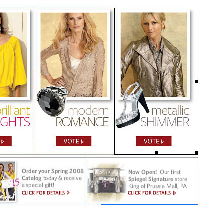
{Subject line: Vote for Your Favorite Spring Look, Get 20% OFF!}

If we take a peak at the email in Dreamweaver, we can see they spliced up the four sections. Spiegel did not use image maps, which are not 100% reliable across all email clients. If you link each vote to a separate landing page, you can easily track results.

For instance a Safari Chic page:

They followed this up the following day with an email announcing the winner:
{Subject line: The Results are In! See the Winning Spring Look + 20% OFF!}

If you do want to take the time to create a survey, check out Survey Gizmo. I came across the site after I received this email from eROI which linked to a survey created by Gizmo. Being nosy, I signed up and found it easy to use. It lets you customize your surveys, adding in your logo and color scheme which is a nice touch.