Grid systems for email
Arbitrary vs. proportional
There are two ways that the designer can bring mechanical form into harmony […] One way is through the use of his own natural and intuitive sense of proportion, and the other is through the application of certain systematic principles of proportion developed by mathematicians, artist-designers, and architects throughout the course of design history. ― the grid by Allen Hurlburt
I used to rely on my intuition for parts of the design such as type sizes and vertical spacing. There was a size and spacing system in place, it's just that the numbers bore no relationship to each other. I think of this early period as being stuck in spacer hell, as I had numerous random values to keep track of all adding needless complexity.
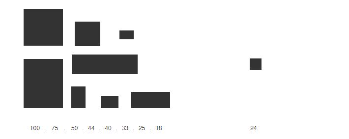
Series of random vertical increments applied throughout the system vs. one base unit
Left are some vertical spacers pulled from an old project, what's interesting is many of those 'random' numbers are proportional. We gravitate towards simple round numbers and start building out patterns subconsciously. Though not all the values fit, and the system breaks down further when you factor in the type sizes and line heights I was using.
I certainly never start designing by laying out a grid and saying, this is what I’m going to do. But I do think about proportion. I do what looks good - and it usually turns out that I’ve done a golden section, or a double square, or a double cube. ― Architect John Pawson, in designer and the grid by Lucienne Roberts / Julia Thrift
Certain patterns and ratios are intrinsically pleasing to us when deciding what looks 'right', and therefore inescapable. Rather than mimic these proportional relationships through guesswork, a grid takes what we do intuitively and rationalizes it.
Why use a typographic grid ?
- Creates order and visual consistency through a proportional system
- Readers are reassured by that order which lends credibility to your message
- Helps the reader quickly orient themselves and navigate the email
- Speeds up the design process
- A spacing system makes hand-offs between designers and coders easier
- Guide for devs, if unsure about something just make it a multiple of the base unit
- More than one designer can work on a design system at the same time
- Clients can add to the email system in-house as there are simple guidelines to follow
- Helps clients who are non-designers make design decisions
- Makes it easier for agencies to revisit an old system in order to add new modules
- Reduces the stress that comes from too much arbitrary guesswork
- Readability is often baked into the fabric of a typographic grid
- Humans dig an ordered proportional system (patterns and repetition), why fight nature
Baseline grid
The baseline grid is derived from the body copy, often the largest portion of type on a page. It's measured from one baseline to another, the baseline being the line your type appears to rest on. Traditionally it was used in newspapers and magazines with multi-column layouts, so that the text aligns when side-by-side and from page-to-page. This pattern is repeated vertically through the system, and it's a quick way to carve out spatial zones.

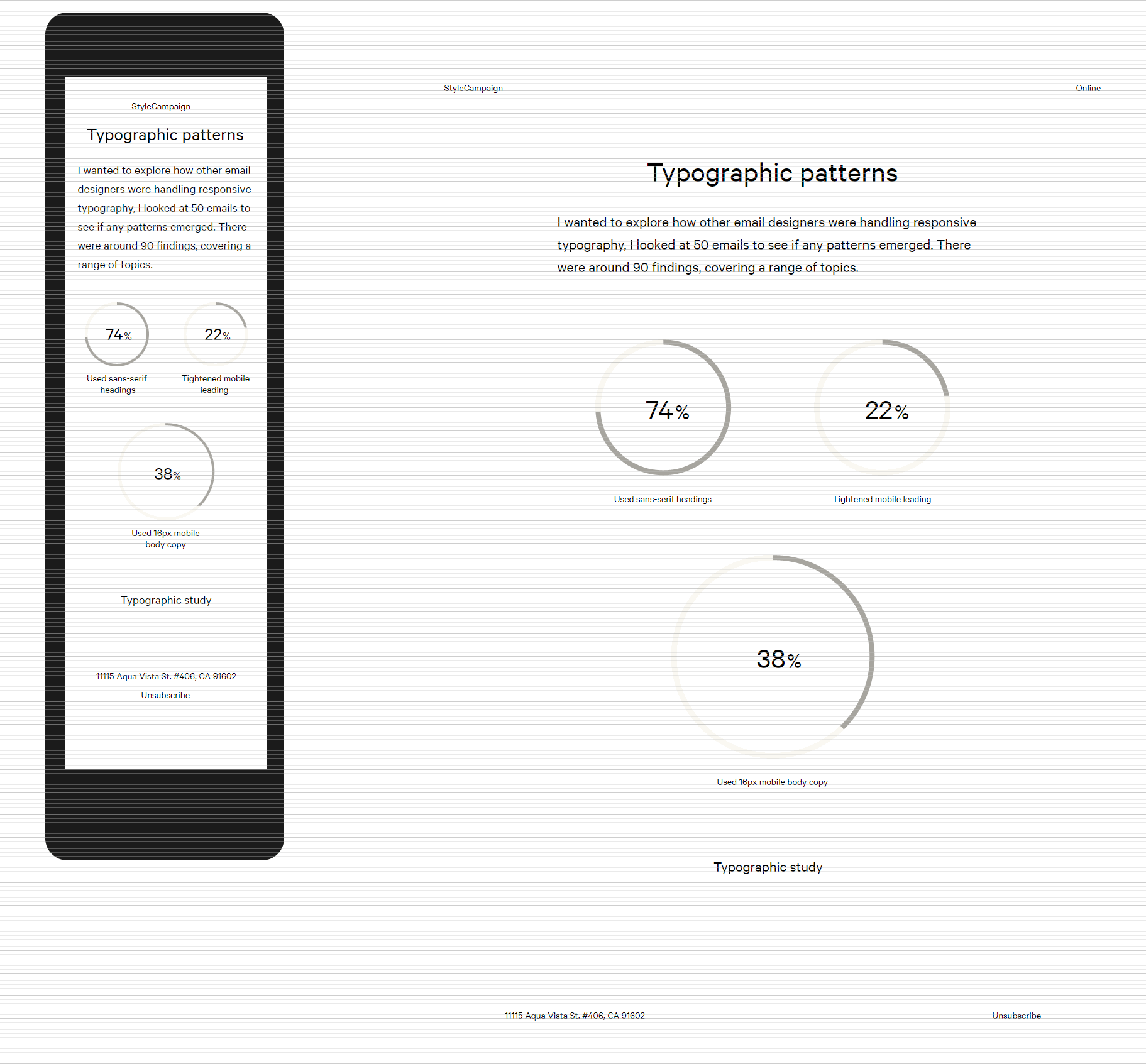
24px baseline grid, spaced vertically in regular 24px increments
If your body copy is 15 px with a line height of 24 px, then 24 px would be your baseline unit. The line height of the headings, navigation, footer copy etc. all need to be a multiple of 24 px to stay in beat.
Two sizes of type set on a 24px baseline, left 24/36 and right 15/24 both line heights divisible by six
24 px increments are quite large though, you'd struggle to set all your line heights to: 24, 48, 72, 96. So you can subdivide a whole baseline to give you a smaller unit of 12 and 6. That gives you a spacing system built around three proportional values: 24 px, 12 px, and 6 px. This increases our options to: 6, 12, 18, 24, 30, 36, 42, 48, 54, 60, 66...
24px baseline grid, subdivided into 12px and 6px
Type sizes do not have to be a multiple of the baseline, just the line height. Though again it helps to use a scale rather than random numbers. Typically you are looking for a type scale that gives you enough to work with in the 12 – 36 px range as email headers tend to run smaller than on the web. Two scales I use quite frequently are the traditional and Fibonacci series, both are outlined in Bringhurst' book The Elements of Typographic Style.
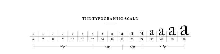
Traditional scale from The Elements of Typographic Style by Robert Bringhust, image from retinart.net
You can apply the baseline grid to elements besides the typography such as images, buttons and white space. That way the vertical rhythm of the type matches other aspects of the design creating a relationship between the two.
Use baseline grid to align elements other than type vertically
In my comps I position the mobile and desktop layouts side-by-side with the same baseline running across both, you can see an example here. For this design the body copy is 24 / 36 px, I then subdivided the baseline down to 18 px and 6 px. I'm using the traditional type scale mentioned above, with all line heights divisible by 6. Though your base unit does not have to be 6 px, as long as your line height can easily be subdivided it will work. e.g. with 24 px it could be 4 px, 6 px or 8 px, and with 28 px 4px or 7 px.
Email with all elements laid out on a 36px baseline grid, then subdivided into 18 and 6px
We're dealing with HTML not print, and line-height isn't leading so I did have doubts. This isn't about sweating 1 px across 50 email clients, with email rendering there's always a sensible point at which you have to let go. Experienced email designers and coders have a shared expectation on where that line is. In a way a baseline isn't much different from a redline, in that the degree of accuracy a skilled dev can expect to accomplish doesn't change.
6 px grid
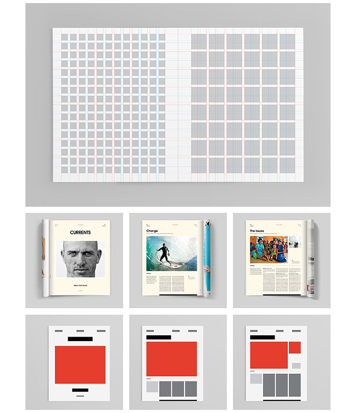
One of the most well known grid systems is by Karl Gerstner for Capital magazine in 1962. The modular grid is 58 units across, with a basic unit of 10 points derived from a line of body copy. This accommodates one, two, three, four, five, and six columns with two units for gutters, all cleanly divisible by the base unit. Variations are still in use today, Francesco Franchi, art director of IL magazine used an adaptation for their redesign.

IL magazine grid adapted by Francesco Franchi from Karl Gerstner', Capital grid system
A grid with proportional columns and gutters, built out of typographical units seemed the next logical step from a baseline grid. As it further extends the idea of a proportional system to every part of the layout. The fact that it's a compound grid — which is just to say it's multiple grids in one super-structure — makes it ideal for email modular systems as there's so much varied content to manage.

Email widths today range from Victoria's Secret 520px, to Finery' 740px and Nordstrom' 960px
I tried to recreate Gerstner' grid but it was too wide for email as 58 × 24 px = 1392 px. For many years 600 px / 640 px have been standard email widths, but now that Gmail supports responsive design I've noticed more variation that seems to be trending wider. Nordstrom for instance started sending out a 960 px wide email back in Sep 2017. Both the width and the content will determine the grid structure. For me this means the creation of a detailed module document at the start of the project, identifying the use cases and module patterns to be included.
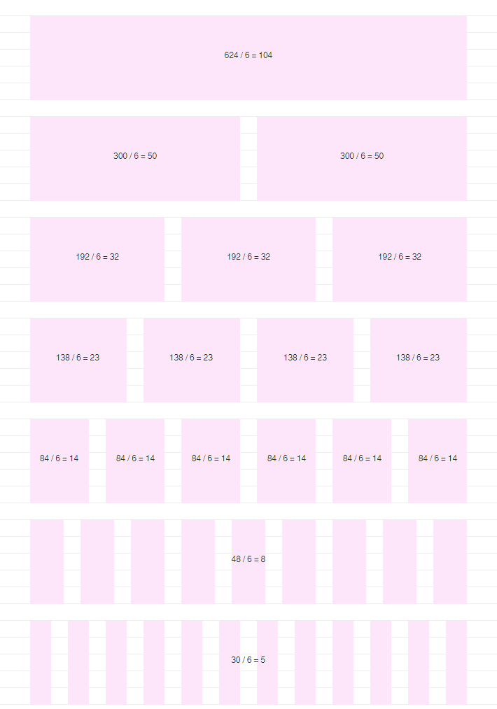
624px wide email system, 24px baseline and gutters, layout for a 6px grid
This system was designed for a b2c client, its 624 px wide and supports one, two, three, four, six, nine and twelve columns all cleanly divisible by 6 px with 24 px gutters. I use the tool Gridulator to work out the math. Underpinning the columns is the baseline grid which governs the vertical spacing of all the elements.
Baseline and column grid align all the elements such as type, images and buttons around a common 6px unit
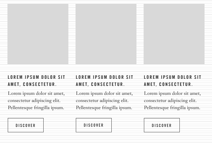
This three column module is built on a 660 px wide grid. Each image is 204 × 204 px with a 24 px gutter between, line heights are all divisible by 6 and the button is 120 ×48 px. I've most often used 6 px units, but 8 px grids seem to be the most popular. Which makes sense as we're working with pixels not print, and screen resolutions are often multiples of 8:
Apple's HIG states, "Use an 8 px-by-8 px grid. A grid keeps lines sharp and ensures that content is as crisp as possible at all sizes, requiring less retouching and sharpening. Snap the image boundaries to the grid to minimize half pixels and blurry details that can occur when scaling down".
Material design also uses an 8 px grid for UI and 4 px baseline for type. A 600 px wide email supports an 8 px grid more cleanly than 6 px, you could also build a system around 5 px or 7 px. Grids are not just a math's exercise though, I've built grids that work arithmetically but had to abandon them as for instance the gutters felt off once I added content.
Modular grid
My current email system is built around a modular grid, which is a series of vertical and horizontal lines. It's 1098 px wide consisting of nine 90 px modules, with 36 px gutters which corresponds to the 26 / 36 body copy. My baseline is 36 px subdivided into 18 px and 6 px. Each 90 px module is 2.5 × the 36 px baseline, or if subdivided into 6 px then 90 / 6 = 15 units. I'm using square modules, which have rational proportions such as 2:3 and 5:8 baked in which makes sizing images quite nice.
1098px wide grid consisting of nine 90px modules, with 36px gutters which corresponds to the 26/36 body copy
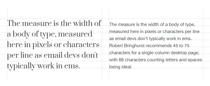
A modules width is often mapped to an ideal line measure and it's depth to lines of type, though you can combine multiple smaller modules to create fields. With this grid six modules gives me ~ 66 characters with a 26 px body copy size, there are also rules governing the other font sizes: small 16 / 24, body 26 / 36 and title 42 / 54.
Six modules map to a single column of body text with ~66 characters per line
I used this grid to design our interactive SVG slider email. The comp below was one of four design deliverable's as there were four hero states, you can view it full-sized here. We used tables and SVG to build this email, though it makes sense to try and translate it to CSS grid at some point just as an experiment.

One of the comps handed to dev for the interactive SVG project designed on a modular grid
I've designed numerous modules on this system just exploring what it can do — this gets confusing as it's email modules on a modular grid — and I noticed that this type of grid also lends itself to the design of pages and not just smaller components. Which makes sense as these grids are traditionally used in editorial design, like for Transworld Surf:
Transworld Surf magazine redesign modular grid system
I've seen this style of asymmetrical, collage-y layouts in magazines and websites for the past few years, and email designers have also been adopting it. Mostly its image-based retailers as it's hard to code these types of layouts. We managed with tables for the most part, though there were a couple of Outlook clients that didn't like a section of the design. CSS grid or SVG layouts may get you there but neither have universal support, and the fallbacks might not suit everyone either aesthetically or due to the complexity of how they're implemented.
Summary
The grid makes it possible to bring all the elements of design - type, photography, illustration and colour - into a formal relationship to each other; that is to say, the grid is a means of introducing order into a design. A deliberately composed design has a clearer, more neatly arranged and more successful effect than an advertisement put together at random. ― The Graphic Artist and his Design Problems by J.Muller-Brockmann
Adopting a more systematic process resulted in leaner more focused email design systems, and solved the problems I was having trying to keep track of too many arbitrary values. Whilst improvising the size and placement of design elements is doable, for projects of this nature a typographic grid can help you reach a solution quicker and with less stress. These rules also scale, whether its ten or forty modules or across teams of one or twenty. It's easier for designers, coders and clients to keep track of a simple shared system.
If you want to read further the book Grid Systems also by Josef Muller-Brockmann is a great read. I also have a number of grid resources in this Google doc, from my reading list to tools.