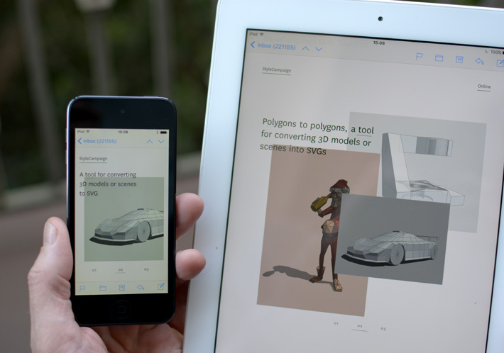
Interactive email using SVG and SMIL
An experiment to see if we could create a SMIL-based interactive email.
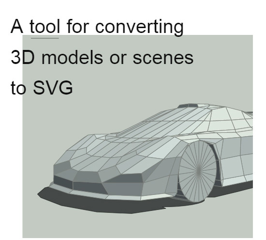
For this demo just the hero section is an SVG, the rest of the email is a traditional responsive design made up of tables, CSS etc. You could make the whole email an SVG where supported, but we opted not to do that here as we wanted to keep the surrounding fallback.
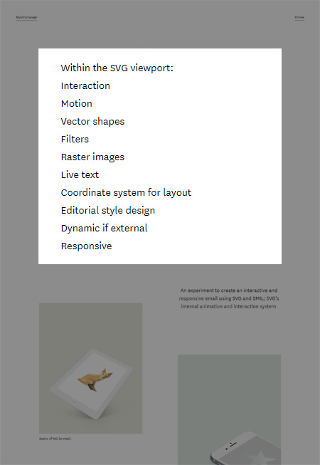
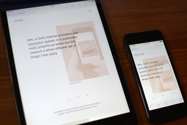
An SVG is like a layout within a layout, governed by a different set of design rules. Outside the SVG viewport is a traditional email made up of tables, CSS etc. inside it's fun times.
Interaction in email isn't new, for the last three years it's been gaining momentum led by Mark Robbins clever punched card coding hack, and Justin Khoo's contributions. You can see a number of examples here and here. The hope was that SMIL-based interaction could be an additional method, especially for those of us interested in exploring SVG' layout capabilities.
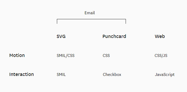
Some of the different technologies used to create an interactive experience in email and on the web.
Idea
We did some of our early research into interactive SVGs during the countdown project. If you look at the image below, it's not a stretch to imagine transitioning between layers of SVG assets to create an app-like experience. The timer layer order switched out automatically at a certain time of day, with the interactive email the switch in SVG assets is triggered by a user interaction like a click or mouse over, this is referred to as event handling in SMIL.
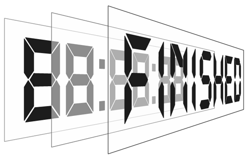
Timer SVG containing 3 groups of vector shapes that we switched between depending on time of day. SVG 'layers' can also contain raster images and live text along with user input for interaction.
Below is an example of a simple click event. You have two rects, one has zero width and the other below it a width of 80. If you click on the lower rect the other will grow in width to 100 over a period of 4 seconds.
/* Example of a simple SMIL event */
<rect x="0" y="0" width="0" height="15">
<animate id="aLoop"
begin="aButton.click"
attributeType="XML"
attributeName="width"
from="0"
to="100"
dur="4s"
fill="freeze" />
</rect>
<rect id="aButton" x="0" y="20" width="80" height="20" fill="#efefef" stroke="none"/>
Example of a simple SMIL event.
I should note that if you wanted to explore the layout possibilities of SVG but not use SMIL for interaction, you can combine SVG with punched-card coding. Here's a simple demo, if you click the button the timer changes color.
A simple SVG and punched card coding demo.
Slider v1
We'd figured out some of the basic building blocks of SMIL-interaction, next we built out a proof-of-concept SVG slider. This was the first time we'd used raster images in an SVG, and we dug deeper into SVG buttons.
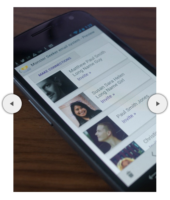
Proof-of-concept SVG slider which helped us figure out buttons and where we started to encounter some of the limitations of SMIL interaction.
SVG buttons create many challenges as they can only carry one set of instructions. Normally in script you can apply logic to a button — conditionals like 'if, then, else' statements — so when you click a button at different times it does different things. This means you can effectively reuse the same button for different events, but in SMIL it's one event per button.
So if you have a button which triggers an event such as move image 1 from a to b, that same button can't subsequently make image 2 move from a to b as that's a separate event. If you repeatedly click on a button the exact same event will reoccur.
The workaround is a slight-of-hand, once you've used a button to trigger an event you replace it with an identical button with a different event tied to it. So although it looks like there are two buttons in this slider, there are actually eight in total. This increases the amount of content choreography going on behind the scenes, our single event now triggers a whole series of actions. Not only is it shifting images across the page, but its moving all these buttons around. Too many simultaneous actions firing off one event, or too many events strung together can cause SMIL to loose track. So there's a limit to the amount of complexity it can handle.
Slider v2
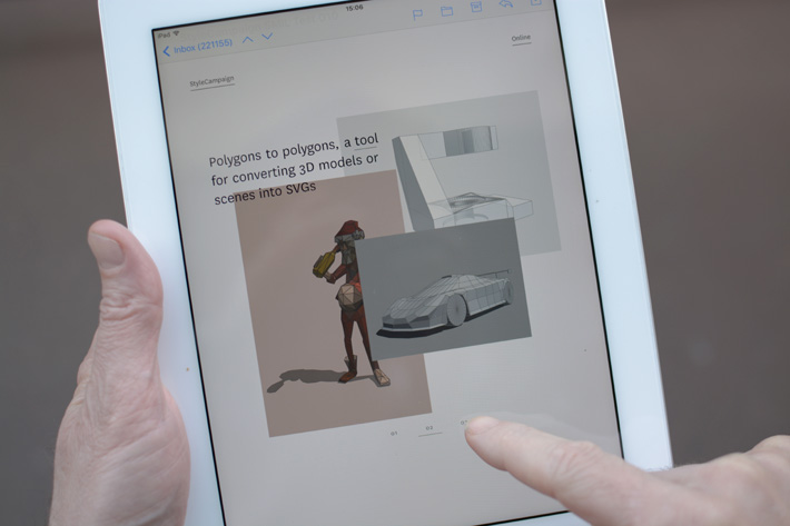
During work on slider v1 I realized the layout potential of SVG, and that realization ballooned into slider v2. Putting aside interaction, you can create editorial style layouts that use selectable live text and the whole thing can be responsive. On top of that you have motion and filters, so there's a lot to dig into regardless of interaction.
We used device detection to serve up the SVG and troubleshoot support issues.
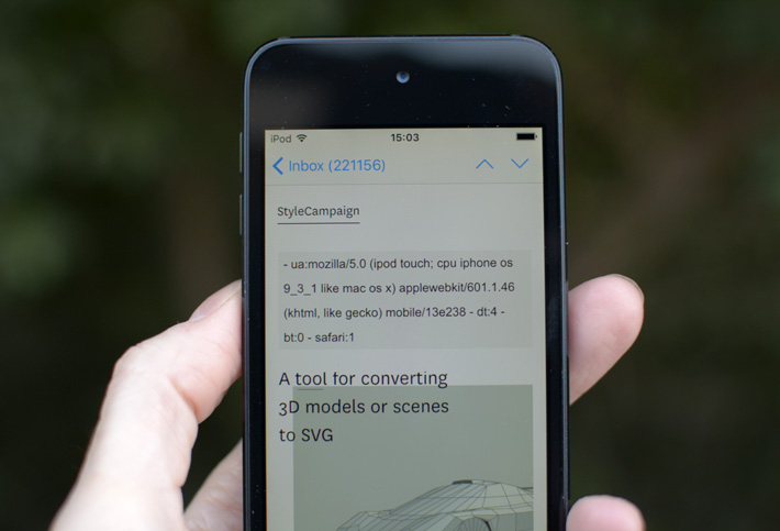
The slider email is designed to have three levels of support. The first is a baseline experience, this is your typical responsive email built using tables and CSS. You can view it here without the SVG enabled. We didn't focus too much on the fallback's rendering as this was more in the way of an internal experiment. As long as it showed up in the right email clients then we'd know everything was working as expected. You'll notice the fallback doesn't have to correspond to the SVG, the hero section layout and its copy is different. If opened in an email client with no SVG or external CSS support this is what you'll see.
The second level of support is where the SVG kicks in, here we show a basic SVG without the interaction controls and with unique title text. This is predominantly for IE in this project as it supports SVG but not SMIL. The SVG is being displayed via an external CSS link which hooks up to a PHP script. The PHP script will check the User Agent String of the device, based on that information it will determine whether or not to serve up the SVG. For other SVG projects this intermediate-level could also include webmail clients Yahoo! Mail, Outlook.com, Office 365 and AOL which support an animated SVG via the <img/> tag but no interaction. A static SVG is the default behavior, we then progressively add features like interaction in the next level of support.
The third level of support is the fully-featured SVG with all it's interaction, which you can view here.
Device detection has it's faults, but being able to drill down to different platform versions was invaluable for this project.
SVG support
There are different methods of embedding an SVG into an email, the two we are most concerned with are image and inline. Both have varying levels of email client support, not just for basic SVG but for SMIL animation and interaction. For the slider project we are using inline SVG, which means you add all the SVG data directly into your HTML. Inline SVG supports SMIL animation, interaction and can be manipulated via CSS.
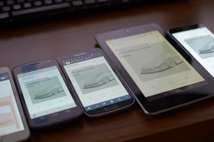
More recent native Samsung versions get the full interactive SVG, apart from far left which is an old Galaxy Note running 2.3 which displays the fallback.
Here is my QA doc for this project, and a Litmus preview. Email support for inline SVG is ~51% based on Litmus Dec 2017 stats, though everyone's support numbers will differ:
- Apple iPhone (28%)
- Apple iPad (11%)
- Apple Mail (7%)
- Outlook for Mac (Included in Apple Mail I think)
- Samsung native Android 4.0 and up (5%)
Browser support for inline SVG breaks down as:
- Chrome
- Safari
- Firefox
- Opera
- iOS Safari
- Android web
- IE browser (basic SVG)
IE doesn't support SMIL but does support basic SVG, so it displays the default SVG behavior rather than the enhanced interactive build. We do this using device detection which allowed us to troubleshoot a range of support issues.
In 2015 SMIL was deprecated in Chrome 45 and then reinstated. As of today SMIL is 'back from the dead' by popular demand and still supported as there are SMIL use cases you can't do any other way. SMIL has been around since 2000-ish and I don't see it going anywhere in the next few years, but be aware there's been a bit of a back and forth with it and it could get deprecated again further down the road.
We initially experimented with blend modes but there wasn't support for them in some Safari browsers, Mac Mail and iOS email clients. Blend modes don't fail cleanly as it's one SVG element on top of another, if not supported you just see the top-most SVG element which for us was a solid or semi-transparent color. We switched to SVG filters which have broader support and fail cleanly.
Responsive SVG
While the interaction is handled by SMIL the responsive design within the SVG is driven by CSS
By default an SVG is responsive in the sense that it's fluid, so you could design it like a scalable email and have one layout that works across desktop and mobile. Slider v1 is an example of this, nothing is being moved around it's just scaling. While that's extremely useful, scaling on its own doesn't always cut it especially when text is involved. If you take a look at slide two SVG mobile layout and scale that up in your browser the text is too large, inversely if it's good for desktop it becomes tiny on mobile. There's bound to be situations like this when you'd like to adjust an SVG beyond a one-size-fits-all scaling.
Mobile SVG from slide two, see how text gets large when scaled up.
With an inline SVG all the assets that make up the SVG are still accessible to us, therefore we can use CSS selectors to change SVG properties. So while the interaction is handled by SMIL the responsive design is driven by CSS. Although CSS and SVG can communicate with each other, they only share a subset of language. So part of the task here was figuring out the ways in which CSS and SVG overlap.
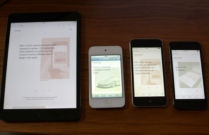
All three slides have changes to the design across device widths, above is slide one on two iOS devices.
You'll recognize the media query below, we are saying that when the width is less than 642px make the following changes to the SVG layout:
/* Responsive SVG CSS*/
@media screen and (max-device-width: 642px), screen and (max-width: 642px) {
*[class=mobshow]{visibility:visible !important;}
#flrecta { fill:#e0e0e0 !important; height: 508px  !important; fill-opacity:1.0 !important;}
#flrectc { fill:#a9c0a9 !important; height: 508px  !important;}
svg #svg-img-d1 image { width:820px !important; height:1262px !important;}
svg #svg-img-d3 image { width:840px !important; height:1196px !important;}
svg #svgdesktxt{ visibility:hidden !important;}
svg #mobblockrect { height: 1172px  !important;}
svg #clipRect{ height: 1022px  !important;}
}
As our SVG is inline we can use CSS to adjust it's contents based on breakpoints.
We did a couple of quick tests using media queries within an SVG on a separate project but didn't end up using it anywhere. You have to think about it differently, as it's not how big the screen is but how the SVG viewport scales. So you'd say when the SVG viewport reaches a certain size make this change to the layout. Though we don't know how reliable this technique is as we just had a quick play (guessing there would be support issues).
Performance
The code that drives the interaction and responsive SVG is pretty lightweight — this is where I fess up — the reason the HTML file is so large is because the SVG assets are inline and I designed it with stupidly complex SVGs. Slide two to be precise, those vectors account for over half the HTML file size. If we were to replace those with more suitable artwork, then the whole thing would have been massively smaller and would have loaded faster.
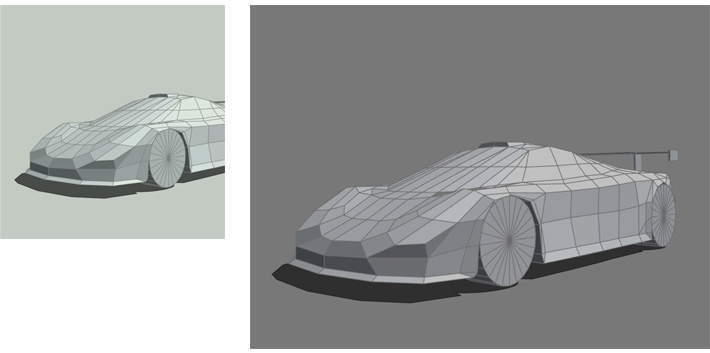
A more performant layout would have used the car on its own on the desktop for slide two.
Also on slide two we are going from three assets on desktop to one on mobile — one car SVG being referenced twice so that doesn't add to the overhead — but just like traditional responsive design you want to reuse one set of lightweight assets everywhere. A better design would have been the car alone as a hero SVG on desktop, and then a cropped view on mobile as the size is set irrelevant of its scale. If this project used an external SVG we could have dynamically served up just what was needed on mobile, but our SVG assets were inline.
Performance will be affected by the processing power of the device it's viewed on. Here we have a few iOS devices ranging from an old model running iOS 5, to a recent more powerful device running iOS 11.
Performance will also be affected by the processing power of the device it's viewed on. The more powerful the device the faster it can draw those shapes, and the smoother the animation. I had planned to add slider transitions but the project was already struggling a little. Some of my design decisions had made things needlessly complex, and trying to implement them eroded the stability of the interaction.
One thing we realized after the slider project, is that you want to avoid reusing a button if possible. As mentioned above, if you click a button the same event will happen again and again. What you ideally want to do is use a new button or fresh event, even if it's to carry out the same task. In this sense slider v2 is making things hard for itself, as the design encourages you to reuse the same event as you hop between slides. For instance one, three, one again, two and three again.
In hindsight we could have made it more stable, but it was our first SVG/SMIL experiment and you're just trying to figure stuff out. Subsequent projects have displayed solid interaction, as we were able to make more informed design decisions. Though we've only scratched the surface of the SMIL specs, so there could be an entirely better way to go about all this.
Viability
There's mileage in SVG/SMIL for email designers wanting to experiment with advanced layout, motion and interaction. But it has real limitations when it comes to the complexity of the events it can handle. If you push it too far it gets buggy, and it's hard to pin down what 'too far' means as it's so project specific. So while I wouldn't rule out SMIL-based interactive emails, you'd want to keep it relatively simple.