CSS shapes in email

It's best to concentrate on shape-outside (text following the models outline), as shape-inside (ball with text inside) didn't make it into the spec, but you can kludge it. View the demos in iOS 8 or Chrome, you may need to enable experimental features.
PNG demo
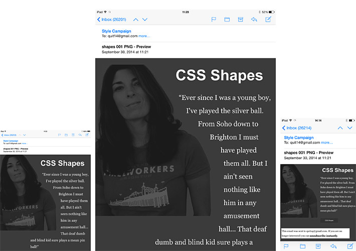
This PNG demo uses a polygon to define the shape, rather than the images alpha channel. CSS Shapes are supported in iOS 8.0.2 testing on an iPad Mini (left), iOS 7.0 on iPad retina (center), but not iOS 7.1.2 on my iPod (right).
You can see the content reverts back to a rectangular formation where support is absent. Right now 46% of Apple devices run 8.0, though knowing the speed with which Apple users upgrade that number will rapidly climb.
JPEG demo
We wanted to try substituting the PNG for a JPEG, because of the smaller file size, and broader support. On our first run through it rendered fine in iOS8, but had issues in iOS 7.0 on an iPad retina as it's lacking transparency. We tried tweaking the Z-index but it didn't fix the problem.
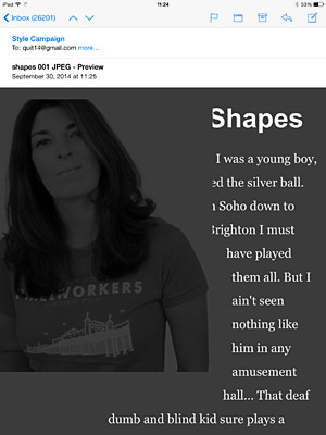
We then tried switching the JPEG to a background image, along with some fallbacks. The element containing the polygon definition is empty (can be table, span or div), the background image is in the body of the email. This fixed the issue of the JPEG obscuring the text, you can see a Litmus preview.
iPad Mini running 8.0.2 (left), iPad retina running 7.0 (right).
Tools
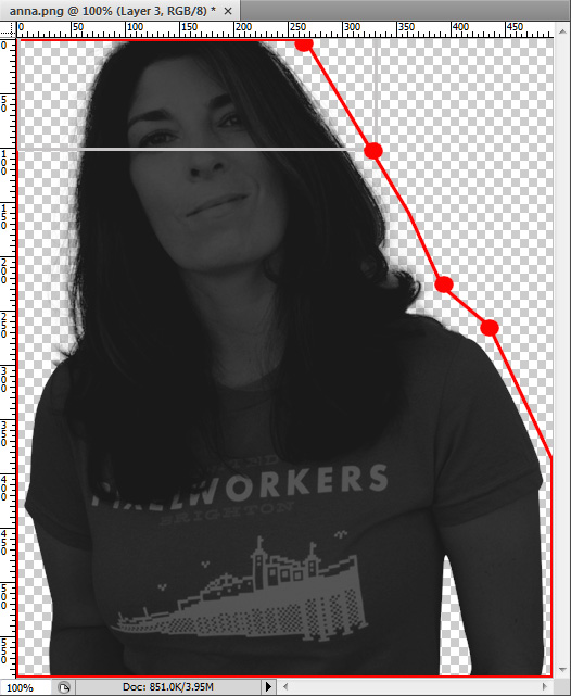
We used Photoshop with the grid set to pixels to eyeball the XY co-ordinates, and then plug them in as polygon points. You could also use the lasso tool to plot it out. You don't need to use many points, just remember to close off the polygon. So the red point with the grey lines through it, would be 330px on the x-axis and 100px on the y-axis.
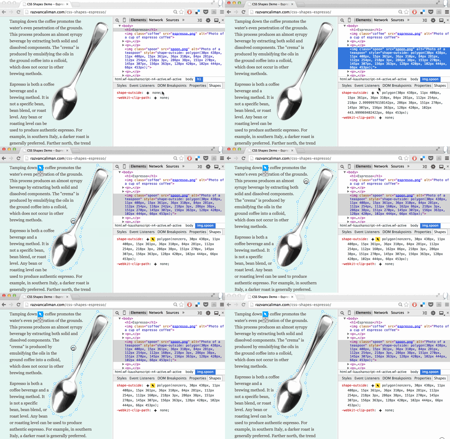
If you want to get more fancy, you can edit CSS shapes in live preview mode using Chrome.
Fluid
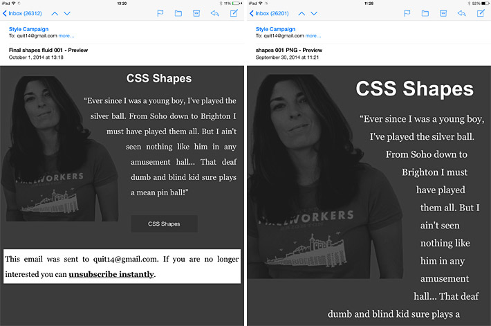
Up to this point we've been defining the polygon using pixel values, which are hard-coded so they don't scale. For this demo, we switched the pixel values for percentages using a rough guess. In Photoshop, if a point is half-way across the x-axis and a quarter of the way down the Y, its 50% and 25%.
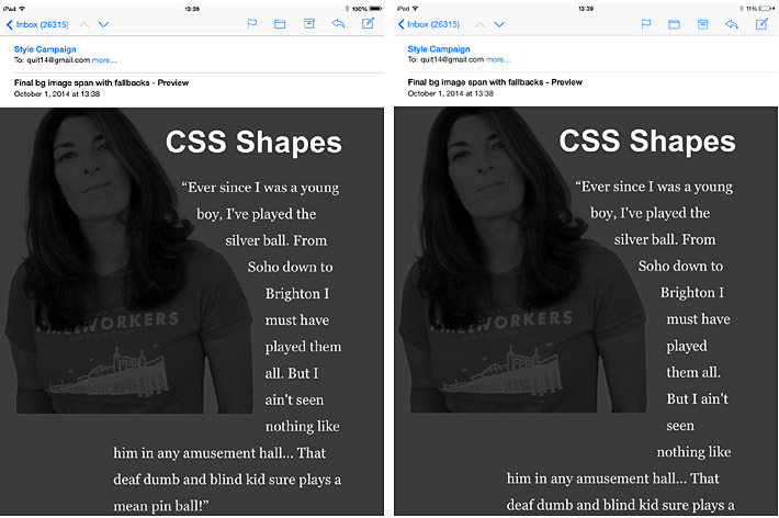
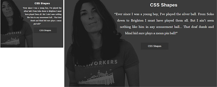
The image that the polygon is applied to, is also defined by percentages. So if the image scales to 50%, the polygon values will adjust to match the new scale. Obviously this is a crude test, but it shows that you can use CSS shapes within fluid layouts.
Fluid percentages left, and fixed pixels right. Both screenshots from iPad retina running 7.0.
We stuck with a PNG for this test, we can't apply this technique to the JPEG background demo, as in most circumstances background images don't scale. Although you could use multiple background images within a fixed-width adaptive layout.
Ever widening gap
I think it's possible to use CSS Shapes in real-world projects with a bit more work. Many of the issues you'll notice here are self-induced due to the nature of rough internal tests. For instance our demo layout was unsuitably wide, we didn't finesse the fallbacks, or inline all the code.
What this brings home to me though, is the gap between what's possible on the low and high-end of email design is ever widening. Along with SVGs, web fonts, CSS animation and media query support, we now have CSS shapes and possibly a host of other crazy stuff.