MapMyFitness case study
We worked closely with Jay DeFoore, who leads email and marketing automation efforts for MapMyFitness, to optimize the company's email template suite for mobile and update the branding to coincide with a site refresh. While it's not unusual to see clients with 50% mobile usage, MapMyFitness has the highest mobile numbers I've seen.
"Take a look at this report in Litmus, I knew our audience was largely mobile but this - 71% of opens - is insane!"
Jay DeFoore - Email Marketing Manager at MapMyFitness
Modular Responsive Templates
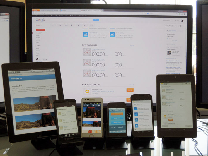
Needing something, "easy to use and scalable", MapMyFitness opted for a modular responsive template. This consists of numerous modules, that you can mix and match, duplicate or re-order for different types of mailings. You start by identifying common design patterns already in use, or sketching new patterns. Then documenting each module via a text description or wireframes.
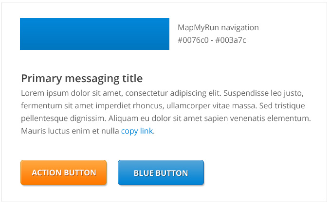
I then mocked up the basic building blocks such as the typography, color palette and buttons. As MapMyFitness was in the process of a site refresh, I had the luxury of a new style guide to work from. This part of the process is similar to styletil.es.
Once I had those components, I could design the modules which were previously outlined. I like to submit a couple before launching into the full set to make sure I'm on the right track.
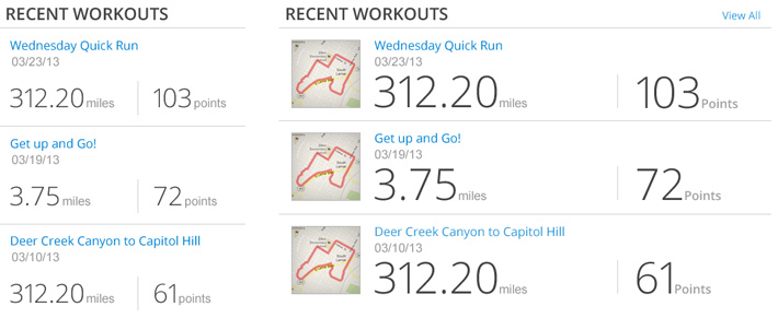
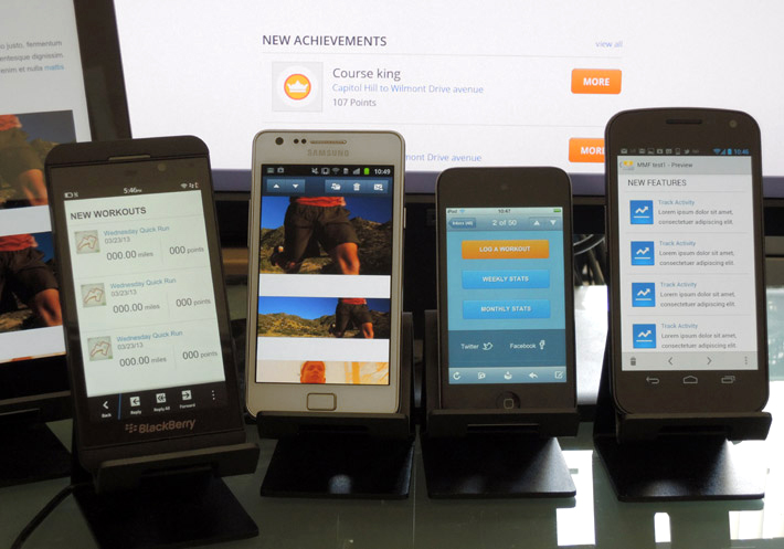
There are a number of ways you can adapt images across desktop and mobile, MapMyFitness choose two. One that takes the desktop image and crops it on mobile, and another that makes the entire desktop image fluid. There are pros and cons to each tactic, so picking more than one gives you some flexibility. Other image options include: swap, hide, stack and overflow.
As we were using web fonts throughout, I also checked each module in the fallback font as the spacing can differ. With 71% mobile usage, the majority of users will see the preferred font.
Coding & QA
As well as looking out for rendering issues during QA, we also 'finesse in the browser' or email client in our case. Mostly evaluating performance, ergonomics, how the template transitions from breakpoint to breakpoint and tweaking things in the device lab.
We only 'design in the browser' if it's a design pattern we're not sure we can pull off, then we'll build an early prototype from sketches. Sometimes we'll move to code after the first draft and iterate from there, but there's still one Photoshop mockup involved. While there's been talk on the web of ditching Photoshop, I've found there's less complexity, interaction and fewer mockups when building a responsive email vs. a responsive website so it still works for me.
Getting Out Of The Office
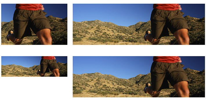
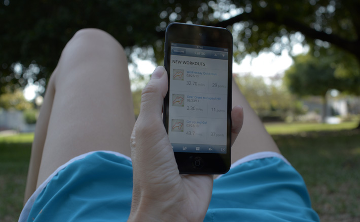
Some of that 71% mobile email usage probably takes place during or immediately after a workout. So I took the template out for a jog to see how it holds up under sunlight, when I'm tired or in motion. I try to explore different environments during QA, obviously you'll never recreate every scenario but just one context besides the office helps.
App Integration
One thing I noticed from using the app myself is the strong email and app integration. As Jay mentioned, "Some of the links in our emails are responsive as well. We use a redirect service to code links so that if a user is on a desktop device they go to our website, but if they’re viewing the email on their phone and they have the app installed the click will launch the app directly. It’s a pretty innovative approach I’m surprised more people don’t take advantage of. "
Internal Management
Once its made it through QA, the modules then make up one master HTML template from which MapMyFitness can build out a whole suite of emails.

At the start of the project, one of Jay's concerns was how hard it would be to manage the master template internally:
"Having never worked with media queries or responsive templates before, I was worried there would be a sharp learning curve."
"But much to my surprise the modular templates were easy to work with. After a day or two of experimenting I was quickly able to plug in various combinations of modules to iterate and test different layouts. I especially like the ability to optimize image sizes for mobile or desktop display. I’m glad I insisted on clear delineations in the code, because that helped make the modules plug-and-play".
Stats
Prior to the responsive modular template, MapMyFitness were using a number of fixed-width desktop layouts. They switched over to the responsive template back in April 2013. Jay was kind enough to share some thoughts and stats:
"We saw great results when we applied Style Campaign’s responsive design and a simplified UX to our welcome email, which users receive when they download and activate one of the MapMyFitness mobile apps".
"Welcome email clickthrough rate increased 50% compared to the previous version. We also saw a 25% bump in the clickthrough of our newsletter after the refresh."
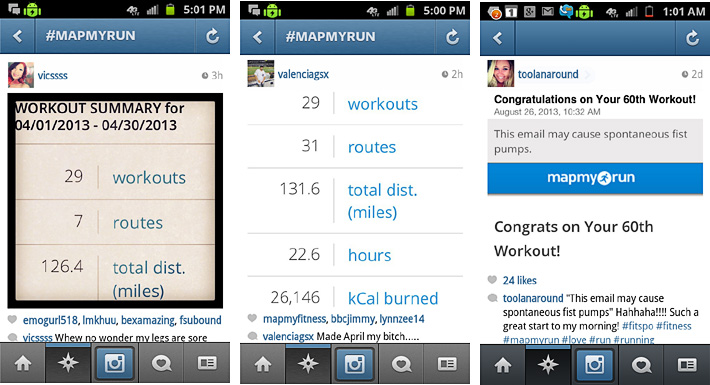
"The most exciting thing I noticed after implementing the responsive templates was the uptick in social sharing of our emails."
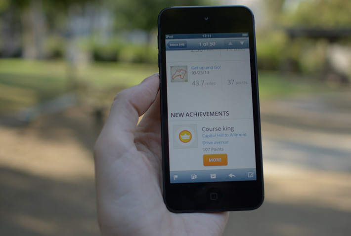
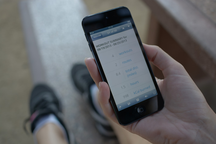
"Users view the email on their phone, take a screengrab and brag to their friends and families on social media about how far they biked or how fast they completed a 5k. Instagram is the recipient of many of these email shares, and a focus on the display of the core 320x480 module of the email was key in encouraging more shares "
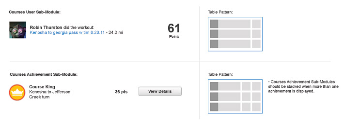
"Despite my excitement at rolling out all the templates, it was still important to test and tweak the new designs, and to incorporate feedback from our users. After encouraging users to provide direct feedback on the redesign by simply replying to the emails they received, I was able to quickly ascertain that the font size we used to display numeric data - workout summary module seen above - was too large and causing users to scroll on their phones. I was able to quickly dial down the font size, and since then social shares on Instagram have really exploded."
My project takeaway was density, and single screen views. While not new concepts for me - I talk about fitting product grids into a single iPhone screen in my #RED video - it reminded me to apply that same thinking to a broader range of content.
That's not to say squeeze every module into a single screen, but just pay closer attention to density. Especially if it's content people are likely to share. It needs to be interesting and in the right format, such as a single iPhone screengrab.