10 Creative Email Footer Designs
Over the years a few have delighted me, influencing the way I design. I've listed 10 below, be sure to vote on your favorite. You can submit your own via email or on Twitter using #annaff.
1. Ground as a Design Element: {view email here}
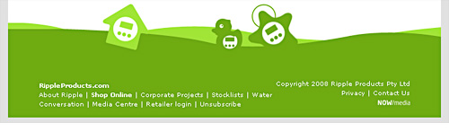
I see this technique a lot on website footers such as here and here, but rarely in email. This RippleProducts email has a green table on the bottom with an image strip above.
2. Background Image: {view email here}
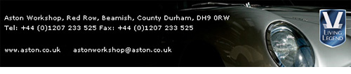
After I saw this Aston newsletter I started to use this technique myself. It degrades well, email clients that don't support background images show a black table background.
3. Blog Post Summary: {view email here}
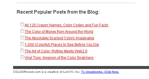
Feature secondary articles in your footer like this newsletter from ColorLovers.
4. Drive In-Store Traffic: {view email here}
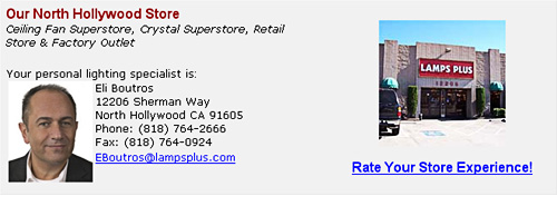
Use your footer to drive subscribers in-store. Lamps Plus use your postcode - submitted at sign up - to inform you which store is closest.
5. Highlight Website: {view email here}
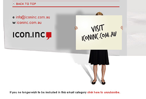
This photo draws the eye to the Icon.inc website. I love this email, it has a great animated header...
6. Social Media: {view email here}
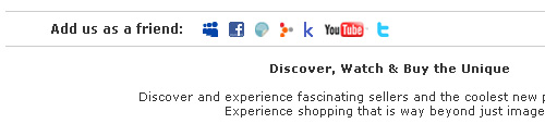
In the last month Sur La Table, Shopbop and Urban Outfitters have added social media links in their footer.
Over time we'll see more retailers moving the link above the fold - like Bloomingdales and The Conran Shop.
7. Enhance Brand: {view email here}
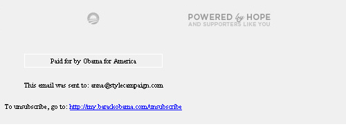
Every part of your email should enhance your brand. Barack Obama's footer had the slogan, "Powered by Hope".
8. Standout Copy : {view email here}
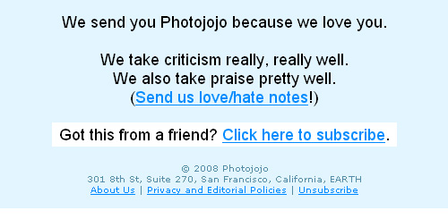
It's not always the design of your footer but the words you use. Footer text is often legal sounding and off-putting in length. So its refreshing to read Photojojo's, "Send us love/hate notes!". (Notice the address includes EARTH)
9. Don't hide the Unsub: {view email here}
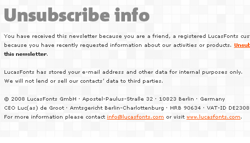
Just this week I was discussing (@stylecampaign) if the unsub should be placed at the top or bottom of a newsletter. This email from LucasFonts adds a big "Unsubscribe info" header in the footer. It's a gutsy approach to the unsub dilemma.
10. Recent Issues: {view email here}
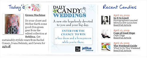
People don't catch every issue of your newsletter, adding links to recent editions allows you to maximize content.
If you've designed a stylish email footer (or seen one you like) email me the URL and I'll put it on the blog. Alternatively post the url on Twitter using the hashtag #annaff (Anna Footer Fetish) and I'll get it.
Check out:
Design inspiration - 400 beautiful web footers
4 newsletters in this post are from the Campaign Monitor gallery - View more