Video in email (Gifs and WebP)
|
|
Speaker – Anna Yeaman, 20 mins
All the slides (105) →
Hi this is Anna from stylecampaign, I’ll be talking about the basics of animation in email using Gifs and WebP. If you missed it part one was Cuts. This is where you take a small number of frames and cut between with no transitions. You can produce a range of effects fairly quickly.
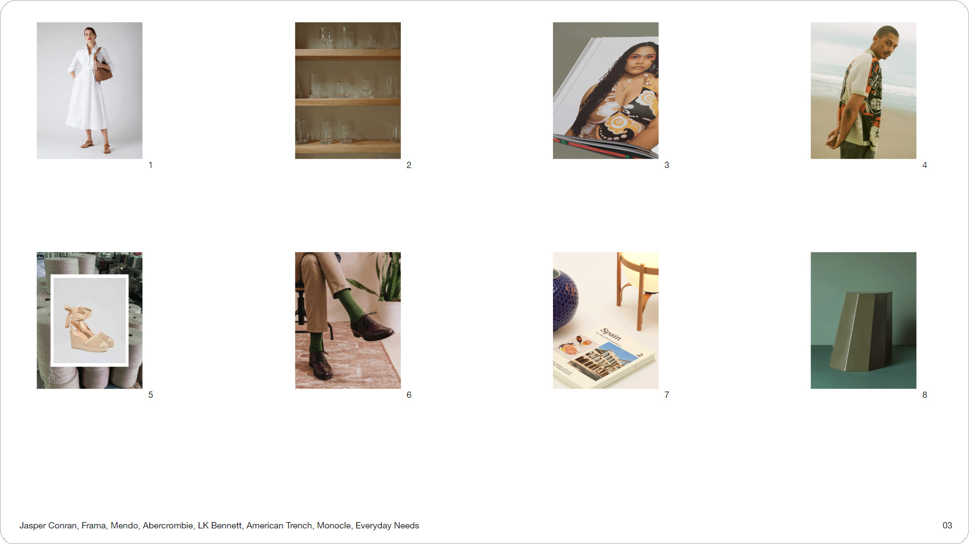
Slide 03, If you missed it part one was Cuts.
Slide 05, File-size, placement, accessibility, making and trends.
Part two is Video, and I’ll be going over file-size, placement, accessibility, making videos for email and trends. So to see what’s typical I saved 100 animations from my inbox and sorted them into 3 groups.
54 out of 100 were cuts, 26 were video, and 20 were keyframe animations. Video and cuts made up the majority at 80%. These were some of the videos I received, and by ‘video’ we’re really referring to Gifs and WebP. While a couple had an HTML5 component most weren’t real video.
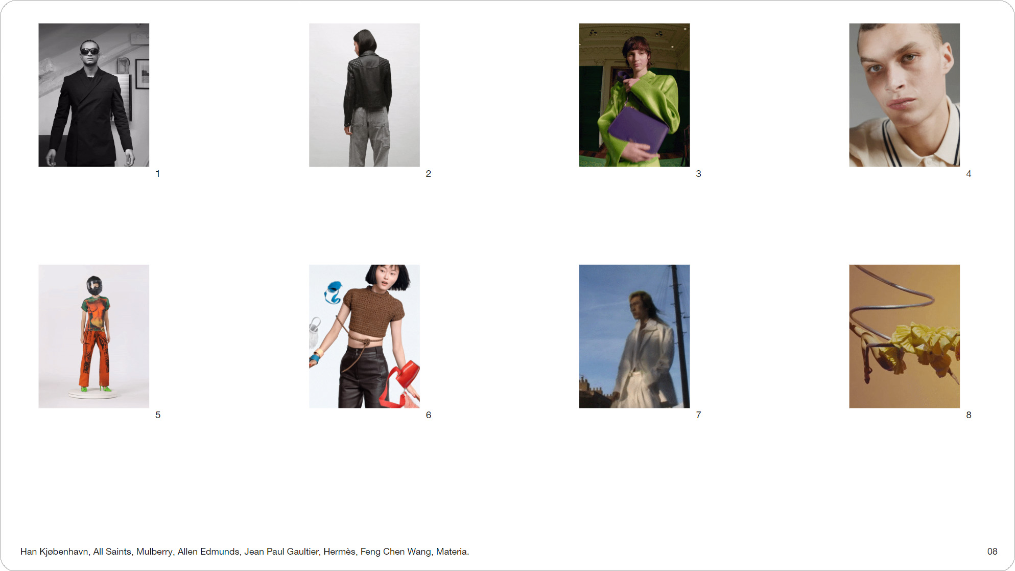
Slide 008, Some of the videos I received, and by ‘video’ we’re really referring to Gifs and WebP.

Slide 09, So let’s start with file-size and frame count
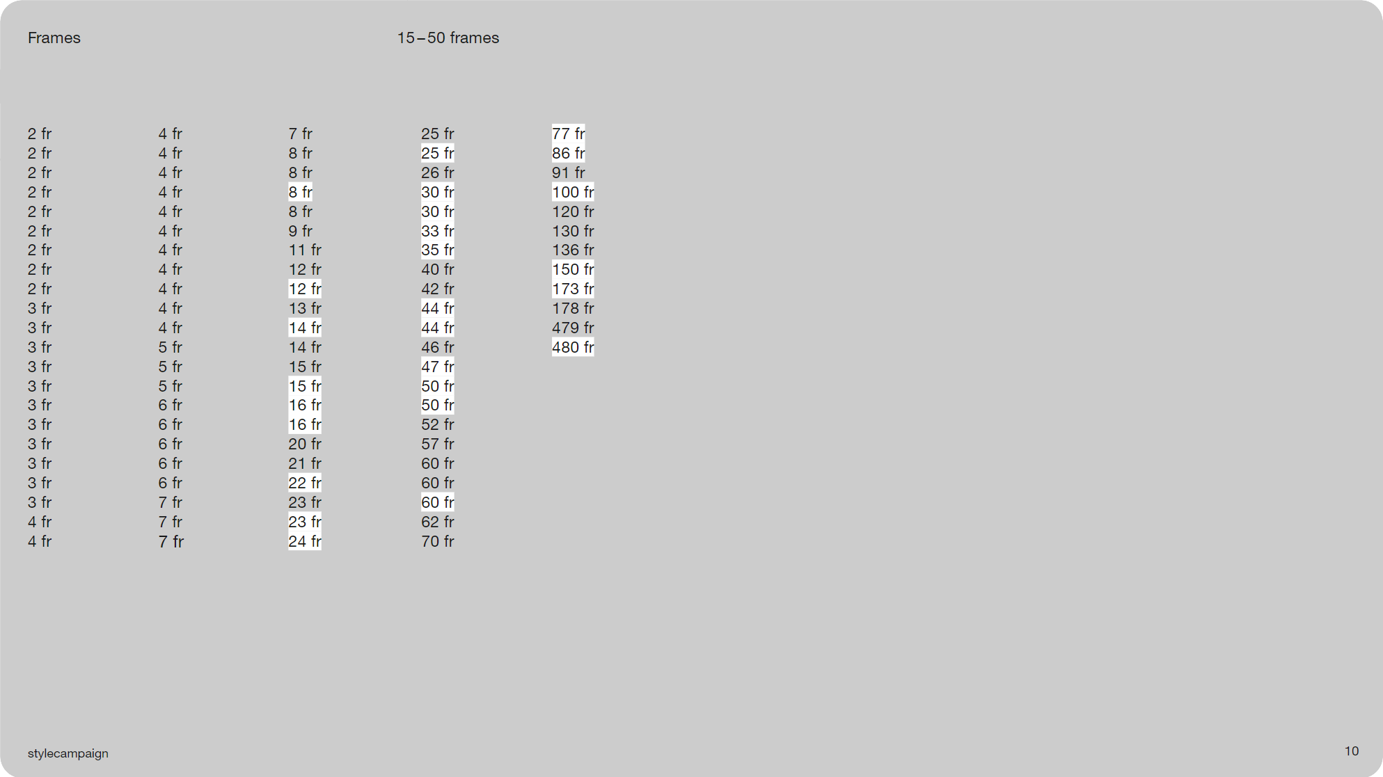
Slide 010, Most of the videos were between 15–50 frames long.
So let’s start with file-size and frame count. Most of the videos were between 15–50 frames long, you can see them highlighted in white. The lowest was Booking.com which used just 8 frames. It comes in just under the 1MB limit we discussed in part one, it’s 986KB. Yelp uses only 12 frames, it had the smallest file-size at 451KB.
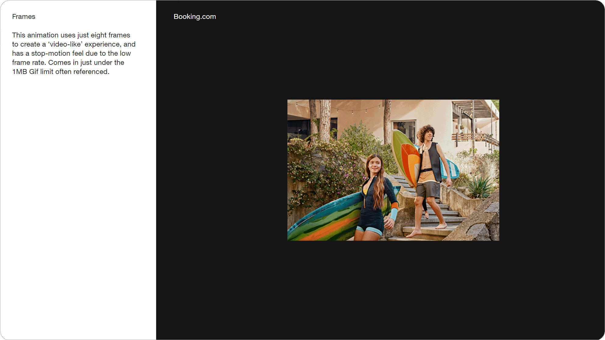
Slide 011, Booking.com used just 8 frames and comes in just under the 1MB limit.
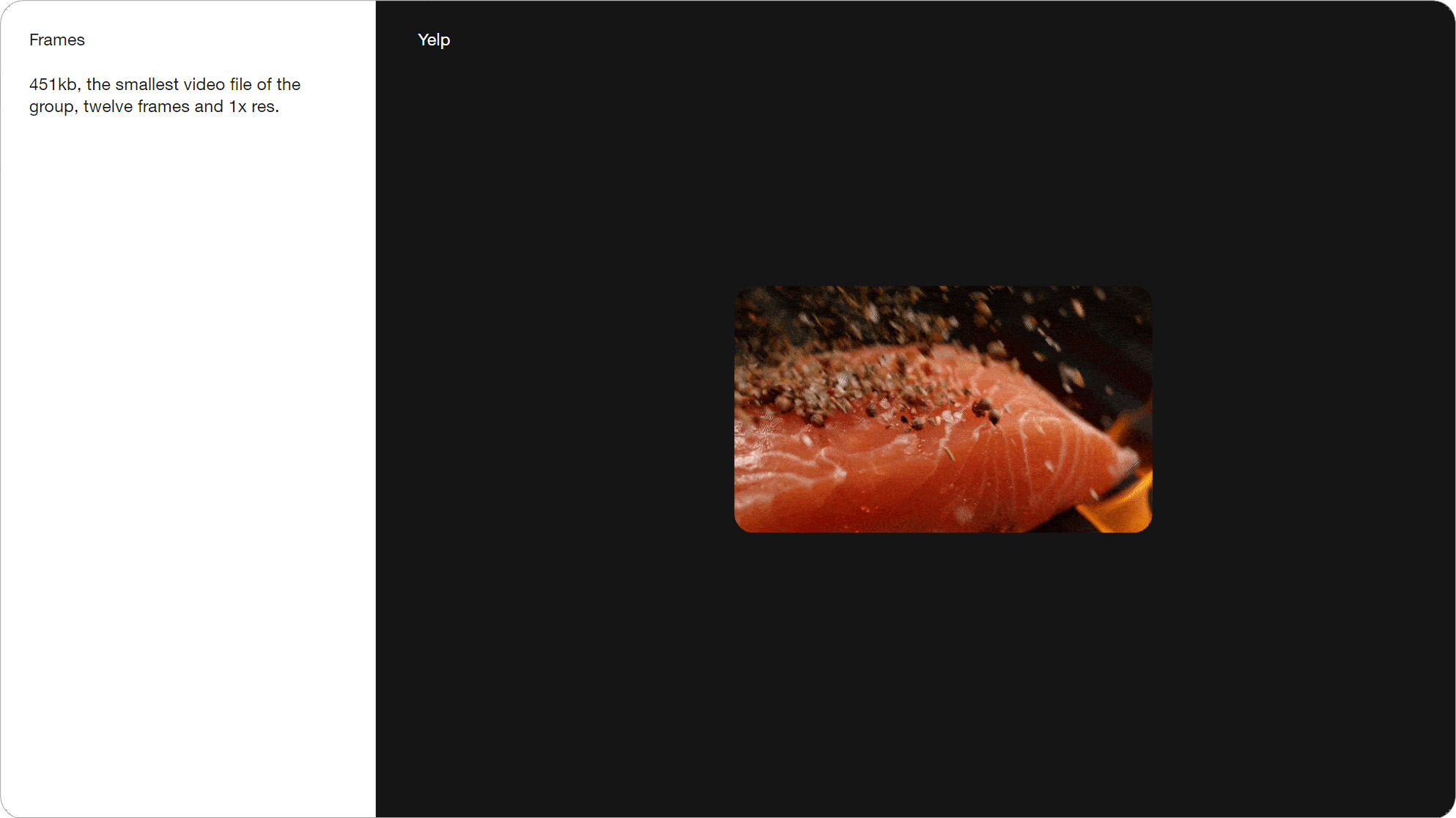
Slide 012, Yelp uses only 12 frames, it had the smallest file-size at 451KB.
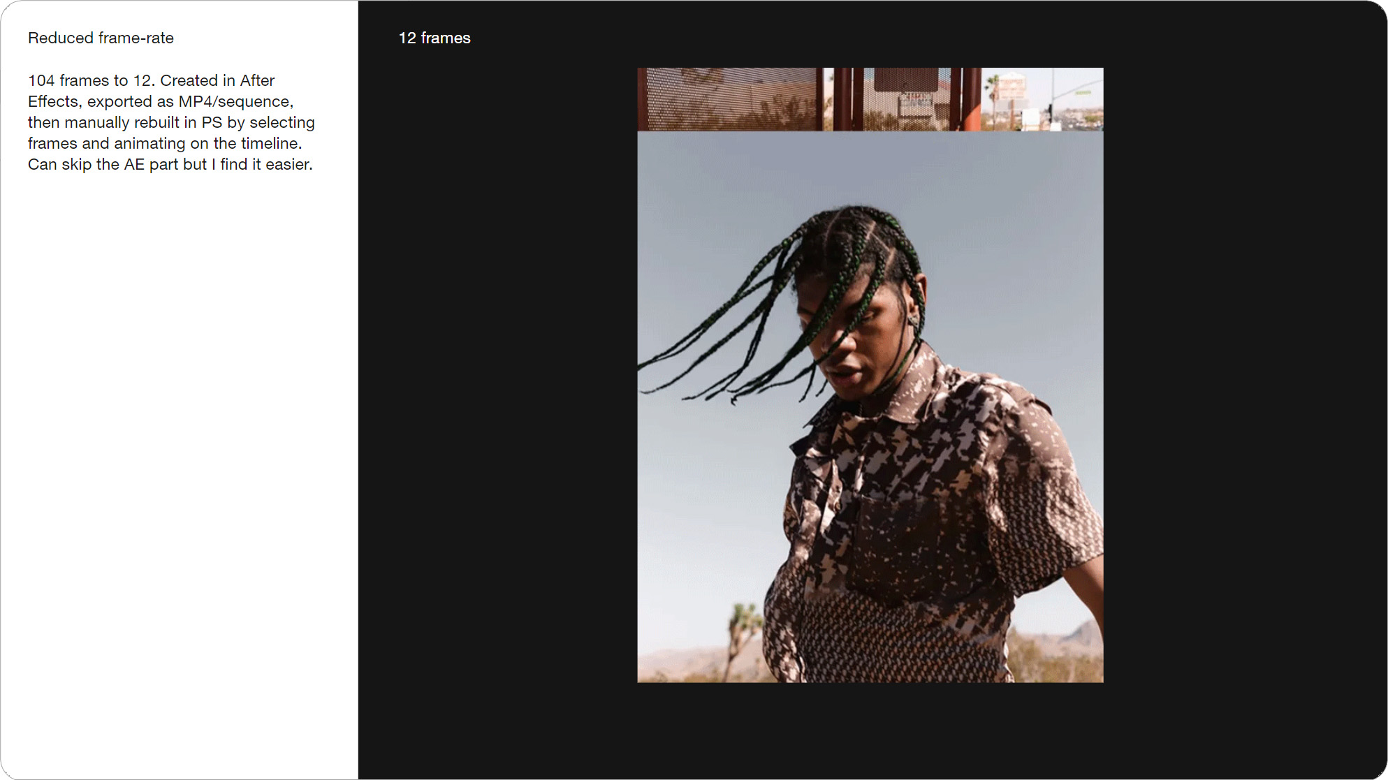
Slide 013, Originally 104 frames out of AE, this version is just 12 frames.
I’ll sometimes create these reduced frame rate animations. This was originally 104 frames out of After Effects, whereas this version is just 12 frames after I rebuilt it in Photoshop. Though typically we want something that’s runs more smoothly, like this Han Kjøbenhavn video. Its 25 frames long, and 4.1 MB.
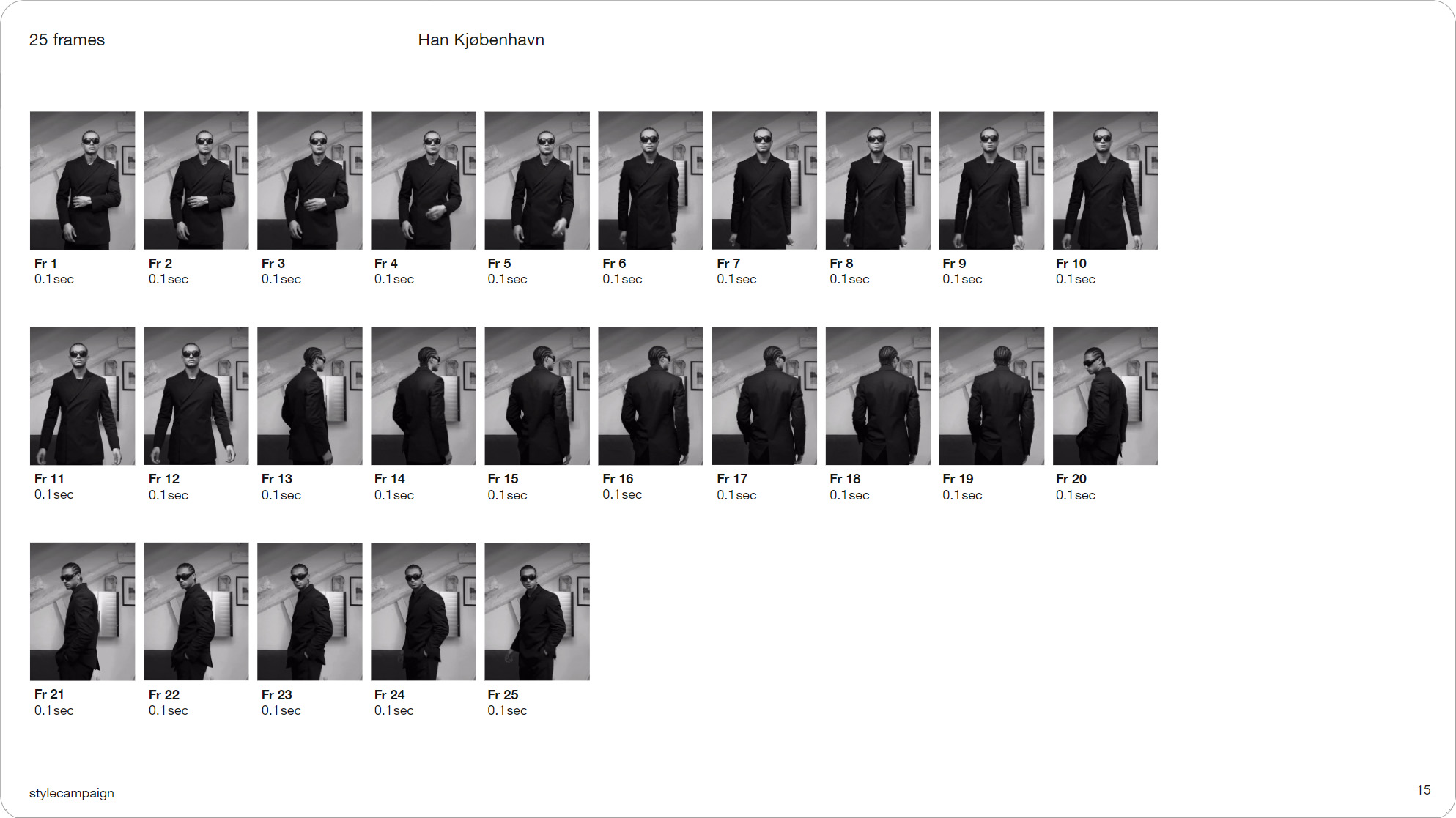
Slide 015, Han Kjøbenhavn video, 25 frames long, and 4.1 MB.
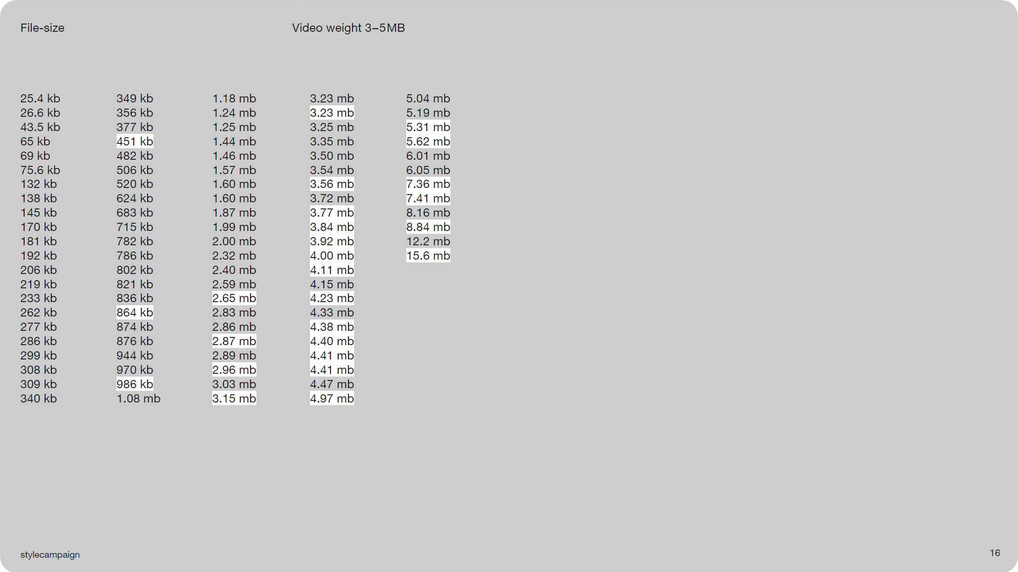
Slide 016, Most videos 3–5 MB, not much happening below ~3 MB.
Which is fairly typical, as most of the videos were between 3–5 MB. They’re bunched around the 3rd and 4th column in white. You can see that there’s not much happening below ~3 MB, especially if were wanting smooth video. Which is Slacks recommended limit.
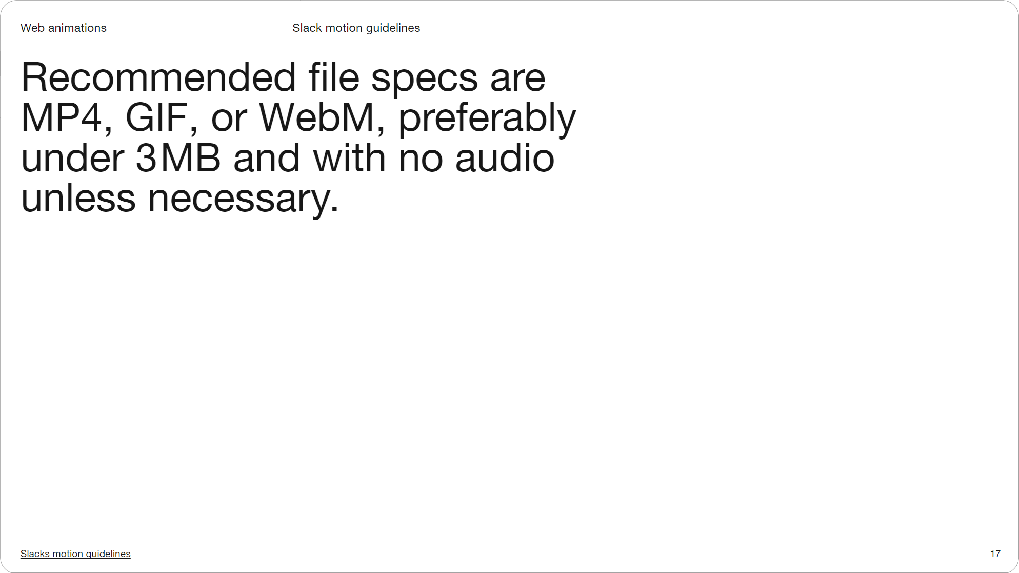
Slide 017, Slacks recommended file size limit for web animations is 3MB
In contrast to ‘cuts’ most of the videos stuck with 1x res, only 7 out of 26, 2x the resolution. You can load different resolution images based on criteria like browser width, or via dynamic images if you want to go that extra step. A couple like Mulberry were using half res and scaling it up, though even then this file is 3.6 MB.

Slide 018, Only 7 out of 26 videos, 2x the resolution.

Slide 019, Mulberry were using half res and scaling it up.
Only 3 out of the 26 videos were under the 1MB recommendation from part one. And one thing I’m seeing more of is multiple videos in one email. Paco Rabanne featured 3–5 videos in a number of sends this year. Zara, Nike, and F.Miller have also all sent two or more videos in an email, it’s not that uncommon.
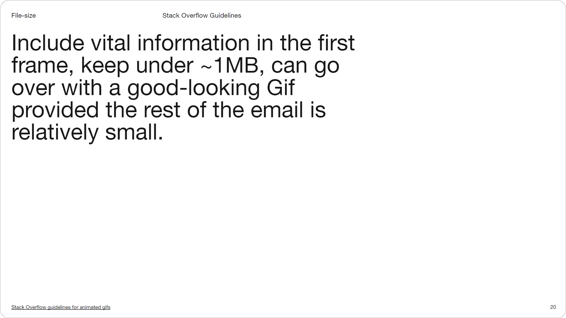
Slide 020, Can go over ~1MB provided the rest of the email is relatively small (Stack Overflow).
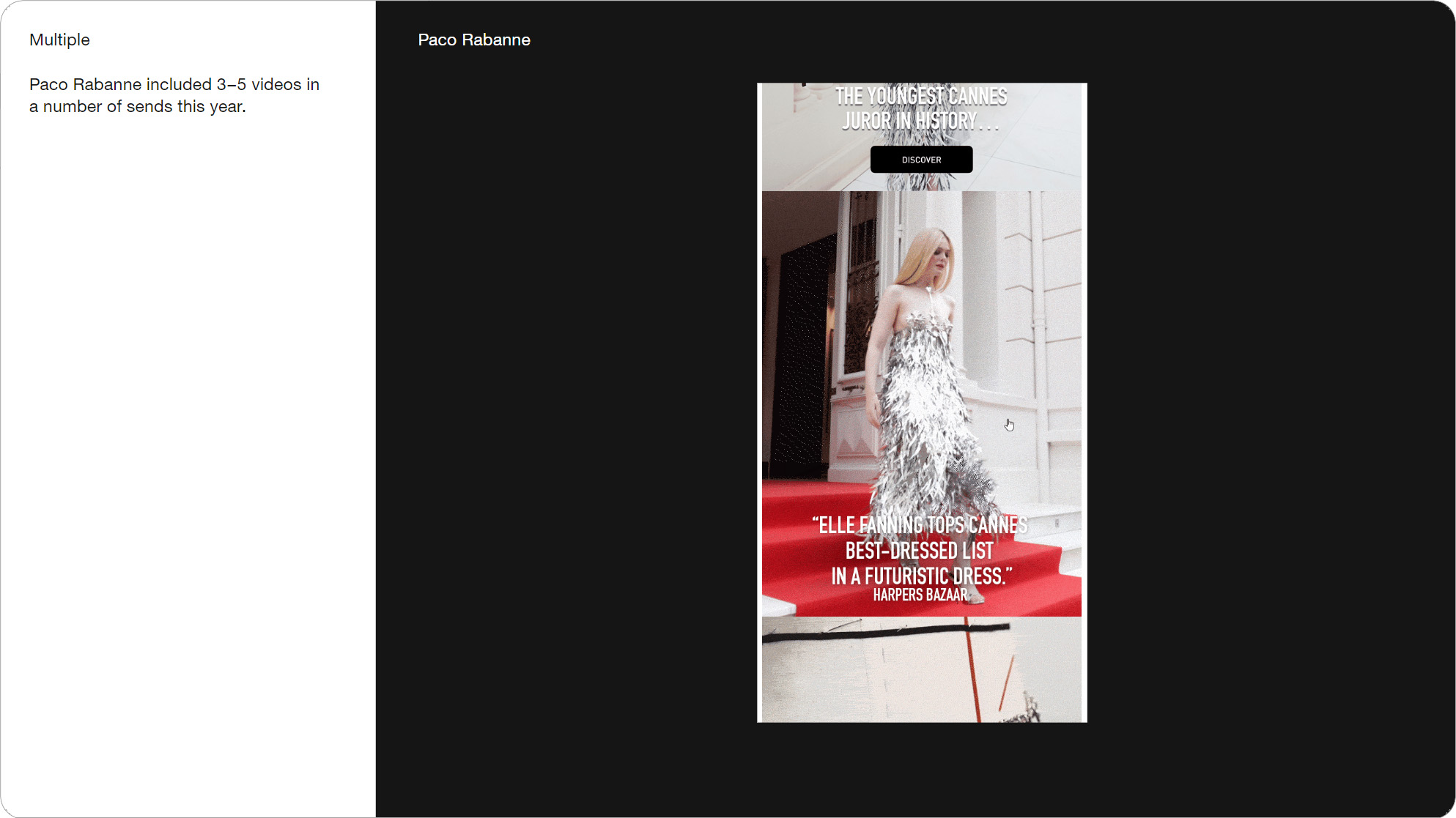
Slide 021, Paco Rabanne featured 3–5 videos in a number of sends this year.
Below is from Compass’ motion guidelines, and they have a bit about email. They mention using fewer frames, shorter duration, and fewer colors, to try and keep below 1MB. There’s really no secret to keeping file sizes down beyond what we already know. Some people use an optimizer like Ezgif, these are file names from a couple of video emails I received: Ezgif.com-optimize.gif and 1393320_ezgif.webp.
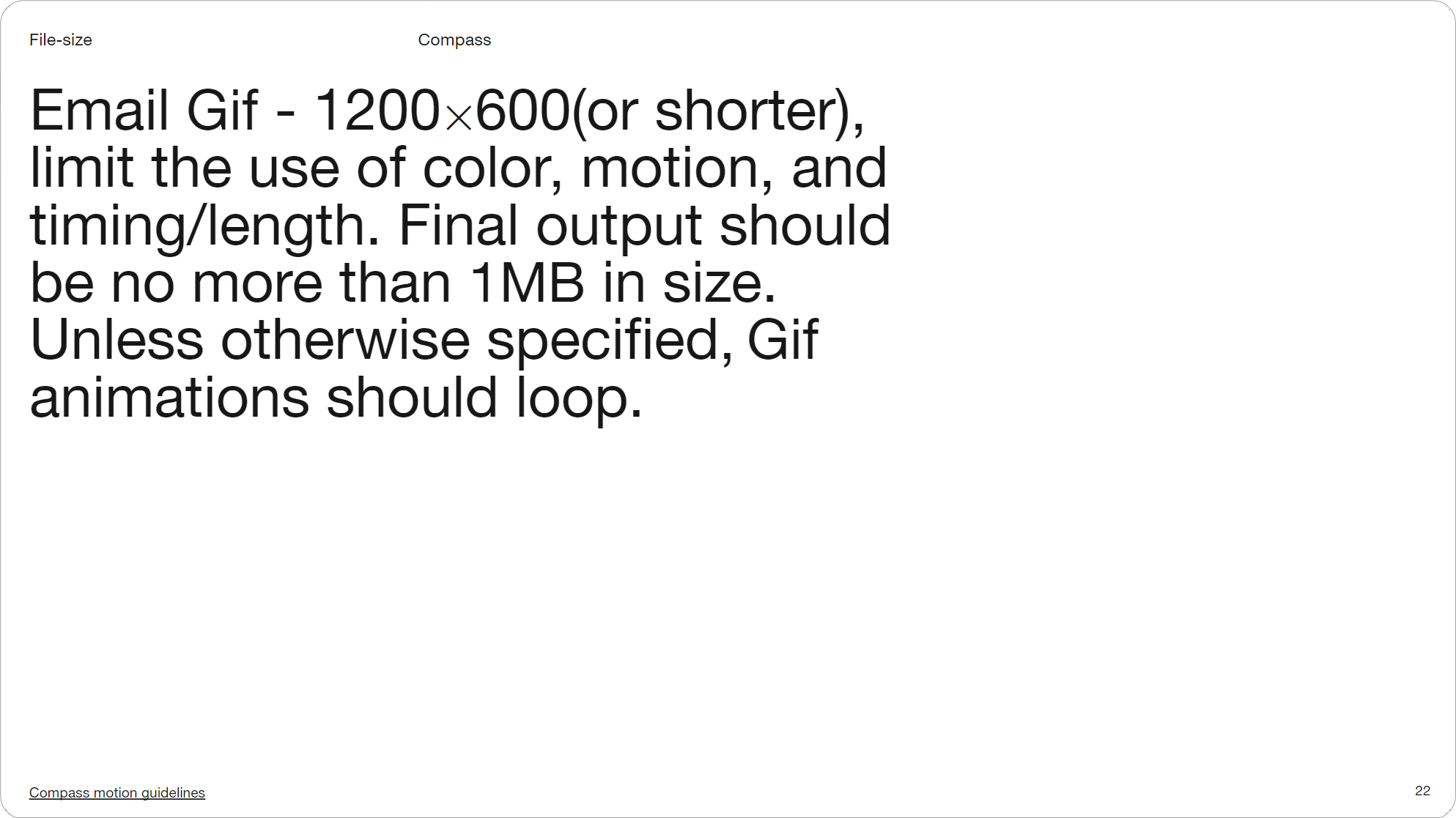
Slide 022, Compass guidelines, no secret to keeping file sizes down beyond what we already know
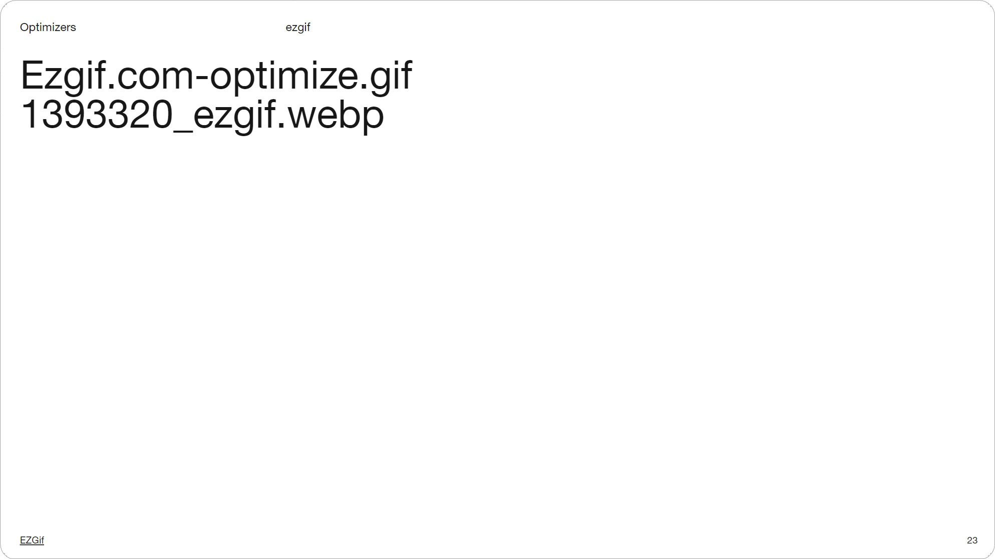
Slide 023, These are file names from a couple of video emails I received (Ezgif).
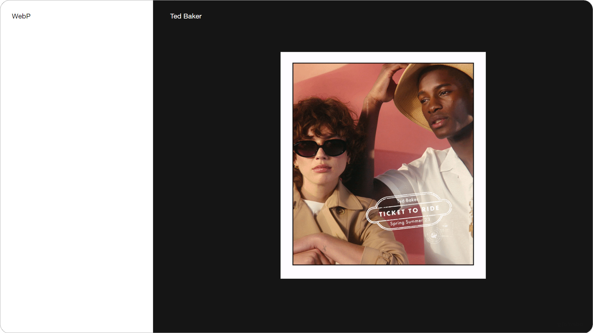
Slide 024, 5 out of the 100 brands used WebP, one was Ted Baker.
The only magic bullet I know of is switching to WebP, which 5 out of the 100 brands did. One was Ted Baker, and another was Zara. Loewe, Chanel and Dior have also used WebP, so it’s mainly fashion retailers. WebP animations are around 64% smaller than Gifs, with better image quality.
This is from Zimmermann, the WebP file is more than twice the resolution of the Gif, and it has more frames (82 compared to 52) and yet it’s still half the file size. The WebP is 3.7 MB versus the 6.6 MB Gif. The benefits are pretty clear.
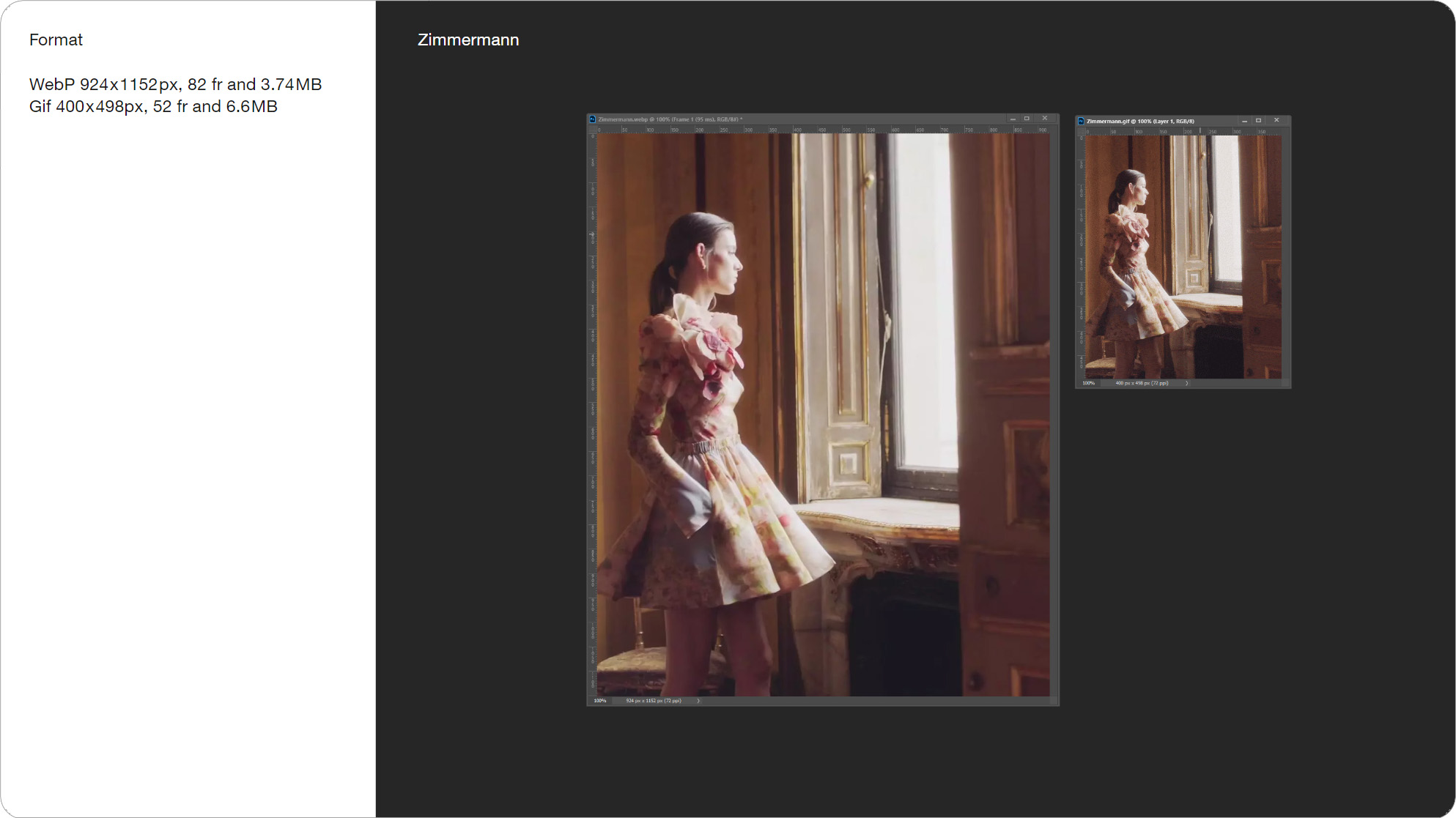
Slide 027, Zimmermann WebP video 2x res of the Gif but half the file size.
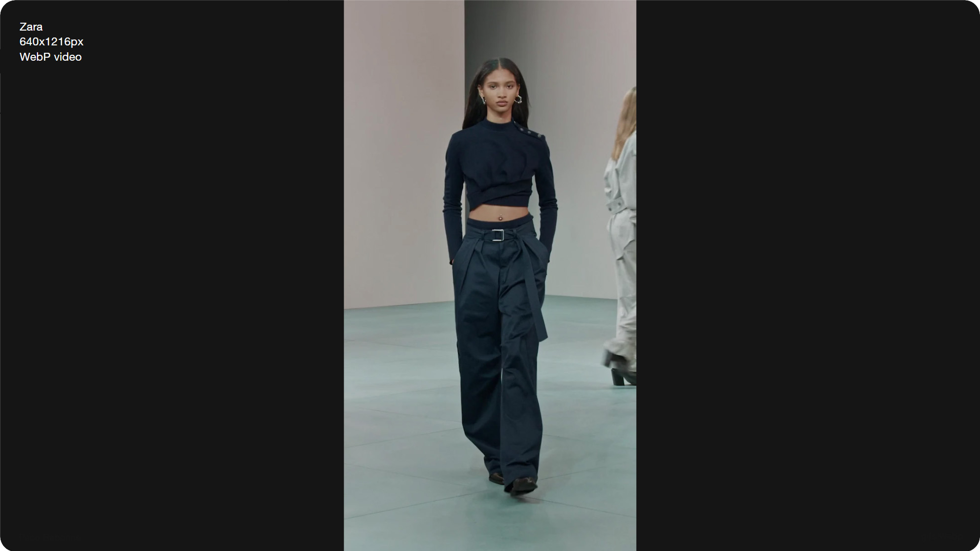
Slide 028, WebP video by Zara, 640x1216px, 1xres, and 320 frames.
I think this is the biggest video in an email I’ve ever seen. It’s a WebP video sent by Zara, and it’s 640x1216px tall, 1x res, and 320 frames. This long, tall format looks great on mobile. To top it off they had a second video underneath. So brands are already using WebP to send bigger and longer videos.
Email support for webp is 88%, and that’s if your using dynamic images (probably via a vendor). If you’re using the picture element then it’s Apple and Android clients.
Slide 030, AVIF and Jpeg XL are designed to supersede WebP.
I wanted to briefly mention the AVIF format, as brands like Mr. Porter, Saks, Chanel, and Zara are already using it in email. It supports animation, though I’ve only ever seen it used with static images. AVIF can be up to ten times smaller than a Jpeg, so it’s not surprising were seeing it used for hero images like here with Chanel. This AVIF image is 1400x1800px, so 2x res. I installed this AVIF PS plugin, to view and create still images. AVIF has 56% email support, again you’d use it with the picture element or server-side.
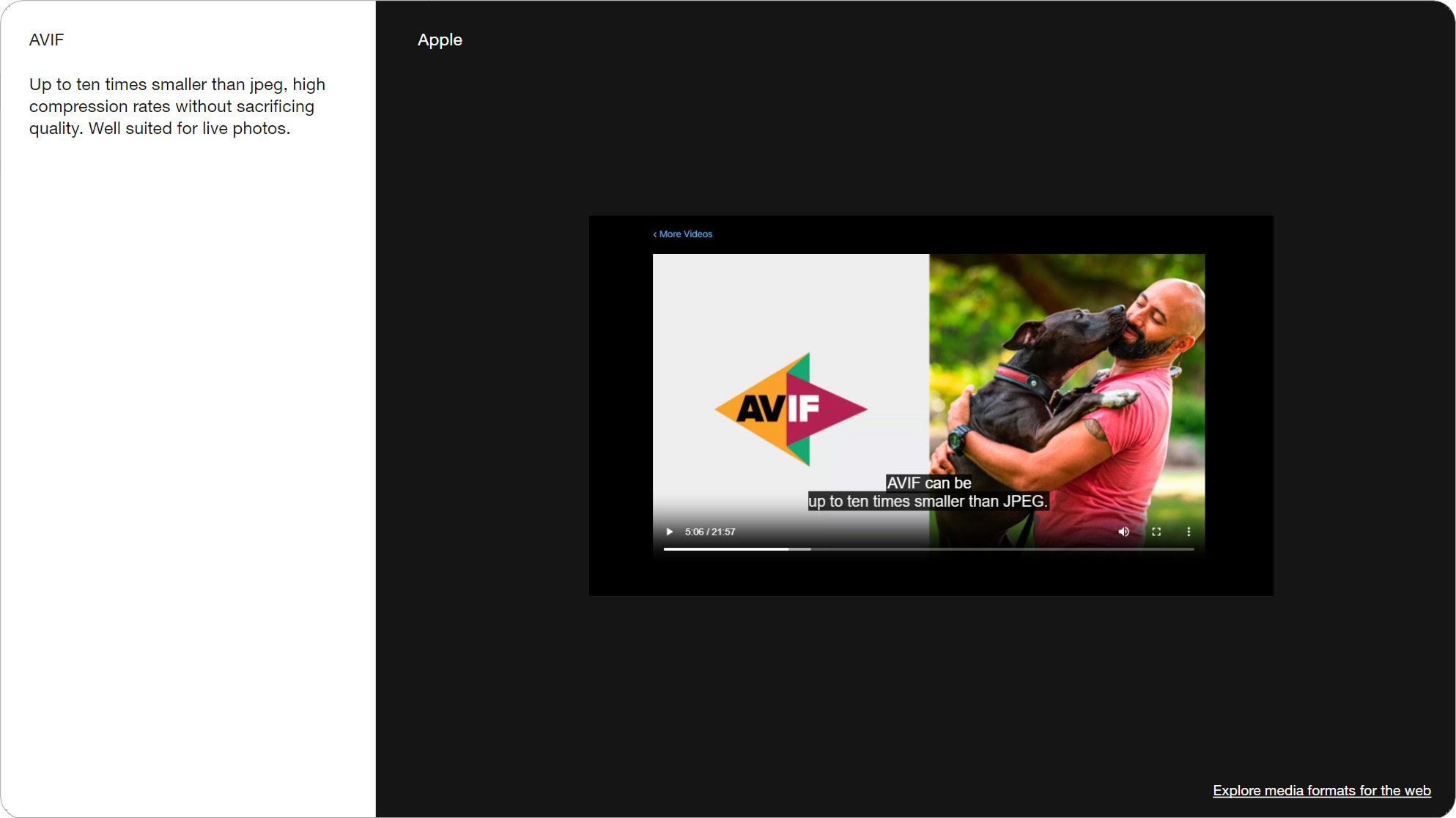
Slide 031, AVIF can be up to ten times smaller than a Jpeg.
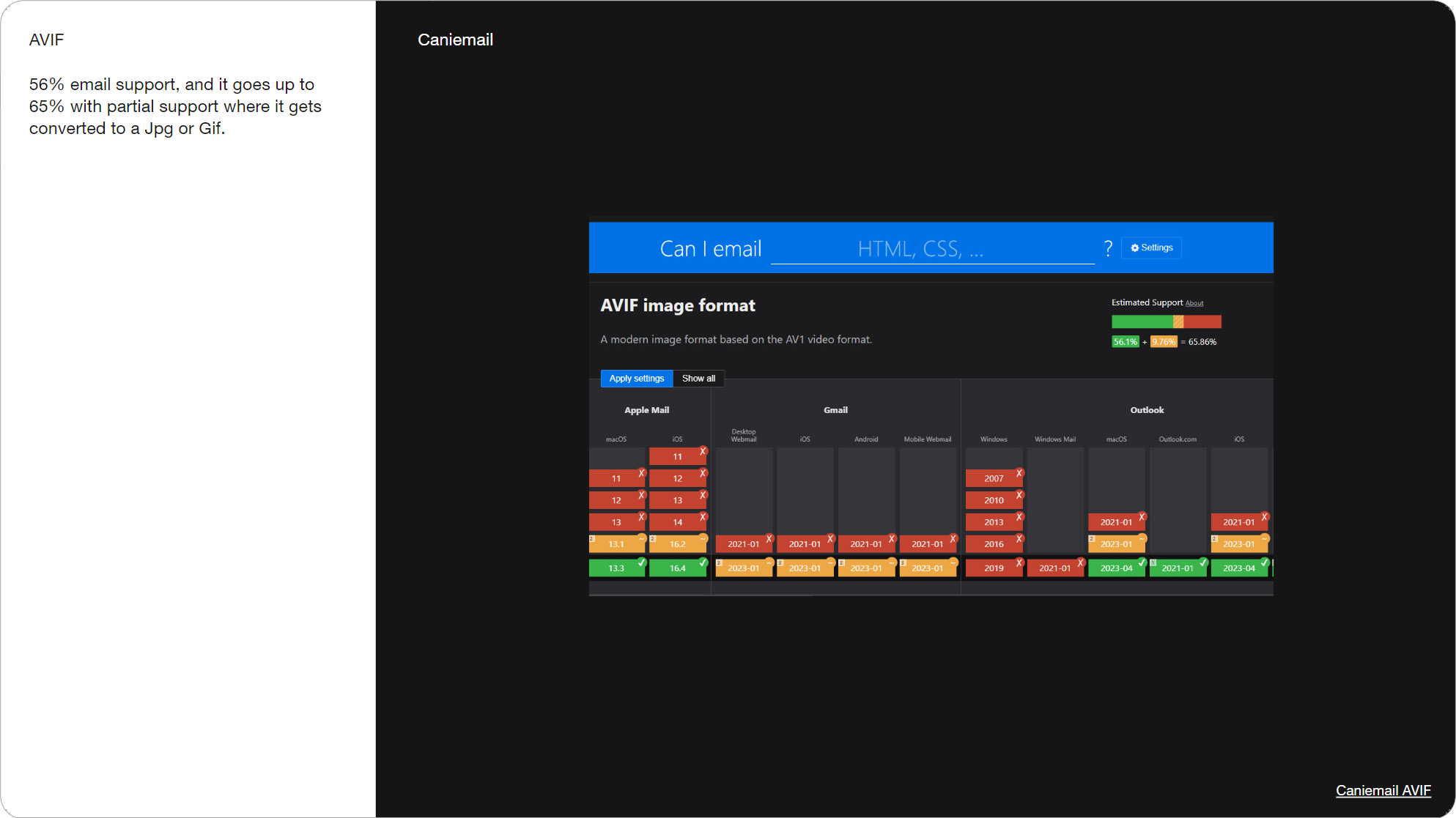
Slide 033, AVIF has 56% email support, again you’d use it with the picture element or server-side.

Slide 034, Gmail’ 102k limit is just the code not external images.
Just a final caveat when talking about file-size, is Gmail’ 102k limit isn't something you need to factor in, as it doesn’t include external images, it's just the weight of your code.

Slide 035, Placement, 10/26 videos were placed further down the email.
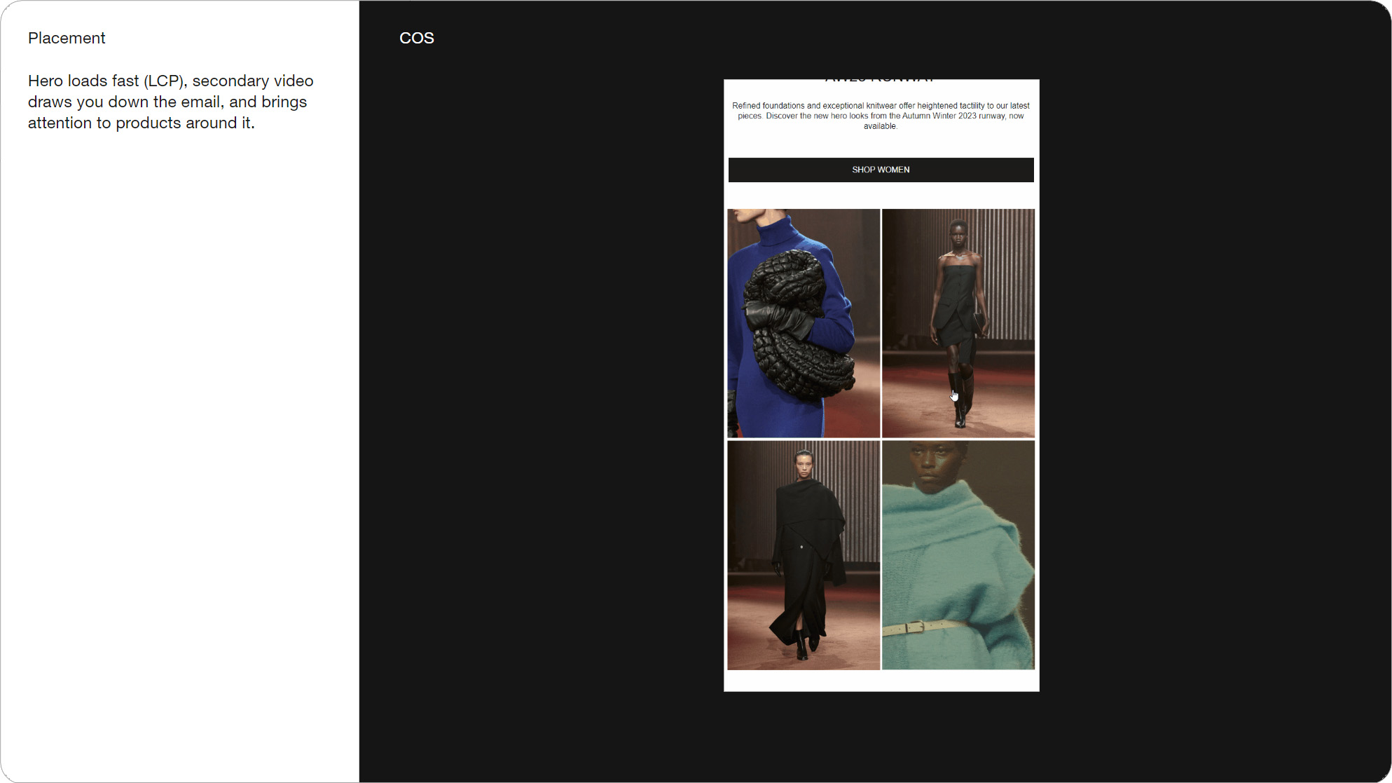
Slide 036, A static product grid further down the email and one block is video (COS).
The next thing I wanted to look at is placement. Ten out of the 26 videos weren’t in the hero but placed further down the email. I’m seeing this sort of configuration a lot; where you have a static product grid and one is video. It draws the eye down the page, and keeps the file size fairly small as it's not a large image. Here’s a few more examples from Frank and Oak, Lavin, and Jimmy Choo.
And the same pattern on the web, multiple small videos interspersed, drawing you down the page. This is from the website Maison Margiela, I really like how subtle and inviting the video is here, with the slow-mo.
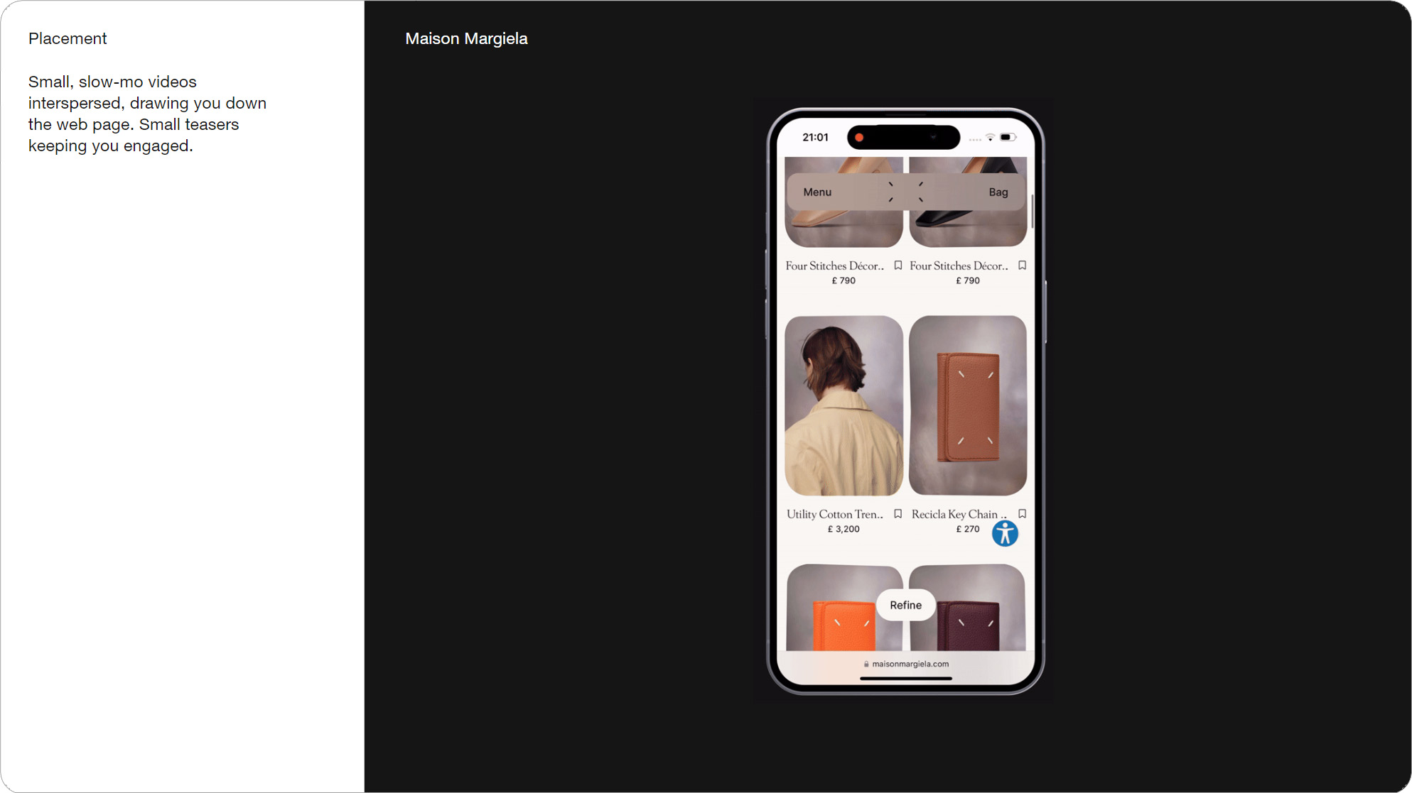
Slide 037, Multiple small videos interspersed, drawing you down the page (Maison Margiela)
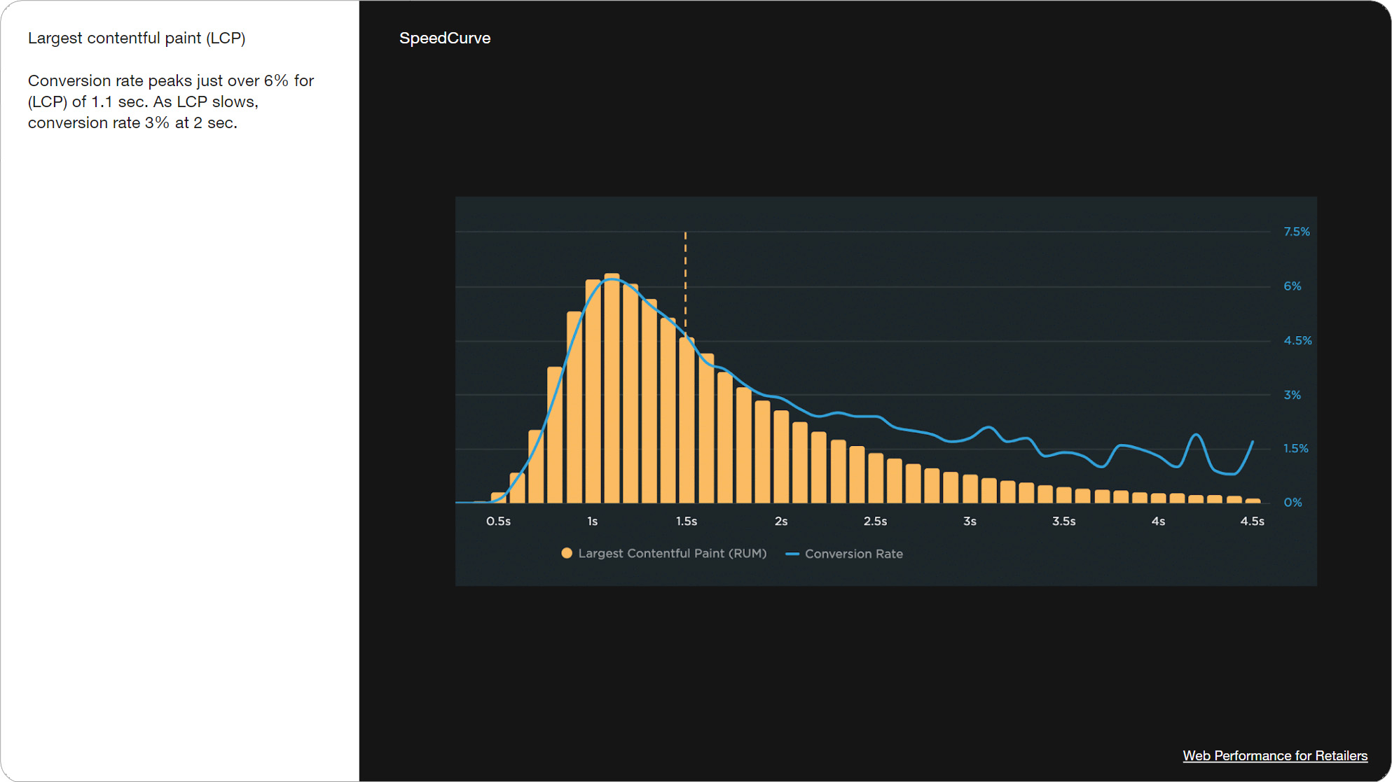
Slide 038, 50% drop in conversions if the LCP goes from 1 to 2 seconds (Speedcurve).
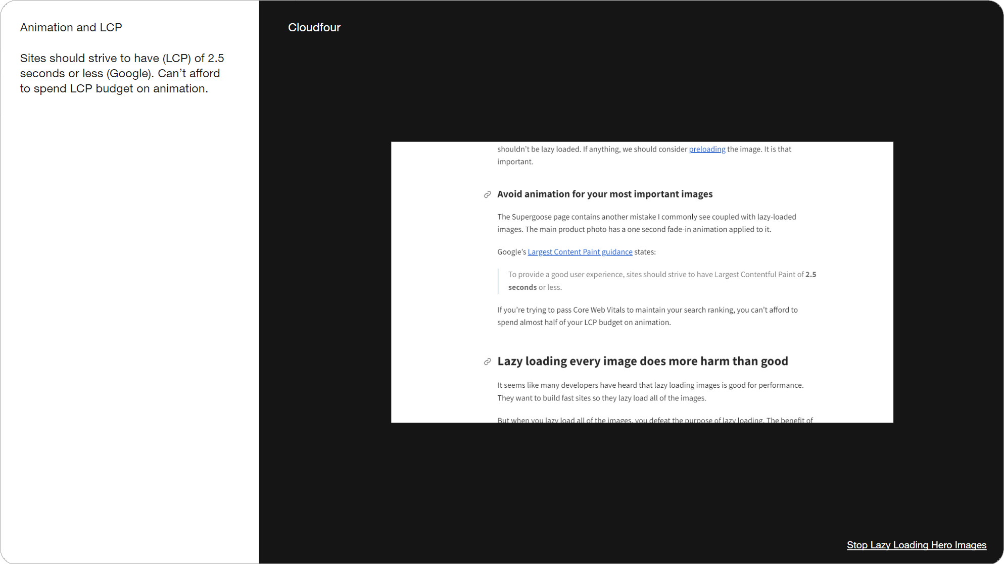
Slide 039, Avoid animation for your most important images (Cloudfour).
There’s a performance metric called, Largest Contentful Paint, which measures the “Amount of time it takes for the largest visual element to render.” So likely the hero image. This graph from Speedcurve shows a 50% drop in conversions if the LCP goes from 1 to 2 seconds. So we want our hero image to finish loading as quickly as possible. For this reason it’s sometimes recommended that you don't animate your LCP. I’m not saying never put video in the hero, just that it's worth testing some different approaches.
This article talks about how people have become desensitized to header/hero content, and just scroll right past. I think it was Mark Robbins who shared this in the emailgeeks slack.
Slide 040, People often scroll right past the first screenful and settle below (The rhythm of your screen).
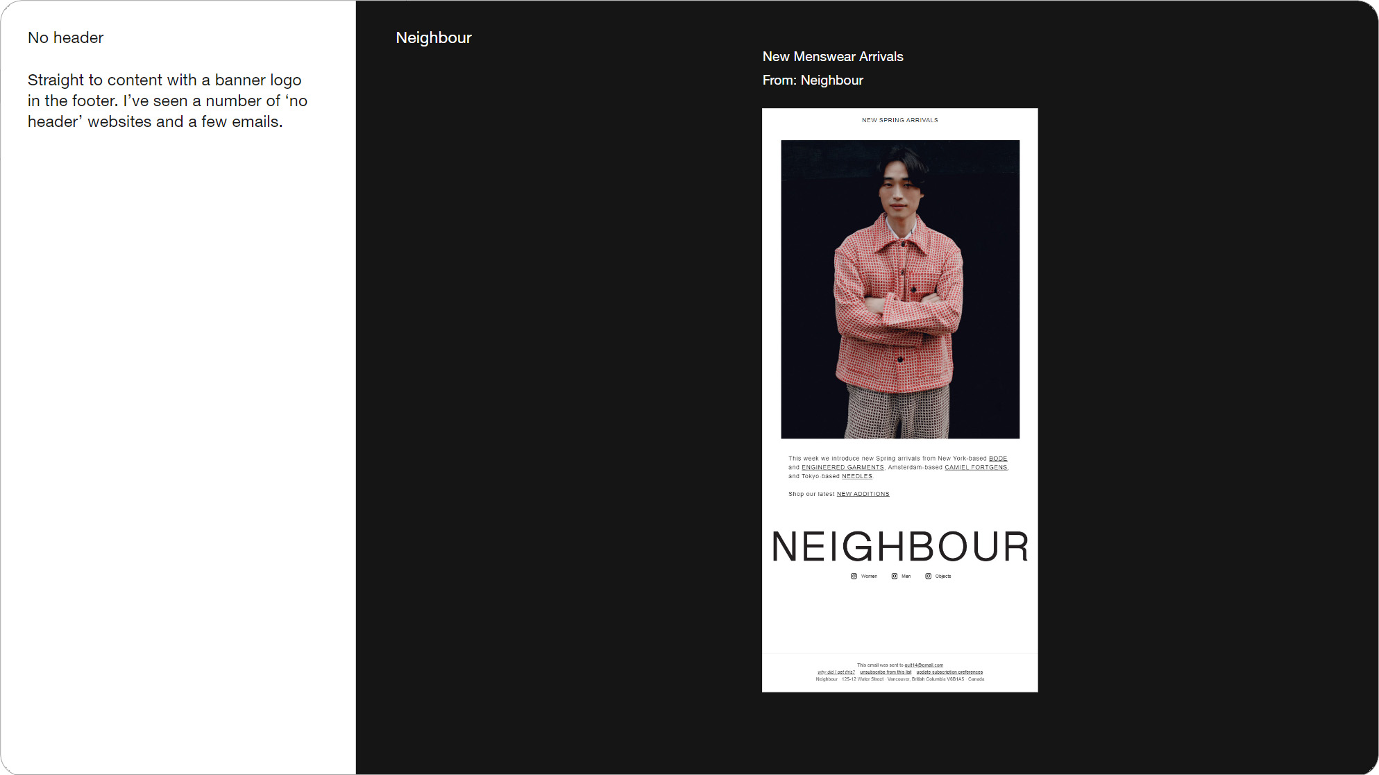
Slide 041, Email by Neighbour doesn’t have a traditional header and logo in footer.
Related to this, this email by Neighbour doesn’t have a traditional header, it’s just straight to the content with a big logo in the footer. I first noticed this 'no header' trend on websites, and I’ve seen it creeping into email, here’s one from Sportivo.
We’ve moved our navi and web version links into the footer, but I’m also seeing logos getting shifted. With email you still have the from name right above for brand recognition, so it's not as radical as it seems. Here’s examples on the web by Balestra and Studio Jarvis.
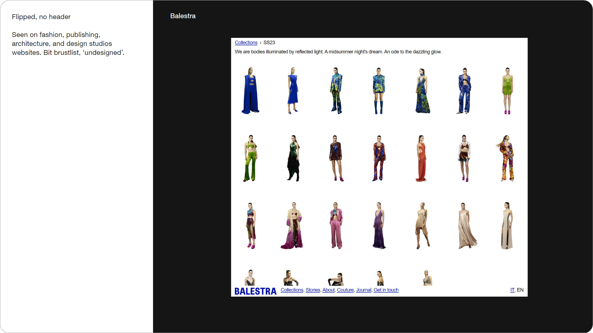
Slide 042, A 'no header' example on the web by Balestra.
Slide 043, Lazy loading defer loading images that are off-screen until user scrolls near them.
Lazy loading would be useful with animations placed further down the page, as it only loads assets when they’re needed, as you scroll near them. There's strong native browser support for lazy loading, around 93%.
Can I email puts support at 29% (this was in 2021), but if we go by email client marketshare it's more like 60%. Just make sure you don’t lazy load your hero images, only assets that are further down.
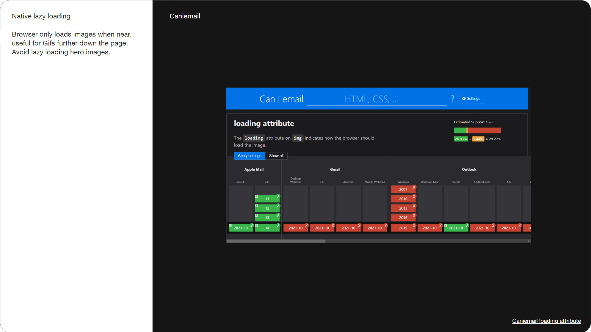
Slide 044, Can I email puts lazy loading support at 29%.

Slide 045, Accessibility, there’s WCAG success criteria specific to video.
There’s a few WCAG success criteria specific to video, you’re probably familiar but let's have a quick run through.
Slide 046, Player controls

Slide 047, On the Risd university website, there’s this pause motion button on the right.
Player controls are a level A requirement with auto playing content that lasts more than 5 secs. We can see it in action with this video marquee on the Risd website, there’s this pause motion button on the right. Also on this Sustainable Digital Design website there’s a switch to turn all animations off. As well as The Office of Ordinary Things, another climate, sustainability focused design studio.
There’s obviously common ground between sustainable design, and accessibility. There’s been a couple of talks by Alice Li and Ted Goas, about eco-friendly emails, I’ll add the links in the write up. This quote is from MEK, who explain how they designed their website to reduce its CO2 emissions.
Slide 048, Sustainable design and email.
Back to player controls, even if you’re using real video like Moncler, it’s still going to show up as a Gif in Gmail. We have the same problem described by the BBC. Which is partly why all 100 animated Gifs I saved out looped continuously. The BBC recommend lazy loading as a solution, but as we just saw support is 26% in email. So yeah you get what we're dealing with.
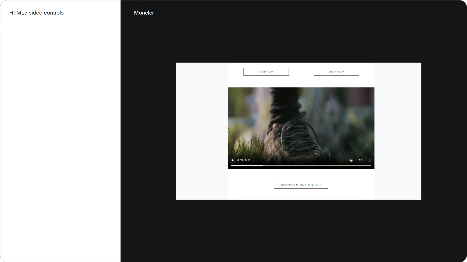
Slide 049, Moncler using real video with controls, but still going to show up as a Gif in Gmail.
Slide 050, If Gif is near the bottom of a page, 5 sec finished before the user ever sees it (BBC).
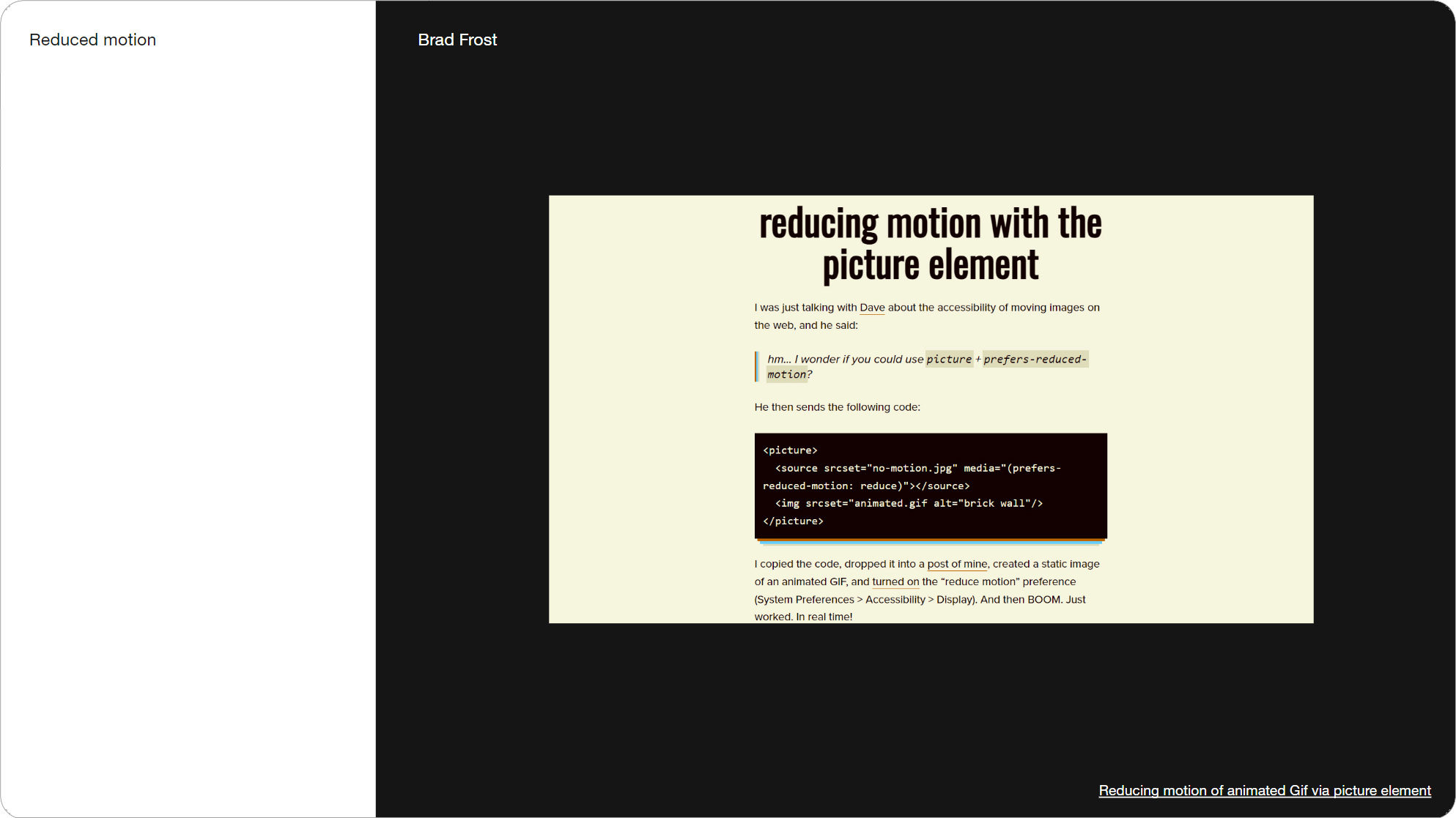
Slide 051, Reducing motion of animated Gif via the picture element.
One thing we can do is add a reduced motion query, which allows us to provide a static alternative for people who’ve opted out of motion. It has 46% support, but ~60% marketshare. Related to motion blur and camera shakes, is the Three Flashes or Below Threshold. These all fall under motion sensitivity, which is discussed in this article by Val Head.
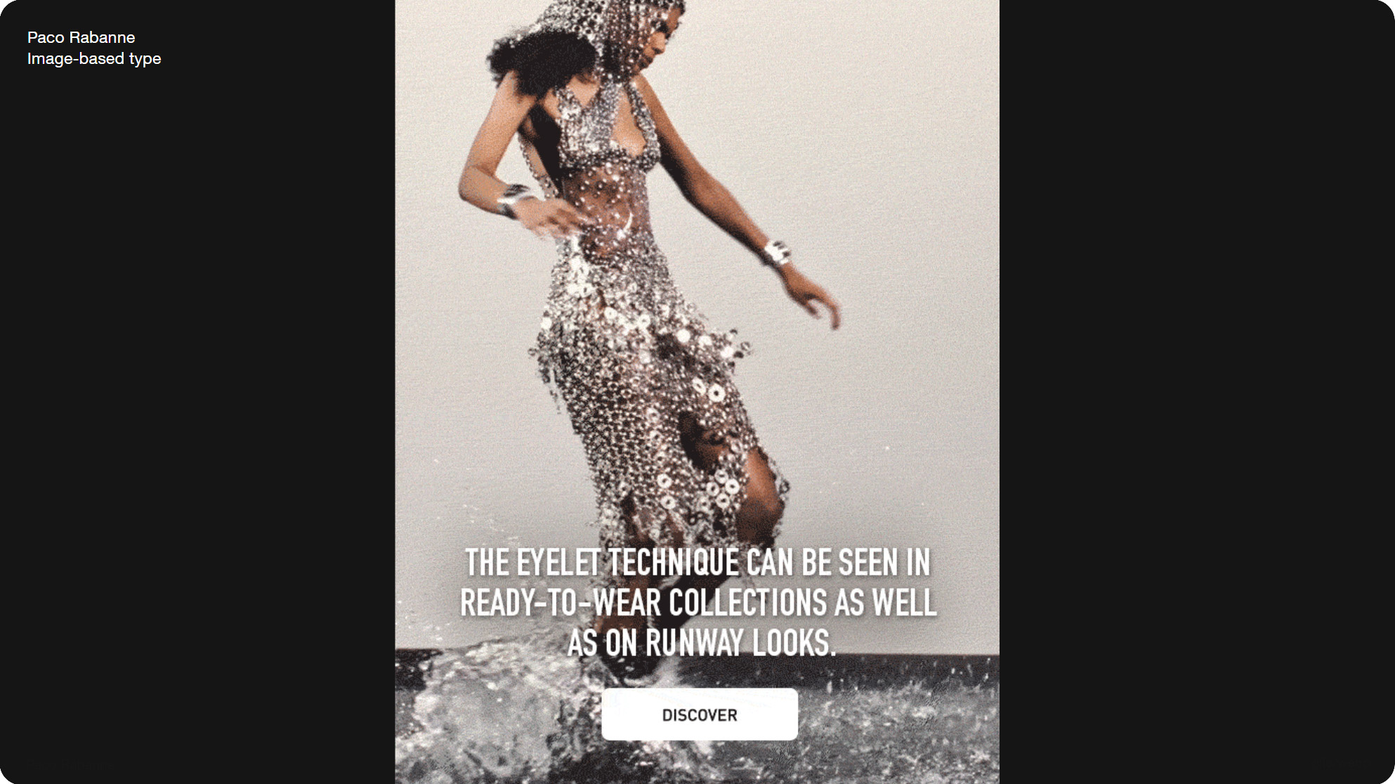
Slide 055, In this Paco Rabanne email the text is image-based, but nice and large.
We covered type in part one. In this Paco Rabanne email the text is image-based, but nice and large. Here they’ve used live text with a video background.
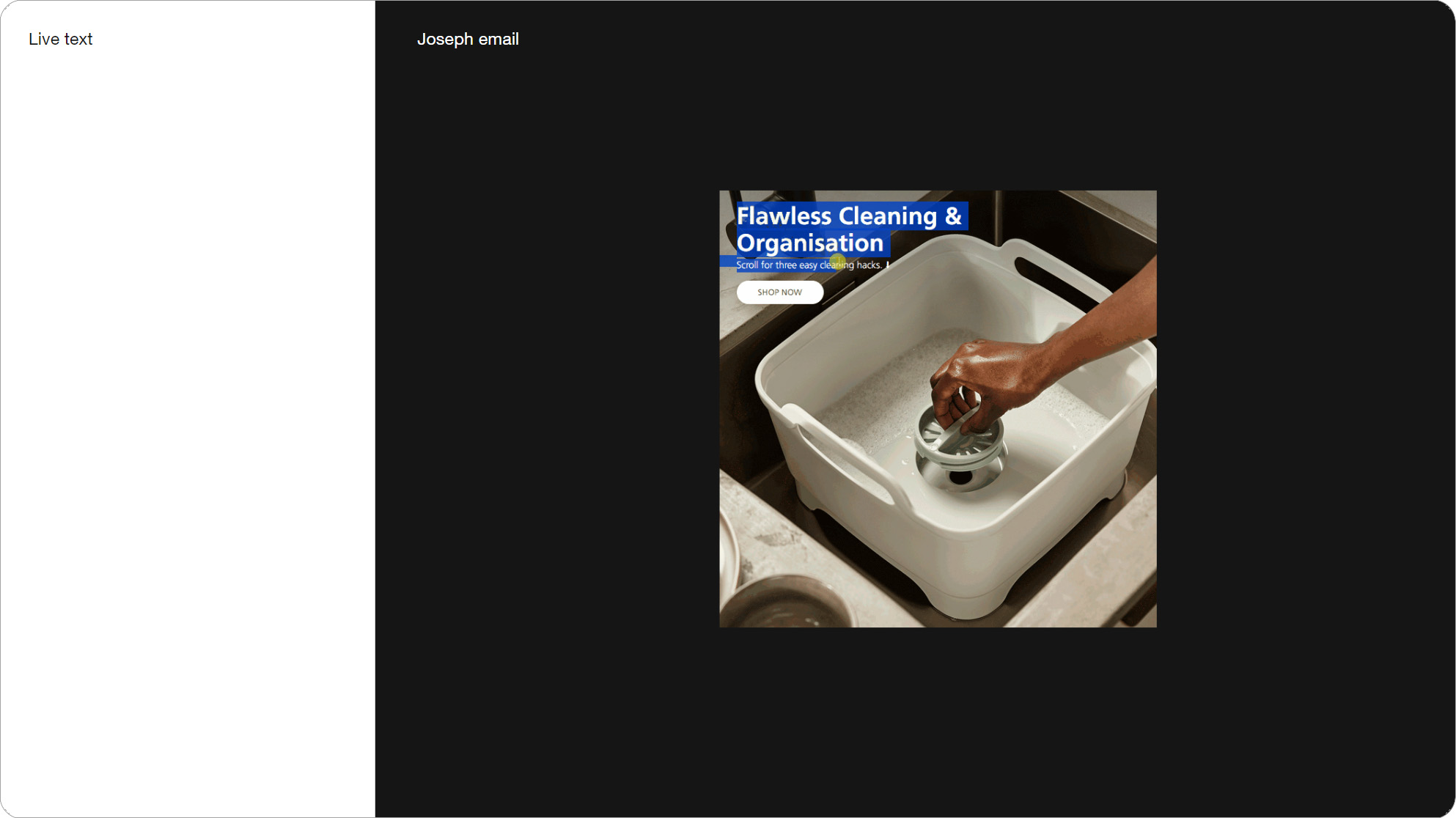
Slide 056, Here Joseph have used live text with a video background in their email.
Typography and video are covered in a number of motion guidelines. This is from Uber, Noom, and Unity have a motion grid in order to keep all their animations and type consistent.
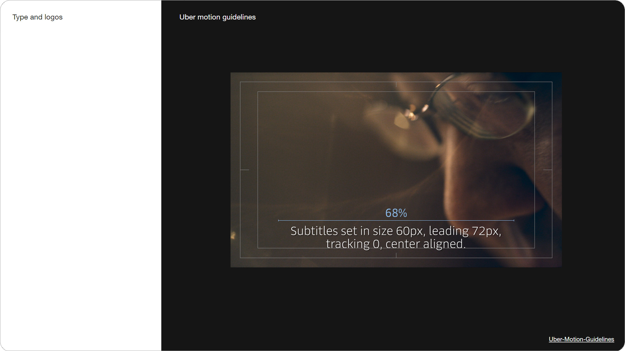
Slide 057, Uber motion guidelines include type within video.
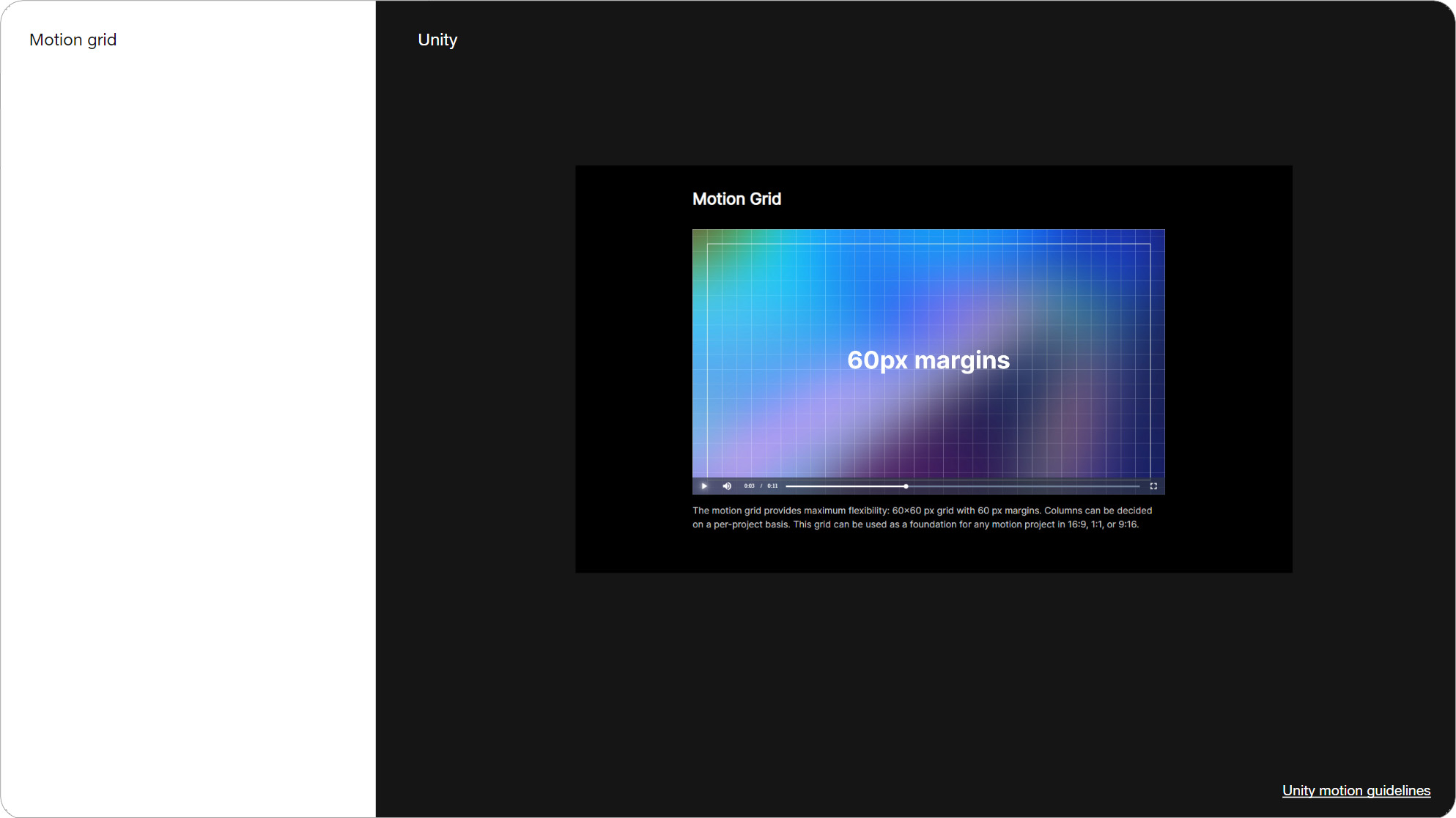
Slide 059, Unity have a motion grid in order to keep all their animations and type consistent.

Slide 061, For making lets pick up where we left off...
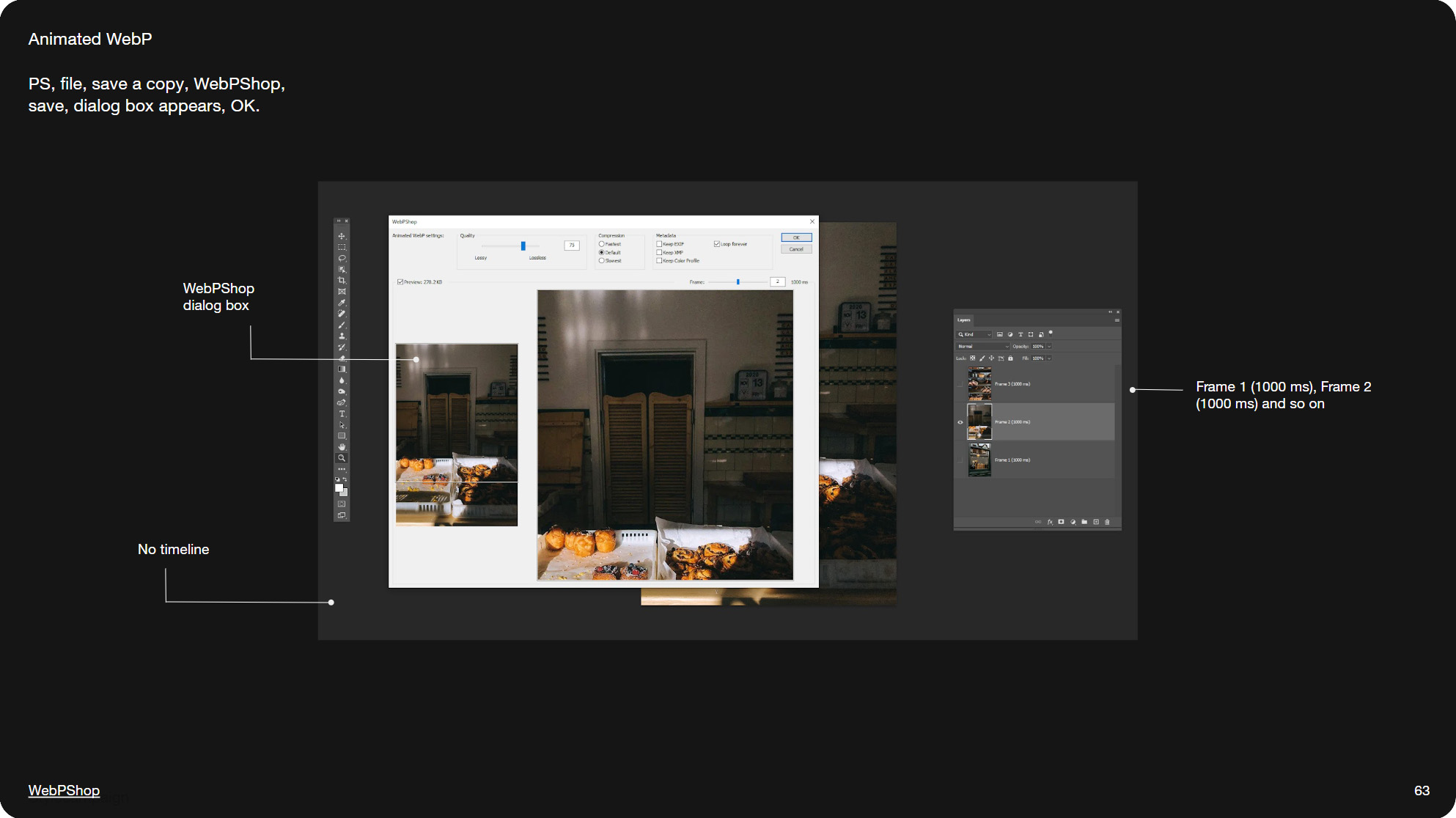
Slide 063, WebP in PS, we installed WebPshop, and put the timing in the layer names.
For making lets pick up where we left off. In part one, we saved an animated Gif out of PS by going file/export/save for web (legacy). For webp, we installed the plugin WebPshop, and put the timing in the layer names, so for instance Frame 1 (1000 ms), Frame 2 (500 ms). This is fine for short animations, but for video you might have 50 layers.
For that you can use this script called LayerRenamer, which automatically names and numbers all your layers. For instance Script/frame %n (100 ms) will replace %n with layer numbers. You might also need to reverse the order of your layers, by going to Layer/Arrange/Reverse.
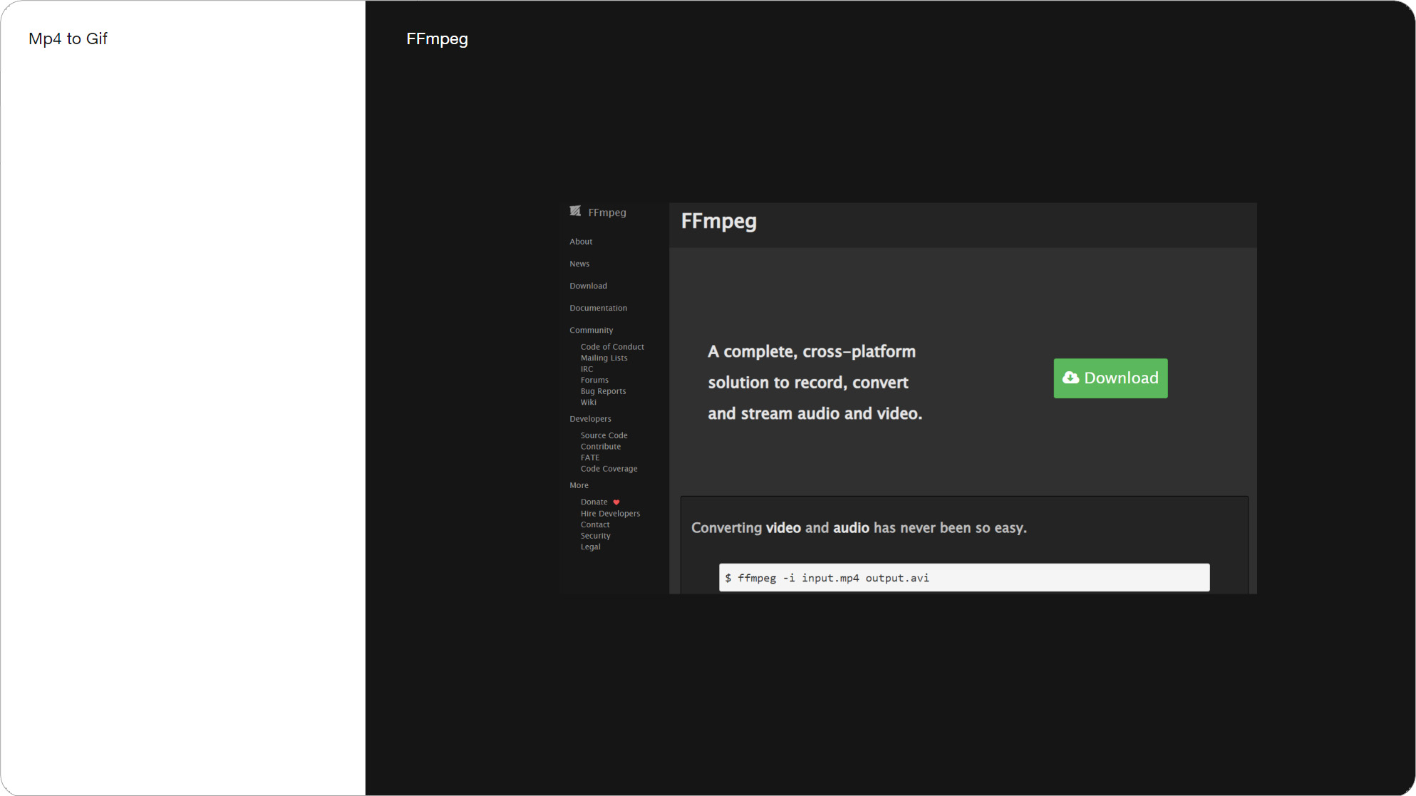
Slide 066, Nowadays I do most of my video conversions using FFmpeg.
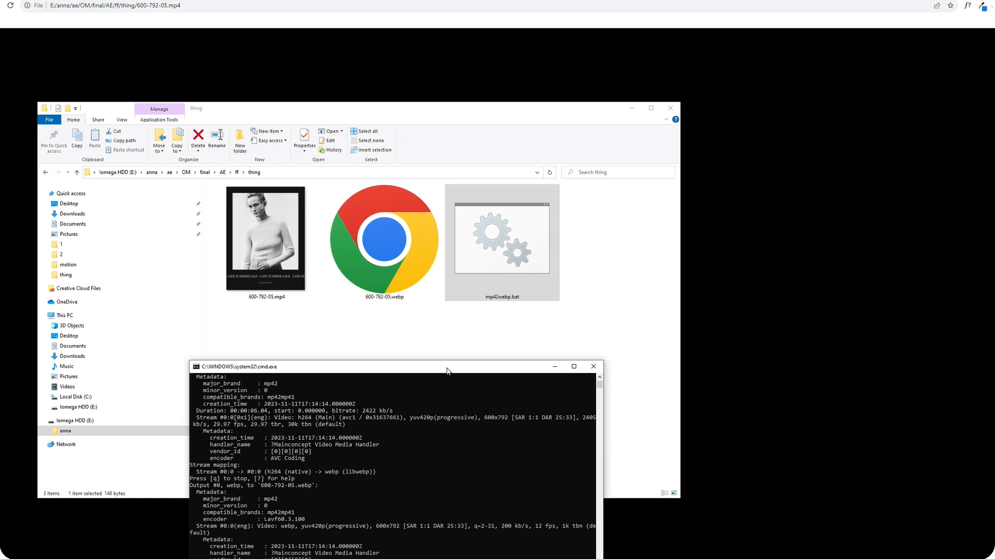
In the video I convert an MP4 to a WebP video using FFmpeg.
Though nowadays I do most of my video conversions using FFmpeg. It's a free open source command line tool. So if I’m in AE, I’ll save out an MP4 video and then use FFmpeg to convert it to either a Gif or WebP. Many tools are powered by FFmpeg, such as Ezgif which I mentioned earlier. I’ll quickly show you how I make a WebP video from an Mp4 file. So all I need to do is put the input and output file name in the script and double click it.
I can also add a crop parameter to FFmpeg, so it converts and crops at the same time, as I only need that strip of animation. For Gif output I think there’s an image quantizer parameter, which tells it to generate a custom color palette for every frame, so for instance if you’re using 256 colors (or less e.g. 128). My scripts are pretty vanilla. As well as converting between different formats, you can scale, crop, trim, adjust the frame rate, or set the number of loops using different parameters. So it saves you having to open Premiere for basic stuff. Occasionally I’ve saved an MP4 out of PS and then used FFmpeg to make the WebP, rather than mess around with layer names.
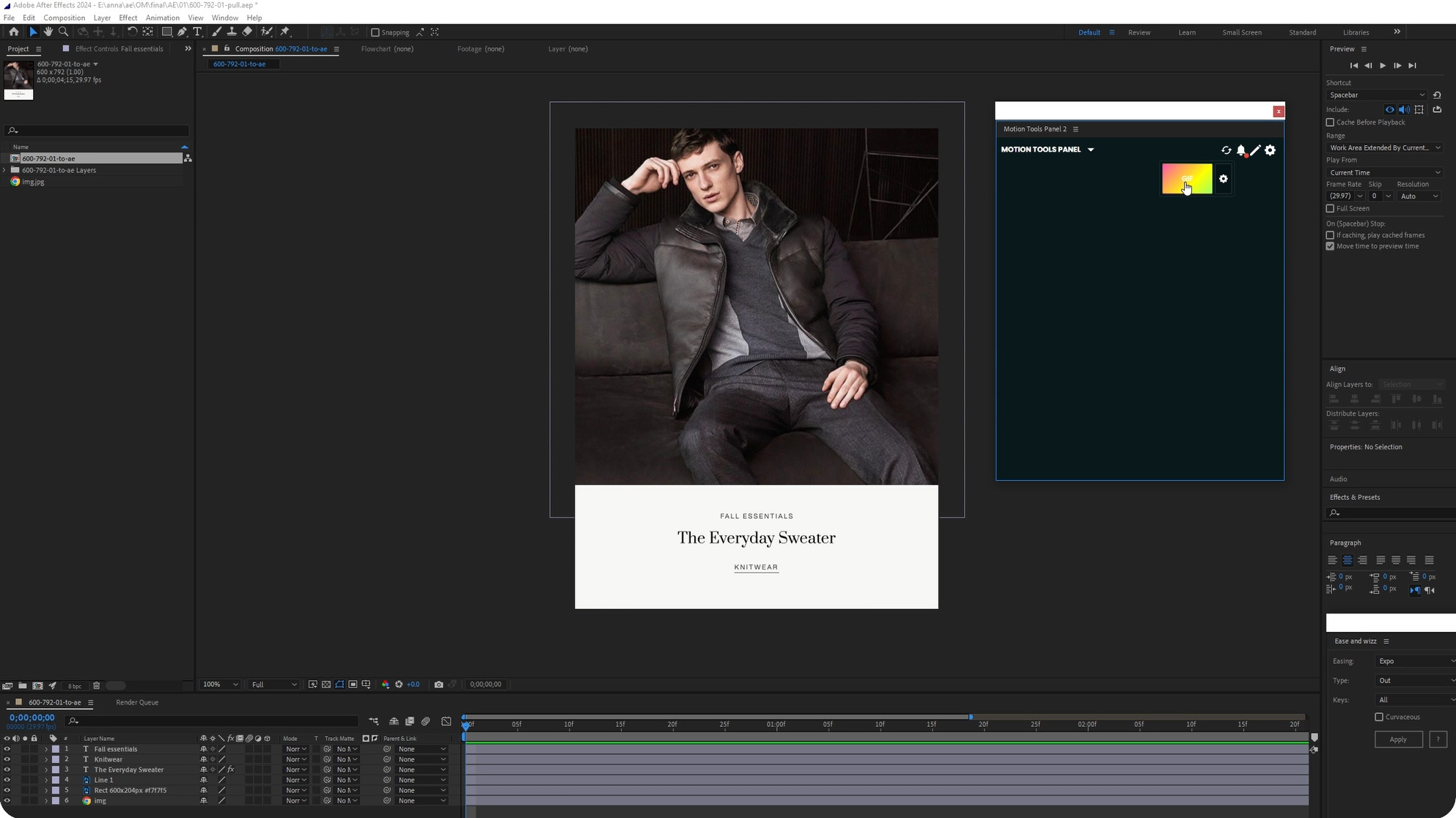
In the video I show the Motion Tools plugin in action.
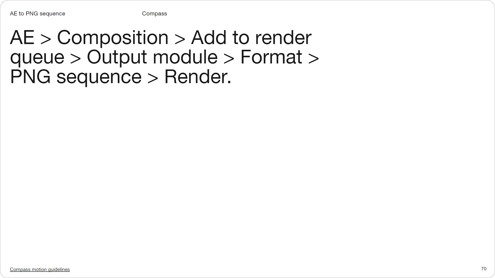
Slide 070, Compass motion guidelines, they render a PNG sequence out of AE.
If you just want a Gif out of AE you can use the plugin GifGun, it costs $39. Alternatively there’s the Motion Tools Gif plugin. It was released recently, and does the same thing as GifGun but it’s free. You just select your comp, and then press the big make Gif button and it automatically outputs two Gifs of different quality into a folder for you.
Lastly this is from Compass motion guidelines, what they do is render a PNG sequence out of After Effects and then convert that to a Gif. I imagine many of you are using vendors for video in email, but just in case, there’s a number of ways you can go about it.

Slide 071, WebP lib from Google.
As well as FFmpeg, there’s also the WebP lib from Google.
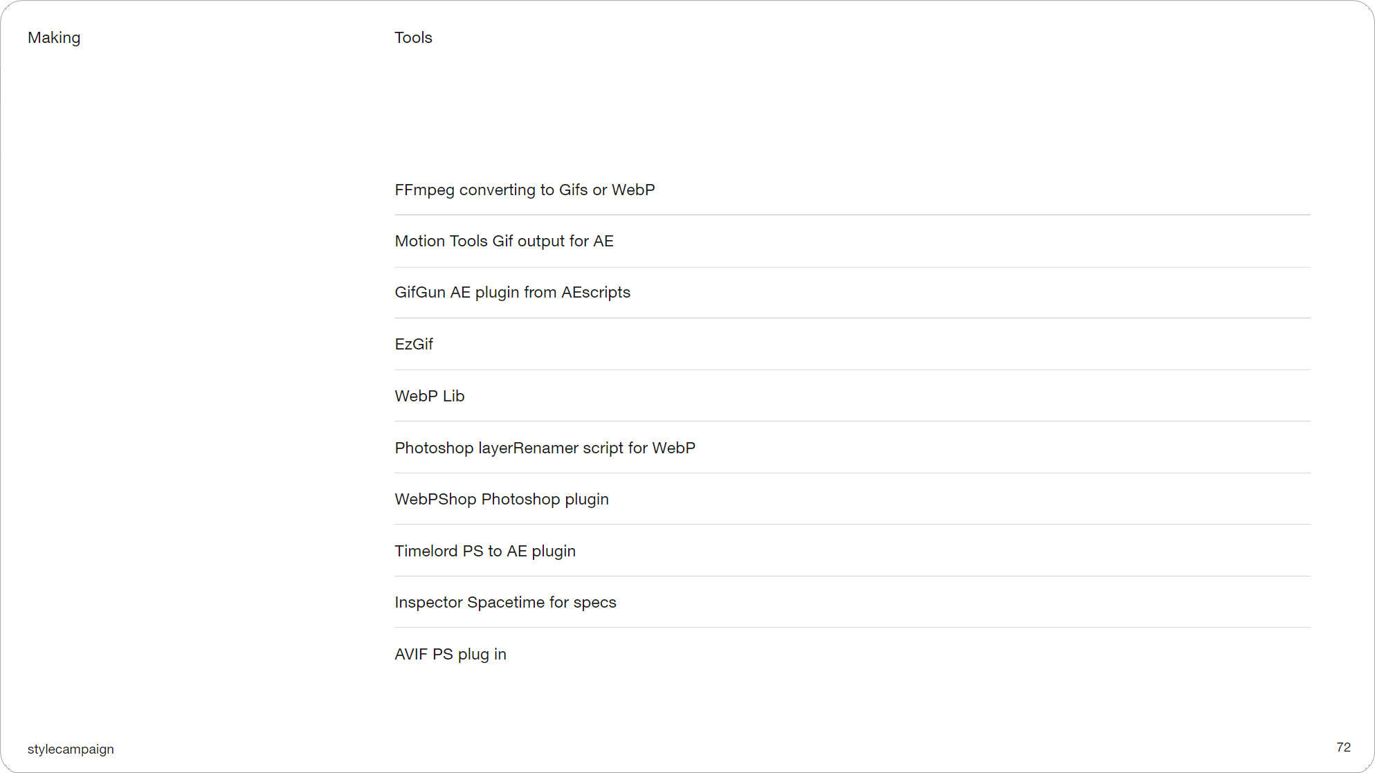
Slide 072, Here’s a round up of some of the tools I mentioned.
Here’s a round up of some of the tools I mentioned. Besides converters, there are also things like Timelord which helps to bridge PS and AE, and Inspector spacetime which generates motion specs from your After Effects files.
- FFmpeg converting to Gifs or WebP
- Motion Tools Gif output for AE
- GifGun AE plugin from AEscripts
- EzGif
- WebP Lib
- PS layerRenamer script for WebP
- WebPShop Photoshop plugin
- Timelord PS to AE plugin
- Inspector Spacetime for specs
- AVIF PS plug in
It goes without saying, if you have the skills and time you might want to do some of this in code. I’m putting CSS to one side because it’s a whole other talk, not because I don’t think we should be using it. One thing I sometimes do is prototype in After Effects, and then collaborate with a developer to try and rework it in code. And ideally it helps to have some kind of description of what you’re trying to do.
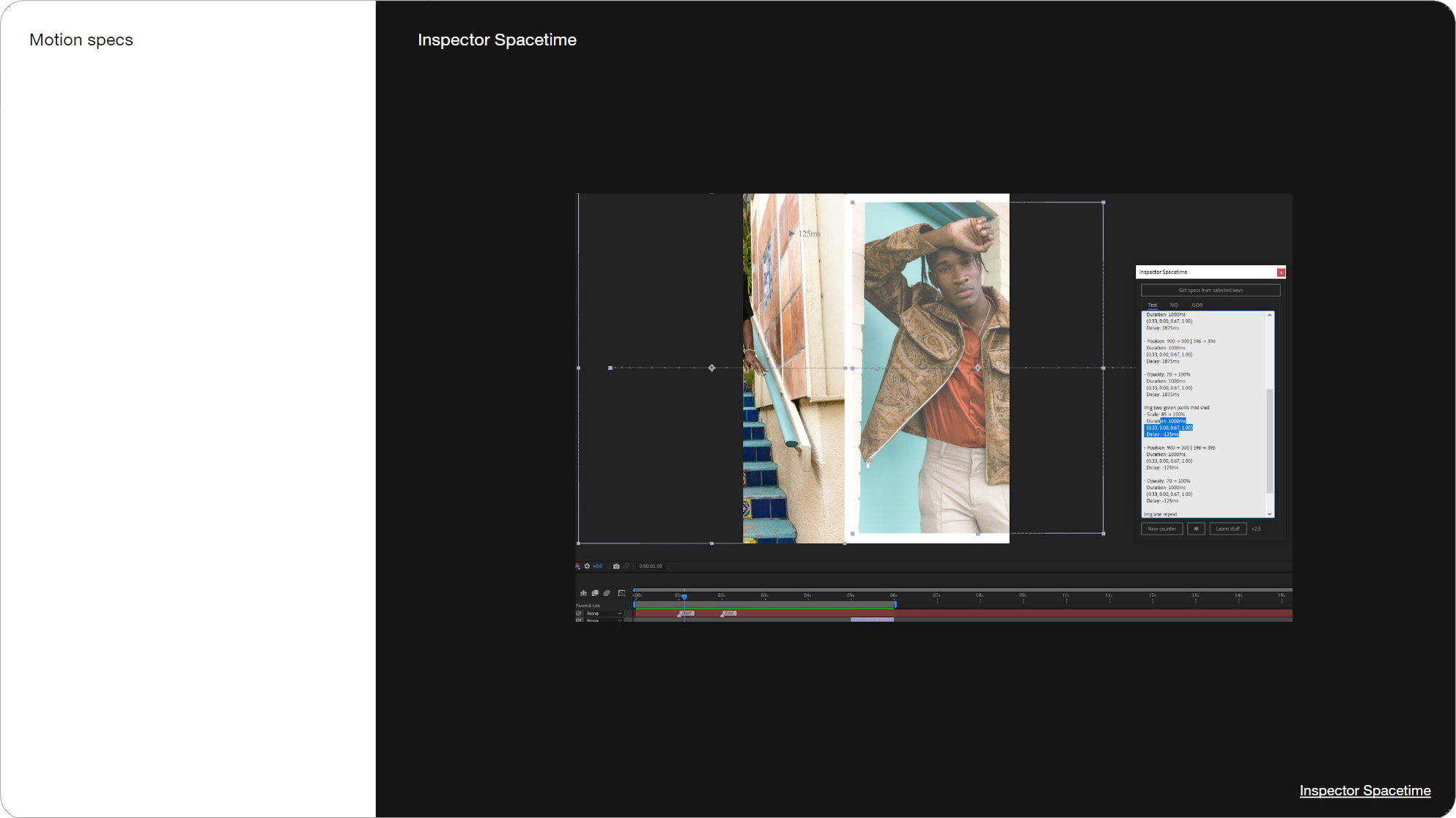
Slide 073, Inspector spacetime generates motion specs from your After Effects files.
Slide 074, If you have the skills and time, do it in code, AE is handy for prototyping.
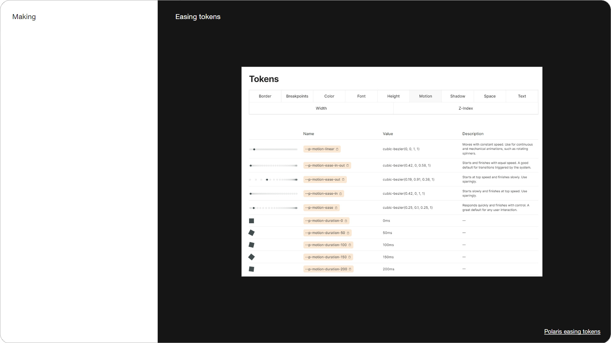
Slide 075, Polaris have their easing tokens documented in their guidelines.
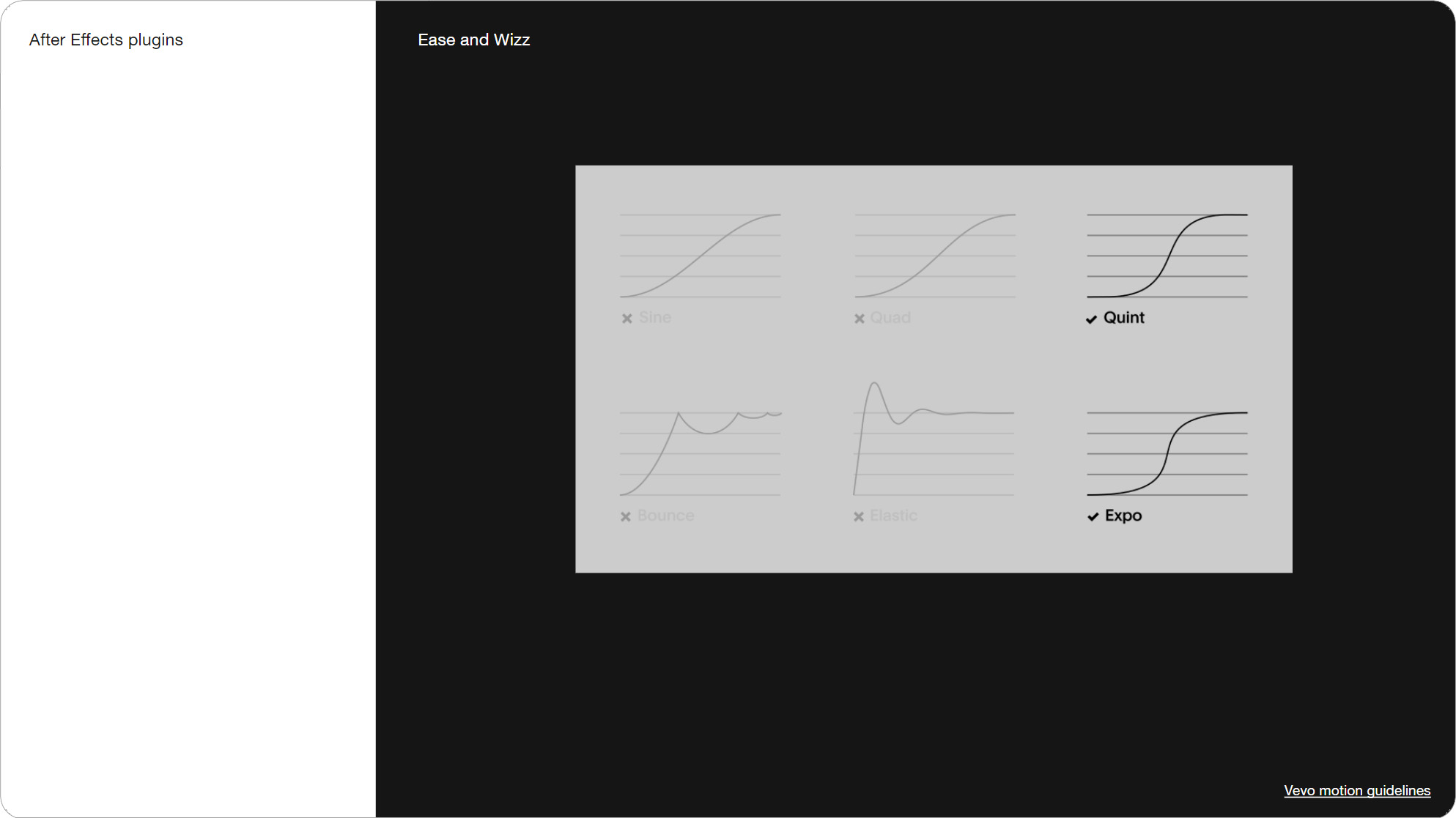
Slide 076, Vevo mention Ease and Wizz, which is an AE plugin.
You’d likely add things like timing and easing to your motion specs. Polaris have their easing tokens documented in their guidelines with a nice plain English description over there on the right. Vevo mention Ease and Wizz, which is an After Effects plugin with a bunch of easing presets. One benefit to using After Effects is there are a lot of tutorials and resources around it, which creates this shared understanding. I have this plugin myself and use Expo.
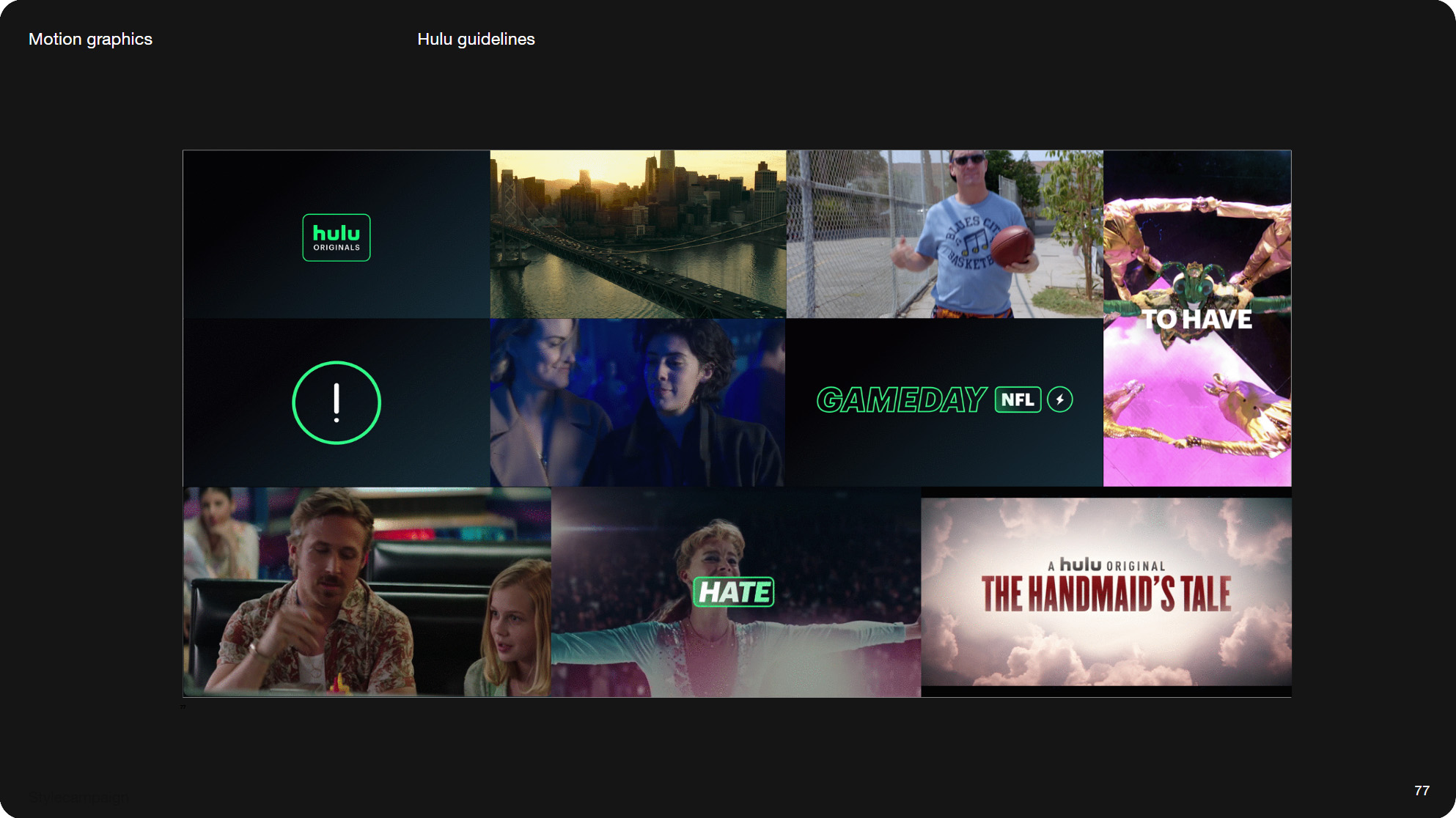
Slide 077, Hulu motion guidelines.
Video content is often incorporated with motion graphics, like Hulu here, so things like easing and transitions are all part of it. Transitions show up in a number of motion guidelines. As email designers we often inherit ready-made video assets, but some light video prep isn’t that unusual. These are Fresh Island Festival' and Slacks transitions from their guidelines.
Slide 080, Motion guidelines, with a bit more of a focus on video.
These are some motion guidelines, with a bit more of a focus on video.
- Noom motion guidelines
- Fresh Island Festival
- Slack motion guidelines
- Uber motion guidelines
- RISD brand guidelines
- Compass motion style guide
- Vevo motion guidelines
- Unity motion guidelines
- Stocksy motion guidelines
- Fiverr’s brand motion guidelines

Slide 081, Tooling trends, a few projects have caught my eye, that take motion tooling a step further.
A few projects have caught my eye, that take motion tooling a step further. The first is by Square, who built their own web-based motion tool called otto. So that anyone can make on-brand animations. So you’d still start with your shot list, and then build an editor around it. I’ll scroll down this article so you can see it better. It mentions how they can modify and extend the tool, I guess by adding new animations.
Slide 082, Square built their own web-based motion tool called Otto.
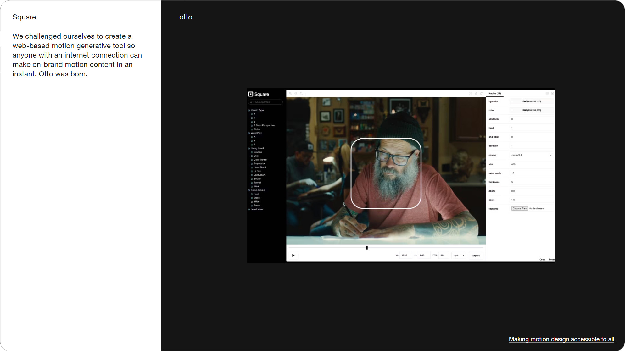
Slide 083, Otto a web-based motion tool so anyone can make on-brand motion content.
Another project I liked was this animation toolkit made by DIA for Pinterest. Mitch Paone referred to it as “a generative edit tool housed within AE”. Let me just show you some of it...
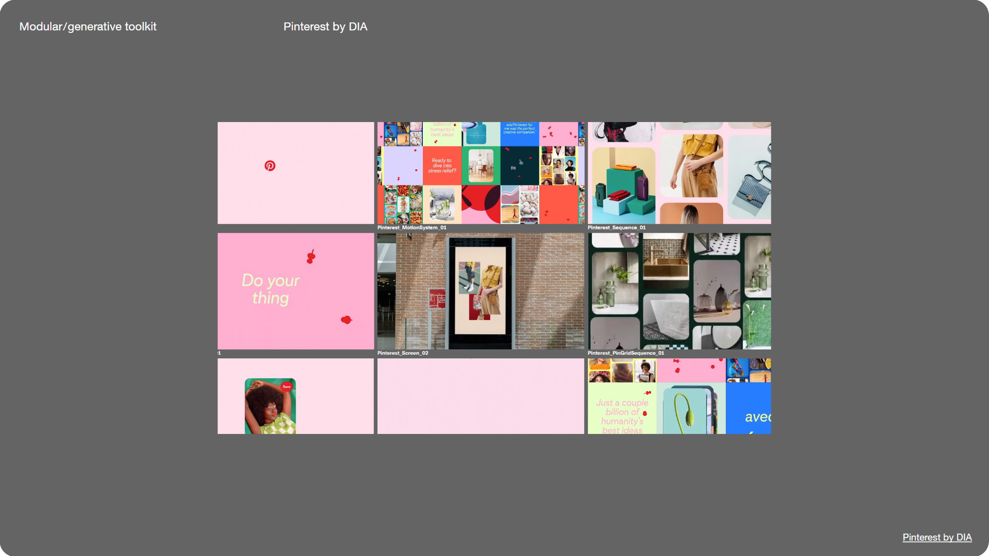
Slide 084, Animation toolkit made by DIA for Pinterest.
Slide 085, Mitch Paone referred to it as a generative edit tool housed within AE.
Then there’s this generative branding tool for the Tokyo Dome made by &Form, there’s obviously some crossover with generative art here. Which you can see more clearly with this other DIA project, this was for technology start-up, smlXL.
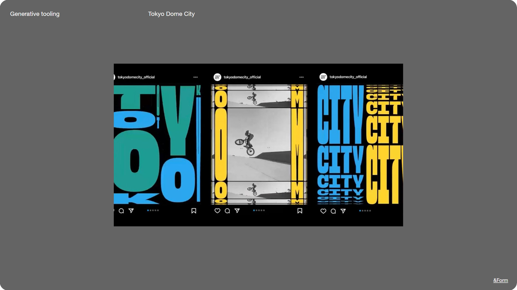
Slide 086, A generative branding tool for the Tokyo Dome made by &Form.
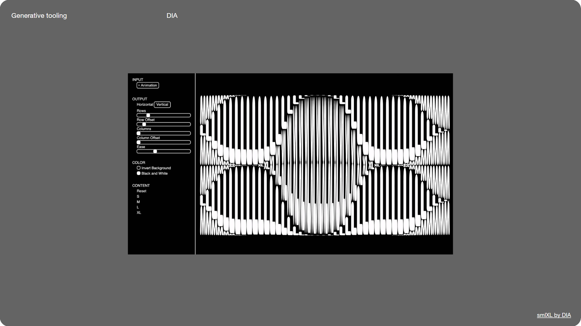
Slide 087, DIA generative branding tool for technology start-up, smlXL.
So I suppose the progression is to make ad-hoc animations, then manually make a toolkit which is where I’m at, then make some custom tooling to more easily generate animations. Often with some kind of generative or modular (mix and match) element. Like what we’ve been doing with modular systems, but for motion.
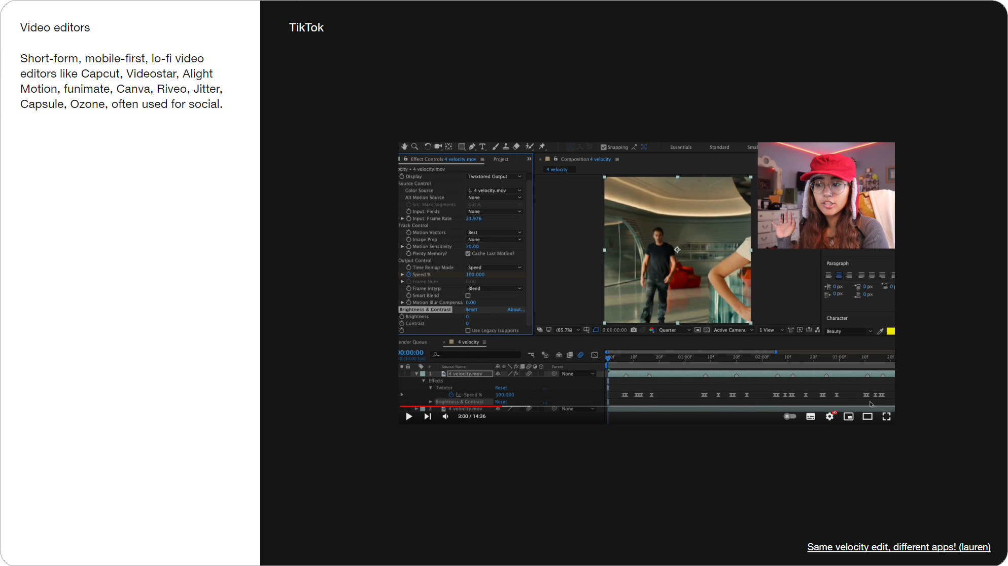
Slide 088, Interesting tooling in the short-form video space, such as Capcut, Jitter, and Riveo.
There’s also a lot of interesting tooling in the short-form video space, such as Capcut, Jitter, and Riveo. This is a tutorial showing how to do a velocity edit using a few different apps. I like to follow some of the motion trends that show up on social for my own work.
I’m not saying we should all start making velocity edits...but for instance these were professionally produced by motion designer Chrissie Abbott for Adidas. They look lo-fi, almost like a zine in animation form. Like 90s digital art.
Slide 089, Velocity edits are incredibly popular on TikToK.
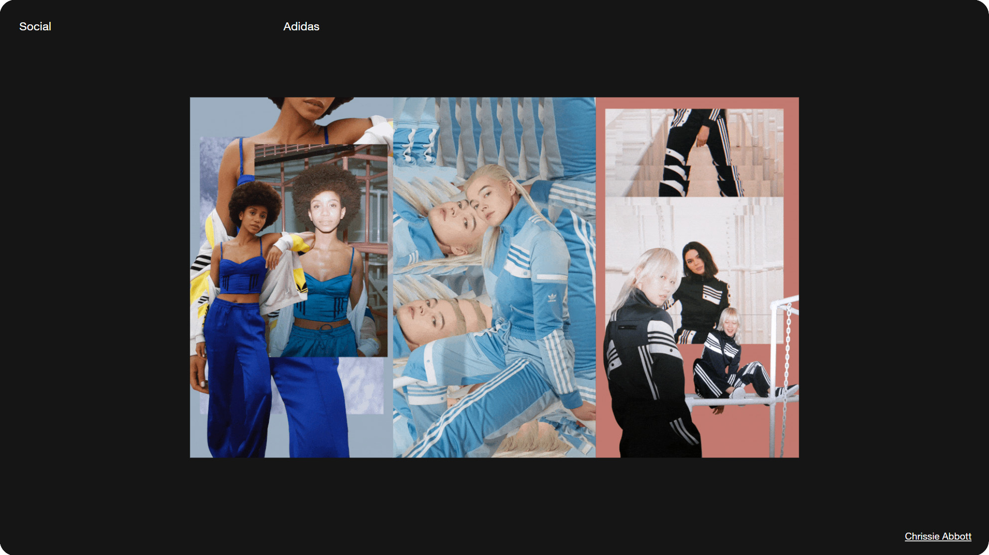
Slide 090, By motion designer Chrissie Abbott for Adidas.
A number of the video emails I received have that same, almost unpolished feel, as if they were shot on someone’s phone. This is by the fashion retailer Feng Chen Wang. Also the Mulberry video we looked at earlier, has a retro VHS quality to it, via a filter of some kind. If we compare it to Maison Margiela’s videos which look slick and professionally made.

Slide 091, Lo-Fi video by fashion retailer Feng Chen Wang.

Slide 092, Maison Margiela’s videos which look slick and professionally made.
This article talks about how restaurants have adapted their menus to be more viral. And how TikTok requires moments of motion and "activation" because of video, so close-ups of stretchy cheese, and dripping sauce. Social media can be a source of inspiration, for both tooling and visual trends.
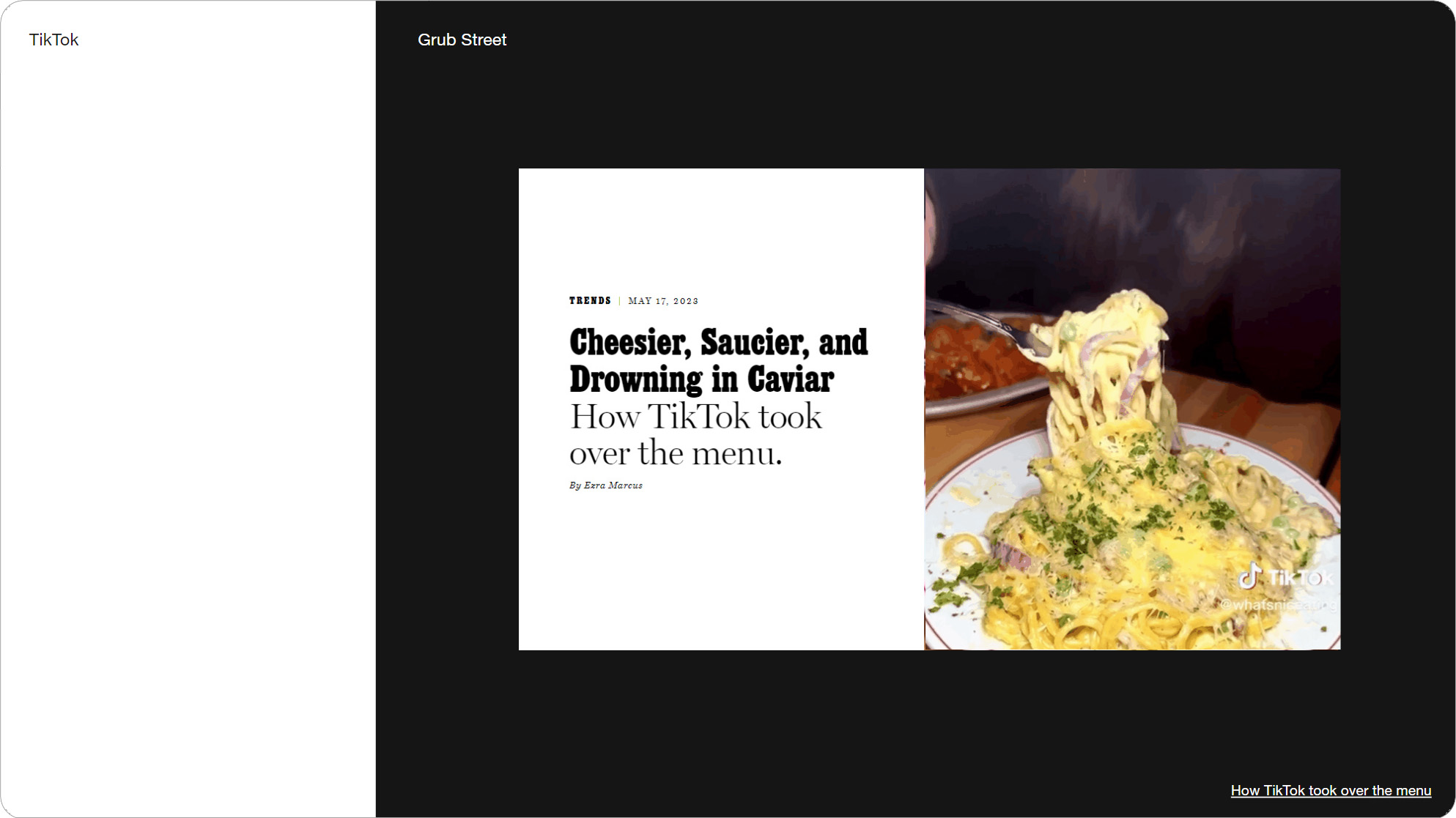
Slide 093, Restaurants have adapted their menus to be more viral.
Slide 094, TikTok requires moments of motion and "activation" because of video.
Though I also collect a lot of bread and butter stuff as reference material, like ten different sliders and video grids. Stocky’s motion guidelines have a bunch of versatile animations. The reason I collect all this is I need to come up with a list of shots (for animation toolkits), similar to how we come up with a list of modules. So I’ve been getting a bit more organized, in order to have a lot of ideas on hand.
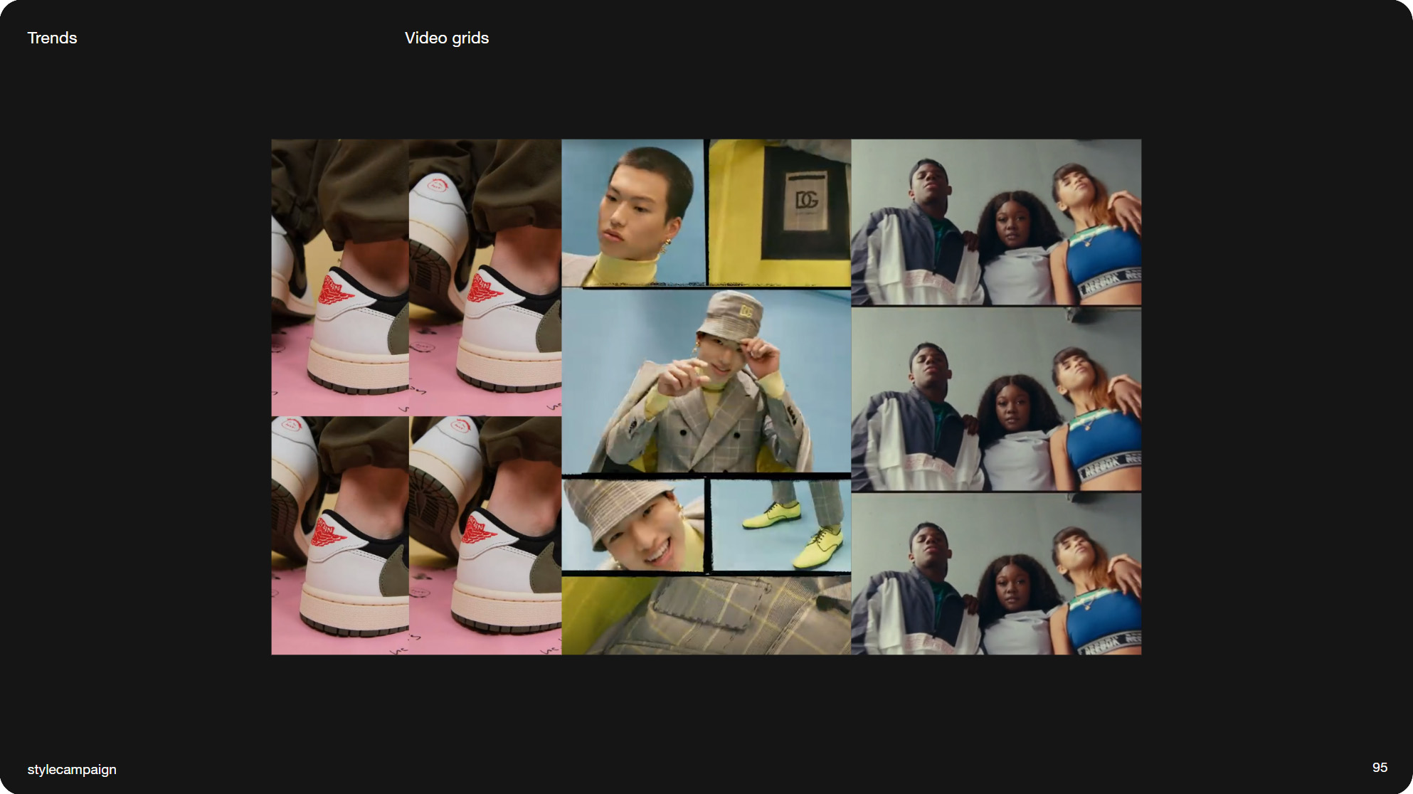
Slide 095, I collect a lot of bread and butter stuff as reference material, like video grids.
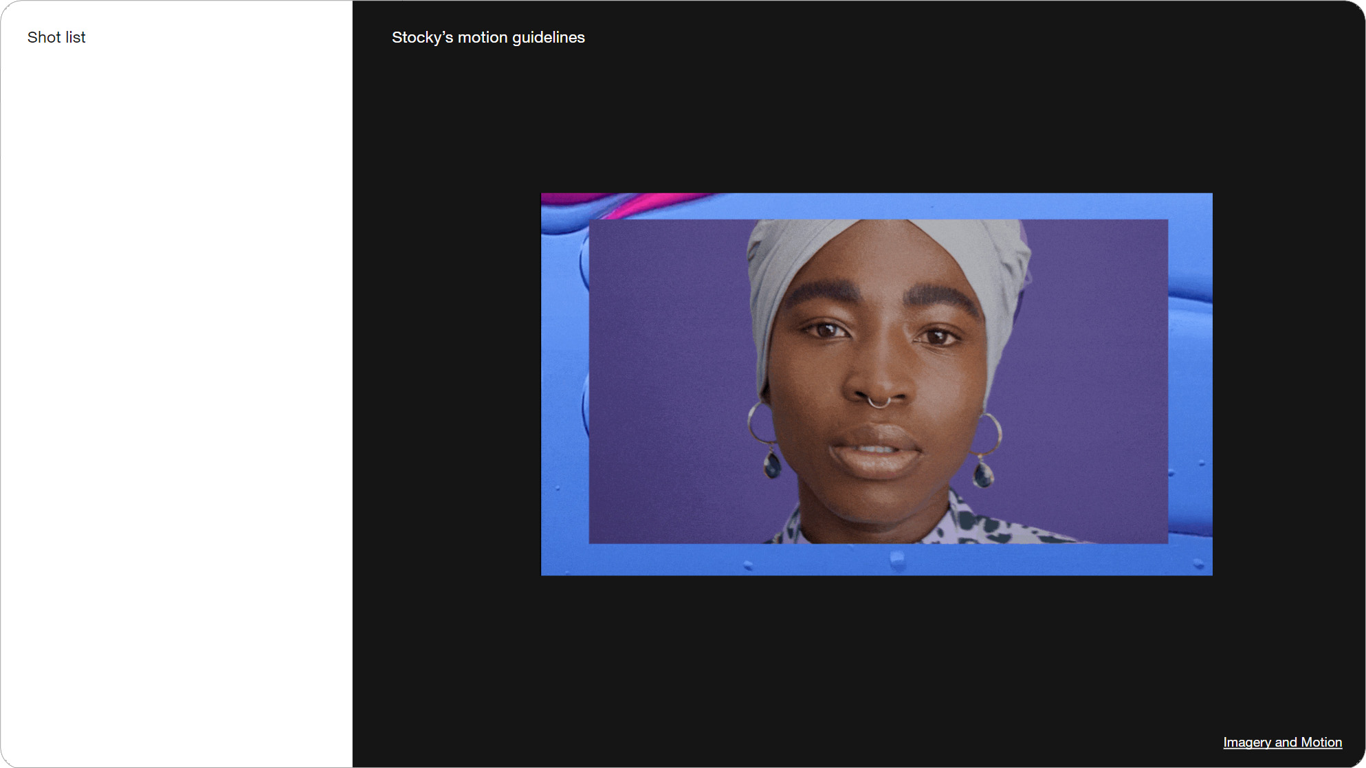
Slide 096, Stocky’s motion guidelines have a bunch of versatile animations.
One new short-form video editor is Ozone, I haven’t used it, but like a number of tools it has an AI component. And it looks like we might be getting some AI tools built into Premiere.
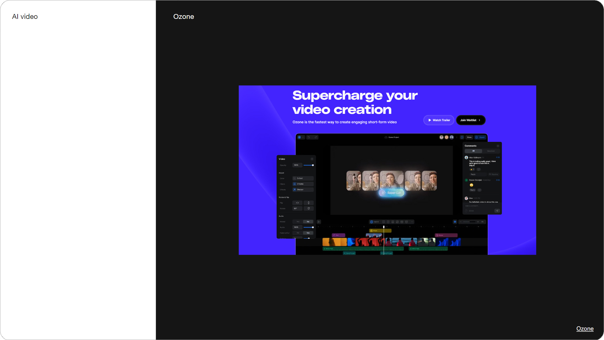
Slide 097, One new short-form video editor is Ozone, it has an AI component.
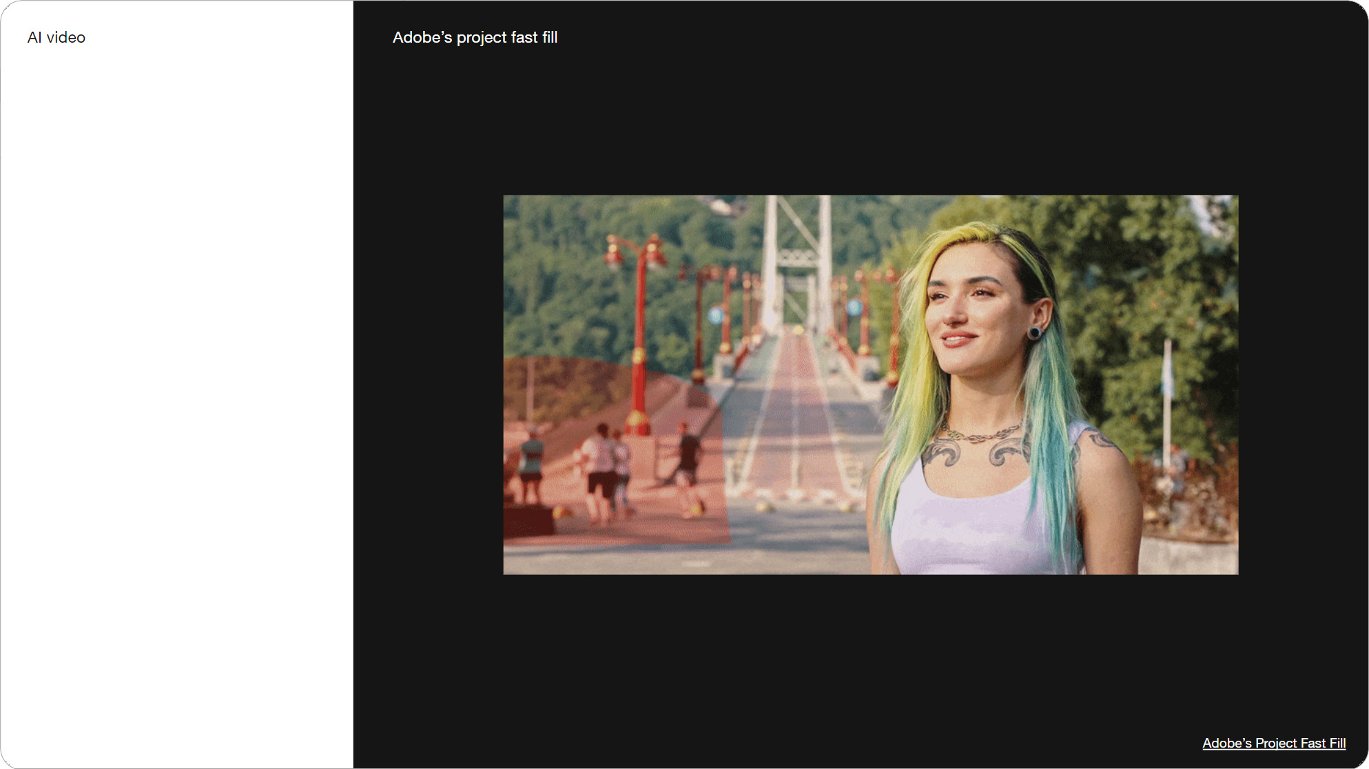
Slide 098, Adobe’s project fast fill, AI tools built into Premiere.
This was a job posting for an AI Prompt Animator on Danny Glover’s website earlier this year (2023). It reads, “Someone active in the AI animation space and would be a project leader of sorts”. I’m cautiously interested in whether AI can help us create animations. Though a lot of the AI video I’ve seen still looks borked, and there’s also ethical issues to consider. For instance taking a models likeness, and creating new content from it.
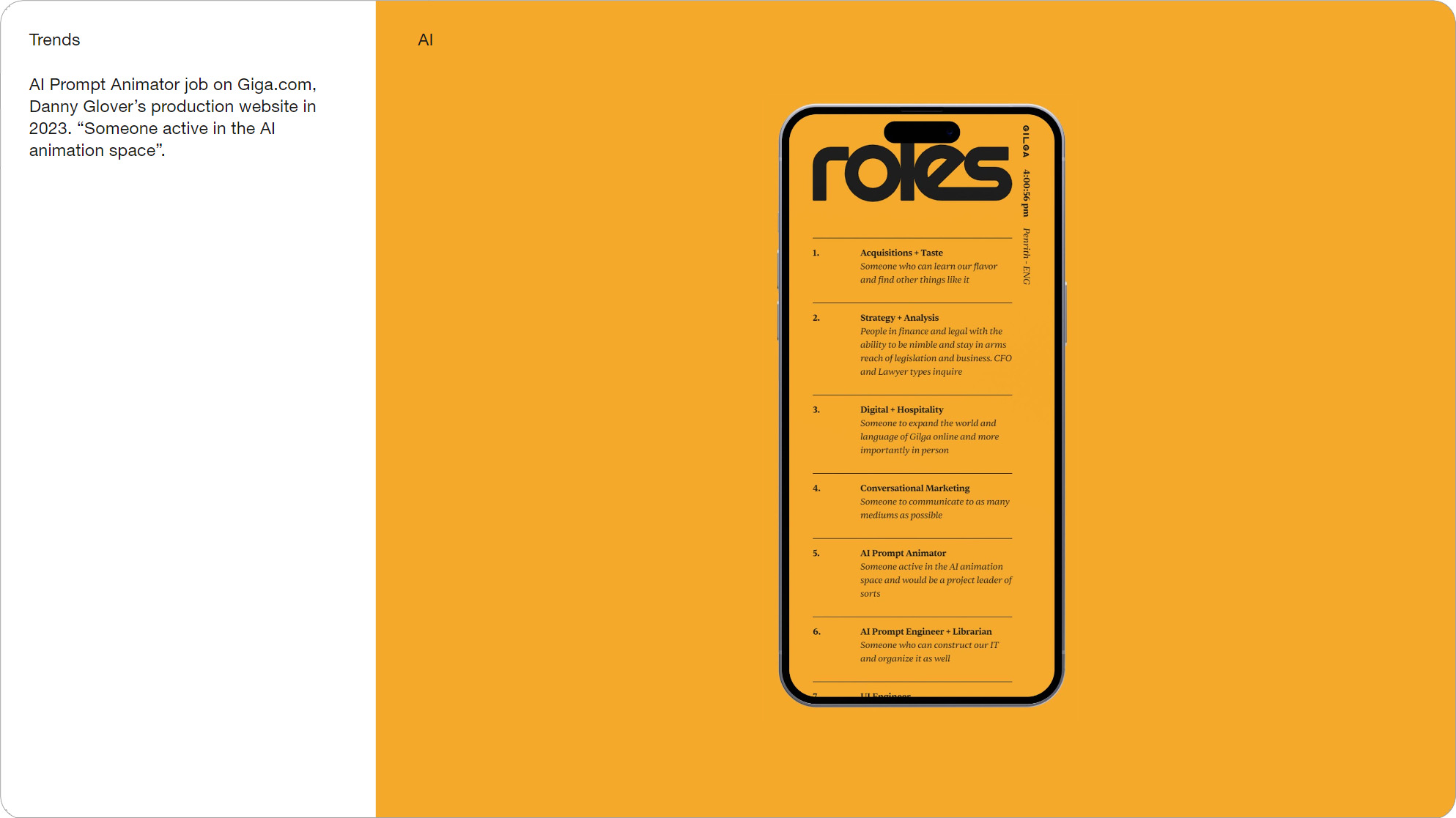
Slide 099, A job posting for an AI Prompt Animator on Danny Glover’s website.
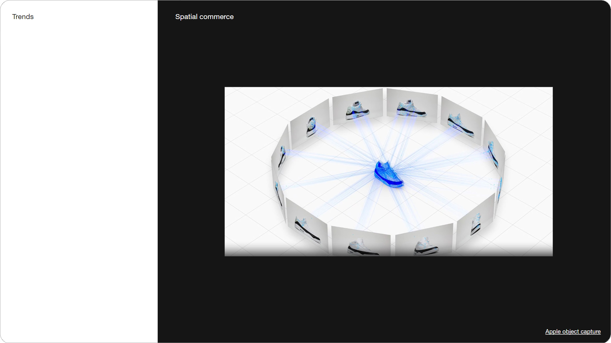
Slide 100, AR and Spatial commerce, like Apple’s object capture and Luma AI.
Lastly there’s tooling around AR and Spatial commerce, like Apple’s object capture and Luma AI. These allow you to create 3D models on your phone, which you can then make videos or animations out of.
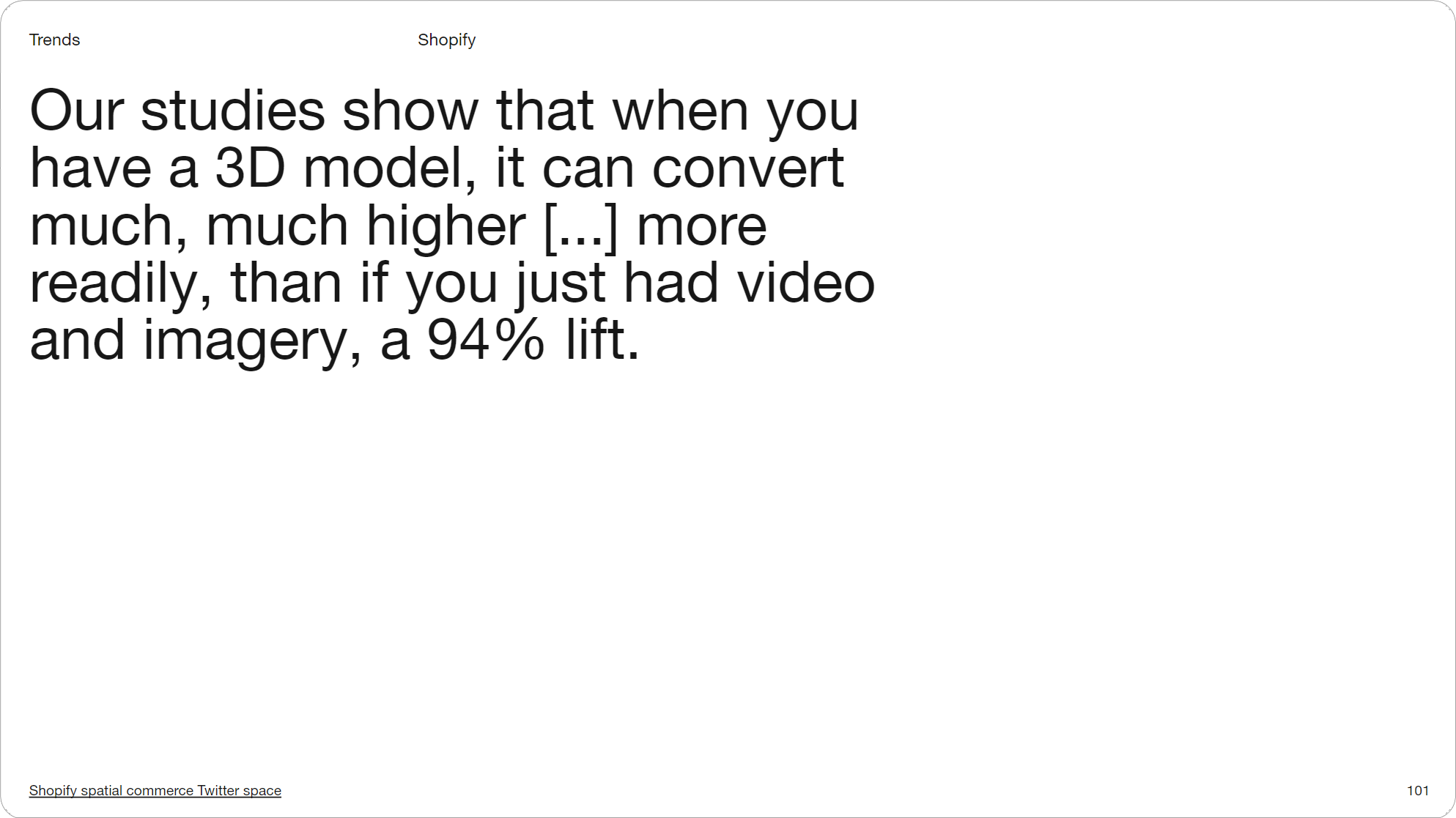
Slide 101, 3D model, a 94% lift over video and imagery (Shopify).
Which might be useful as the Shopify team said 3D models convert more readily, a 94% lift over video or imagery. So I’m interested in getting more 3D models into email even just via animations, or possibly linking to AR content from an email. Now that Apple’s Vision Pro headset is out, it’s worth revisiting AR and email.
![Once you’ve got a 3D object you can turn it into videos and stills, view it in AR, animate it however you like, all from any angle. (Shopify spatial commerce Twitter space [19:00])](https://stylecampaign.com/blog/blogimages/animation-basics/video/video-102.png)
Slide 102, 3D object turn into videos, stills, view it in AR, animate it, all from any angle
These are a bunch of AI video tools, though I’m sure many of you have already had a play.
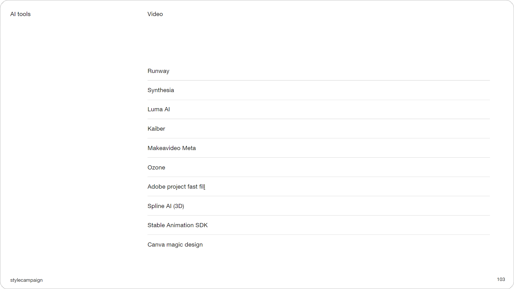
Slide 103, A bunch of AI video tools.
- Runway
- Synthesia
- Luma AI
- Kaiber
- Makeavideo Meta
- Ozone
- Adobe project fast fill
- Spline AI (3D)
- Stable Animation SDK
- Canva magic design
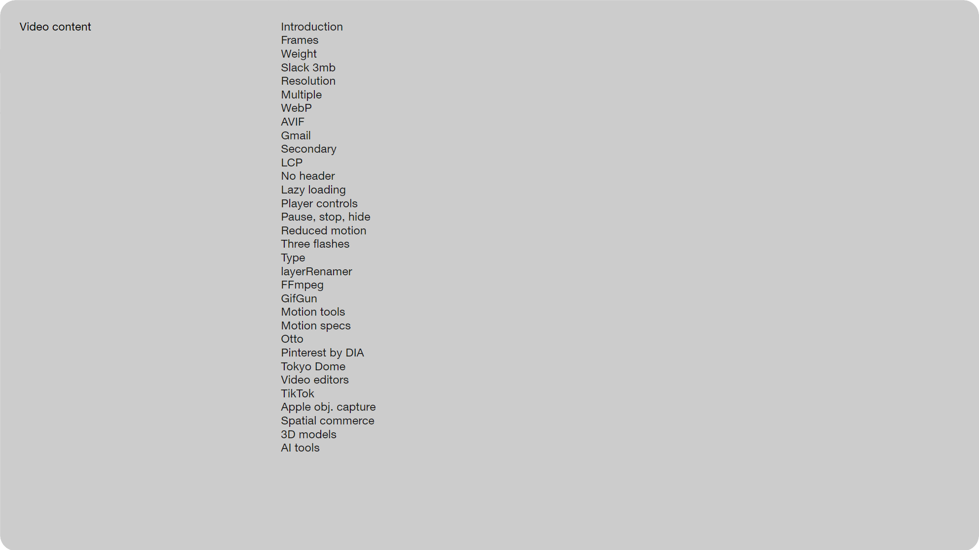
Slide 104, Rundown of what what we just looked at for part two video.
So here’s a quick rundown of what what we just looked at for part two video. For the final part I’ll be going over keyframe animation, which made up 20 out of the 100 animations. As you’ll see it’s mostly light keyframe animation, at a level most of us can handle, or at least get up to speed with.

Slide 105, thanks again for joining me
So thanks again for joining me – Anna.