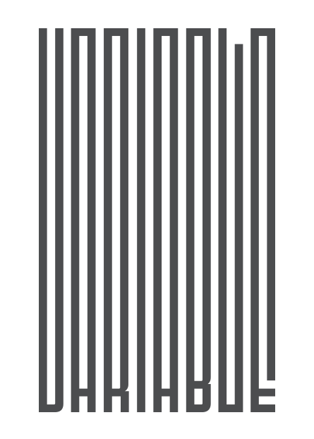
Variable fonts in email
 |
|
Variable fonts generate multiple styles from a single font file. Glyph outlines |
Normally when you purchase a webfont you'd choose from a range of individual styles such as condensed or bold, and each of these is a separate file. The change introduced with OpenType variable fonts, is that they can generate multiple styles from a single font file. This is possible as character outlines can morph between extremes, such as a thin to black weight. If you squint and imagine the image above is the letter ‘I’, its outline can shapeshift across a range of weights; all drawn from the same glyph and with the same number of points.
 |
|
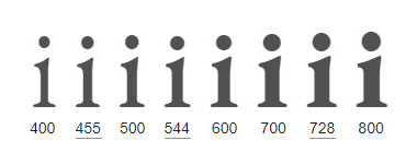
Variable font EB Garamond, weight axis 400 – 800. Named instances |
The full range of weight options falls along a design-variation axis, from which the type designer is able to assign different locations and useful names e.g. thin, regular or bold. These pre-defined options are called named instances. If you require a weight that falls inbetween a named instance you can select it yourself, allowing for more control. As type designer David Jonathan Ross explains, “Variable fonts break down that wall between type designer and type user, because now you have access to stuff that previously only I had access to.”
Registered & custom design axes
Weight is just one of five registered design axes outlined in the OpenType 1.8 specification. There’s also width, slant, optical size and italic. Type designers can also add their own custom axes. For instance WHOA by Scribble Tone has an appropriately named ‘ Radness ’ axis, and Jabin by Frida Medrano has a ‘ Swash ’ axis. All the axis inside a font can be combined to access a large array of potential combinations, all rendered from the same font file. This increase in choice comes at a smaller file-size — assuming you need more than a couple of styles to begin with — and fewer requests.
 |
|
Variable font WHOA designed by Scribble Tone, originally had the one |
 |
|
Frida Medrano’s variable font Jabin has two axes: weight and swash. |
Benefits of variable fonts
Google Fonts, who account for 70 % of all hosted webfonts, ran this Twitter poll in January, 2019: If you know what Variable Fonts are, what benefits are the most important to you?
- 18 % Custom expressive fonts
- 36 % Finer text typography
- 27 % Same fonts, faster
- 19 % Animated text effects
Finer text typography
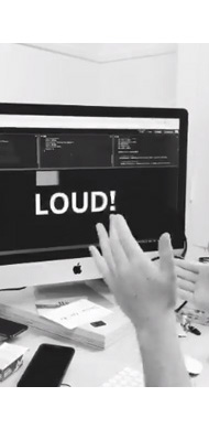
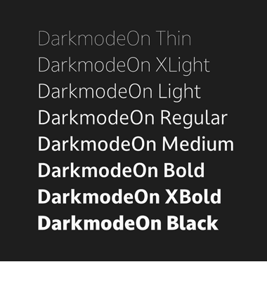
‘Finer text typography’ or responsive typography was listed as the top benefit in the poll. More control over the typesetting for improved readability and accessibility is a strong feature. In Isabel Lea’s variable font experiment, the word ‘ Loud ! ’ gets bolder as she claps. Bram Stein showed how a variable font can aid justification. Dave Crossland explains how optical size can improve legibility, through size-specific adjustments. While Jason Pamental demonstrated how increasing the grade axis — Grade changes the weight of a typeface without altering glyph widths, so the text doesn’t reflow — can improve readability in dark mode. Other demos show variable fonts responding to device width, human gestures, ambient light and distance.
 |
|
Variable font Graduate by Eduardo Tunni has 12 axes. Above shows |
 |
|
In Isabel Lea’s variable font experiment, the word ‘ Loud ! ’ gets bolder |
 |
|
Variable font Literata by TypeTogether, comparing the optical size axis. |
Same fonts, faster
Performance gains received the second highest number of votes. Variable fonts are smaller in size compared to a font family of individual styles, as they interpolate or morph between outlines. The type designer draws the letter ‘ N ’ for example at its lightest and heaviest — two extremes on a weight variation axis — and the in-betweens are dynamically generated. So only the data from those key outlines make up the file size, even though we have access to a full-range of weights.
 |
|
Variable font FF Meta by Erik Spiekermann, has a weight axis for |
Although variable fonts are more performant, they can still contain bloat. In their write up, ‘How to use variable fonts in the real world’ Clearleft created a subset of the variable font Source Sans (essentially ditching parts of the font they didn’t need ), and converted from TTF to WOFF2 which took them from 491 Kb down to 29 Kb. In an effort to make these types of optimizations readily available, Jason Pamental, a member of the W3C Web Fonts Working Group, shared that they’re exploring something along the lines of font streaming, or ‘progressive font enrichment’. This involves only serving up parts of the font as and when needed; across multiple page views or sites. Google Fonts built out a proof of concept in 2019. From this March 2021 update, '@font-face supports incremental', this font loading strategy is still being pursued.
Animated text effects
19% cited animated text effects as the main benefit of variable fonts. Kinetic typography has been increasingly popular over the last few years, and the ability to animate variable fonts adds more fuel to that trend. Mitch Paone, of DIA Studio, gave a nice talk about how they approach their kinetic identity systems work in this video from 2019. More recently Twitter Design shared a rebrand, featuring kinetic type mixed with a zine aesthetic, a collaboration with Grilli Type and Irradie. Animated text might be worth exploring in conjunction with prefers-reduced-motion as some animations, though mesmerising, can be a bit hectic.
 |
|
Space Type Generator by Kiel Mutschelknaus. Kinetic typography |
 |
|
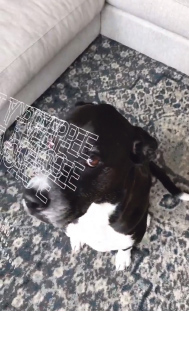
"When the studio dog becomes the content for your R&D..." |
 |
|
Instead of an axis that adjusts e.g. the weight of a variable font, |
Custom expressive fonts
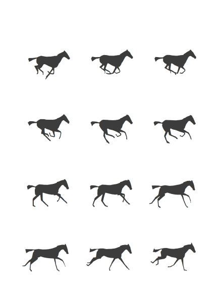
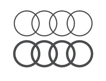
Keeping with the more experimental side of variable fonts, 18% chose custom expressive fonts as the main benefit. There are many interesting new typeface designs such as those found on futurefonts.com, and through David Jonathan Ross’ fontofthemonth.club. Kinetic type, colored variable fonts, Laurence Penney’s horse animation that’s a variable font, a typeface that visualises climate change, Audi' variable rings, Toshi Omagari’s variable font converted from an animated Gif. People are still exploring what this format can do.
 |
|
Variable font Fit by David Jonathan Ross, was designed to fill up any |
 |
|
Variable font UT Morph, by Wete and Oscar Cobo. A display font |
 |
|
Audi Rings Variable allows you to set the weight from 200 – 400 |
Support for variable fonts
OpenType font variations were introduced at the ATypI conference in 2016 in a collaboration between Adobe, Google, Apple and Microsoft. In a recording of the OpenType session, Simon Daniels shared,“The fact that we have four major companies here, should be a statement that we are expecting this to be supported in all major platforms, OS platforms and major content creation platforms.”
This has largely panned out; as of March 2021, Caniuse reports 92% support for variable fonts (up from 85%,18 mths ago). Variable font usage on the web rose 1.8 – 11% in 2020. Illustrator, Photoshop and InDesign now support variable fonts, as do the Apple and Android OS. If you want to try out some variable fonts yourself, there are a number available on v-fonts.com and axis-praxis.org. In Photoshop look for a VAR to the right in your font menu, then check the properties panel. For more details, Nick Sherman maintains a VF support table.
Webfont support in email
Webfont support in email is currently 52.54%, according to caniemail (@font-face support, tested July 2019). It includes: Apple Mail, iOS Mail, Outlook on Mac, Samsung Mail, and Thunderbird. As variable fonts are still loaded via @font-face, you'd expect support to follow along similar lines. Email support for variable fonts is ~50%, based on current 2021 emailclientmarketshare.com stats, and includes iOS Mail and Apple Mail (at least based on these tests which use TTF and WOFF2).
 |
|
Variable fonts running in Apple Mail, with non-standard weights. |
They are three ways in which you can import webfonts into email: @font-face directly in the head, via import or link. If using the later two, Google Fonts automatically serves the right font format to the right browser. Placing the code directly in the head takes more work, as you need to open up the request in various browsers and collect the font URL. e.g. Chrome will give you WOFF2 and IE WOFF. Ilya Grigorik, when working at Google, told me to stick with import or link as, "We apply a lot of UA-specific optimizations, some of which *do* require different CSS files." I'm sure that's still the case with variable fonts.
All of these methods ultimately rely on @font-face support. If you open up the import or link url, you’ll see the @font-face code that corresponds to your browser. Webfont support can vary slightly, depending on which font formats you use, and how they're imported. Though all three methods can still be used to import either static or variable fonts.
Google Fonts hosting
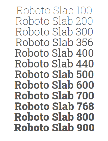
If you go to the Google Fonts homepage and toggle on variable fonts, pick one and you'll see variable font sliders. For now the UI is restricted to weight, italic and width. Of the websites using variable fonts, ~90 % are using the weight axis, the next closest is ~5 % for width. As weight is by far the most popular axis in use, keeping with a few registered axes simplifies things. We might see breakout custom axes — maybe GRAD — added in later.
 |
|
Google Fonts variable axis slider for Roboto Slab ( weight ). |
Registered axes
Implementing variable fonts isn’t that different from how we currently handle static webfonts, as it still comes in via @font-face. Below are some Google Font requests from the new API, showing the changes to the syntax when using the registered axis weight ( wght ). There are five registered axes, each has a four letter tag associated with it, and you only need to list the ones in use. They're weight ( wght ), width ( wdth ), slant ( slnt ), italic ( ital ), and optical size ( opsz ). The five registered axes are in lowercase ( wght ), whereas custom axes are in caps ( GRAD ).
Here's what an old request for Roboto Slab would have looked like:
@import url('http://fonts.googleapis.com/css?family=Roboto+Slab:400,500,700');/* What a request used to look like */
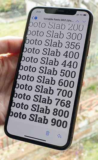
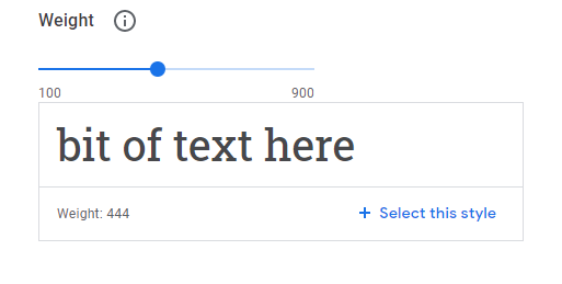
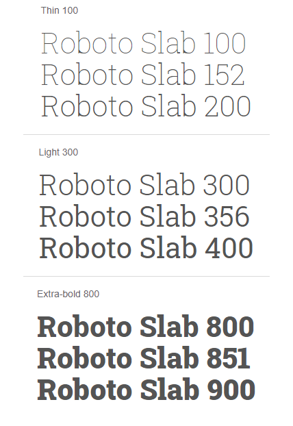
Open Google Fonts, set the Roboto Slab variable slider to weight 444, and you get the request below from the generated code snippet. The value beside the axis name maps to a position on that variation axis e.g. wght @ 444. Font weights normally jump in increments of 100 e.g. 400 = regular, 500 = medium, 600 = semi-bold. A value of 444 is a non-standard weight, which can now be selected with variable fonts. Also note the new API, at fonts.googleapis.com/css2:
@import url('https://fonts.googleapis.com/css2?family=Roboto+Slab:wght@444');/* Give me the non-standard weight 444 */
To set a few different weights put a semicolon between them:
@import url('https://fonts.googleapis.com/css2?family=Roboto+Slab:wght@444;500;700');/* Give me the non-standard weight 444, plus named instances medium/500 & bold/700 */
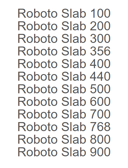
If you want a range of weights, you add two dots between the values like in the request below. You can get details about ranges in the Google Fonts axis value table or Wakamaifondue. For Roboto Slab the weight axis ranges between thin and black, 100 – 900 (400 is regular / default):
@import url('https://fonts.googleapis.com/css2?family=Roboto+Slab:wght@100..900');/* Give me all the weights from thin/100 to black/900 */
Google are calling these two dots, 'tuples' and have a few rules around their use:
- List axes alphabetically ( e.g. a , b , c , A , B , C )
- Axis value groups ( i.e. tuples ) need to be sorted numerically
- Tuples can’t overlap or touch ( e.g. wght 400..500 and 500..600 )
For registered axes, we can then use existing standard attributes like:
font-weight: 444;
font-stretch: 110%;
This changes if you are using a custom axis, then you'll need to use the CSS property font-variation-settings. Custom axes like 'Distortion', 'Swash' or 'Glow', won't have a corresponding standard attribute, so you'll need to place them under the umbrella of font-variation-settings. You can include registered axes, but the WC3 advises sticking with existing attributes where possible so font-weight: 444; rather than font-variation-settings: 'wght' 444;
font-variation-settings: 'wdth' 120, 'wght' 444, 'GRAD' 88;/* Custom axes under font-variation-settings, registered axes should use e.g. font-weight */
@font-face in the head
If you want a range of weights and you're placing @font-face in the head, take that request above with the 'tuples' and paste it in the browser:
https://fonts.googleapis.com/css2?family=Roboto+Slab:wght@100..900
Copy the @font-face code into the head of your HTML as usual, note font-weight: 100 900; with a space between the range values. Now you can set whichever weights you need between 100 – 900, from that one WOFF2 file, which is only 39 Kb for this font.
@font-face {
font-family: 'Roboto Slab';
font-style: normal;
font-weight: 100 900;
src: url(https://fonts.gstatic.com/s/robotoslab/v13/BngMUXZYTXPIvIBgJJSb6ufN5qU.woff2) format('woff2');
}
/* font-face code goes in the head of the email */
Here's a variable font test email 001 using @font-face in the head. You should see Roboto Slab if supported, in standard and non-standard weights, and Helvetica as a fallback.
 |
|
Variable font test 001 with Google Fonts hosting, using Roboto Slab. |
Above we've used a WOFF2 file, as we opened the request in Chrome. To get a WOFF file, I'd normally open the request in IE. But IE doesn't support variable fonts, and instead returns a stack of nine standard weights between 100 – 900.
@font-face {
font-family: 'Roboto Slab';
font-style: normal;
font-weight: 600;
src: url(https://fonts.gstatic.com/s/robotoslab/v13/BngbUXZYTXPIvIBgJJSb6s3BzlRRfKOFbvjoUoOWaw.woff) format('woff');
}
/* 1 of 9 standard weights IE serves, below is semi-bold or 600 */
Safari and Edge also gave me back variable WOFF2 links; it appears that all browsers which support variable fonts also support WOFF2. I haven't tested WOFF vs. WOFF2 in email for a long time, we still prefer to include WOFF where possible, but it could be that it's mostly obsolete.
Custom axes
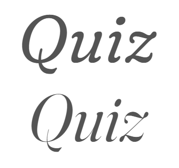
For now the Google Fonts UI only shows sliders for the registered axes: weight, width and italic. Though you can use a broader range of axes if available, check the 'about' section, or this axes table page. I wanted to learn how to structure a more complex request, so I picked the typeface Fraunces by Undercase Type which has two custom axes: Softness and Wonky. First I installed the font, and played with the axes settings in Photoshop to create two distinct styles.
 |
|
I installed the variable font Fraunces by Undercase Type. |
I then jotted down the axes values below, from the Photoshop sliders. Alternatively you can use wakamaifondue.com to find out the available range values:
Style (top): 135px, #545454, Italic 1 on, Optical size 48*, Weight 365, Softness 100, Wonky 0
Style (bottom): 135px, #545454, Italic 1 on, Optical size 135, Weight 365, Softness 0, Wonky 1
*As I understand it optical size should be mapped to your font size, in this case 135px ( see px vs. pt ), I set it to 48 just for testing. Optical size can also be automated with font-optical-sizing.
Using the Google Fonts UI, I recreated what I could such as italic and weight, and copied that basic request into the browser:
https://fonts.googleapis.com/css2?family=Fraunces:ital,wght@1,365&display=swap/* Basic snippet code with italic & weight */
Then I needed to manually add in the 'missing' axes one by one:
https://fonts.googleapis.com/css2?family=Fraunces:ital,opsz,wght,SOFT,WONK@1,48..135,365,0..100,0..1&display=swap/* Extra axes added in manually */
To break it down; first list the registered axes tags in alphabetical order ( only the ones in use ): Italic ( ital ), Optical size ( opsz ), Slant ( slnt ), Width ( wdth ), Weight ( wght ). Next any custom axes in CAPS also alphabetically, that gives me:
ital,opsz,wght,SOFT,WONK/* Registered then custom axes alphabetically */
Then the more tricky part which is adding in the right corresponding values. What I'm requesting needs to cover both styles, while my brain kept wanting to make two requests. You could shove the whole font in e.g. all the weights and axes ranges, but that would add to the file size. First add in the, '@' symbol after the axes list, followed by the values / ranges going in the same order as they appear e.g. Italic, Optical size etc:
@1,48..135,365,0..100,0..1/* Add in each axes values */
So I hope I'm saying: Italic set to 1 turns it on, give me the optical size range of 48 – 135, font weight 356, full softness range of 0 – 100 as I'm using both 0 and 100 ( tried 0..100 vs. 0;100 but browser didn't like the later ), wonky is both on and off so 0 & 1 ( not sure if I need just 1 vs 0..1, request worked with both ). I've the odd question, but the browser is giving me back my @font-face code so I'm going with it.
Google Fonts started adding font-display: swap to the code snippet it generates. It tells the browser to display the fallback font immediately (100ms or less is recommended ), then swap it in for the webfont once it's downloaded. It's on the end of the request URL, and gets pulled into our @font-face code below.
&display=swap
/* display fallback font & swap in webfont when loaded */
When we paste the full altered request URL in the browser:
https://fonts.googleapis.com/css2?family=Fraunces:ital,opsz,wght,SOFT,WONK@1,48..135,365,0..100,0..1&display=swap/* Full altered request URL */
We get the @font-face code below:
@font-face {
font-family: 'Fraunces';
font-style: italic;
font-weight: 365;
font-display: swap;
src: url(https://fonts.gstatic.com/s/fraunces/v7/6NUT8FyLNQOQZAnv9ZwNpOskzA.woff2) format('woff2');
}
/* @font-face code to place in the head of the email */
You'll need to use the CSS property font-variation-settings to assign properties beyond what we’re familiar with. In this case we have the two custom axes, Softness ( SOFT ), and Wonky ( WONK ). These axes need to be defined under the umbrella of font-variation-settings, with the axes and parameters in a comma delineated list, and in caps. Unlike the Google Fonts URL these go side-by-side e.g. 'AXIS' value. I'm not sure if they also need to be in alphabetical order, but it can't hurt:
font-variation-settings: 'opsz' 48, 'wght' 365, 'SOFT' 100, 'WONK' 0;/* Top style */
font-variation-settings: 'opsz' 135, 'wght' 365, 'SOFT' 0, 'WONK' 1;/* Bottom style */
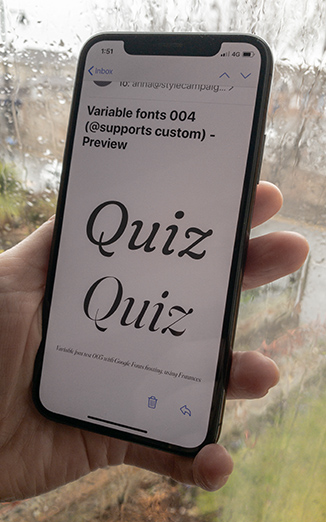
The first test we sent looked fine in the browser, but appeared to be getting partial support in iOS Mail ( no Italics or custom axes ). We placed a CSS !important qualifier on the font-variation-settings and it rendered fine:
font-variation-settings: 'opsz' 135, 'wght' 365, 'SOFT' 0, 'WONK' 1 !important;/* Added !important & it rendered Italics and custom axes */
 |
|
Variable font Fraunces by Undercase Type, rendered in iOS Mail. |
You can see the final working email test 003 here. We just threw these tests together, we haven't dug deep into all the nuances of coding variable fonts in email. I'm sure there's optimisations for instance in the request URLs, so you only get the parts you need. I'm on the design end, so I'm more concerned with being able to document any variable styles for coders and clients. E.g. hand over Fraunces:ital,opsz,wght,SOFT,WONK@1,48..135,365,0..100,0..1 and know what's going on.
Fallbacks with @supports
The other use for font-variation-settings, is to check for variable font support:
*[class=font-roboto-440]{
font-family: 'Roboto Slab' !important;
font-weight: 440 !important; }
}@supports (font-variation-settings: 'wght' 440) {
If using custom axes like test 003 above, you'd set it up like below:
*[class=font-Fraunces-soft]{
font-family: 'Fraunces' !important;
font-variation-settings: 'opsz' 48, 'wght' 365, 'SOFT' 100, 'WONK' 0;
}
@supports (font-variation-settings: 'wght' 365) {
So we can say if you support variable fonts, great serve this; if not serve either a static webfont — so you might get weight 400 rather than 440 — or a standard fallback like Georgia. Email designers still need to fallback to a standard font, as ~50% of email clients don't support webfonts. There may be the odd email client that supports webfonts but not @supports font-variation-settings, but they'll be outliers.
 |
|
Variable font test 002, with Google Fonts hosting, using Roboto Slab. |
 |
|
Variable font email test 002, same weight fallbacks in desktop Gmail. |
Variable font email test 002 uses an @support font-variation-settings check. You should see Roboto Slab if supported, in standard and non-standard weights, and Helvetica as a fallback. Email test 003 also uses a supports check, you should see Fraunces if supported in two different styles, and Helvetica as a fallback. Email test 004 features a self-hosted copy of Amstelvar. The top section has no supports switch, while the bottom does. It looks like this in iOS Mail, and this in Gmail. This switch might not be essential for email designers, but it does allow you to draw a clean line between full support or fallbacks.
Production ready
The new Google Fonts API was introduced at the end of 2019, and generates the same code snippet whether it's a variable or static font. This is how all Google Fonts are to be requested going forward. If you're already using the new syntax, it's just an extra step to take advantage of any variable axes if and when available.
@import url('https://fonts.googleapis.com/css2?family=Open+Sans:wght@300;400;600;800&display=swap');/* Open Sans request, not yet available as a variable font but same syntax */
From a quick scan of my inbox, Abercrombie & Fitch, Coach, and Refinery29 are all using Google Fonts that are available as variable. A number of functional typefaces — not just the experimental kind — are ready to be used. It's not just Google Fonts; other font hosting services like MyFonts offer variable fonts, as do a number of type foundries.
 |
|
A number of type foundries have released variable fonts. Above is |
The incentives might not be as clear-cut as that first shift to webfonts, when every client wanted their brand fonts. The benefits of variable fonts are more subtle, if not invisible in the case of performance. They're essentially an enhancement to static webfonts. Though these upgrades do have a number of everyday applications, which will only increase with the introduction of more preference settings like dark mode, contrast etc. You need type that's more malleable, and in a sensible file-size. I also like the simplicity of everything rendering of that one font file, creatively it feels like a little font program to play in, rather than one font per task.
There is the slight risk that the ability to adjust everything might add complexity to a type system; and maintaining that along with a bunch of unfamiliar custom axes could be challenging for some clients. Type is often the first thing to breakdown in an email system, so it might require some extra guidance. MCKL built out a custom Illustrator panel to aid Adidas designers working with their variable font Adineue PRO. It has a fit to width button that Jeremy Mickel of MCKL said, “Turns just some text into something that feels like a sign”. The tooling around variable fonts is still being figured out, and existing typefaces reworked. But with support ~50%, they're viable, and looking increasingly production ready.
Few resources
- Variable font email test 001 (Google Fonts API )
- Variable font email test 002 ( Google Fonts API )
- Variable font email test 003 ( Google Fonts API )
- Variable font email test 004 ( Self hosting )
- Introducing OpenType variable fonts ( Intro)
- V-fonts.com ( Try out )
- Mozilla variable fonts guide ( Dev )
- Google fonts CSS API update ( Dev )