Small text and accessibility in email
Email type scale study
For this study I made a note of all the live text sizes in use from 50 emails. I’m classifying anything below the common browser default of 16 px as small text, as from an accessibility standpoint this is where things get ambiguous. The emails were loosely broken down into two groups. Group a ( retailers ) features less text and group b ( b2b ) more text. While 50 emails isn’t statistically sound, it's enough to note some trends.
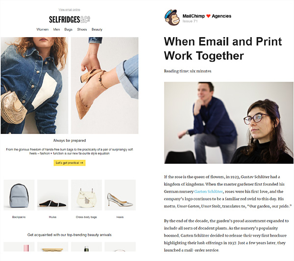
Study of 50 emails type scales, group a ( left ) retail image-driven and group b ( right ) b2b text-driven
- 46 % of all text sizes were set down from a base font size of 16 px
- 12 px followed by 14 px were the most popular small text values
- 40.7 % of all body text was set down from the base font size of 16 px
- 14 px was the most popular body text size under 16 px
- 23 % of all text sizes were set smaller than 13 px
- 11 px and 12 px tied for the most popular pre-header sizes
- 12 px followed by 10 px were the most popular footer small text sizes
- 18 px then 14 px were the most popular primary button text sizes
- 44 % of primary button text sizes were smaller than 16 px ( 3:1 group a )
- 54 % use a single type scale across desktop and mobile
- 4 or 5 different type sizes were typically used
- 27.7 % used image-based h1s alongside live text
- Group a type sizes run smaller than group b as readability is less of a priority
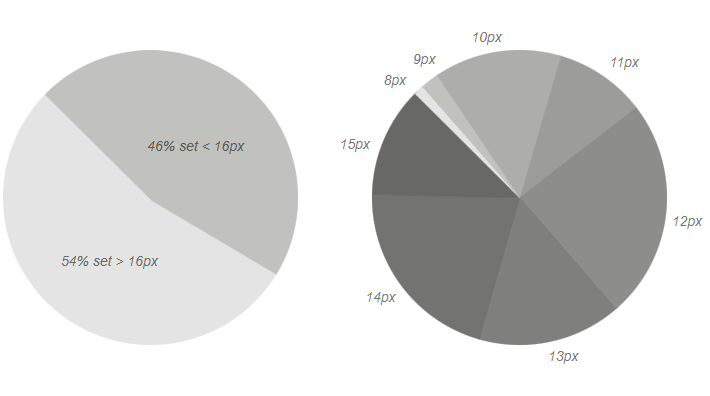
46 % of all type sizes were under 16 px ( left ), small text breakdown ( right )
The question of a minimum font size affects more than just the footer. 46 % or almost half of all font sizes are set smaller than the browser default of 16 px, which increases to 54 % if we isolate the retailers in group a. This includes pre-headers, navigation, body copy, subtitles, button text, captions, overlines and multi-level footers. Although the study doesn't represent the volume of text, it does show that small type is more widely used than you might expect.
WCAG 2.1 and font sizes
As far as I can tell the WCAG 2.1 accessibility guidelines have no minimum font size. My interpretation based on this thread, is that they try to avoid specifying font sizes due to variations in device rendering which make it difficult to predict the exact physical size at which text will render. On top of that you have differences in typeface design, along with no way of calculating the reading distance.

Merriweather ( left ) and Lato ( right ), both 74 px but Lato looks visually smaller largely due to its reduced x-height
Instead WCAG 2.1 suggests you take your cue from user agent defaults as these font sizes were intentionally chosen with readability in mind. So the standard default font size in most web browsers would currently be 16 px. WCAG then goes on to say that relative scaling can be calculated from that default size.
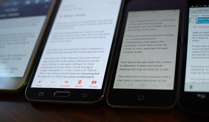
Email with no font-size specified, WCAG is banking on these UA default sizes as being legible
For many mainstream body text fonts, 14 and 18 point is roughly equivalent to 1.2 and 1.5 em or to 120 % or 150 % of the default size for body text ( assuming that the body font is 100 % ) ― WCAG 2.1 large scale text notes.

Font sizes mentioned in WCAG 2.1, 16 px base font-size ( top ), 19 px bold ( middle ) and 24 px ( bottom )
Besides alluding to a 16 px body text size, the WCAG 2.1 guidelines define large scale text as 18 point ( 24 px ) or 14 point ( 18.5 px ) bold except for very thin or unusual fonts in success criteria 1.4.3. These were the only outright mention of font-sizes I found, there was nothing about text set down from the base font-size.
iPhone email client UA defaults
The Apple iPhone is the number one email client at this time with 22 % marketshare, which gives their user agent defaults more weight. We sent some unspecified text to a range of iOS devices to see what Apple considers a suitable base font-size. Older devices rendered the text at 15 px, and newer devices like the iPhone X at 17 px.
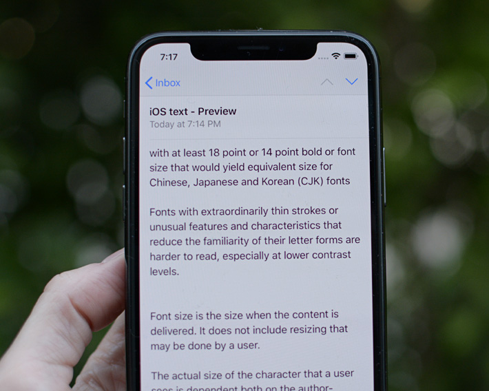
Plain text email sent to iPhone X native email client on iOS 11.4 renders at 17 px
When using text without specifying the font size, the smallest font size used on major browsers for unspecified text would be a reasonable size to assume for the font. If a level 1 heading is rendered in 14 pt bold or higher on major browsers, then it would be reasonable to assume it is large text. Relative scaling can be calculated from the default sizes in a similar fashion. ― WCAG 2.1 notes on large scale text
When looking for a minimum accessible font-size, one interpretation of the WCAG 2.1 guidelines is not to size any text smaller than the user agents default size / 1 em. Which would be 16 px in many web browsers and 17 px on newer iPhones. Though these base font sizes are likely intended to govern the body text size and not set a minimum. It’s also worth mentioning that email designers work primarily in pixels rather than relative units, but you can still use these UA defaults as a guide.
iPhone and auto-scaling
The next test we ran was to send some 9 px text to a range of iOS devices and see what size it renders. We did this because the iPhone auto-scales text in the default email client up to what I believed was 14 px — I was never sure if it was 13px or 14 px — which would give us a UA approved baseline for small text. To override this minimum font-size you'd need to disable it with -webkit-text-size-adjust:none; which puts you at odds with the WCAG 2.1 guidelines.
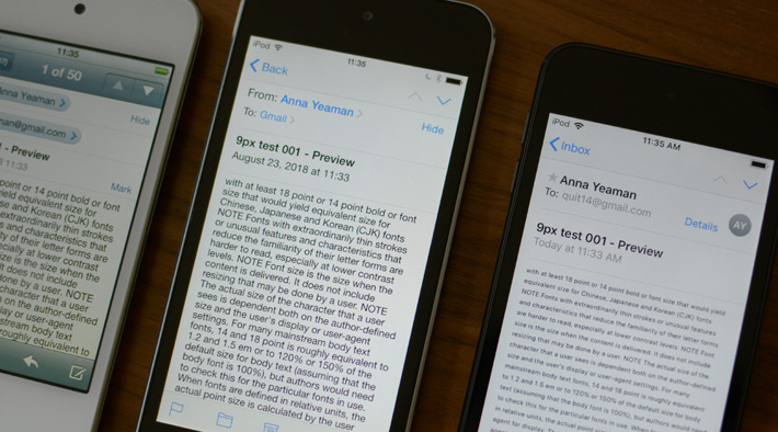
9 px text on older iOS devices is auto-scaled up to 15 px ( left ), on newer it's not and renders at 9 px ( righ t)
I tested on OS 5.1.1 – 11.4 ( iPhone X ), and somewhere between 9.3.5 and 11.2.2 ( see image above ) it stopped auto-scaling. After overlaying some text on the screenshots in PS — Helvetica was the old system font now San Francisco — I was surprised to find it was auto-scaling up to 15 px on older devices. Which makes sense as 15 px was the base font size, what Apple deems its minimum readable for body text.
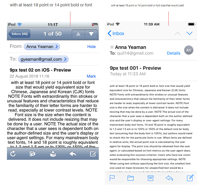
9 px text on older iOS devices is auto-scaled up to 15 px ( left ), on newer it renders at 9 px ( right )
Still I was sure I'd come across that 14 px minimum during QA over the years, so we sent another test with 13 px, 14 px and 15 px text. On the oldest device running 5.1.1 all the text was rendered at 15 px. On a mid-range device running 9.3.5 the 13 px text was sized up to 14 px, and on a newer device running 11.2.2 there was no auto-scaling. You can view a larger image of them side-by-side here. So there does appear to have been a 14 px minimum font-size at some point on iOS. Which is Apple saying that for this device, given a typical reading distance anything below 14 px isn't readable.
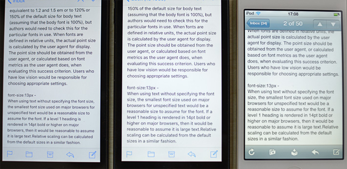
13 px text rendered at 13 px, 14 px and 15 px depending on how old the iOS device is
Seeing what small throws up
At this point I remembered that you could define text as small, and its size will be determined relative to the main text. Small isn't something I've ever used in an email, though web devs do according to this Microsoft study. So we sent a final test with font sizes: 17 px, 15 px and 12 px with a section defined as small to see what the iPhone native email client throws up.
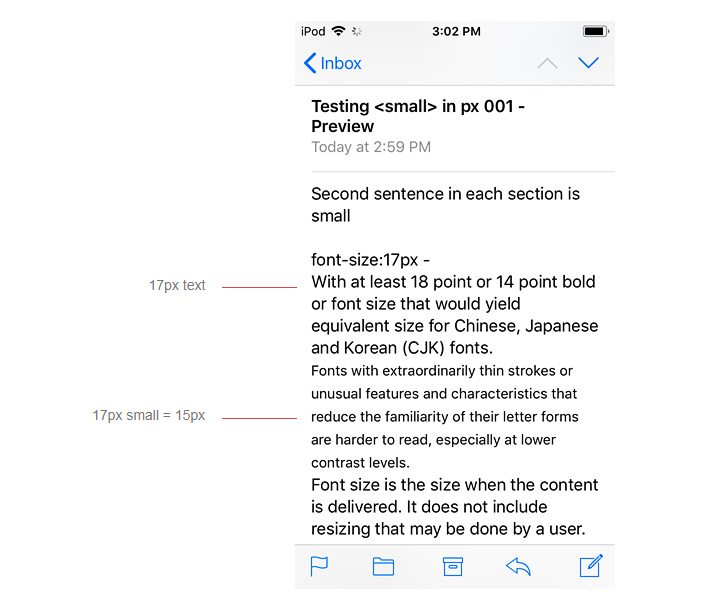
If you define text as small it sets the text down by two sizes on the iOS native email client
17 px text defined as small came in at 15 px, 15 px was reduced to 13 px, and 12 px down to 10 px. This gives us a good benchmark to work with, as small text is set down two pixels. It’s a typographic convention also mirrored in book footnotes, which are typically set down two points. So then assuming your body text is 16 px, your small text should be 14 px, 17 px body then 15 px etc.
Apple HIG and Material Design Guidelines
Next I looked at the type scales Apple and Android use in their design guidelines. Material design fonts are sized in SP, in their conversion table they state 12 Android sp = 12 iOS pt = 0.75 rem so I take that to also mean a straight conversion into pixels assuming the root font-size is 16 px ( 16 sp / 16 = 1 rem ). But don't take my word for it, it's confusing.
Caption and overline text ( text with a line above it ) are the smallest font sizes. They are used sparingly to annotate imagery or to introduce a headline. ― Material Design Guidelines in applying the type scale.
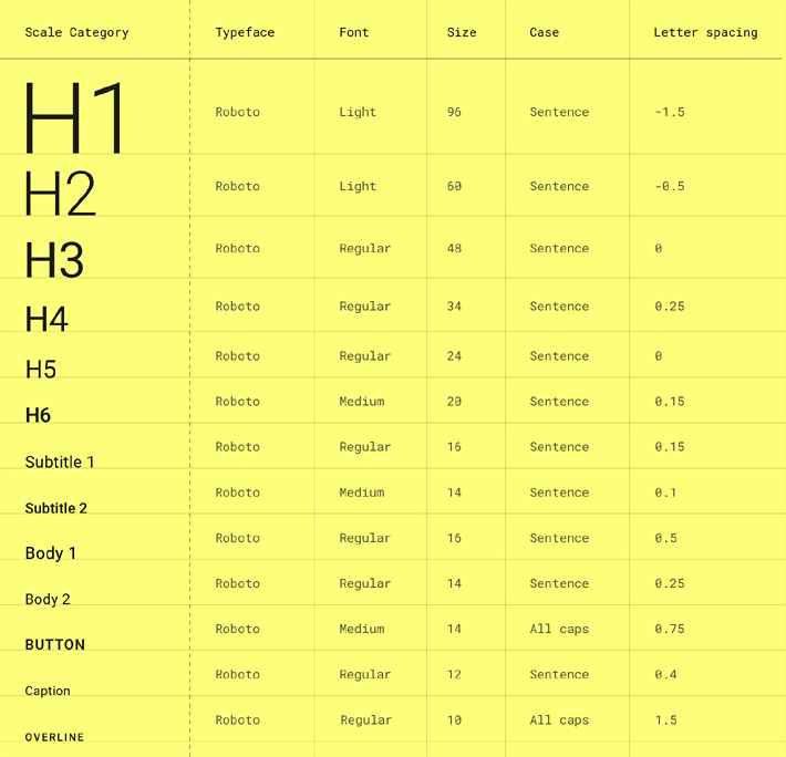
Material Design type scale with 10 sp overlines and 12 sp captions the smallest values
10 sp and 12 sp are the smallest sizes in the Material Design type scale, used for overlines and captions. Though elsewhere in "Applying the type scale", 11 sp and 13 sp are mentioned. Material Design's base font-size is 16 sp, with secondary body text, subtitles and button text all sized at 14 sp reflecting a two size difference. In my study group b ( b2b ) were far more likely to have two body text sizes than group a ( retailers ), with the second set down.
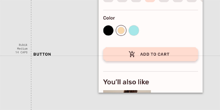
Material Design use 14 sp for button text, subtitles and secondary body text, image from applying the type scale
In Apple's HIG the smallest font sizes for standard default text are 11 pt and 12 pt for captions, with a body font-size of 17 pt. They also have a second type scale for, "Larger Accessibility Type Sizes" which starts at 20 pt for captions. We've been looking at standard type scales — and even then 11 and 12 point values are rarely used — it makes sense to bump these numbers up. Even a point or two helps, as it means fewer people will need to zoom in.
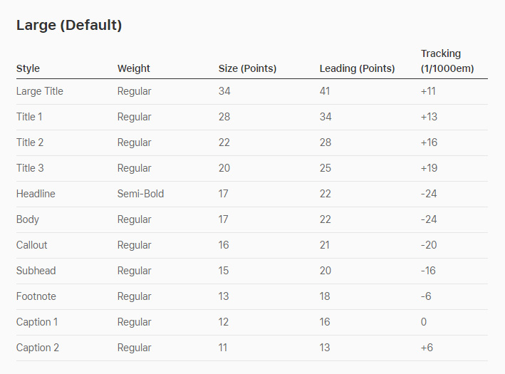
Apple HIG large default type scale
When looking further into type sizes on the iPhone X, 11 px and 12 px text was largely absent. As you see below 15 px and 17 px are used most frequently in the native email client. Again we see that two pixel difference, which makes the font sizes distinct from each other.
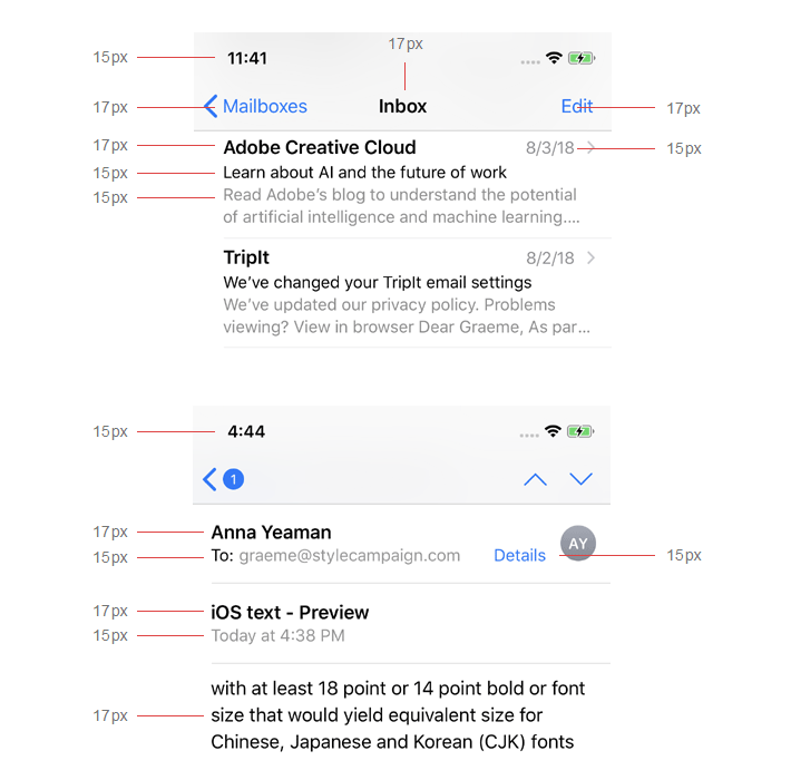
15 px for secondary text and 17 px for primary text are used most frequently in the iPhone X native email client
No consensus
Small text is typically used for secondary or tertiary content, so it's traditionally set smaller than the main text. But how much smaller can you go before it becomes illegible. Some might say a baseline readable size for all text is 1 em / 16 px. WCAG 2.1 advises us to use relative scaling, but it's not clear what their take is on negative values like 0.8 em.
Update: I later came across this under advisory techniques for 1.4.4, "Provide large fonts by default and […] avoid scaling font sizes smaller than the user-agent default, the author won't know the font size, but should avoid percentage scaling that results in less than 100 %". Advisory techniques are only suggested ways to improve accessibility, not necessarily required, but it does point us in that direction.Assuming you do choose to go lower than the default font-size, I don't believe you can make a case for anything under 12 px. Based on the above research a better guideline would be to set your small text two pixels down ( ~87 % body ). This would give us small text sizes of 14px and 15px for typical body font sizes.
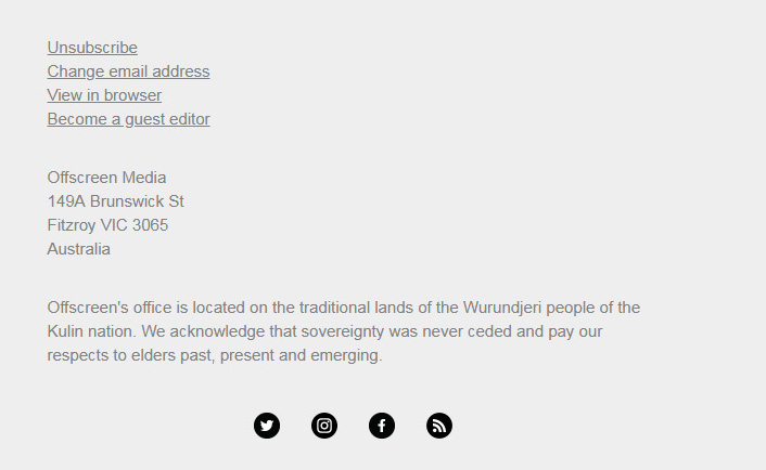
Offscreen uses a single type size of 15 px Helvetica throughout its footer, across both desktop and mobile
Our first rule is to stick to one or two type sizes at the most. If necessary, there are other devices such as bold, light, roman and italic to differentiate different parts of a text, but even there, stick to the minimum. ― Vignelli canon p 72
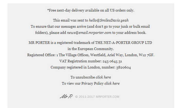
Mr Porter uses a single type size of 14 px Georgia throughout its footer, across both desktop and mobile
If 14 or 15 px seems high check out the Offscreen email above, it uses just three font sizes the smallest of which is 15 px. Also the Mr Porter email which uses 14 px throughout its footer. You can do a quick test to see what your email would look like with a larger minimum font size under the Chrome settings.
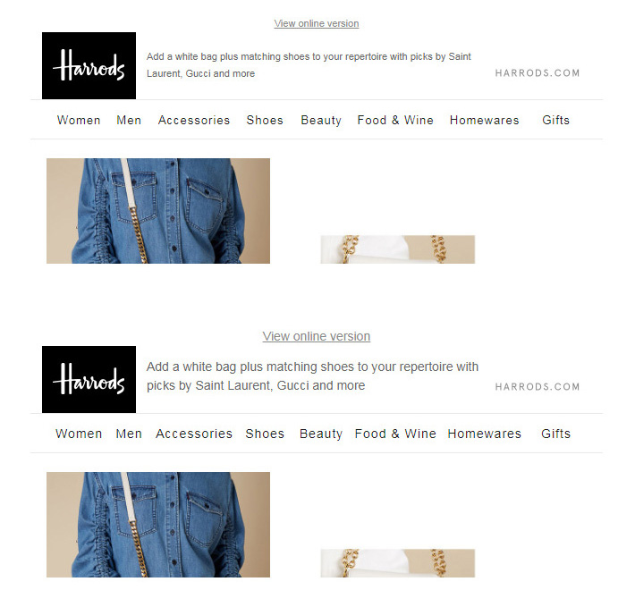
View your email with a larger minimum font size: Chrome settings / Customize fonts / Minimum font size ( works in Gmail and browser )
Here are a few extras relating to small type:
- Make sure the color contrast matches WCAG 1.4.3, it's around #767676 against white
- Choose the right typeface for legibility at small sizes
- Look for a large x-height e.g Arial, Helvetica
- 97 % of emails in this study use a sans pre-header compared to 3 % serif
- Give footer text the line-height it needs, don't try to squash it up
- No light or thin weights
- Avoid small text sentences set in caps or italic
- Make footer links clear with an underline and not just color
- Light text on a dark background is harder to read, it might need to be bumped up in size
- Use as few font sizes as possible, too many can make your email seem confusing and messy
- Make font sizes distinct, keep at least a couple of points between sizes
- Small text requires extra letterspacing, look for a well spaced typeface
- Rather than ilegible pre-header text, consider hiding it
- Short bursts of caps such as button text need extra letterspacing
- 80 character maximum measure for sentences of small text, 66 even better
- Look to book footnote conventions when sizing footers, usually set down 2 points
- Try using a proportional scale when choosing type sizes
- Don’t center long paragraphs of small copy such as disclaimers