12 ways to encourage scrolling
Web users spend 80% of their time looking at information above the page fold. Although users do scroll, they allocate only 20% of their attention below the fold - Nielsen March 2010
Luckily there are design tricks to encourage scrolling, here's 12:
1. Diagonal lines {View}
A continuation of the title text, the diagonal line cleaves through the creative drawing the eye downward.
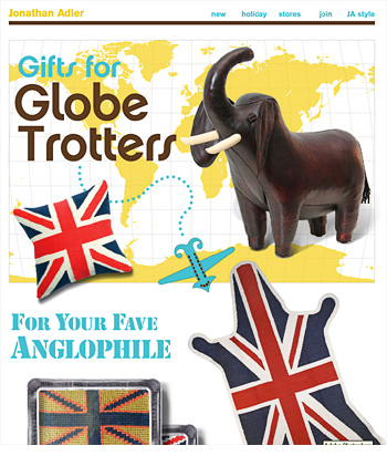
2. Scavenger hunt {View}
If you map out a clear path through your creative, users can't help but follow. Also see the mother of all scavenger hunt emails, by Localsknow.ca. Both examples incorporate game play to engage the user.
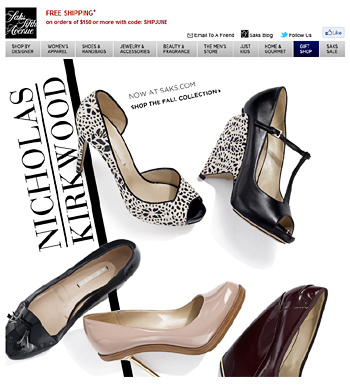
3. Hijack the Navi {View}
A partial view of the creative captures users curiosity in the preview pane. They're compelled to figure out what lies below.
This example courtesy of Chad White, was one of the 2009 Hall of Fame inductees. A riff on this is this Easter Bunny email and Clinique email.
4. Animation {View}
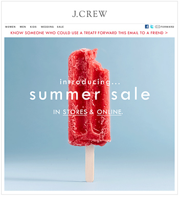
Similar to the bunny email above, the animation in this J. Crew email compels users to explore down the page. Also see Saks and Bed, Bath and Beyond.
5. Legs in the air {View}
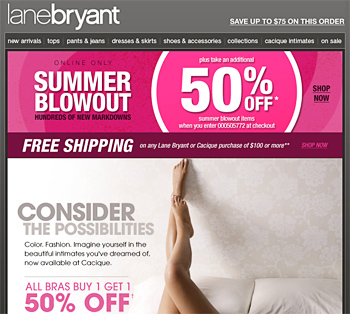
Can legs in the air really be a category? I'm not sure but here's two more. The promise of nudity and unusual composition acts as a teaser.
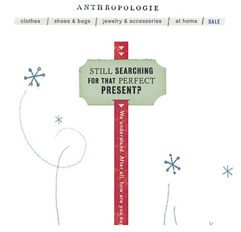
6. Big Arrows {View}
Hard, horizontal lines deter scrolling. The arrow shaped dividers invite further exploration.
Though keep paragraphs of text short if you want people to keep reading.
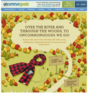
7. Super tall element {View}
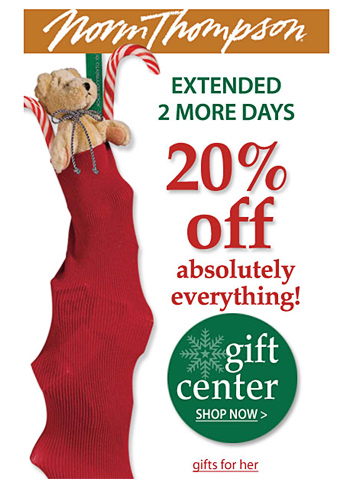 Big bags, stockings, tall ladies and piles of presents...all super tall design elements that indicate further content.
8. Scannable organic layouts {View}
 Organic or editorial style layouts, are easy to scan with no hard horizontal lines to break up the flow.
9. Chain link {View}
Similar to organic layouts, chain link layouts connect each product via a design element. Dotted lines, diagonal lines or scrolls...anything that maps out the route the eye should take.
10. Vertical lines {View}
Vertical lines encourage scrolling, whether it’s a big arrow or vertical stripes.
11. Teaser content {View}
Mobile users check email during quick breaks, so important content should be viewable on the first screen. If your content overflows then allow some teaser content to peek through.
Unlike on the desktop, we know where the fold occurs. Stay ignorant, and you end up cutting off your CTA.
| Above the fold on iPhone 4 | |
|---|---|
| click view to see test screenshots | |
| 320 x 600px | 285px view |
| 500 x 600px | 440px view |
| 550 x 600px | 485px view |
| 600 x 600px | 530px view |
| 650 x 600px | 575px view |
| 700 x 800px | 615px view |
12. Numbered lists {View}
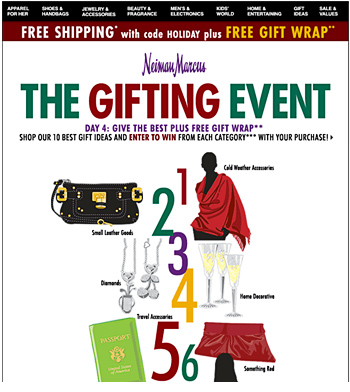
Everyone loves a list, here's another example from Sephora.
Morsel:
Eye tracking reports by Nielsen, found the very bottom of a page often attracts additional attention.
They recommend, "While placing the most important stuff on top, don't forget to put a nice morsel at the very bottom".
So here's mine...last October Clicktale found that 20% more visitors continue to scroll when using larger screens vs. tablets. Attention time also more than doubled over that of small screen users.
Also check out David Hoang's post, "1996 Called - It Wants "The Fold" Back". David argues users don't mind scrolling if given a good incentive and the title made me laugh.