Alternate mobile images
Different creative for Outlook users
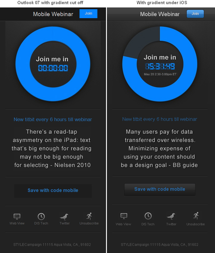
Via the UA string in the HTTP request header our dynamic image server (DIS) knows which client is being used to view an email. So were able to serve different images to different clients on open. This enabled us to fix the hacked off gradient by generating a different foreground image just for Outlook users.
Context-aware
This capability started me thinking about the problems you could solve by serving alternate images to desktop and mobile users, particularly retailers who typically use one hero image.
Legibility
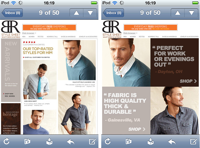
Banana Republic's desktop email becomes unreadable when scaled down (left). The text is too small, CTA's tiny and photo detail is lost in translation. You could create an alternative mobile image as seen on the right, with legible text and product photos that retain details.
Keeping text and product shots legible on mobile
Emphasis
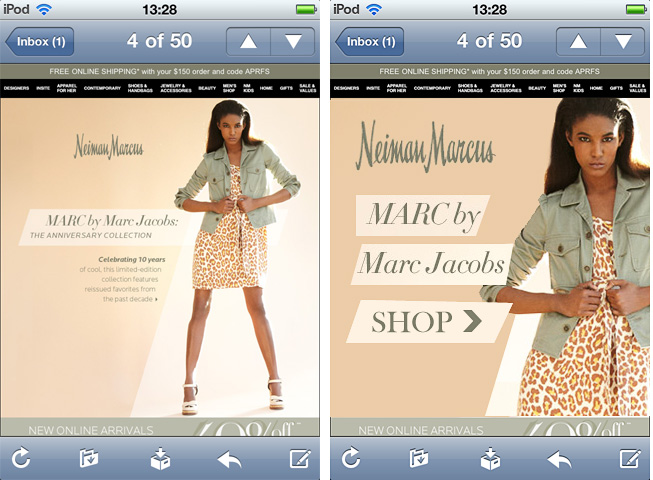
Compare the Gap email on the left with Gap's mobile site on the right. It's the same content just given a different treatment. On the mobile site not only are elements designed for touch, the store locator is given increased prominence. We could finesse our content to better serve mobile users.
Gap email (left) same content given a different treatment on their mobile site

Image weight
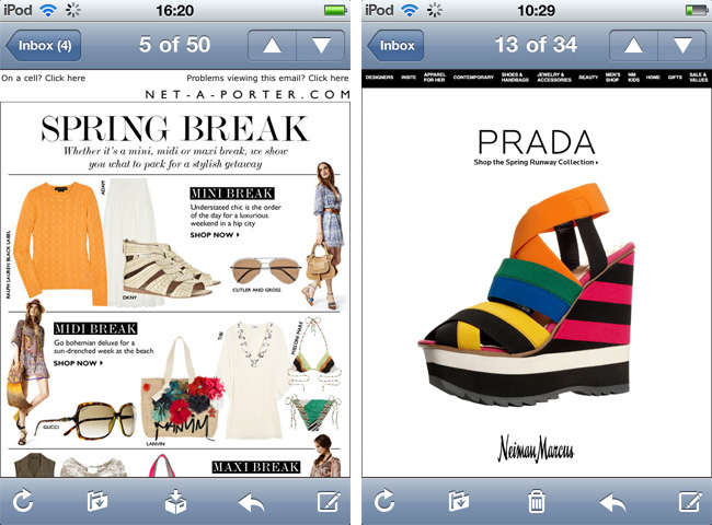
In the Gap email above, the hero image is 109KB compared to 38KB on the mobile site. I looked at 50 retail emails, and found 257.5KB to be the average image weight. Ideally you'd serve smaller images to mobile users, increasing download speed and reducing data charges.
650px wide and 80KB versus 25KB at 320px on the right
Why not just use Media Queries?
While writing this I'm working on a welcome series that uses media queries, I'm a fan. Nevertheless there are limitations with image management.
Performance
Using @media your desktop images get downloaded along with the mobile images. So instead of a 50K download on mobile it's a 300K download. Same if you hide a large desktop image, while not visible it's still downloaded. With dynamic images you'd only download the small mobile image. Re-sizing is done server-side not on the users mobile browser. Also when streaming you can adjust image compression depending on the available bandwidth.
Support
Media queries have limited support in desktop clients like Outlook and some mobile apps such as Gmail. EmailonAcid found Android media query support to be, "buggy to say the very least", dynamic images have universal support.
Capabilities
Dynamic images are programmable and assembled on-the-fly. You can update time-sensitive offers after send or generate images based on time of day and location e.g. If its 7am on the East Coast and your on an iPhone - heck and the weather is cold - generate this image.
Media queries are a thing of beauty, they're also free if you know how to use them. But there are solid reasons why mobile web devs have started to build responsive image solutions to manage their image assets.
Design for mobile & send to desktop?
This has worked for me with a skinny layout, but it becomes strained if you have a 600-850px wide template. Your buttons, text and images can become jumbo-sized on the desktop in order to be legible once they're scaled down. It just depends on the execution, I have seen some slick designs using this tactic.
Though you're still sending large desktop assets - like 677K worth of images - to mobile users. When Google Maps was reduced from 100K to ~80K, traffic was up 10% the first week and 25% in the following three weeks. Performance matters.
Mobile email is more likely to be "in bed" than "on the go", but I still think simplified layouts are a safer bet. Small screen sizes mean you can view fewer products at a time (though here's an interesting idea). Whereas the desktop can accommodate more detailed imagery and exposed product without sacrificing clean design.
Goodbye busy layouts - Hello glance-friendly layouts
Nothing's perfect
Skinny layouts float in a sea of white space, fluid layouts rock but we've no max-width support in Outlook, media queries download desktop assets that mobile users don't need, wide scalable layouts come with large file sizes and alternate images require extra resources. Which tactic you choose will depend on your audience, the devices you're targeting, if you plan to serve identical creative to desktop and mobile, your resources, how image heavy your creative is and if you have a mobile commerce site.