Gap redesigns navi for touch
Sep 9th {View desktop email}
6 tabs with small text and little horizontal spacing

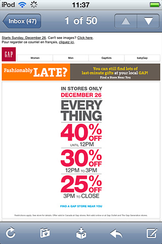
Dec 24th {View desktop email}
Reduced tabs to 4 which increases spacing, but the text is still hard to read.
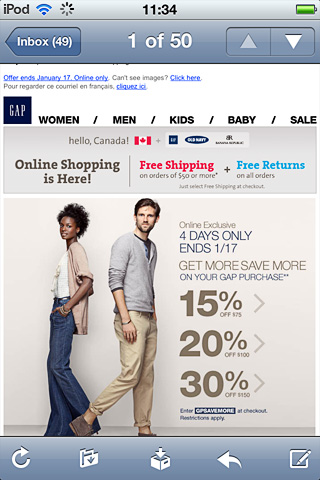
Jan 14th {View desktop email}
5 finger-sized links which are easy to read
A mobile UI designers recent tip to me, was to push the contrast a point or two beyond what I'd do for desktop. When you're viewing creative at a glance, on a tiny screen, potentially half drunk in a bar (his words), it's not time to play 10 shades of grey.
I like how bold the navi above is on a mobile, with plenty of contrast (can't beat black on white). Though it's slightly overbearing on the desktop. The Gap mobile site uses a list view for navigation, positioned at the bottom of the screen.
Looking at the changes in Gap's navi, it's a clear sign that desktop layouts are doing double time on smartphones. Though it's a compromise for both desktop and mobile users.
Check out Designing for touch - Mobile version (1)
Check out Designing email for touch (2) Navi