Designing for touch - Mobile Version (1)
In this Brooks Brothers email, the mobile link is 11px and positioned on top of the web version link. Ideally limit your pre-header to one line, avoid stacking links.
In the Human Interface Guidelines (HIG), Apple recommends a target area, "of about 44 x 44 points" (see red box below).
As you can see from the size of my finger and thumb, those measurements are conservative.

Assuming a. You have excellent eyesight or b. know from previous interactions that a mobile version exists. Users are forced to pinch and flick a few times in order to avoid the link underneath.
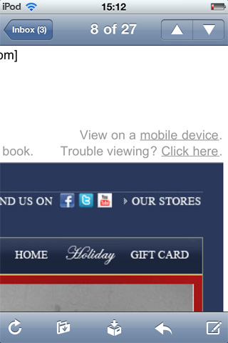
That's asking a lot of mobile users, who value efficiency.
Clicking a link on mobile to be asked 'are you visiting on a mobile?' is just annoying. Get me to the content, no time for barricades - @alex_gibson
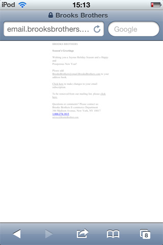
Then the mobile version looks like this, as the viewport has not been defined...
2. Targeting smartphones?
What becomes clear, is many retailers are not targeting smartphone/touchscreen devices with their puny mobile version links (I really hope not!) but devices which lack image support, like older Blackberries.
BTW Older Blackberries disable links. Instead of, "Click to view mobile version" test the full URL,"View mobile version http://www.mymobileversionurl.com." Check out this NRF SmartBrief example. For short URLs check out MobileTinyURL.
Some retailers have realized the creative they send to desktop users, is passable on a smartphone. No need for a separate "iPhone/Android" version.
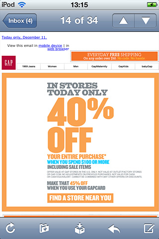
I like this grid layout, which converts well to finger-sized targets.

3. Mobile first
If this is their smartphone strategy, retailers need to redesign the header, navi and footer for touch.
Half measures and inconsistent design (some days the creative works for mobile other days less so) frustrate users. Design for mobile first, rather than trying to squeeze your desktop creative onto the small screen.
"mobile design will drive all digital design going forward" - kyle outlaw @razorfish #uxofmobile #sxsw - @davemc9ee
4. Image blocking on the iPhone
Just as I thought I had this figured out, I came across this article, "Image issues thwart mobile e-mail plans" it states,
"...images in a Hotels.com e-mail opened on an iPhone in Hotmail did not show up but the text did. In January 2011, it will add a link in each e-mail to view a “mobile-friendly version.”
Hotmail (& AOL and Gmail) only block images for iPhone/iPod users if accessed via the web e.g. Safari browser.
If you view Hotmail email natively on an iPhone, images are displayed by default.
Left: Hotmail running Natively :: Right: Hotmail via web (Safari)
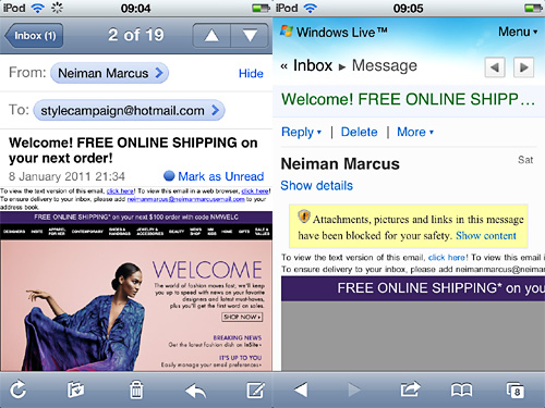
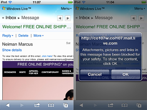
You can click once to, "Show content" in Hotmail via the web (yellow box above right). Though the experience is diminished. Only a 320px wide section is displayed (below left) so left justify your mobile link. If it's out of sight on the first screen, users won't hunt for it.
Alternatively, click on Neiman Marcus' text version. After which, you're further prompted to allow content (below right). This adds an extra step, along with the tiny links. I don't see many mobile users jumping through these hoops.
Left: After clicking, "Show content". :: Right: After clicking, "Text Ver"
5. Who is reading my mobile version?
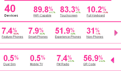
One way to determine if smartphone users are reading your mobile version is PercentMobile (using it on this blog). It tells you the percentage of touchscreen users. So, 40 different mobile devices accessed this blog, 83.3% touchscreen enabled:

You can add PercentMobile tracking code to your mobile version, as it's hosted on the web. Then you'll know exactly who is reading it and whether to design for touch.
You won't be able to use PercentMobile for email client usage, for that check out Litmus or Pivotal Veracity.
Changeable
One of the biggest challenges for email designers, will be the transition to touch this year. I was recently chatting with a mobile UI designer, we both agreed we're all winging it. It's such a new and changeable field, mobile design strategies from 6mths ago may not apply today.
I've already been approached to design templates (not mobile versions) which are optimized for touch. So don't kid yourself its 12mths away. In part two I'll share some examples and mistakes, some truly cringeworthy. I'd love to hear how other designers are adapting, feel free to get in touch.
Check out Designing email for touch (2) Navi
Check out Gap redesigns navi for touch