Mobile email design (part 2)
{ Missed the horizontal design in part 1 >> }
1. Portrait or landscape?
In portrait mode, the visible area on the iPhone is 320 x 356 pixels:
In landscape 480 x 208 pixels:
This does not include the space taken up by the status, URL and button bar which are displayed by default.
We've been using a 370px wide template, since Feb this year. Last month we had a 44.29% click-through rate and our open rates have also been in the 40's. I mention this, as we were concerned how a skinny template would perform on a PC, with so much blank space to the right:
2. Device width & scale
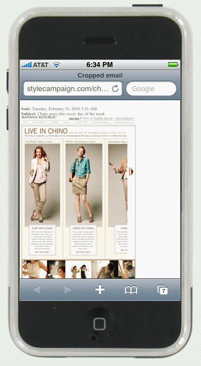
By default the iPhone sets the browser device width to 980px. Most emails are around 650px wide (skinny 320px wide), when viewed in the browser they appear zoomed out:
By adding the following code, you can set a custom device width:
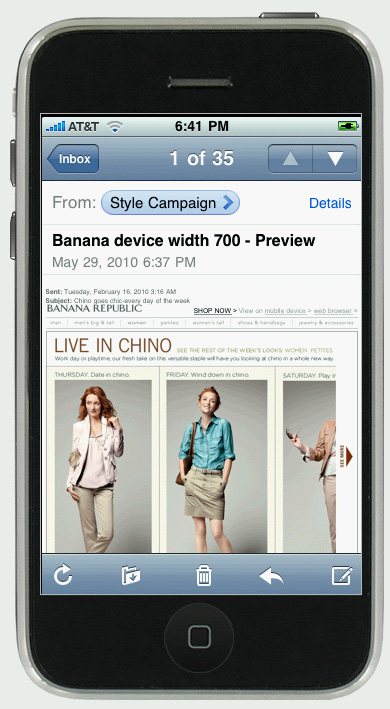
<meta name = "viewport" content = "width = 650">Here's how the Banana Republic email displays after setting the device width to 700px:
You can also adjust the default scale.

Here's the code:
<meta name = "viewport" content = "width = 650, initial-scale = 1.0">Read more on setting the device width and scale on the Apple dev site.
3. Narrow columns of text
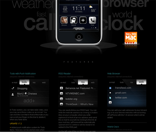
Blocks of text over 320px wide can be difficult to read on an Android or iPhone, as they force users to scroll and zoom. I noticed many iPhone app websites favor a 2 or 3 column layout, consisting of 320px blocks of content like apps.selcukyilmaz below:
This gave me the idea of an email with two 320px wide columns. Clients may be more receptive to a 2 column layout as it still looks traditional, coming in at 640px wide. Here's an example I just designed.
We are going back to the single column for email because of mobile devices @dtboyd #spop10 via @LorenMcDonald
While I agree that a single column layout works well for mobile, fixed blocks of text over 320px wide are not mobile friendly. I favor a 320px single column layout, two 320px column layout or a fluid single column layout.
4. 12px + fonts
The iPhone auto scales small fonts up to 12px. To avoid this you can add the following code:
style="-webkit-text-size-adjust:none"Though the takeaway is to make all your email text over 12px. Apple recommends a 17 - 22 pixel font for the iPhone.
Chad White points out that 64% of retailers use an 8-point font size or smaller in their email footer text. Chad has created the Boomer Legibility Initiative for a New Decade (BLIND) on LinkedIn, which asks us to increase our font sizes.
5. No Flash
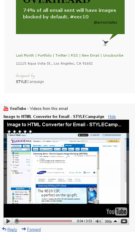
Flash is not supported on the iPhone or iPad. For this reason I've been placing our videos on YouTube. The iPhone launches YouTube video full-screen in landscape mode:
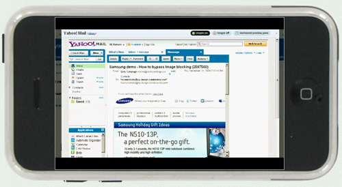
Placing your video on YouTube has the added benefit of playing in Gmail. If you have a YouTube URL the video is automatically displayed underneath the email:
What's next?
Part 3 in the mobile email series looks at pixel art and part 4 fluid layouts.
If you missed part 1 >> - horizontal - check it out.
Also here's a gallery of 11 skinny emails from 37signals, Threadless and many others...