Light on Light vs Light on Dark A/B Test
You should try making an AB test w/whitebox /black bg and vice versa... believe this time the dark bg wins - @fspereira
So that's what I did last week...
![]()
A/B Test Emails: {View light} / {View light on dark}
Guess which got the most clicks this time? Scroll down to find out.
![]()
Light on dark won with 19% more clicks {View winner}
Of the people who opened, the light on dark email received a 19% increase in total clicks.
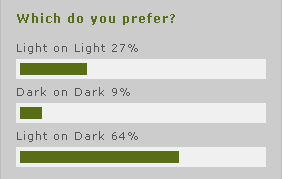
64% of you said you prefer light on dark in last months poll:
![]()
Contrast in the pre-header
My guess is the light on dark won, due to the contrast in the pre-header navi. Many of the additional clicks were to the light vs. dark a/b test CTA and Twitter, which both appeared in the top navi.
The email was sent out at 2pm (PST). During busy business hours, the light on dark was getting almost double the clicks of the light design.
After 6pm the gap narrowed considerably. The contrast in the light on dark seemed to grab the attention of busy workers, as Kelly Lorenz stated, "It pops".
@stylecampaign This time I think light on dark will win. Really pops - @KNLorenz
![]()
Next test {popping pre-header}
I'm going to test light on light vs. light on dark again, but with a contrasting green navi. View the full email here.