Light vs Dark A/B test
I just finished designing a series of dark email templates, for the Hard Rock Hotel Chicago. While hunting for inspiration, I got wrapped up in the light vs dark debate.

Loving any excuse to play with color, I sent out an a/b test for our newsletter.
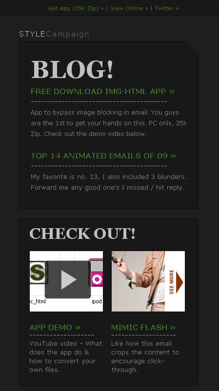
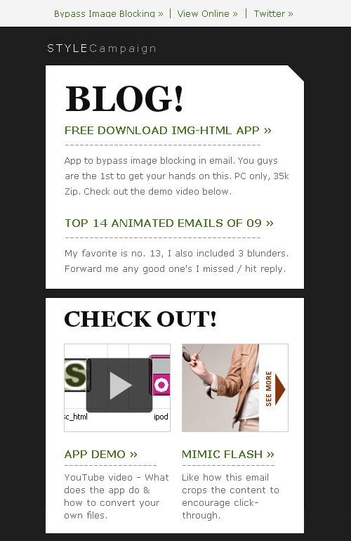
1. A/B Test Emails {Full Email}
Guess which got the most clicks? Scroll down to find out.
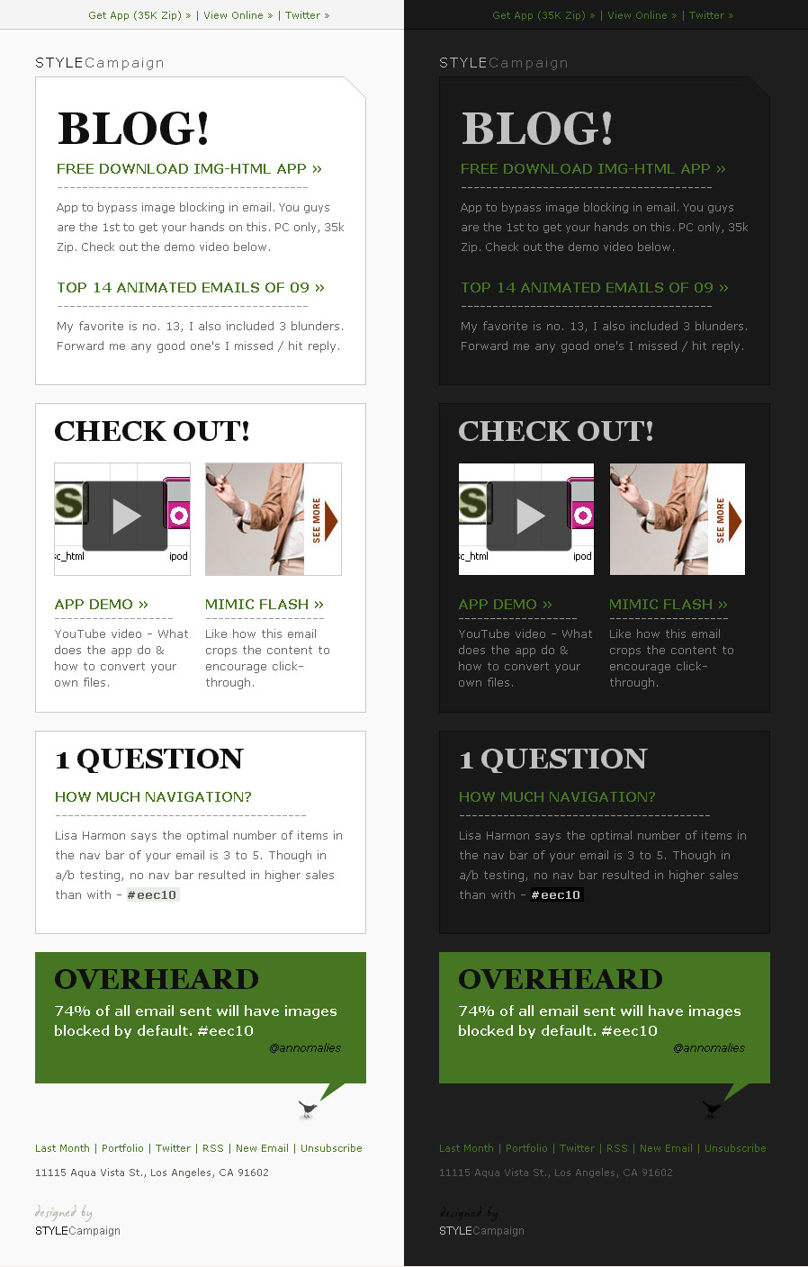
Above is a cropped shot of our newsletter, view full-length.
2. Light won with 150% more clicks {View light}
Did you guess right?
Felipe recommended I test a white box against a dark background.
You should try making an AB test w/whitebox /black bg and vice versa... believe this time the dark bg wins - @fspereira
I'm going to A/B test the above vs. light-on-light next month (with bigger test group). People find dark copy on light backgrounds easier on the eyes, but I love the drama of dark design.
Is this the sweet spot?
Dark vs light tests are not just for b2b. Top Uk retailers Evans and Oasis, both switched from a dark to light design last month.