Happy New Year from Webtype! A lot has happened since the last edition of Webtype News, so this one is overflowing with fresh type and other updates of relevance. We hope you’ll enjoy the abundance of options for your web projects in the new year.
The Underware type foundry is now on Webtype! We couldn’t be happier to welcome this creative European group to our list of collaborators, starting with a diverse mix of selections from their library:
Fakir is a contemporary take on the historical blackletter style and is one of the most distinctive faces in our catalog. Available in 7 styles.
Bello pairs a soft and friendly script with a toned down set of caps, translating the work of a traditional sign painter into a modern context. Available in 2 styles.
Auto, last but not least, is a hardworking sans that manages to be clean without being boring. It offers a palette of 3 (yes, 3!) kinds of italics, ranging from sleek and simple all the way to swashy and calligraphic in influence. Available in 16 styles: 4 weights, each with 3 sets of italics.
Keep an eye out for more Underware releases on Webtype in the future.
Giza brings back the colorful power and variety of the original “Egyptian” letterforms, a glory of the Victorian era. Designer David Berlow based the family on showings in Vincent Figgins’ specimen of 1845, the triumphant introduction of this thunderous style. The first number in the style name indicates its weight, the second number the width. The truly unmissable ultra-fat “Nine” weights were designed for ultimate emphasis in banners and in the very largest of sizes. Available in 16 styles from 5 weights and 5 widths.
Riga and Riga Screen by Ludwig Übele are space-saving humanist sans-serif typefaces designed to work particularly well onscreen. Their personality is clear and practical; true italics give a warm touch. Economical proportions, large x-height, and open letter forms make Riga fit for long body copy, narrow columns, and compact headlines. Riga Screen is adjusted and optimized for even smaller text, in sizes down to 9px. Riga is available in 12 styles: 6 weights with italics. Riga Screen is available in 4 styles: 2 weights with italics.
Apres grew from type that David Berlow originally drew for the Palm Pre smart phone, for use both on the device and in print marketing. Its miniature counterpart, Apres RE was designed specifically for use at small sizes down to 9px. The series’ simple, open letterforms and generous proportions provide a clear, comfortable, and inviting experience for UI navigation, app development and onscreen readability. The plain-spoken geometry is regular and balanced without being static or mechanical, providing a friendly and forthright familiarity. Available in 40 styles: 4 widths, 5 weights, with italics.
MVB Mascot brings the unvarnished spirit of script varsity lettering from years past to a professional skill set. Jaunty but legible, such casual scripts — with their requisite underline swooshes — were standard equipment for classic sports teams. To bring this aesthetic to the digital arena, Mark van Bronkhorst began with a vintage iron-on alphabet, redesigning the flocked, overlapping letters to behave as a script typeface, expanding the character set to support all Latin-based languages. Available in 1 style.
Input is a flexible system of fonts consisting of Sans, Serif, and Mono variants, designed specifically for the context of code and data. It finds inspiration in early computer consoles but looks towards a typographically rich future, offering both monospaced and proportional fonts, all with a large range of widths, weights, styles, and stylistic alternates for richer data-centric typography. Available in 168 styles: 3 families, 4 widths, 7 weights, all with italics.
Learn more on the Input brochure website.
Mønster, named after the Norwegian word for “pattern”, is a decorative reversed-stress slab serif. Designed by Sindre Bremnes, it is an ornamental typeface that recognizes Middle Eastern motifs instead of Wild West traditions. Its tight spacing and exaggerated letterforms combine into powerful, vigorous patterns, and turn big headlines into huge statements. Available in 1 style.
FB Big Caslon is Matthew Carter’s revival of the largest sizes of type made by the Caslon foundry. Those larger cuts were strangely unlike the famously consistent text faces from William Caslon, showing more flare and eccentricity. Already a favorite among designers for 20 years, Big Caslon has been rereleased as a larger family with expanded functionality. Available in 6 styles: three weights, with italics, and optional swashes.
Check out the Big Caslon brochure site to see it extra-large.
Tilda is the script typeface Jessica Hische originally designed for Wes Anderson’s film, Moonrise Kingdom. Inspired by Anderson’s quaint aesthetic, Tilda is formally dressed, without hiding its raw, intentional naïveté. Unusual for a script typeface, it comes in two size-specific styles to preserve its delicate qualities for uses big and small. Available in 2 styles.
Be sure to check out the Tilda brochure website to see it in action.
MVB Solano Gothic was originally designed as a display face for the City of Albany. Named for the city’s main street, the typeface needed to work on signage in proximity to early 20th-century buildings, as well as in contemporary settings. Mark van Bronkhorst’s design is a strong, condensed sans-serif that references pre-digital letters of all sorts, from metal architectural lettering to hand-painted signs. The style is not overtly retro, however. It sits comfortably on contemporary-styled web pages. Available in 5 styles, 1 per weight.
We recently rolled out a new content delivery architecture that improves both the speed and reliability of webfonts for our customers. The new EdgeCast CDN platform increases the number of server locations around the world, which will improve load times globally.
Additionally, we’ve introduced a Webtype Status Page to report the current state of our webfont service. In the unlikely event that there is an interruption in service, the page allows us to be as transparent as possible about the situation.
Campaign Monitor has selected Webtype News as one of the Top 100 Email Campaigns of 2014. We aren’t resting on our laurels though, and are continually improving our format by embracing progressive enhancement and modern web standards for email.
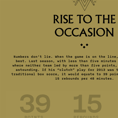
LeBron 11 is the latest shoe collaboration between Nike and LeBron James. The occasion is celebrated with this site, a starkly stylized reflection on James’ basketball career and previous shoe releases.
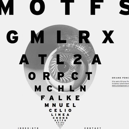
Index-Studio’s website is impressing with a hypnotizing scrolling effect for browsing through their menu. It’s a wonderful demonstration of how webfonts can be used in interesting and unusual ways.
Uses Interstate
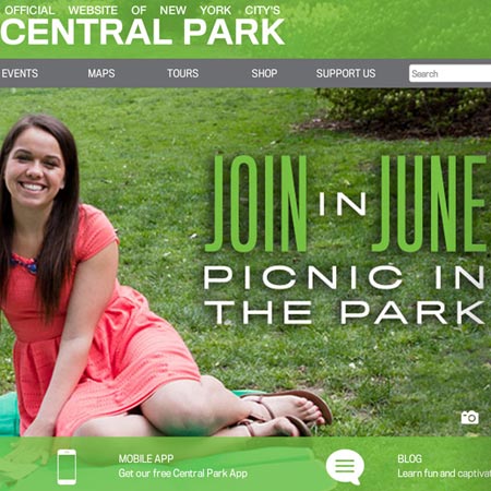
NYC Central Park uses type consistently not only between its print and web collateral, but also with its signage, mobile apps, uniforms, etc. We took a deeper look at their graphic system on the Webtype blog.
Uses FB Titling Gothic
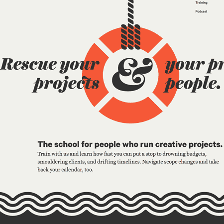
Louder Than Ten started as a digital design studio but relaunched as a school for people who run creative projects. Their website achieves a strong graphic look by sticking to a minimum of striking colors.
Uses The Harriet Series
Visit the Webtype Gallery to see more examples of Webtype in use.
This edition of Webtype News was composed by Nick Sherman. The typefaces used are Fakir Display for headings, and Aften Screen for body text.
©2015 Webtype. All rights reserved.
179 South St, 7th Floor; Boston, MA 02111