|
December 18, 2014
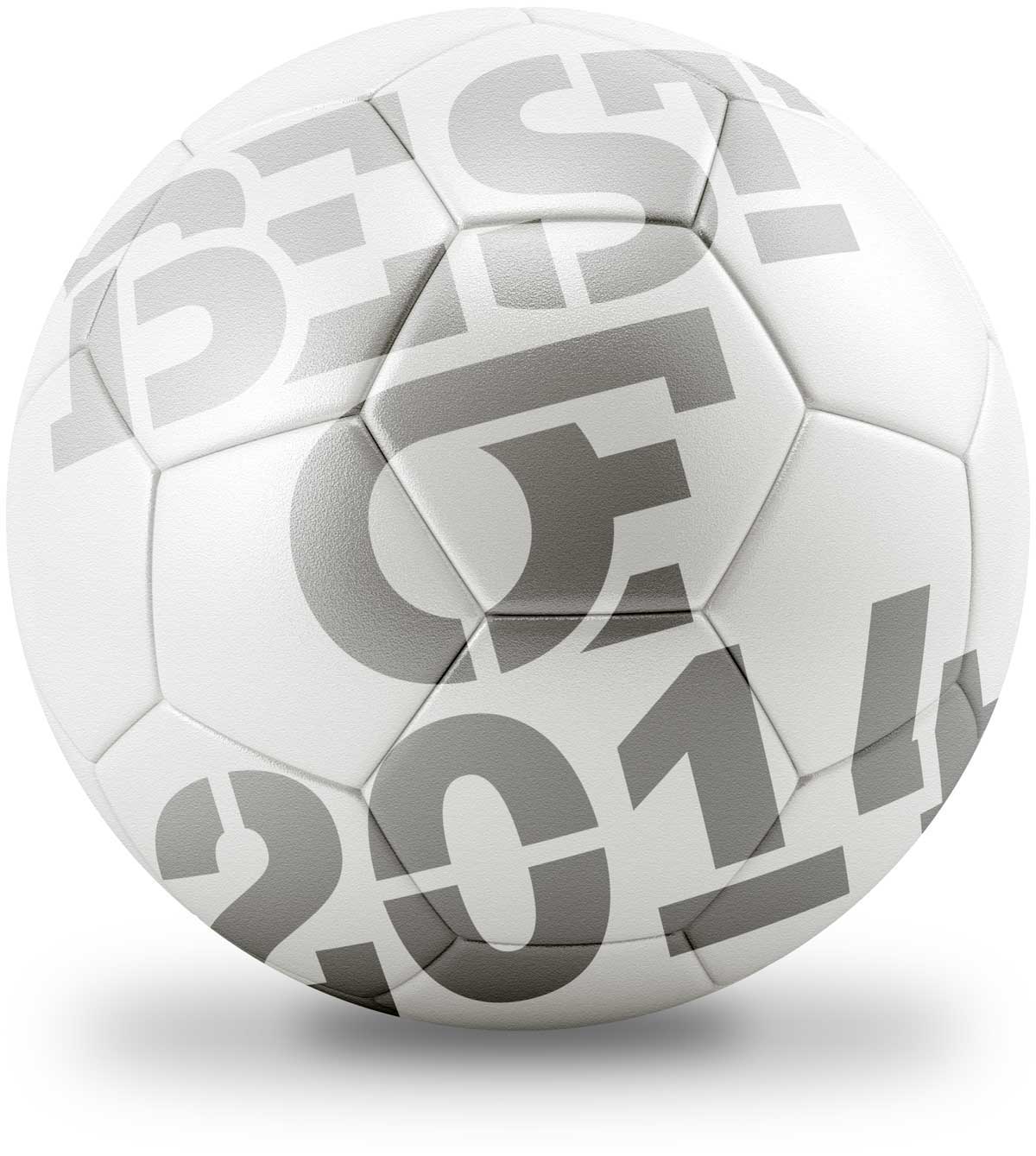
The Best of 2014
Our roundup of the best scoring type of 2014!
|
| |
|
|
It has been quite a year: Germany won the World Cup and we’ve had a type-tastic 12 months that have seen some big players come into the field.
We look back on 2014 and choose our top 25 typefaces with nod to the games that kept us glued to our screens this summer. Lets kick off!
|
|
|
|
| |
|
| |
|
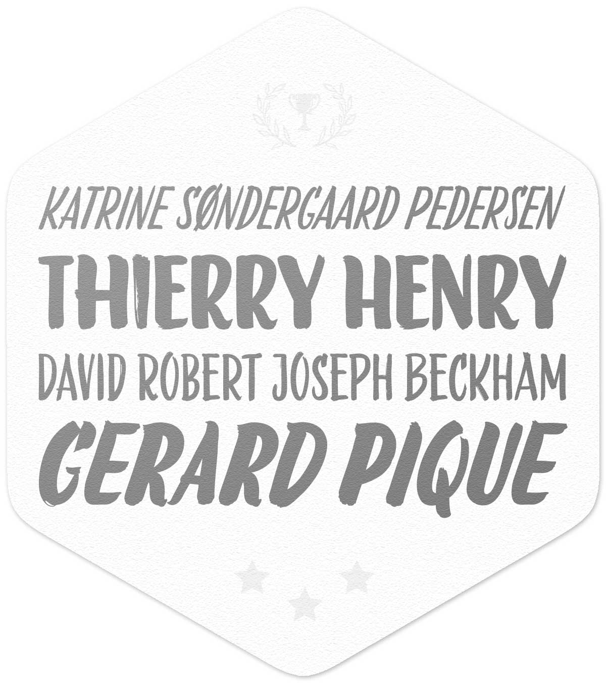
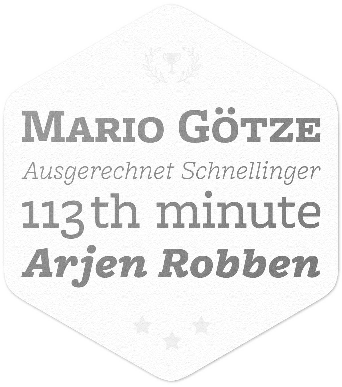
Golden Balls
Nitti Grotesk
Pieter van Rosmalen for Bold Monday
|
| |
|
It’s a rare progression in the type world, going from a monospace to a proportionally spaced release. However Nitti has retained an open feel, staying cohesive with added quirks taken from its grotesque roots. View Nitti Grotesk on FontShop
|
|
|
|
| |
|
| |
|
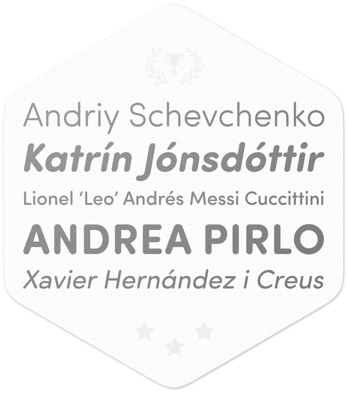
Curve Ball of the Tournament
Brando
Michael Abbink for Bold Monday
|
| |
|
Brando is characterized by strong, linear forms, subtly bracketed serifs, and curves like a Beckham kick. Whilst its handling of the italic forms gives a nice balance between optically corrected obliques and a more naturally flowing italic. View Brando on FontShop
|
|
|
|
| |
|
| |
|
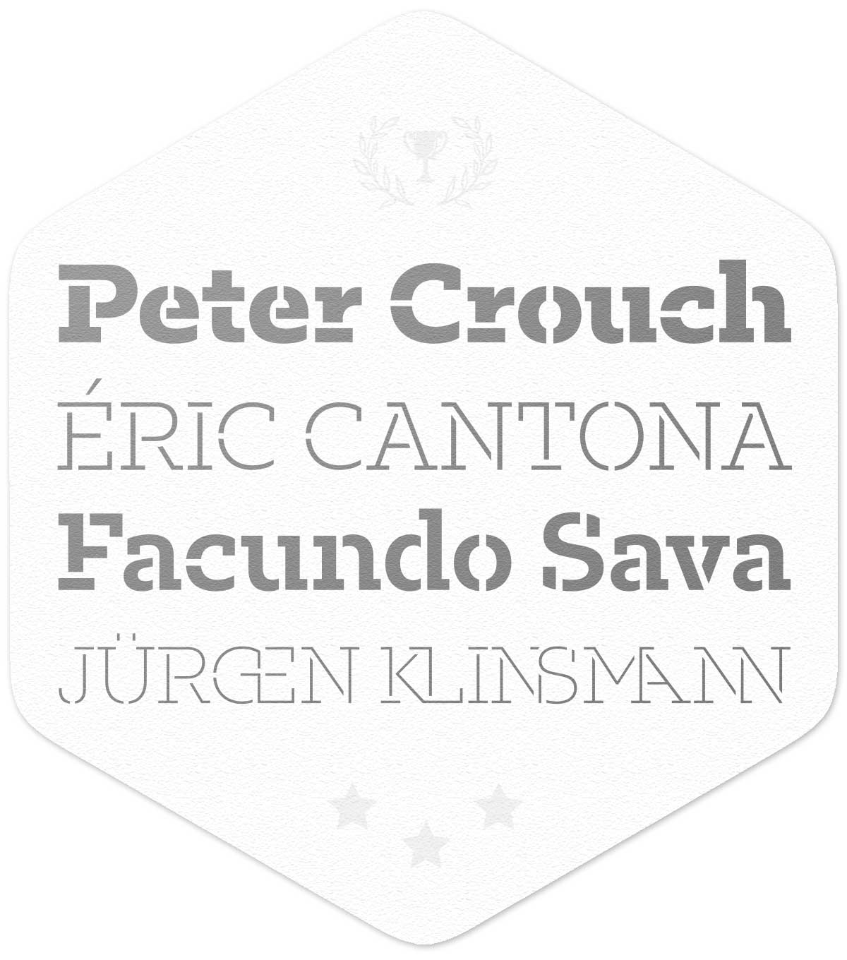
Biggest Fan
Blenny
Spike Spondike for Dalton Maag
|
| |
|
Visually the love child of Futura Black and Pistilli Roman, Blenny marries stencil–like geometry with the sensuous curves of 70s fat faces, exuberant curls and big ball terminals. View Blenny on FontShop
|
|
|
|
| |
|
| |
|
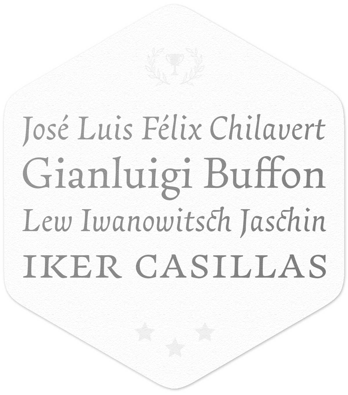
Most Tasteful Team Kit
Cardea
David Cabianca for Emigre
|
| |
|
The subtle curves and slight angles add sparkle to any pitch, with high contrast, luster, and crisp edges. The face has a sculptural feel making it the most attractive kit on the pitch. View Cardea on FontShop
|
|
|
|
| |
|
| |
|
Sunday League
Mandinor FY
Julien Priez and FONTYOU Team for FONTYOU
|
| |
|
A Victorian family of three contrasting typefaces: Modern, Gothic & Italian.
Its ornaments and letters (which include animals) can be mixed together to build original alternates, allowing users to play and build their own glyphs. View Mandinor FY on FontShop
|
|
|
|
| |
|
| |
|
Best Combination Play
FF Antithesis™
Yanone for FontFont
|
| |
|
Its design concept revolves around three poles that are in tension and dialogue with each other. The three weights, Regular, Italic and Bold, all play together in high visual contrast to create the perfect typeface. View FF Antithesis on FontShop
|
|
|
|
| |
|
| |
|
Promising New Player
FF Franziska™
Jakob Runge for FontFont
|
| |
|
The combined skill of a Renaissance Roman or Antiqua in a static classical slab model results in a robust, open and approachable design. Already touted by several publications this is one to watch. View FF Franziska on FontShop
|
|
|
|
| |
|
| |
|
Best Away Kit
Boucherie
Laura Worthington for Laura Worthington
|
| |
|
Bringing the essence of 19th–century French advertising typography alive, this polished, cleaned-up typeface looks better than the Belgium Away Kit with its four distinct display types beautifully complementing each other. View Boucherie on FontShop
|
|
|
|
| |
|
| |
|
Coach of the Year
Pilcrow Soft
Satya Rajpurohit for Indian Type Foundry
|
| |
|
As efficient as a training session with José Mourinho this simple utilitarian sans serif is available in two versions. Its square-like letter forms are similar to those found on street and highway signs around the world. View Pilcrow Soft on FontShop
|
|
|
|
| |
|
| |
|
Six–a–Side
Riga
Ludwig Übele for Ludwig Type
|
| |
|
The six–weight family fills its character interiors with as much whitespace as can reasonably be contained, pushing its round strokes into squared curves. This, in addition to generous spacing and a compact fit, render the face usable in a variety of settings. View Riga on FontShop
|
|
|
|
| |
|
| |
|
Stylish Player of The Tournament
Showcase
Daniel Hernández and Paula Nazal Selaive for Latinotype
|
| |
|
A cute and fun set of sans, slab and script that was made for a range of display uses such as packaging, posters, cards and window dressing. Tie all three lettering styles together with the included sets of mini caps and ornaments. View Showcase on FontShop
|
|
|
|
| |
|
| |
|
Best Looking Player
LiebeDoris
Ulrike Rausch for LiebeFonts
|
| |
|
This hand–painted sign typeface has four different styles. Its casual brush sans, inspired by iconic American sign painter Mike Meyer, offers a unique combination — the allure of all–American sign painting and the meticulous craft of German engineering. View LiebeDoris on FontShop
|
|
|
|
| |
|
| |
|
Most Efficient Passer
Sofia Soft
Olivier Gourvat for Mostardesign Studio
|
| |
|
Sofia Soft rounds the corners on the Sofia family’s four interior weights ranging from Light to Bold. The overall result is reminiscent of Futura’s popular rounded variant, VAG Rounded, but set slightly wider, and quite a bit more generously spaced. View Sofia Soft on FontShop
|
|
|
|
| |
|
| |
|
Best Goal Celebration
Fakt Slab Stencil
Thomas Thiemich for OurType
|
| |
|
This typeface gets everything right. The balance between the design’s overall macro texture, its reconciliation of smooth and abrupt edges, to the amount of playfulness in the placement, width, and detail work around the stencil bridges. View Fakt Slab Stencil on FontShop
|
|
|
|
| |
|
| |
|
Best Goalkeeper
Essay Text
Ellmer Stefan for TypeTogether
|
| |
|
Inspired by early French Renaissance types, the result is a historically informed work of obvious contemporary appeal. Again, differing from the norm only by two or three degrees is the face’s Italic, which, like its archetypes, sets blocks of fine text on its own. View Essay Text on FontShop
|
|
|
|
| |
|
| |
|
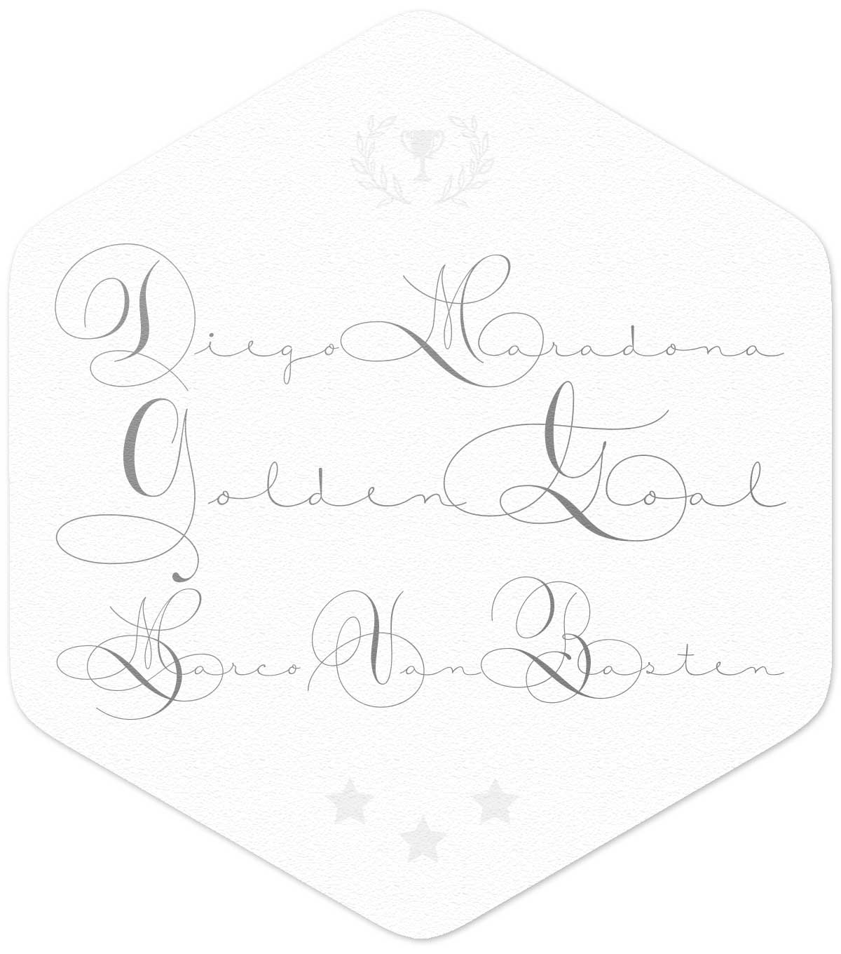
Best Goal
Trola Text
Jordi Embodas and Noe Blanco for Tipografies
|
| |
|
Specifically engineered for continuous reading. Its reduced contrast and simplified serif shapes give it a more robust appearance – whilst its wider proportions and letterforms with a larger aperture guarantee good legibility in text sizes. View Trola Text on FontShop
|
|
|
|
| |
|
| |
|
Free Kick Champion
Lipa Agate
Ermin Međedović for TypeTogether
|
| |
|
Part of a larger type collection, this is the first release in a coherent system developed over the last 10 years. Designed to be used in the smallest text sizes and in poor printing conditions, this clean and honest workhorse face has deep ink traps, narrow proportions and a tall x-height. View Lipa Agate on FontShop
|
|
|
|
| |
|
| |
|
Penalty Champion
Alverata
Gerard Unger for TypeTogether
|
| |
|
A contemporary design that takes inspiration from Romanesque inscriptions from the Middle Ages, Alverata contains informal and irregular variations of the sturdy, glyphic pre–Renaissance letters including many novel, insular forms. View Alverata on FontShop
|
|
|
|
| |
|
| |
|
Best Corner Kick Goal
Mislab
Xavier Dupré for Typofonderie
|
| |
|
A break from the common display–oriented slab serif, in larger sizes, Mislab projects strength with visual language made up of taut, squared curves, low stroke contrast, high shoulders, and abrupt tapers at the joins. The family covers three widths, Normal, Narrow, and Compact. View Mislab on FontShop
|
|
|
|
| |
|
| |
|
Man of The Match
Freight Macro
Phil’s Fonts for GarageFonts
|
| |
|
Freight Macro reinvents the chunky, almost brutish Freight Micro as a sturdy monoline slab serif with discreet typewriter overtones. The straightforward design of these down-to-earth faces lends themselves to editorial, corporate, and advertising applications. View Freight Macro on FontShop
|
|
|
|
| |
|
| |
|
Best Team Player
Neology
Nick Shinn for ShinnType
|
| |
|
Which is easier to read, Helvetica or Futura? Designer Nick Shinn not only thumbs his nose at scientific surveys that take this question seriously; his latest release proves their absurdity. Concluding: “Consistency in letter form and style is not essential to fluent reading.” View Neology on FontShop
|
|
|
|
| |
|
| |
|
Most Spectacular Goal
Courtesy Script
Alejandro Paul for Sudtipos
|
| |
|
As in Victorian times, the precious, hand–lettered look of custom stationery is back in vogue. Enter Courtesy Script, capturing the elegance and propriety of finely practiced Spencerian penmanship. An understated lowercase, its capitals add variety in both the weight of the strokes, and in degrees of flourish. View Courtesy Script on FontShop
|
|
|
|
| |
|
| |
|
Most Impressive Save
FF Bauer Grotesk™
Felix Bonge and Thomas Ackermann for FontFont
|
| |
|
A popular revival of the nearly forgotten Friedrich Bauer design from 1934, this geometric–inspired grotesque reads like a warm Futura. With a range of alternate glyphs allowing the typographer to set the tone between a more subdued and purist interpretation of the forms. View FF Bauer Grotesk on FontShop
|
|
|
|
| |
|
| |
|
Quickest Hat Trick
FF Milo® Slab
Mike Abbink and Jesse Vega for FontFont
|
| |
|
For FF Milo typeface users, this thoughtful addition to the superfamily will ring familiar. Complementary and yet with its own unique abilities, the face can set complex typographic structures on its own. Pairs well with FF Milo family relatives and newcomers alike. View FF Milo Slab on FontShop
|
|
|
|
| |
|
| |
|
Division Champion
Urban Grotesk
Tomáš Brousil for Suitcase Type Foundry
|
| |
|
Following the best of traditions of Grotesk typefaces, the primary characteristics are the connection of the rounded stroke to the stem, a round dot, lower and more thrifty uppercase, and generous numerals. View Urban Grotesk on FontShop
|
|
|
|
| |
|
| |