12 Android preview pane tips
Android only displays the top left-hand corner of your email creative by default. I think of it as the Android preview pane. We’ve been tackling the desktop’s for years, and while Android’s is positioned a little awkwardly we can apply familiar tactics.
It’s dimensions vary - see grid of grim - though I use 300×230px as a rough guide. It’s worth optimizing this area in your desktop layout, regardless if you’re using media queries as @media isn’t supported in the Gmail app.
1. Images blocked
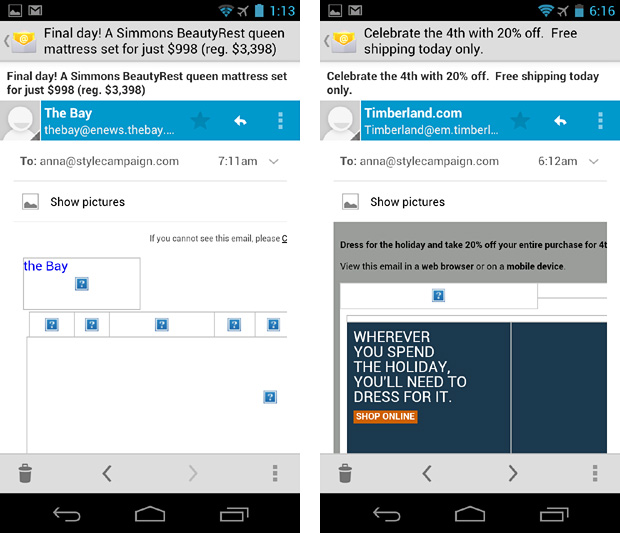
Assume the worst when designing for Android. Compare The Bay (left) with Timberland’s cleverly placed HTML.
2. Color the pre-header
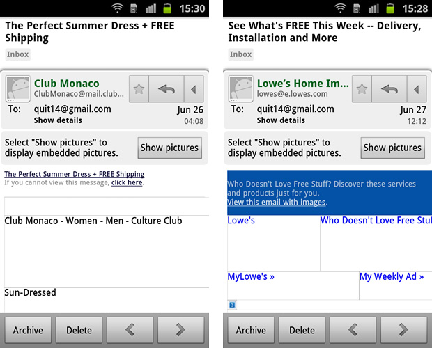
Black pre-header text against white blends with the UI chrome (left). Draw the eye with a colored bg or copy.
3. Encourage scrolling
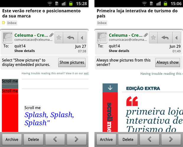
Prompt users to explore beyond the default view. This Celeuma email has a 57px wide “Scroll me” column.
4. Style Alt text
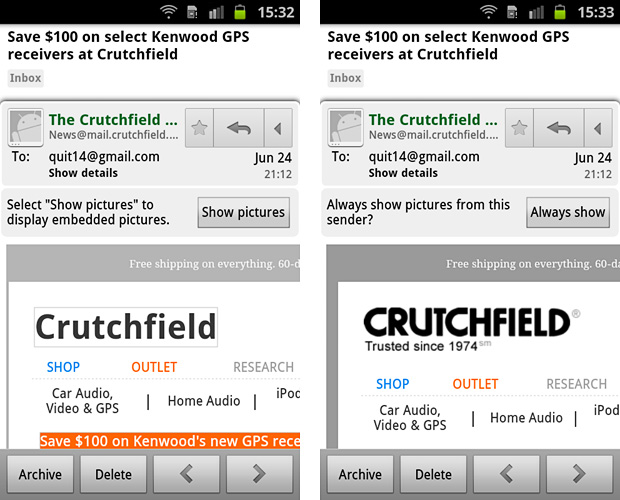
Style your logos alt text. Crutchfield with images disabled (left) and enabled.
5. Vertical navi
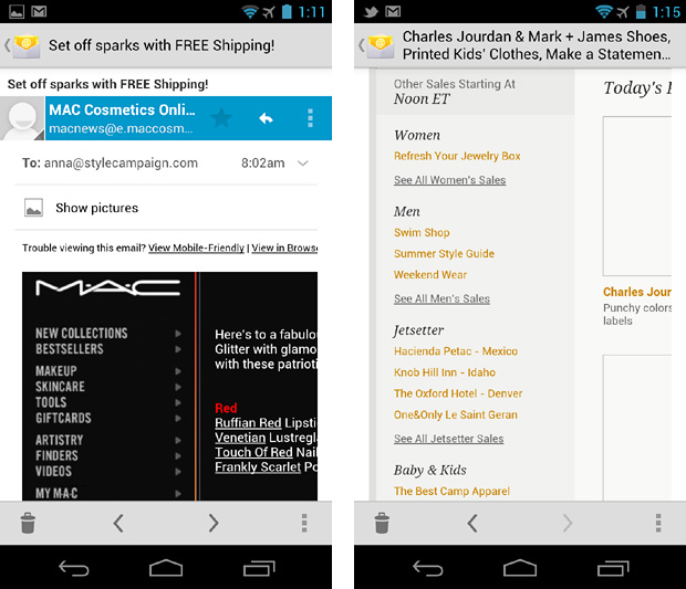
Just make sure it’s designed for touch, with plenty of vertical spacing. MAC (left) Gilt (right).
6. Progressive Disclosure
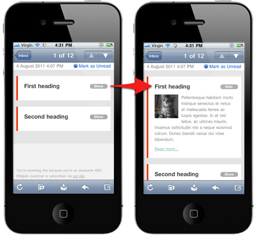
Users can tap to reveal extra content from within the first screen. Thanks to Campaign Monitor for the image and write up. Although it only works in the native client, there are fall backs in place. Also see, Hint and reveal.
7. Color tables
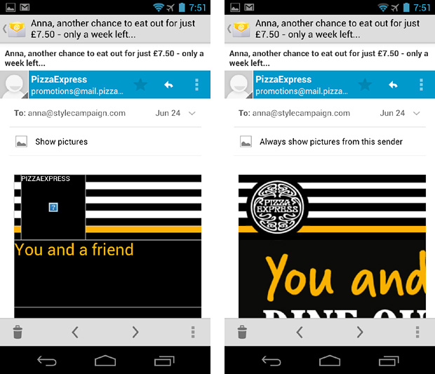
It aids branding and recognition with images disabled.
8. Pixel art fallback
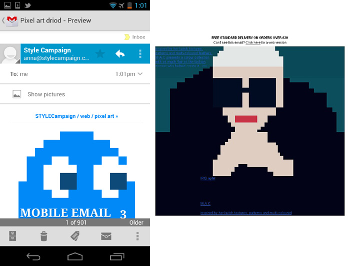
Taken a step further…place fallback pixel art just in the preview area. See Pizza Express and MAC. Thanks to @becskr for the MAC screenshot below right. Also see mobile pixel art and img-HTML app.
9. Left rail
Add a 300-320px wide left rail. Test the alignment of copy/images. MyHabit (left) Fab (right)
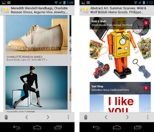
10. 14px and up
You can’t use @media to increase font sizes in the Gmail app, so make your desktop copy at least 14px.
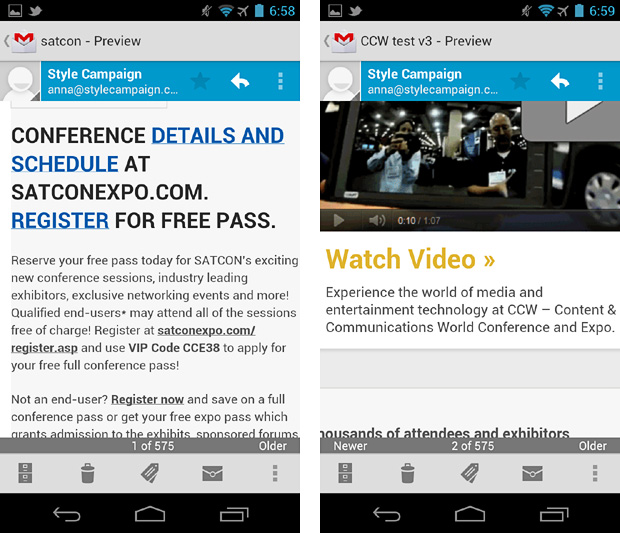
11. Fluid grids and images
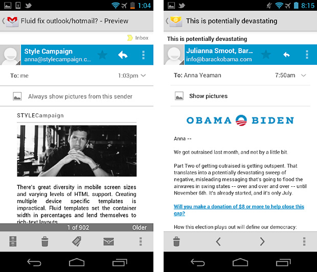
Using percentages your content adjusts to the width of the viewport, even in the Gmail app. More on fluid layouts here and here.
12. Design in chunks
This Crate&Barrel email looks beautiful on the iPhone and iPad, but it’s hard work on Android. Scalable layouts are often centered and spread across multiple screens, requiring lots of scrolling. You can fix this in the native Android client with media queries, but the conflict remains in the Gmail app.
{ iPhone far left / Android right, have to scroll across width of layout to read offer }
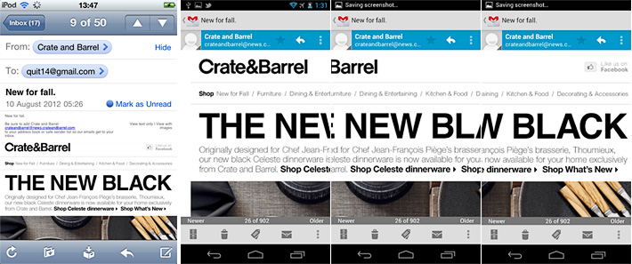
I bet the people who cited “too much scrolling“, as the reason mobile email is difficult to read were Android users! Get to your offer in the first 1-2 chunks, ideally you want it to fit on one screen like Timberland up top.
Best guess
If I had to guess I’d say most Android users are viewing email in the Gmail app. Firstly it’s easier to access than the native client. Secondly Gingerbread is currently running on ~60% of all Android’s. The native client on Gingerbread doesn’t block images by default, the Gmail app does.
If the majority of Android users were downloading images, I’d expect to see higher Android usage stats. Even if I’m wrong and it’s all due to poor user experience, I still plan to use more fluid layouts as a fail-safe for non @media enabled devices.