Designing emails for touch - Navi (2)
The exception is the navigation bar. My finger spans 3 links, making it unusable for touch screen users without zooming in.
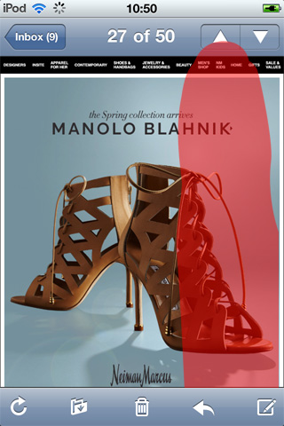
Most email navigation falls short of the 44x44 pixel dimensions Apple recommends. HTML based navigation fares worse, often braking with auto-scaling.
Tab Bar
The tab bar is a standard iPhone UI element users are familiar with. It's a good place to start when reworking email navigation for touch.
{ Bluefly iPhone app screenshot }
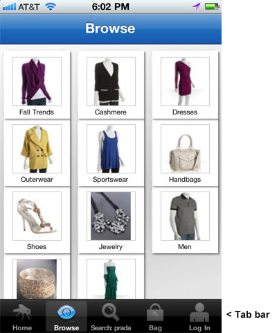
The tab bar is 49px high, with a five button limit (Blackberry also suggests 5 max). It's positioned at the bottom of the screen, where your thumb rests when holding an iPhone one-handed.
Primary controls such as, "Home" go left, making it easy to reach with your thumb if you're right-handed. Less popular links like, "Log In" go right, as it's awkward to bend your thumb back.
Many of us place our unsubscribe links bottom/left. I've begun right justifying unsubscribe links, or moving them top/right, to avoid mistaps.
Positioning
iPhone users expect the tab bar to be at the bottom of the screen. This contrasts with desktop email, which optimizes for the preview pane. Furthermore, each mobile platform has its own UI conventions.
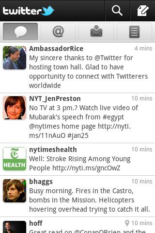
If you view Twitter on the Andriod the navi is at the top:
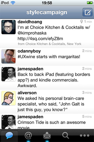
Twitter on the iPhone with navi at the bottom:
Designing for touch, means reevaluating the placement of each element in our email creative. Making adjustments for ergonomics and user expectations that are sometimes in conflict.
Consistency {View email}
Serving up platform specific layouts like Twitter would be ideal, but impractical. Though primarily targeted at iPhone users, the email I designed below will be viewed on the desktop and Android.
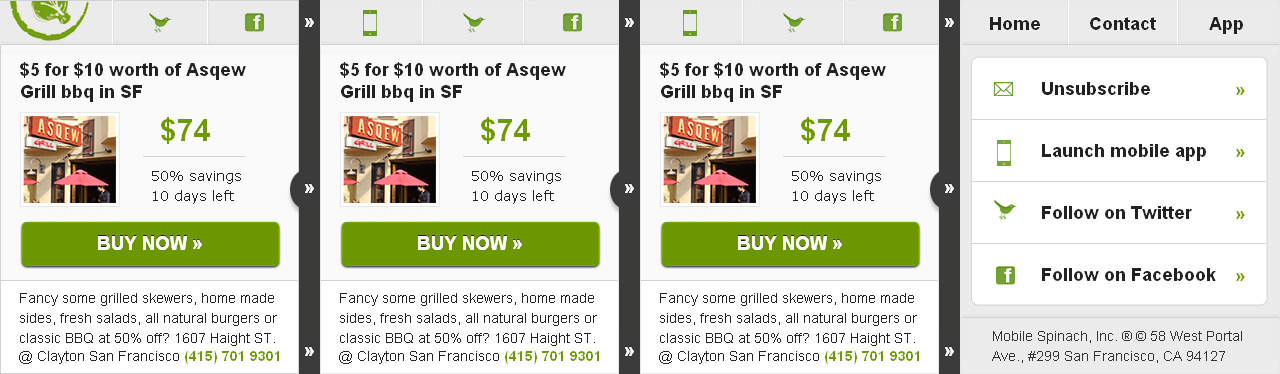
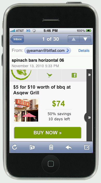
The navi is 100x44 for each tab. On the forth screen I used a list view for navigation. Though I'm wary of implying functionality that email does not support. e.g. When you click on an arrow in a list view on the iPhone, it drills down to another screen.
Screenshot from iPhone 3G. (320x480 res) :
iPhone 4 (640x960 res) :
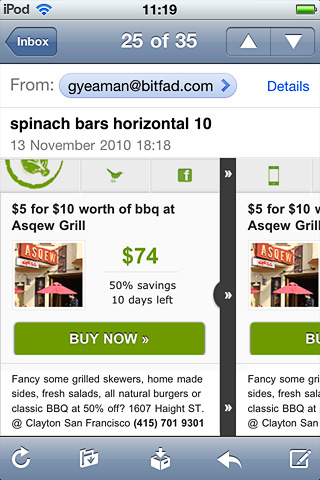
Looking at this months later, I wish I'd added some supporting text to the icons in the top navi. They share each individual deal on Twitter/Facebook. Interpreting icons, even standard ones is no sure thing, as we are not building native apps. Not everyone speaks iPhone, Andriod and BlackBerry users are viewing the same email.
While familiarizing myself with each platforms UI guidelines, I don't want my content to mimic just one. Can we safely mash up mobile conventions for email, isolate the commonalities?
Ditch Navigation?
Figure out the absolute least you need to do to implement the idea, do just that, and then polish the hell out of the experience... - John Gruber v slideshare on Mobile UI Practices.
A year ago I designed this horizontal layout, I'm reworking it. I've taken out the logo, increased the font size and moved the footer admin. I plan to make it no more than 280px, the height on the first screen of an iPhone 3G (minus toolbars, subject line ect). Zero fluff, just content that's distilled down to its bare minimum.
In contrast a twelve link navi bar feels lazy. A catch all for marketers who don't know what subscribers want. Either edit the navigation to no more than five tabs, or remove it altogether. The fewer elements on the page the better.
Check out Designing for touch - Mobile version (1)
Check out Gap redesigns navi for touch