11 Skinny emails
My main concern with using a skinny email, was how it would perform on a PC. It leaves a lot of empty space to the right. However, our stats over the last 4mths would indicate that PC users don't mind.
If you need pro-skinny ammo or reassurance, check out these eleven skinny emails:
Click images to view emails.
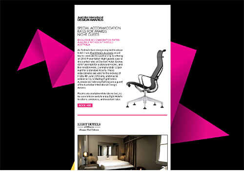
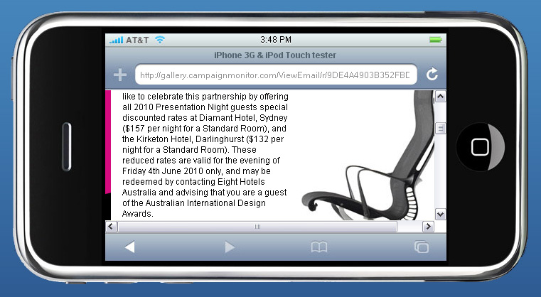
1. AIDA {View}
{498px wide}
One way to fill that dead space on a PC, is to use a background image. Just note that background images are not supported by Outlook 07, Gmail and Hotmail.
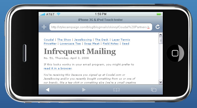
2. Coudal partners {View}
{380px wide}
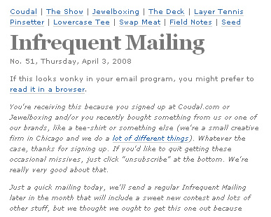
I love how clean this Coudal design is. My only suggestion is to increase the font from 10px to 12px.
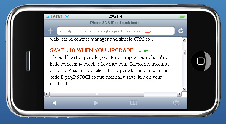
3. Basecamp {View}
{420px wide }

16px body font, great use of color and minimal images. All around 20K, which is the maximum size the W3C recommends for mobile emails.
4. Silberpuls {View}
{450px wide}
Rather than use a large background image, Silberpuls adds an accent image, keeping the file size down.
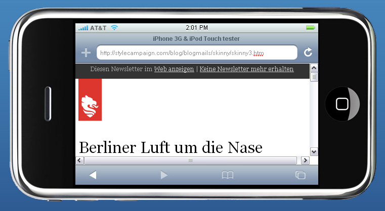
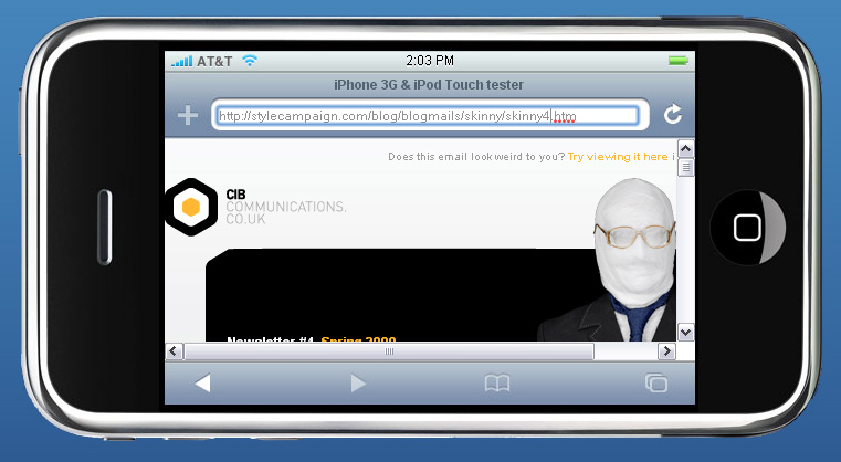
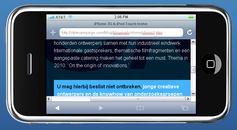
5. CIB {View}
{490px wide}
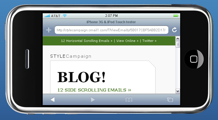
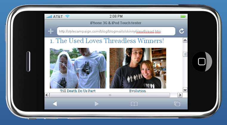
The visible area on the iPhone is 320 x 356px in portrait and 480 x 208 in Landscape. Your skinny email needs to be under 480px wide.
Unless you want your email flush left in the inbox, subtract 20px or so for a left margin.
6. .NET {View}
{500px wide}
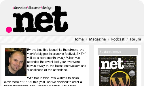
Although .net is 500px wide, the two column skinny layout ensures the main content is visible. I'd increase the font size...

7. Design Week 2010 {View}
{Column of text 411px wide}
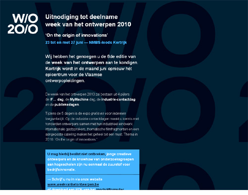
The W/O logo forces the design right, pushing some of the copy of the screen. Though it's easy enough to pan right, and read down the column of text:
8. STYLECampaign {View}
{370px wide }
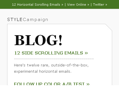
My skinny template, wish I'd made it 320px wide instead of 370px. Footer text is too small, going forward all my text will be at least 12px.
Still it's been performing really well, giving me the confidence to move onto 320px templates.
9. Threadless {View}
{480px wide}
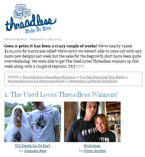
Interesting to see how Threadless was using a skinny template back in 05. They've since moved onto a 656px wide template.
10. 37signals {View}
{440px wide}
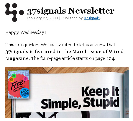
Like Threadless, 37signals now use a much wider template.

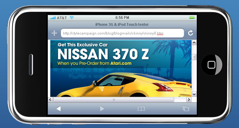
11. Atari {View}
{490 pixels wide}

A few of these templates were 10-40px off the 460px wide mark. I included this Atari example as its more image based than most of the examples I've seen.
The Skinny/inspiration
Campaign Monitor reported iPhone email usage more than doubled in 09, it's up 128.6%.
25.6% of Hugo Boss subscribers (LA stores) read the April email on their iPhone. It's now their no.1 email client.
If you missed designing email for the iPhone (part 2 skinny) catch it here >>
Momkai's narrow website gave me lots of great ideas. For more skinny inspiration, check out these websites designed for the iPhone.