Easy to sign up for email in-store? I visited 10 retailers...
![]()
1. M.Fredric: {view large}
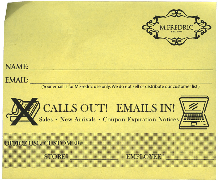
M. Fredrick had a matching yellow sign at the cashier, it really drew my eye. They state their privacy policy and only ask for name and email.
I would move the administration fields to the back, or smaller, to keep the design simple.
I'm a little confused by their "CALLS OUT! EMAILS IN!" slogan. I'd ditch it altogether or replace with something like, "WEEKLY COUPONS & SALES". Frequency is a big omission here.
![]()
2. Pier 1: {view email}
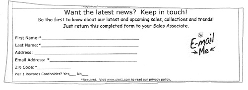
Pier1 had these forms at the cash register, someone can't cut a straight line. Unlike Urban Outfitters, you get the feeling the handmade look is not branding.
The form states,"Visit www.pier1.com to read our privacy policy". Why not replace that text with a brief privacy statement?
Although Pier1 ask for an address its not required, I'd still get rid of it. Use the same guidelines as a web sign up form, ask for the bare minimum.
![]()
3. Gap: {view large}
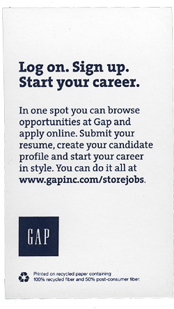
Gap had no sign up slips, when I asked an assistant I was given the above recruitment card and told to, "Ignore everything but the website address" where I can sign myself up when I get home.
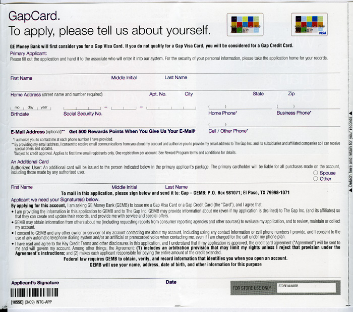
Gap do promote their Gap Card at the cash register. The aplication states,"Get 500 Rewards Points When You Give Us Your E-Mail". Quite a few retailers lump email sign up into their membership program.
![]()
4. Urban Outfitters: {view email}
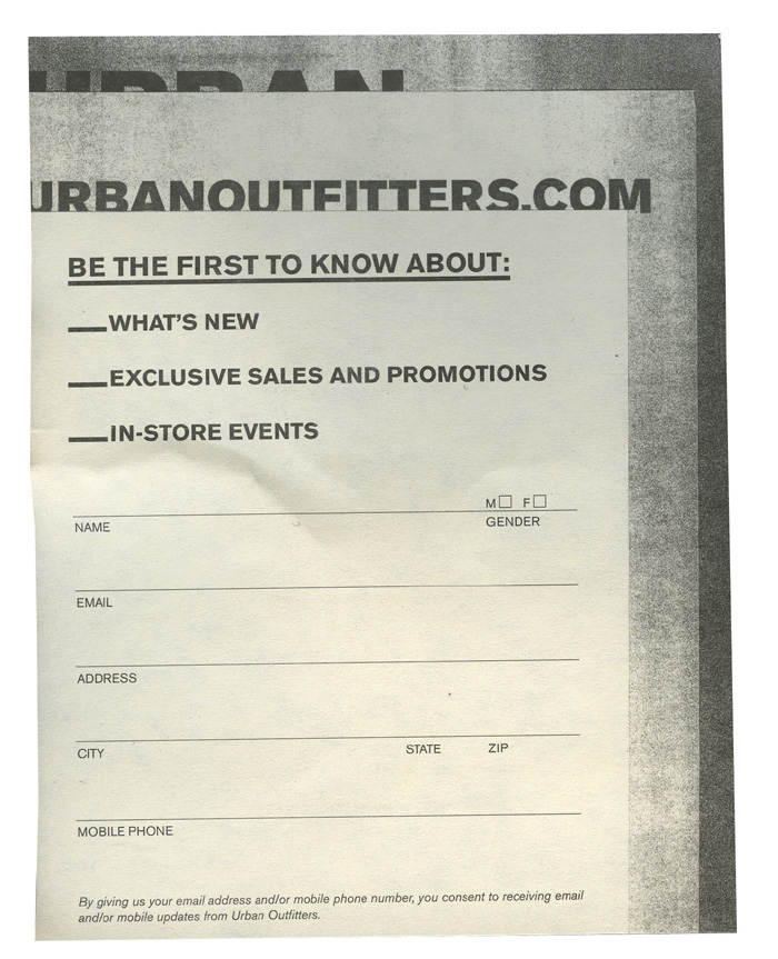
New design above, includes a field for mobile updates.
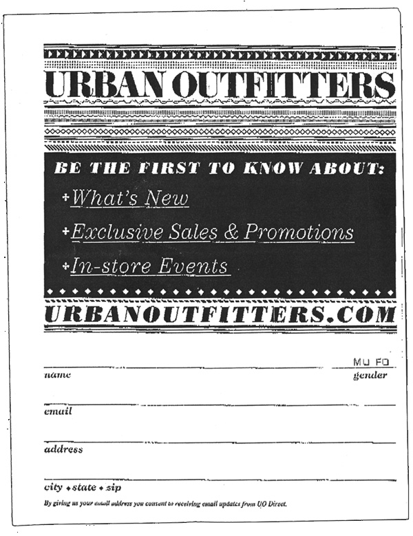
Old design.
The forms are placed beside each cash register. Nicely on-brand, with a privacy statement and clear benefits.
I would get rid of the address and add frequency.
The old design was a pile of loose slips, prone to getting dispersed. The new design is a tear off booklet.
![]()
5. Lucy: {view large}
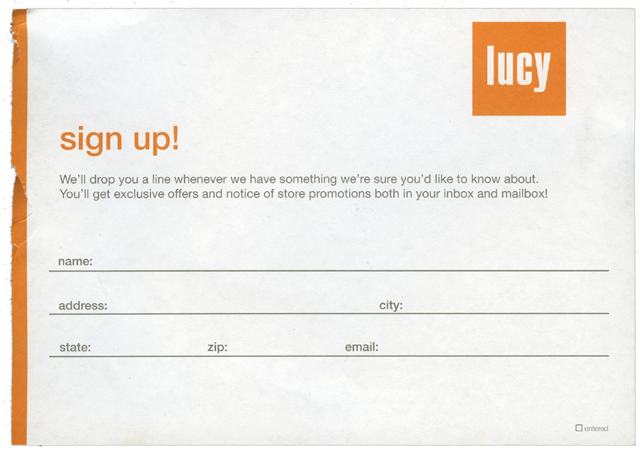
Lucy had the largest slips, 7"x5". Well designed to match the store colors. Lucy ask for too much information on sign up.
![]()
6. Banana Republic: {view email}

After prompting a sales assistant, she dug out this slip behind the cash register. I'm not sure if its their email sign up, or what was on hand. Like Gap, Banana Republic are focused on card membership in-store.
![]()
7. Lucky Brand Jeans
Lucky Brand Jeans had a large book, prominently displayed at the cash register. Impossible to miss, with a big email deals title. One drawback is everyone can see your contact details. They also asked for an address.
![]()
8. Lemon Rags: {view email}
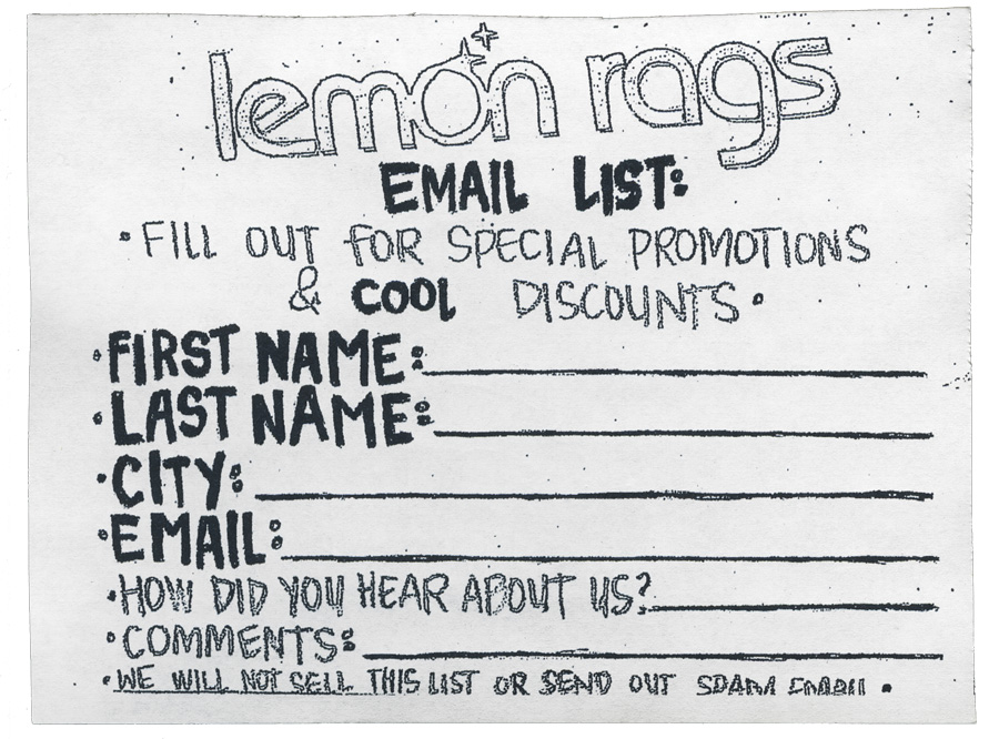
Lemon Rags used a sign to direct my eye to these well designed slips. Points for branding and privacy statement, but no frequency and too many fields.
![]()
9. Aveda: {view large}

Aveda is another retailer which lumps email sign up into their rewards program in-store.
![]()
10. Barnes & Noble
Barnes & Noble had no email sign up at the counter, though its part of their membership card application. After asking a sales assistant, he asked me to write down my address and he would enter it.
He also told me to expect the newsletter every Tuesday, the only mention of frequency all day.
![]()
Takeaways:
- Add a privacy statement.
- Place forms at checkout, but test other locations that don't hold up the queue.
- A pen might help.
- Take time to design a form that matches your brand.
- State frequency and benefits.
- Add a sign to draw the eye. I can read it while waiting in line to pay.
- All you need is email, make name optional and forget address.
- Customers want to receive deals via email, without getting a store card.
- Place admin on back, alternatively Lucy have a tiny entered box bottom right.
- Use color where appropriate. M.Fredric's yellow slip and sign was the easiest to spot.
- I've never been asked for my email address at the register, in majority of cases.
In-store email sign up is either hidden in a store card application, or poorly executed. No frequency, few signs to draw the eye and too many fields. Email sign up is agrresively pursued online, in-store its a passive experience.
It a small sample and not all bad, but I see room for improvement. If you've ideas for in-store sign up I'd love to hear them...