Is your email designer shortchanging you? Read this and find out
I'm Ok with that.
Sometimes though, the laziness of the designs has me scowling at my inbox. Take this Crate&Barrel newsletter I received today:
{ View full HTML Crate&Barrel email }
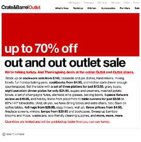
Its made up of 5 horizontal gifs, when there is no reason why the whole thing cannot be in HTML. That way it can be read with images blocked. There's even a big red gif at the top, why not make it a table? Its just lazy... I would understand if this came from an inexperienced local retailer, but its Crate&Barrel who should know better.
![]()
What's up with Sur La Table?
Every-time I receive a Sur La Table newsletter, I want to smack them on the forehead! As an upscale store with 50+ branches nationwide, surely they have the budget for a proper template? Compared to competitor Williams-Sonoma - whose emails use HTML text - its sadly lacking in readability.
{ View full HTML SurLaTable email }
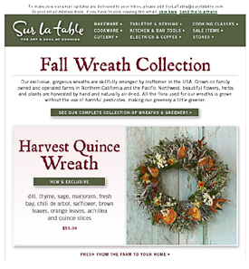
Its all images...no HTML text. They use image maps in their header to link to categories on their website. When images are blocked, the links will no longer function under Yahoo Mail, Entourage or Gmail. In fact image maps don't work under Gmail even with images enabled...
A pre-header text link such as, "Fall Wreath Collection" would be a simple improvement. (Read about pre-header links here)
![]()
At least add some pre-header text!
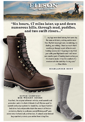
Not to pick on Filson - I could have chosen any number of retailers - their entire email including contact details is made up of images. A lot of readers are going to see a big X in their inbox and nothing else. It would take little effort to convert the title, "Six hours, 17 miles..." and the rest of the text to HTML. It does not overlap any images, fits in a box so can be substituted for a table and HTML text.
I feel like a broken record, but a pre-header link to the featured, "Highlander Boot" would give this email a boost.
{ View full HTML Filson email }
Compare Filson to Tommy Bahama's newsletter:
{ View full HTML Tommy Bahama email }
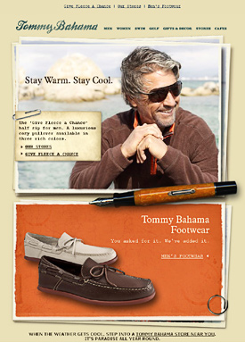
Tommy Bahama's email relies heavily on images, but most of the text is HTML which overlays the background (read more about that technique here).
They add pre-header text in the 3 links at the top, and a link to the online store at the bottom. It shows that with effort, you can balance using images and HTML text. Other retailers doing a great job are Land's End and REI Gearmail.
I've noticed Pottery Barn making their calls to action in HTML recently, though strangely not the rest of the text...
![]()
Lazy or smart?
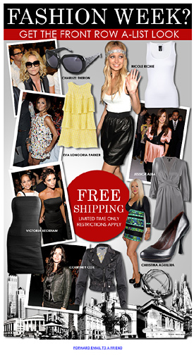
I can't believe that these retailers - or the large agencies they employ - are not aware that making your newsletter entirely of images sucks. I can understand in some cases, because the design does not lend itself to the rigid layout of HTML. Take ShopIntuition below, or Intermix Lust who favor the popular collage layout.
{ View full HTML ShopIntuition email }
But that's not the case with the examples above, which have no such restrictions.
As an email template designer, I know it takes more work to convert text to HTML. It basically adds a whole extra step to the design process, sometimes doubling the production time. I would be lying if I said I had not used images in the past, when I could have used HTML.
What gets me, is these are large brands making fundamental mistakes. They hire big firms and end up with a dud. Its up to retailers and individuals to educate themselves, so they're not getting shortchanged. Next time you speak to your designer, ask about substituting images for HTML text and adding pre-header links.
![]()
Are newsletter designers shortchanging people? Or are conversions not affected by using images instead of HTML?