Email Evolution - Is your navi bar user friendly?
I noticed that Land’s End recently changed it’s newsletter template. Instead of images in their navigation bar, they’ve switched to HTML text. Now the links will show up by default in the preview pane, and should result in a higher click through rate.
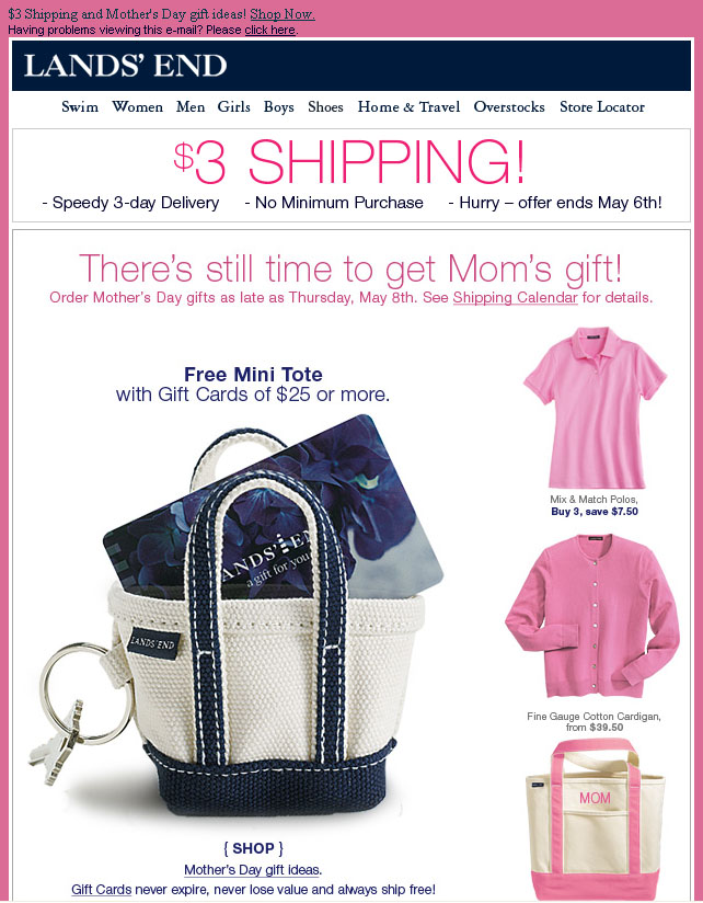
{ old navi bar - view full email }
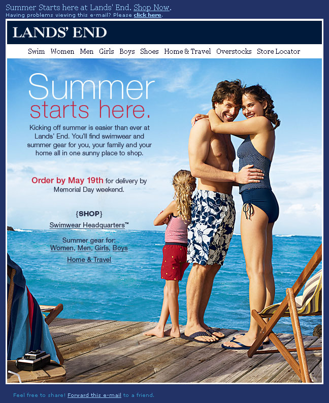
{ New navi Bar - view full email }
There are a lot of businesses that can make this simple improvement to their newsletters (me included!) I would be interested in the percentage of retailers currently using HTML vs Images in their navi bar. Looking in my inbox most are still using images like Ann Taylor and Banana Republic.
Quick update to this post, currently only 14% of the 104 top online retailers compose their navigation bars with HTML text rather than images - Retail Email Rendering study just released by the EEC